Coastal Beige
Behr's vanilla beige, reviewed honestly: the coastal name that is really yellow, the north rooms where it glows, and the trim that makes it look dirty.

Jessica has spec'd whites and neutrals for more than 300 rooms and keeps a sample wall of painted drawdowns in her studio. Every color review is checked against real reader rooms in the comments and re-tested when a formula changes. About the testing process →
- 1First Star69
- 2Classic Gray74
- 3Coastal Beige82
- 4Chantilly Lace91
- 5Ultra Pure White97
The Fast Verdict
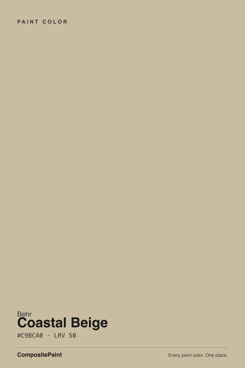
Coastal Beige is a vanilla beige with a yellow undertone, filed in Behr's yellow family and sold under a name that promises sand and sea. At LRV 82 it is bright enough to live with the whites on paper; on four walls it is cream-beige, and the yellow is the point. North and east light keep it quiet and finished. West sun, a bright white tub, or a cooler greige you thought was coastal will all tell the same story: this is not gray sand, and it is not a true white.
North and east living rooms that need warmth · cream kitchen cabinets with oak, brass, and butcher block · tone-on-tone walls and trim in traditional houses · anyone who wants vanilla beige, not coastal gray
You wanted gray sand or a true white · trim is staying a creamier off-white · cool gray floors, Carrara, or a bright white tub · a west wall that bakes all afternoon
- Honest vanilla beige at LRV 82 — holds as cream instead of washing out to white
- North and east rooms that feel gray under a true white actually warm up
- Flatters oak, walnut, brass, and butcher block the way a gallery white never will
- One-color rooms (walls + trim + ceiling) look original in traditional houses
- Cabinets hide scuffs better than Ultra Pure White or Polar Bear
- Not coastal gray — buyers expecting sand-and-sea see yellow vanilla by the second wall
- Reads dirty next to a brighter true white, and fights creamier off-whites on the trim
- West afternoon sun and the oak-plus-warm-bulbs stack pull the yellow all the way forward
- On the wrong house it reads as 1990s builder cream, not current beige
What Color Is Coastal Beige, Really?
A vanilla beige with a yellow spine — and the name is doing the damage. Coastal, on a paint chip, usually means gray sand, sage, or a cool greige that photographs like driftwood. Behr files PPU7-13 in the yellow family, and Home Depot's own listing calls it a vanilla beige with a yellow undertone that can read as beige depending on the light. That is the honest color. It sits in the PPU7 beige-cream strip next to Silky White (PPU7-12) and Roman Plaster (PPU7-10): one step creamier than a calm warm white, several steps paler than the sandy beiges below it. It is a Home Depot workhorse, not a Color of the Year, not a viral cabinet color. Confirm the can says PPU7-13.
At LRV 82 it reflects most of the light that hits it, but it is clearly not a bright white. White Dove sits three points higher at LRV 85 and is grayed enough to still read as a warm white. Behr Swiss Coffee is at LRV 87 and shows its cream without dropping into beige. Ultra Pure White is a true white at LRV 97. The useful twin is Sherwin-Williams Dover White at LRV 83, hex #F0EADC — one digit off this can's #F0EADA. On a wall Coastal Beige holds just enough yellow-beige body to soften shadows and flatter oak; next to a real white the same number is the risk, because the field looks unwashed. On a chip it can pass as a soft white. On four walls it is beige.
Undertone in one line: warm yellow-vanilla — never gray, never pink, never coastal in the blue-green sense. In north or filtered east light the yellow calms and it reads as a finished cream-beige. In west sun after about four o'clock it goes distinctly buttery. If your sample looks dingy, a brighter white is sitting next to it, or the bulbs are cool. If it looks yellow, that is the paint being honest about the hour. Both versions are the same can.
Where It Shines
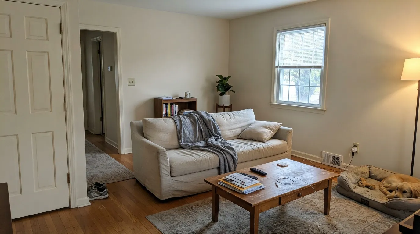
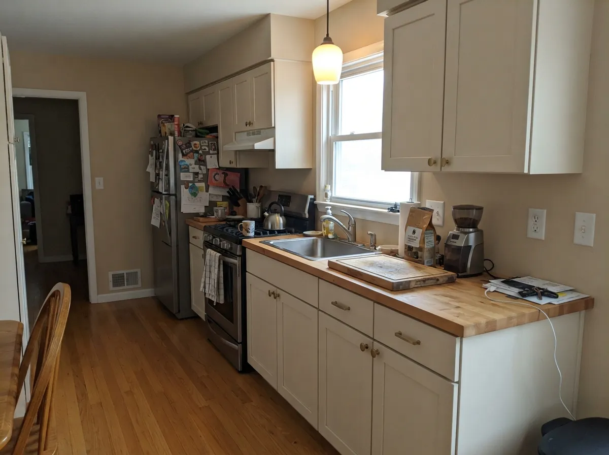
Give it a room that runs cool and materials that run warm, and it does the job a yellow-family beige is hired for. North-facing living rooms that feel gray under a true white; east bedrooms that want cream without butter; kitchens with oak, unlacquered brass, and butcher block. The one-color room — walls, trim, and ceiling all Coastal Beige with only sheen changes — is the pairing that keeps it from looking dirty. Behr's own coordinating chip is Navajo White, a deeper yellow cream at LRV 74, which tells you the intended company: more yellow, not less.
Where It Fails
Almost every regret about this color follows one of three scripts, and all three are visible on a large sample before the first gallon. None of them are a bad batch — but if your room matches one, this is not your beige, and a second coat will not fix it.
Shoppers hear Coastal Beige and picture gray sand, seagrass, a cool whole-house neutral. Behr filed this chip in the yellow family. On four walls the vanilla-yellow is unmistakable — cream, not driftwood, not sage, not the greige Even Better Beige was mixed to be. If gray-sand coastal is the goal, this is the wrong can. Sea Salt is the cool coastal read; Even Better Beige is the beige that skipped the yellow.
Two pairing mistakes, same dirty-wall photos. Leftover builder-white, a bright tub, or Ultra Pure White on the millwork will make Coastal Beige look yellowed and unwashed — because it is beige, and the brighter plane wins. The other trap is a soft white in the same temperature: Swiss Coffee, Polar Bear, Blank Canvas on the trim against these walls, and the two creams fight. Either run Coastal Beige on walls and millwork and let eggshell / semi-gloss separate the planes, or commit to a clearly brighter true white on the trim and let the walls be cream on purpose. The in-between whites are the ones that look like a mistake.
Low western light pulls the yellow all the way forward, and Carrara-look quartz, grey LVP, and a bright white tub sit at the opposite temperature and shove it further. On the chip it is a soft vanilla; in those rooms it reads sour cream. Honey oak plus 2700K cans plus this paint is the same stack that turns Dover White yellow — sample a big board on the actual west wall and against the actual slab. If you cannot live with the yellow hour, pick White Dove or Alabaster and let the floor be the warm one.
Room by Room
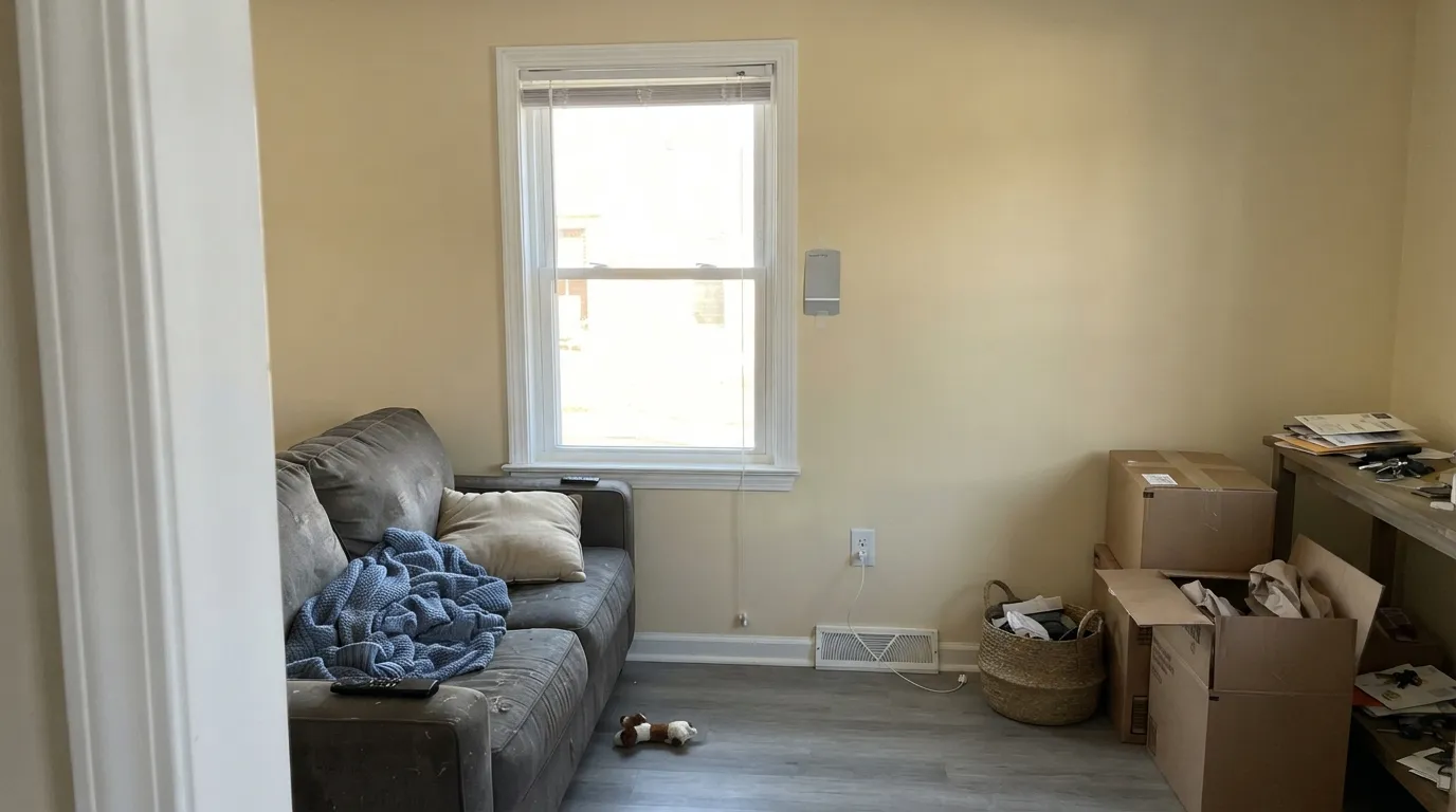
Cool flat daylight tames the yellow and leaves a comfortable cream-beige, which is the version most people fall in love with. Eggshell; same color on trim in semi-gloss, or Ultra Pure White if you want the walls to read as cream on purpose. A west glass wall is the 4 p.m. test, not a given. Grey LVP will pull the yellow forward — sample first.
Warm counters, brass, butcher block, terracotta — all of it loves this vanilla. Satin on cabinets wipes clean and hides knuckle marks a gallery white would broadcast. Cool white quartz, grey tile, or a white farmhouse sink will make the boxes look more yellow by contrast. Honey oak plus 2700K cans is the yellow stack: sample against the actual floor and the actual bulbs. Urethane-fortified cabinet enamel either way.
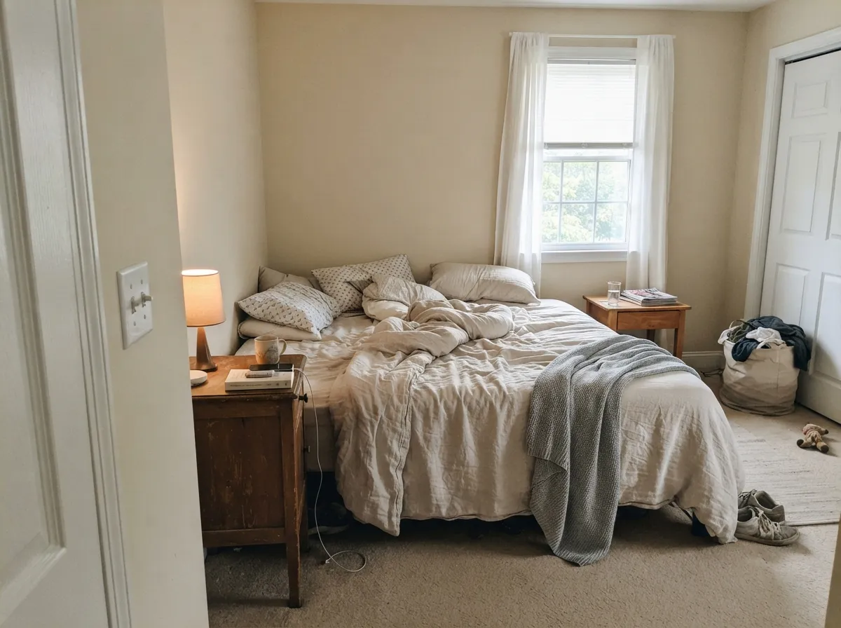
Filtered east light and 2700K bulbs hold the cream to a glow instead of a butter wall. Eggshell; same color in semi-gloss on the millwork. Crisp white linens will make the walls look more yellow than they are — stay on cream or oatmeal bedding. If the bedroom faces west and bakes, this is not the can.
Dining rooms run on lamplight, and 2700K bulbs make the vanilla look intentional rather than dirty. Pair it with Hale Navy or Adirondack Blue and it reads finished, not themed. A west-facing dining room with uncovered glass is the afternoon test again.
LRV 82 is light enough to keep a hallway open and beige enough that it never feels like a rental corridor. One eggshell color across the main floor removes the cut lines between rooms. Windowless interior halls will read a step deeper and a touch yellower — put a lamp in, or the tunnel goes dingy.
With warm stone, a wood vanity, and brass: easy. With a bright white tub, white toilet, or cool grey marble: it argues, and the cream looks yellowed. That is the same fixture trap Dover White has. If the porcelain is staying bright white, use Alabaster or Ultra Pure White instead.
Your Light Is the Risk
Cool flat light tames the yellow and leaves a finished vanilla beige. This is the light a yellow-family cream was mixed for — warm enough to rescue a gray room, quiet enough not to go butter.
Low western light pulls the yellow all the way forward. On the chip it is vanilla; at 4 p.m. on a west wall it is butter. Sample that elevation at the yellow hour before you buy gallons.
The brightest, most honest read: clearly a cream-beige at midday, warming as the sun drops. Most people like the shift; if yellow is the dealbreaker, this is where you will see it first.
2700K bulbs make it creamier and cozier, and can tip it yellow if the floor is already gold. Cool 4000K LEDs strip the vanilla and leave a dingy beige. Swap bulbs before you swap paint.
Most complaints about Coastal Beige are a light mismatch. Upload a photo of your actual room and see it on your walls — then ask for the same wall in north light or evening lamps before you buy a single sample.
Need It From Another Brand?
Any paint counter can custom-tint Behr PPU7-13 directly. If you would rather stay in one brand's own deck, these are the closest stock matches, measured as ΔE2000. Under 2 is a difference you will not see on the wall.
| Brand | Closest color | ΔE | LRV | |
|---|---|---|---|---|
| Sherwin-Williams | Classic Light BuffSW 50 · Sherwin-Williams | 0.8 | 83 | Color page → |
| Benjamin Moore | StonewareCSP-245 · Benjamin Moore | 0.5 | 82 | Color page → |
| Valspar | Grow8003-25A · Valspar | 1.4 | 82 | Color page → |
| PPG / Glidden | Ivory TowerPPG1103-1 · PPG / Glidden | 0.0 | 82 | Color page → |
| Glidden | Ivory TowerPPG1103-1 · Glidden | 0.0 | 82 | Color page → |
| Dutch Boy | Little Star116-1DB · Dutch Boy | 0.4 | 83 | Color page → |
Similar Behr Colors
The nearest shades to Coastal Beige within Behr's own range, ranked by perceptual color distance — useful when you want the same look a touch lighter, darker, or warmer.
WCAG 2.1: AA is 4.5 : 1 for normal text, 3 : 1 for large text, AAA is 7 : 1.
Coastal Beige vs the Colors You're Also Considering
Every Coastal Beige sample board has the same rivals on it. The numbers show the real lightness gap — then it comes down to which risk you would rather live with.
Pick this if you shop Home Depot and want the slightly more beige, yellow-family version of that cream.
Sherwin-Williams SW 6385 · LRV 83Dover WhitePick this if your painter already works in Sherwin-Williams — it is the same vanilla idea, one LRV point brighter, with a much longer paper trail.
Pick this when you actually want beige, not a white that merely leans warm.
Benjamin Moore PM-19 · LRV 85White DovePick this if you want the safest warm white — grayed, quieter, still warm without going vanilla.
Behr has several near neighbors, and the differences are small but visible side by side.
Rye Bread (PPU8-10, LRV 52) is a touch lighter and slightly softer in its warmth. On the wall it reads a half-step airier, which makes it the safer pick for a dimmer room where Coastal Beige might turn heavy. Coastal Beige gives you a bit more presence and a sunnier cast in bright rooms.
Tea Bag (PPU8-09, LRV 50) matches Coastal Beige for depth but leans more khaki-green, with less of the red-orange warmth. Choose Tea Bag if you want an earthier, more organic beige next to greens and grays; choose Coastal Beige if you want the sandier, warmer coastal read.
Gobi Desert (710C-3, LRV 52) is slightly lighter with a whisper more pink in its warmth. It flatters rooms with terracotta or blush textiles, while Coastal Beige stays more strictly sand-toned. Sample any two of these together; in isolation they are easy to confuse.
Coastal Beige Coordinating Colors
The rule for coordinating with Coastal Beige is simple: stay on the warm side, and do not park a slightly creamier off-white next to it. It loves dark trim, terracotta, slate blue, and deeper yellow creams — and it argues with icy whites, cool greys, and blue-grey stone. Crisp true-white trim works only when you want the walls to read as cream on purpose. These are the partners that keep showing up in rooms that work:
Coastal Beige Is Not A Coastal Gray
The name is doing almost all of this color's marketing. Behr puts PPU7-13 in the yellow family, lists it as a vanilla beige with a yellow undertone, and sits it in the PPU7 strip with Silky White and Roman Plaster — a beige-cream collection, not a sea-glass one. The intended palette is Mediterranean sand: terracotta, deeper yellow cream, a slate blue on the door. That is coastal in the Capri-stucco sense, not the Cape Cod gray-shingle sense. There is no Color of the Year attached to it, no famous TV-show wall, no viral whole-house run. Volume is modest. Honest obscurity is fine; the chip still has a job.
The useful cross-brand fact is the hex. Sherwin-Williams Dover White is #F0EADC at LRV 83; this can is #F0EADA at LRV 82. If every photo you saved is tagged Dover White, you already know this color. The Behr version is a hair more beige and a lot easier to buy at Home Depot. Confirm the SKU. Behr Navajo White (22) is the deeper yellow cream on the same coordinating card, eight LRV points down — not a match, a darker cousin.
Coastal Beige With Wood Tones And Floors
Warm wood loves it, and that is the pairing this vanilla was mixed for. White oak, walnut, butcher block, and cedar all sit comfortably against the yellow-beige because the warmth meets theirs halfway. Unlacquered brass and antique bronze are easy; polished chrome is the one metal that leans cold against it.
Honey oak is the pairing people argue about. The yellow in the floor and the yellow in the paint can either look original — old-house cream, stained doors, the whole traditional stack — or they can gang up under 2700K cans and read banana. Sample a big board above the actual floor with the actual bulbs on. If the oak is orange-leaning builder stock and you wanted a current beige, Even Better Beige skipped the yellow on purpose.
The flooring that needs a sample first is cool grey LVP, gray-washed wood, and Carrara-look stone. Grey floors pull the vanilla into relief, and the wall can read sour cream against them. Warm rugs will not rescue a whole-room clash. If the floor is staying cool, pick White Dove or Alabaster and let the floor be the soft one.
Three Ready Palettes Built on Coastal Beige
A color is never alone on the wall. These are complete combinations in the 60-30-10 pattern, with the reason each one holds together. Every one opens in the visualizer.
One vanilla at two sheens is how this color avoids the dirty-white problem: nothing brighter is in the room to make the beige look wrong. Adirondack Blue is the slate-blue note the coastal name promised and the walls cannot deliver.
Try this palette in your roomSame PPU7 beige family at two depths: vanilla walls, a plain-spoken warm beige on the boxes, terracotta on the door. This is the Mediterranean palette the marketing hinted at — sun-warmed stone, not ocean gray.
Try this palette in your roomThe high-contrast option: Ultra Pure White is unbeatable on trim and ceilings, and the fifteen-point LRV gap makes Coastal Beige read as cream on purpose rather than as a dirty white. Hale Navy is the single dark note the scheme needs.
Try this palette in your roomCoastal Beige FAQ
Is Coastal Beige a white or a beige?
Beige — a light vanilla beige at LRV 82. Behr files it with the whites on some charts and in the yellow family on the color page. On a chip it can pass as a soft white. On four walls nobody will call it white once a true white is in the room. If white is what you actually want, this is the wrong can; White Dove or Polar Bear will actually do that job.
Does it look coastal, or yellow?
Yellow-vanilla, not coastal gray. The name is marketing: sand, not sea. In north light it calms toward a finished cream-beige; in west sun it goes distinctly buttery. If you wanted gray sand, seagrass, or a cool whole-house neutral, look at Sea Salt or Even Better Beige instead.
What trim white goes with Coastal Beige walls?
Coastal Beige itself, in semi-gloss, is the safest answer. If you want contrast, go clearly brighter — Ultra Pure White or Extra White — so the walls read as cream on purpose. Soft whites in the same temperature (Swiss Coffee, Polar Bear, Blank Canvas) fight it. A leftover builder white in the middle looks like a dirty mismatch.
Is it good for kitchen cabinets?
Yes, if you want cream cabinets rather than white ones. Satin Coastal Beige hides handprints better than a true white, and it loves brass, oak, and butcher block. Cool grey quartz and white appliances will push the yellow — sample against the actual counter. Honey oak plus 2700K cans is the stack that turns this vanilla into butter. Use a urethane-fortified cabinet enamel.
Is Coastal Beige the same as Sherwin-Williams Dover White?
They are close enough to be twins, not the same can. Dover White (SW 6385, LRV 83, hex #F0EADC) is one digit off this hex and one LRV point brighter, with the same yellow-cream job and the same bright-white regret. Coastal Beige is the Home Depot version, a hair more beige. Sample both if you can cross brands; pick by the store your painter already uses.
Will it look yellow in a north-facing room?
North light is actually its friend. Cool daylight tames the yellow and leaves a comfortable vanilla beige, which is why a yellow-family cream earns a north room that a grayed white would flatten. West sun is what pushes the yellow flash. Warm 2700K lamps help after dark. If the room stays dim and you refuse lamps, it can go dingy — then pick Swiss Coffee instead.
Have you painted with Coastal Beige?
Rate it — one tap helps the next reader decide.
Ask a Question