Terra Cotta Clay
Behr's stucco-house terracotta, reviewed honestly: the sunny exterior it was actually built for, the shaded wall where it goes dusty rose, and what to pick instead.

Jessica has spec'd whites and neutrals for more than 300 rooms and keeps a sample wall of painted drawdowns in her studio. Every color review is checked against real reader rooms in the comments and re-tested when a formula changes. About the testing process →
- 1Rookwood Terra Cotta14
- 2Determined Orange22
- 3Terra Cotta Clay34
- 4Venetian Plaster42
- 5Colonial Yellow59
The Fast Verdict
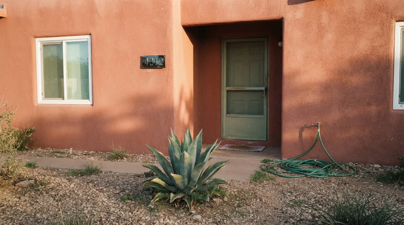
Terra Cotta Clay is a warm, dusty red-orange sold everywhere Behr sells masonry, stucco and brick paint — and that is the tell. This is a working exterior color first, an interior accent second. In full sun on stucco it turns genuinely fiery and Southwest-authentic; in shade or under cool light it drops the red and settles into a flatter clay-brown. It is not trying to be a beige with a hint of orange. It commits, and the commitment is the whole point.
Stucco, adobe or brick exteriors in a sunny climate · a Southwestern or Mediterranean front door · a warm accent wall or kitchen island under real daylight · anyone who wants an honest terracotta, not a greige pretending to be one
Your exterior stays mostly shaded or north-facing · you live somewhere overcast most of the year · you want it on all four walls of a small room · you plan to trust the paint chip without a large sample on your actual stucco or drywall texture
- A real, honest terracotta — not a beige with an orange filter
- Formulated and sold in Behr's masonry, stucco and brick line, built for real exterior durability
- Mid-depth LRV holds its saturation in strong sun without washing pastel
- Reads authentically Southwestern or Mediterranean, not craft-store orange
- A genuinely strong, uncommon front-door color on a light house
- Drains toward dusty, muddy clay-brown in shade or overcast light
- Goes flat and loses its warmth under cool LED bulbs indoors
- Reviewers note the cured color runs more muted than the small paint chip — sample big
- Too saturated for four walls of a small room without a lighter trim to frame it
What Color Is Terra Cotta Clay, Really?
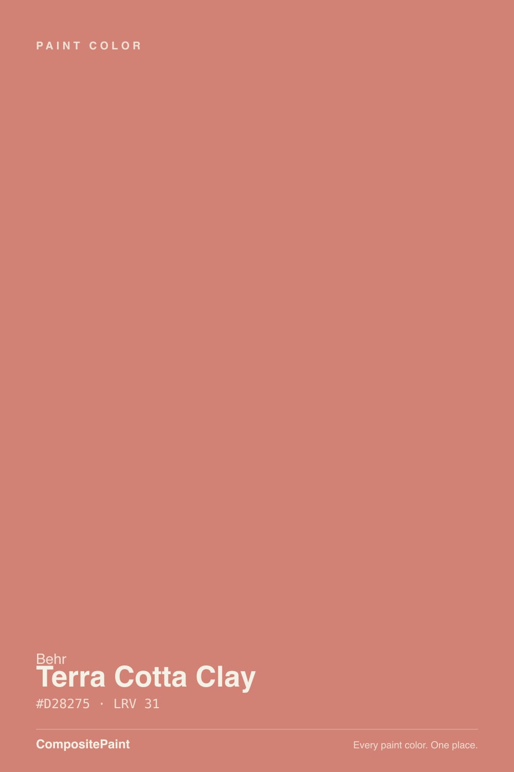
A muted red-orange terracotta with a genuinely dusty, clay-like character — closer to sun-baked adobe than to a bright pumpkin orange. Behr sells it directly in its Masonry, Stucco and Brick paint line, in flat, satin and elastomeric formulas built to bridge hairline cracks on real stucco and concrete. That is unusual for a color this site reviews: most entries here are standard interior wall colors; Terra Cotta Clay is a working exterior product that happens to also tint into interior paint. The name is doing its job — this is the color of fired clay, not a decorator's idea of orange.
At LRV 34 it sits at a genuine mid-depth, deep enough to hold its color in strong sun without washing pastel, but not so dark that it reads brown. That is the useful range for a stucco exterior: bright enough to photograph well against a blue sky, saturated enough to survive years of UV without looking chalky. Indoors, on a single accent wall, the same depth reads warm and grounded rather than loud — closer to a spice-rack orange than a traffic-cone one.
Undertone in one line: red-orange first, with the red muted by a real amount of gray-brown so it never turns candy-orange. If your sample looks pinkish-dusty, that is shade or overcast sky doing it; if it looks fiery and almost brick-red, that is direct sun. Both are the same paint being honest about the light it is in — and on a masonry surface specifically, more than one Home Depot reviewer of Behr's masonry line has noted the dried, cured color reads a shade more muted than the little paint chip. Buy the sample size and roll it onto real stucco or brick before committing to five gallons.
Where It Shines
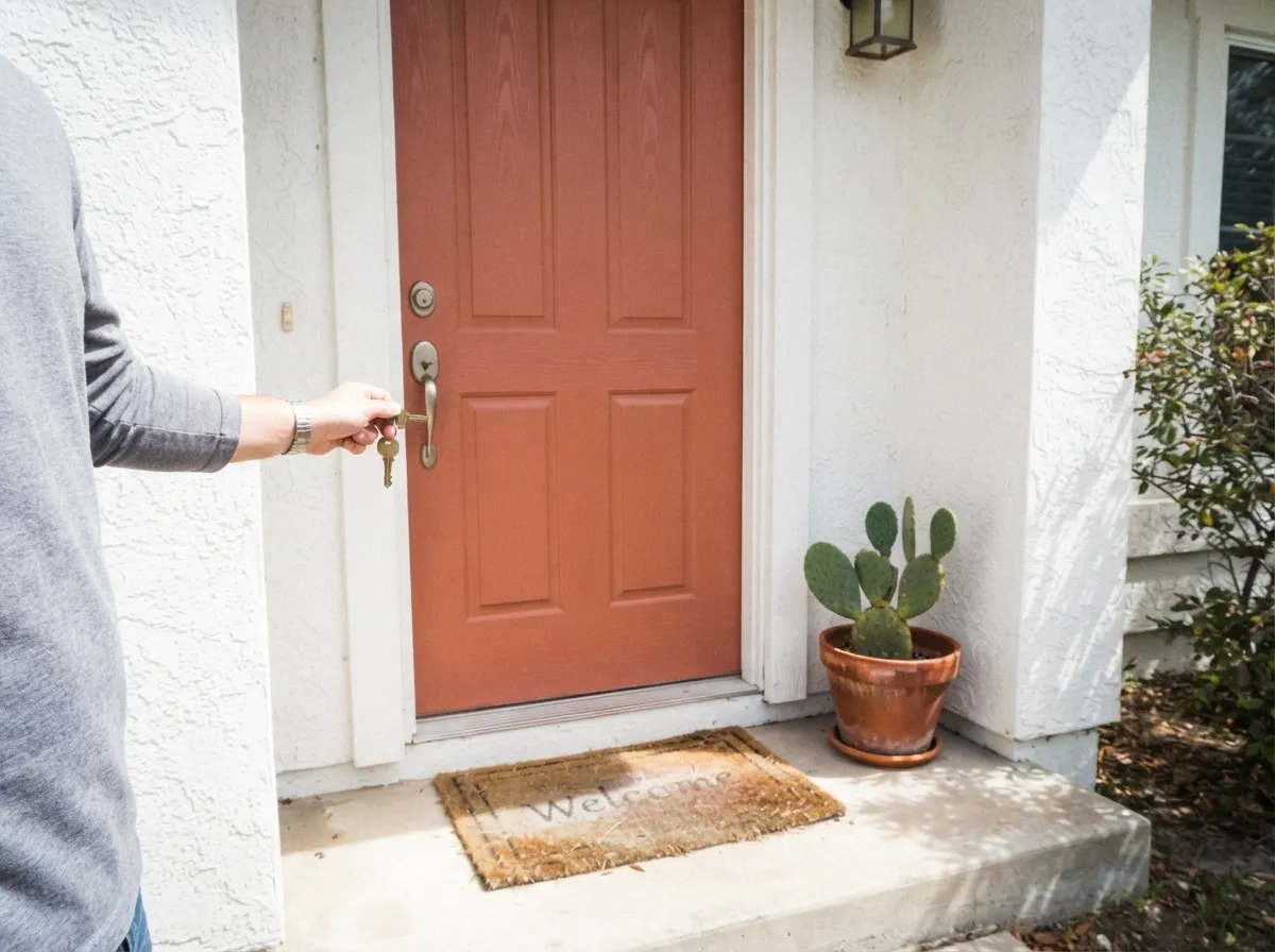
Give it real sun and a masonry or stucco surface and it does exactly the job it was formulated for. On a Southwestern or Mediterranean-style house it turns the whole exterior warm and sun-baked, especially against a blue sky or with cactus and desert landscaping. On a front door it is a genuine statement without going full fire-engine. Indoors, one accent wall under daylight with cream trim and warm wood is its second home — enough color to feel deliberate, contained enough not to fight the rest of the room.
Where It Fails
Almost every disappointed story with this color traces back to one of three mismatches, and all three are predictable before the first coat goes on. None of them are the paint failing — they are the paint being asked to do a job it was never built for.
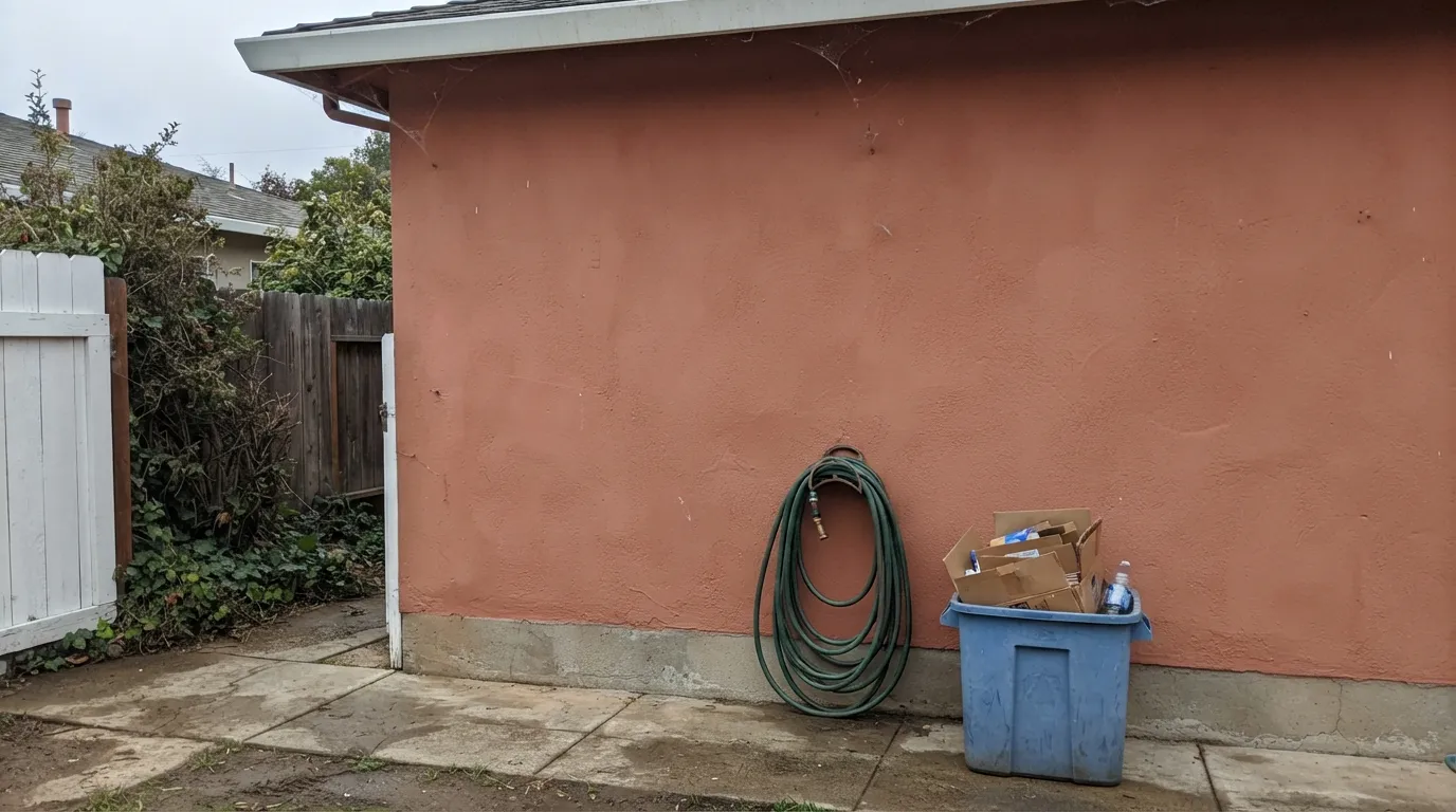
This color needs sun to read as terracotta. In shade, under an overcast sky, or on the north side of the house, the red drains out and it settles into a flatter, dustier clay-brown that owners describe as muddy rather than warm. If most of your exterior stays shaded, test a large sample on the actual wall before committing — do not trust how it looked on a sunny neighbor's house.
Reviewers of Behr's masonry, stucco and brick line have specifically flagged that the cured color on the actual wall reads a shade more muted and less orange than the small paint chip suggests. That gap matters more on a stucco or brick texture, which scatters light differently than a smooth chip. Get the sample size, roll it onto your actual surface, and look at it in morning and afternoon light before ordering the elastomeric five-gallon.
At LRV 34 this is a genuinely saturated color, and a small interior room painted floor to ceiling in it — walls, trim, ceiling, all one color, no cream or white to frame it — can feel closer to sitting inside a clay pot than a designed room. It is built to be a wall on a big exterior or one accent, not an enclosure. Give it a lighter trim color and let it be the one loud note, not the whole chord.
Room by Room
This is what Behr formulated it for. On a Southwestern or Mediterranean house, in real sun, it looks authentically sun-baked rather than painted-on. Use the elastomeric masonry formula on stucco or concrete block — it bridges hairline cracks the standard exterior acrylic will not.
A terracotta door against white, cream or tan siding is a genuine statement without tipping into fire-engine red. Semi-gloss holds up to weather and hands. Skip it on a house that is already warm-toned brick — the door will disappear into the wall instead of standing out.
One wall, warm daylight, cream or white trim: it reads spice-warm and deliberate. Under cool LED lighting or in a windowless room it goes flat and brownish — swap to 2700K bulbs before blaming the paint.
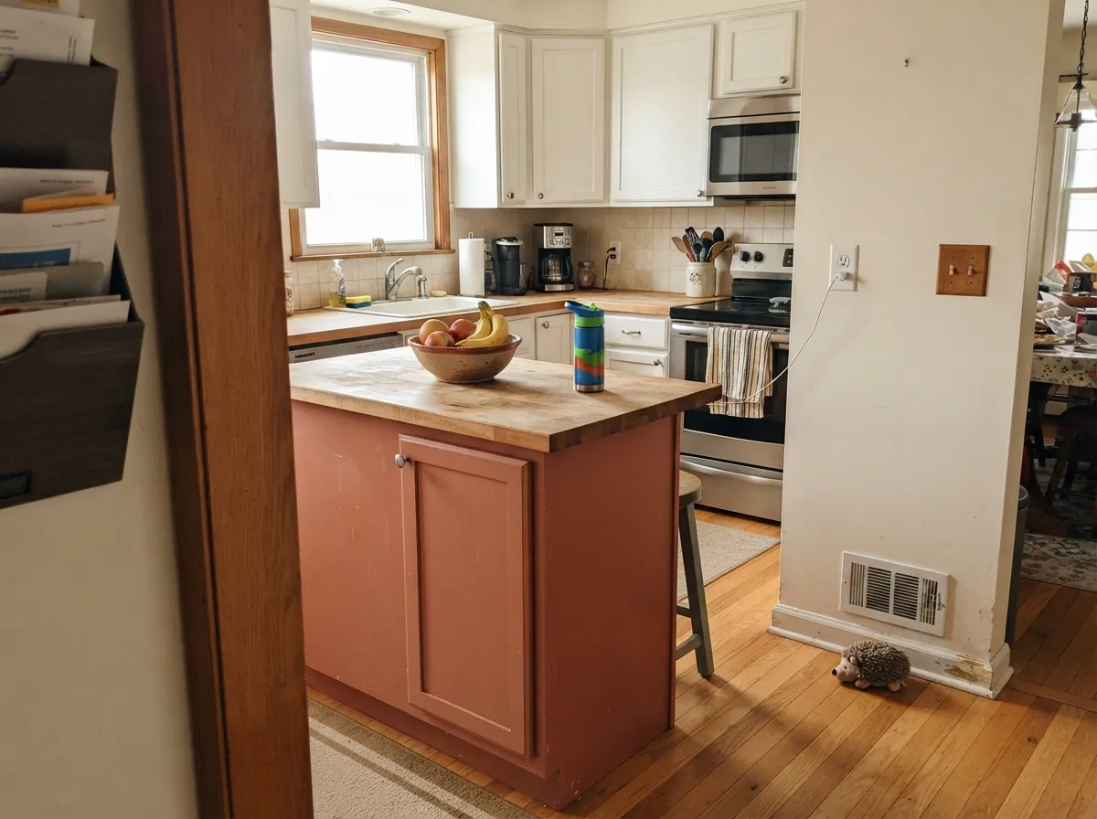
A terracotta island under white or cream perimeter cabinets is a genuinely warm, Southwest-leaning move, especially with butcher block or warm wood counters. A full kitchen of terracotta cabinets is a much bigger bet and reads dated faster than a single accent piece.
This depth of red-orange is stimulating, not restful, across four walls. As a single headboard wall with cream or white on the rest, warm lamps, and dark wood furniture, it can be genuinely cozy. As a whole-room color it fights sleep more than it helps it.
Without direct sun feeding the red, this color loses its whole reason for being. In consistently dim or north-facing rooms it just reads as a muddy, dated clay-brown. Pick a color that does not depend on warm light to look good, or add real daylight and warm bulbs before you commit.
Your Light Is the Risk
This is the light it was built for. On stucco or a front door it turns genuinely warm and sun-baked, close to fired clay.
The red drains out fast without direct sun. What looked terracotta in the store can read muddy clay-brown on a shaded wall.
Cooler and more muted in flat morning light, most fiery and saturated as the sun lowers in the afternoon. The swing is real — sample both times.
2700K warm bulbs keep an interior accent wall reading terracotta after dark. Cool white LEDs pull it toward a dull, brownish red.
Most complaints about Terra Cotta Clay are a light mismatch. Upload a photo of your actual room and see it on your walls — then ask for the same wall in north light or evening lamps before you buy a single sample.
Need It From Another Brand?
Any paint counter can custom-tint Behr M200-5 directly. If you would rather stay in one brand's own deck, these are the closest stock matches, measured as ΔE2000. Under 2 is a difference you will not see on the wall.
| Brand | Closest color | ΔE | LRV | |
|---|---|---|---|---|
| Sherwin-Williams | Subdued SiennaSW 9009 · Sherwin-Williams | 1.8 | 32 | Color page → |
| Benjamin Moore | Pumpkin Patch055 · Benjamin Moore | 1.5 | 33 | Color page → |
| Valspar | Laredo2004-5C · Valspar | 3.1 | 34.3 | Color page → |
| PPG / Glidden | Cinnamon BrandyPPG1199-5 · PPG / Glidden | 1.5 | 33 | Color page → |
| Glidden | Cinnamon BrandyPPG1199-5 · Glidden | 1.8 | 33 | Color page → |
| Dutch Boy | Coral House305-4DB · Dutch Boy | 4.7 | 34 | Color page → |
Similar Behr Colors
The nearest shades to Terra Cotta Clay within Behr's own range, ranked by perceptual color distance — useful when you want the same look a touch lighter, darker, or warmer.
WCAG 2.1: AA is 4.5 : 1 for normal text, 3 : 1 for large text, AAA is 7 : 1.
Terra Cotta Clay vs the Colors You're Also Considering
Every Terra Cotta Clay sample board has the same rivals on it. The numbers show the real lightness gap — then it comes down to which risk you would rather live with.
Pick this for a lighter, more livable terracotta that still holds up across a whole stucco exterior.
Behr PPU2-12 · LRV 21Terra Cotta UrnPick this for a deeper, more brick-leaning terracotta on a front door or small masonry accent.
Pick this for the Behr masonry-line version, built specifically for stucco and brick durability.
Sherwin-Williams SW 7701 · LRV 24Cavern ClayPick this if your painter works in Sherwin-Williams — a close cousin that also needs real sun to glow.
The Behr neighbors are close but not interchangeable. Nectarina 220D-5 (#D57D72, LRV 30) and Fireplace Glow M190-5 (#D37C76, LRV 30) both run a touch more orange and a touch darker. Vintage Coral MQ4-32 (#D58876, LRV 33) is lighter and clearly pinker. Cabana Melon MQ4-39 (#C68269, LRV 29) is the earthiest of the group and the closest to a true brown clay.
Across brands, Valspar Vintage Coral 2002-6A (LRV 30.7) is a deltaE of 1.07, which is visually identical in normal room light. Note that Behr and Valspar both use the name Vintage Coral for different colors, so match on the code, not the name.
Benjamin Moore Tropical Fruit CSP-1115 (deltaE 2.27) and Sherwin-Williams Lei Flower SW 6613 (deltaE 2.79) are very close, but sample first. Farrow and Ball Fruit Fool No. 9911 (deltaE 3.76) is close but visibly different side by side, reading dustier and cooler.
Terra Cotta Clay Coordinating Colors
The rule for coordinating with Terra Cotta Clay: keep the trim clean and warm-white or near-black, and let the accents be desert-adjacent — sage, khaki, teal — rather than another warm color competing for attention. These are the partners that keep showing up in rooms and exteriors that work:
Why This Color Is Sold as a Masonry Specialty Paint
Most colors on this site are standard interior wall paints. Terra Cotta Clay is different: Behr sells it directly under its Masonry, Stucco and Brick line, in a flat interior/exterior formula, a satin version, and a Behr Premium elastomeric version built specifically to bridge hairline cracks on stucco, concrete block and masonry. That is a real functional difference, not marketing — elastomeric coatings stretch and flex with the substrate in a way standard acrylic paint does not, which matters on a stucco house that moves with temperature swings.
None of that stops it from working as a standard tinted interior or exterior acrylic on drywall, trim or a door — Behr's ColorSmart system will mix it into any of their product lines. But the masonry-line packaging is the honest tell for what this color is actually for: real stucco, brick and adobe exteriors, not a curated accent-wall palette.
Terra Cotta Clay on a Stucco Exterior
This is the color's real job, and it does it well in the right climate. Against a blue sky, with desert landscaping — agave, cactus, gravel, or even just a Mediterranean tile roof — it reads sun-baked and deliberate rather than like an odd orange house on a street of beige ones. Full southern and western sun brings out the most saturated, fiery version of the red; the shaded north side of the same house will read noticeably more muted and brownish, so walk the whole exterior with a sample panel before committing to five gallons of the elastomeric.
It pairs best with white or cream trim, which gives the eye a place to rest, and with dark or black window frames and doors for a more current look. Avoid pairing it with another warm, competing color on the same facade — a terracotta house with an orange-leaning roof or brick foundation can start to fight itself instead of reading as one warm, cohesive palette.
Three Ready Palettes Built on Terra Cotta Clay
A color is never alone on the wall. These are complete combinations in the 60-30-10 pattern, with the reason each one holds together. Every one opens in the visualizer.
Crisp white trim frames the terracotta so it reads intentional rather than like an unbroken orange box, and a near-black door supplies the one dark note that makes a warm Southwest exterior feel finished, not flat.
Try this palette in your roomWarm Swiss Coffee keeps the room bright and lets the island carry the color; Sculptor Clay's khaki warmth bridges the two without introducing a third competing undertone. Brass or matte-black hardware finishes the look.
Try this palette in your roomWhite siding lets the terracotta door read as a real statement instead of blending in, and a teal-blue accent on shutters or planters is the classic desert complementary pairing that keeps the entry from feeling one-note.
Try this palette in your roomTerra Cotta Clay FAQ
Is Terra Cotta Clay an interior or an exterior color?
Both, but its natural home is exterior. Behr sells it directly in its Masonry, Stucco and Brick line — flat, satin and elastomeric formulas built for stucco, concrete and brick durability — which tells you where it earns its keep. It also tints into standard interior and exterior acrylic paint for walls, trim and doors, so an interior accent wall works too; just expect it to need real daylight to look its best.
What is the undertone?
Red-orange first, muted by a real amount of gray-brown so it never turns candy-orange or pumpkin. In direct sun it leans toward a fiery brick-red; in shade or overcast light it settles into a dustier, more brownish clay. Neither version is wrong — it is the same paint responding honestly to the light.
Will it work on a whole house, or just as an accent?
On a Southwestern, adobe or Mediterranean-style stucco house in a sunny climate, the whole exterior works beautifully. On other house styles, or anywhere the exterior stays mostly shaded, it is safer as a front door or a single accent than a full-house commitment.
What trim or door color pairs with it?
Crisp white or off-white — Behr Ultra Pure White or Whisper White — is the classic Southwest contrast and keeps a terracotta exterior from feeling like an unbroken orange wall. For a more modern look, a near-black like Behr Cracked Pepper on the door or shutters gives it real definition.
Will it look like the paint chip?
Expect it to run a shade more muted than the small chip once it is rolled onto a full wall — that gap has been specifically noted by reviewers of Behr's masonry line, and stucco or brick texture scatters light differently than a smooth swatch. Buy a sample size and test it on your actual surface, in your actual light, before ordering the big can.
Good for an interior accent wall?
Yes, with real daylight or warm 2700K bulbs. It reads spice-warm and deliberate on one wall with cream or white trim around it. Skip it on all four walls of a small room, and skip it entirely in a dim or north-facing room, where it goes flat and muddy instead of warm.
Have you painted with Terra Cotta Clay?
Rate it — one tap helps the next reader decide.
Ask a Question