Benjamin Moore Hale NavyvsBenjamin Moore Van Deusen Blue
Why this comparison: Van Deusen is the gray-washed navy; Hale Navy the more saturated one. Hale Navy and Van Deusen Blue are close but distinct (ΔE 6.66). Visible difference on the wall, especially in flat daylight.

Built from our full reviews of both colors — same measured data, same real-room photos. About the testing process →
The Numbers
Van Deusen Blue is slightly lighter (LRV 12 vs 8, 4-point delta).
What Each Color Really Is
A dark blue with a heavy pour of charcoal in it — that is the whole color in one sentence. Most navies on the fan deck are built on a clean blue pigment that stays obviously blue no matter where you put it. Hale Navy is knocked back with gray, so the blue only steps forward when light lands on it directly. Stand a Hale Navy sample next to a true black like Onyx 2133-10 and the blue is unmistakable. Stand it alone on a wall across the room and most people will call it charcoal. Both reactions are correct, and which one you get depends almost entirely on where the color sits relative to your windows and lamps.
At LRV 8 it hands back only a few percent of the light that hits it. Practically, that means the wall contributes nothing to the brightness of the room — every bit of light you have has to come from the windows and the fixtures, and the corners farthest from both will go flat and dark. This is also why paper samples lie: a two-inch chip is floated in a sea of white paper that bounces light back into it, so it looks like a rich blue in your hand and like a shadow once it covers a wall. Paint a large sample board, lean it where the actual surface will be, and look at it at 9 a.m., 4 p.m., and after dinner.
Van Deusen Blue belongs to Benjamin Moore's Historical Collection, one of 191 colors the company pulled from restored landmarks and historic homes for the 1976 bicentennial. That pedigree matters: this was never built as a trend color, it is a documented period blue, and that is exactly why designers reach for it when a client says "navy" but does not want this year's Pinterest navy. The undertone is a gray-based blue with a faint whisper of green — not enough to call it teal, but enough that it never tips toward violet the way some navies do. That flexibility is the real selling point: it sits comfortably next to warm brass and next to cool stainless without arguing with either.
At LRV 12 it is genuinely lighter than the navy most people picture. Hale Navy, the site's other reviewed navy, sits at LRV 6 — roughly half the light reflectance — and on paper that gap should be obvious on the wall. In practice it often is not: put Van Deusen Blue in a room that does not get much daylight and it sinks toward the same near-black weight as Hale Navy. Homeowners on Houzz have reported exactly that — a first-floor, north-facing coat that "looked like Hale Navy, too dark," when the whole reason they picked Van Deusen over Hale Navy was to avoid that exact weight. This is a color whose personality depends on daylight actually showing up.
Specs Side by Side
| Spec | Hale Navy | Van Deusen Blue |
|---|---|---|
| Brand | Benjamin Moore | Benjamin Moore |
| SKU | HC-154 | HC-156 |
| Hex | #434B56 | #485B6E |
| RGB | 67, 75, 86 | 72, 91, 110 |
| LRV | 8 | 12 |
| Undertone | blue / cool | blue / cool |
| Family | Blue | Blue |
How Light Changes Them
Steady warm daylight lifts it into a real, readable navy most of the day.
Cool gray light drains it toward slate, then near-black by late afternoon.
2700K lamps blacken it. 3000–3500K keeps the navy legible. Bulbs matter here.
It will close the space in. Great in a powder room or den, wrong in a family bath.
Reads exactly as intended: a confident, gray-based navy, clearly lighter and calmer than Hale Navy. This is the light that justifies picking it.
Sinks toward near-black and starts reading like Hale Navy — the documented Houzz complaint. Test on the actual wall before committing a whole room.
Deep and quiet in the off hours, noticeably bluer and brighter at the sun's peak through that exposure. The swing is real — most owners like it.
Warm 2700K bulbs keep some blue visible after dark; cool LEDs push it toward flat black. Aim a lamp at the wall if you want the color to survive the evening.
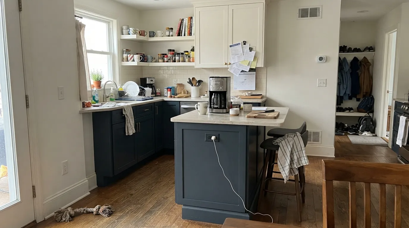
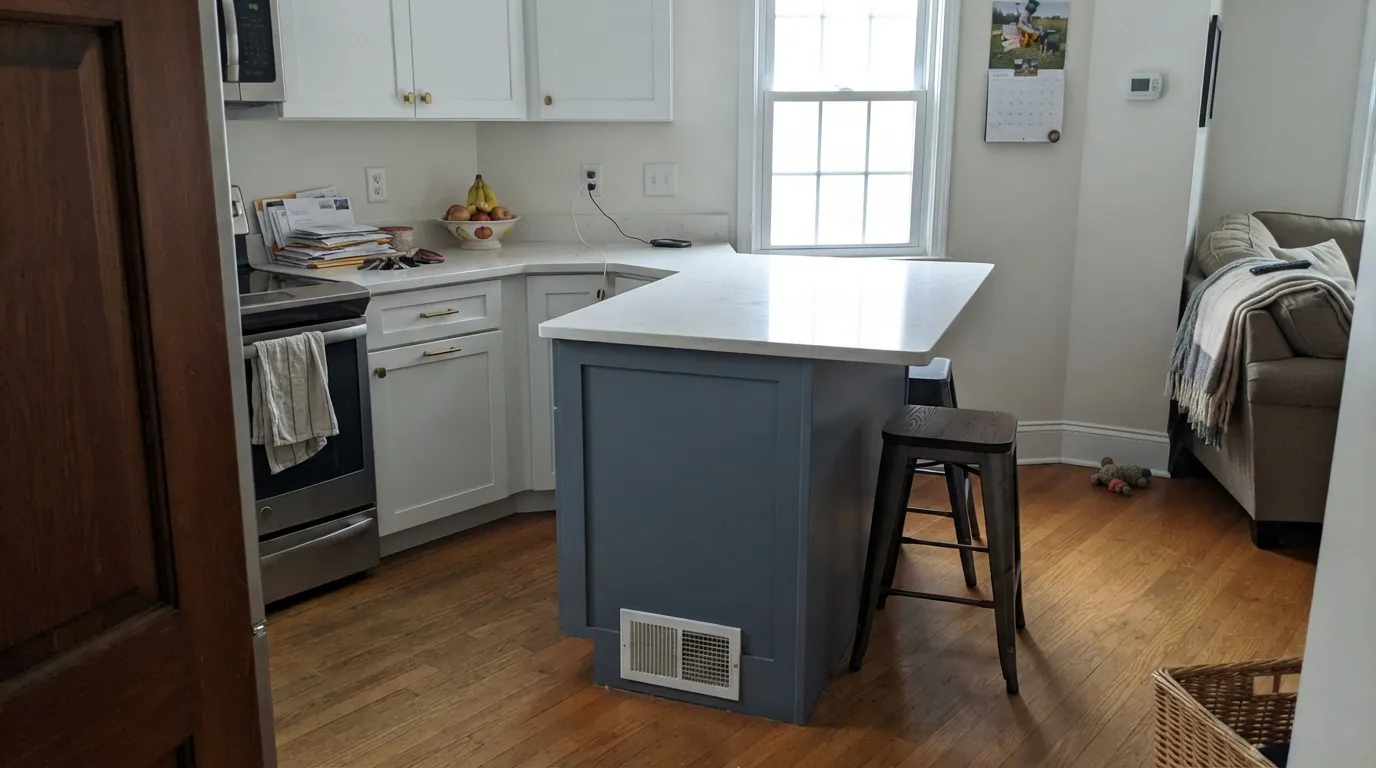
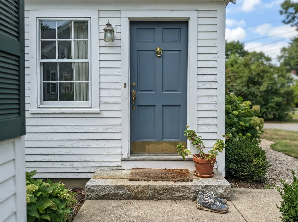
Both Colors in Real Rooms
Photos from our full reviews — the same rooms and captions, so you can judge each color where it actually lives, not on a chip.

When to Pick Which
Kitchen lowers and islands with light counters · front doors on white, gray, or brick · built-ins and a fireplace wall · a bright south-facing office or dining room
Your room faces north and is small · you want people to see blue, not near-black · you are hand-brushing cabinets with rough prep · the surface bakes in direct sun all day
Kitchen islands under white or cream cabinets · front doors on white clapboard or weathered cedar shingle · library built-ins with brass and leather · anyone who wants navy but finds Hale Navy too heavy
Your room is dim and north-facing · you specifically want a color you can tell apart from Hale Navy at night · you want a true saturated blue, not a grayed one · your stone is warm gold-veined and already fighting green
No comparison page can see your light. Upload one photo of your room and try both colors on the same walls, seconds apart.
Hale Navy vs Van Deusen Blue FAQ
Which is lighter, Hale Navy or Van Deusen Blue?
Van Deusen Blue is lighter: LRV 12 vs 8. Van Deusen Blue is slightly lighter (LRV 12 vs 8, 4-point delta).
Which is warmer, Hale Navy or Van Deusen Blue?
They share the same undertone family — both read blue / cool. The difference between them is lightness and depth, not temperature.
How similar are Hale Navy and Van Deusen Blue?
Hale Navy and Van Deusen Blue are close but distinct (ΔE 6.66). Visible difference on the wall, especially in flat daylight. The only reliable test is seeing both in your own room and light — a side-by-side on a screen or chip flattens the difference.
Can I use Hale Navy and Van Deusen Blue together in one house?
Yes, in separate rooms. They are close enough to feel related but different enough to notice, so give each its own room and connect them with a shared trim white. Avoid putting them on adjoining walls.
Ask a Question