Denim
The blue-jean blue Sherwin-Williams quietly files under purple, reviewed honestly: the rooms it makes, the light it needs, and when to buy a navy instead.

Jessica has spec'd whites and neutrals for more than 300 rooms and keeps a sample wall of painted drawdowns in her studio. Every color review is checked against real reader rooms in the comments and re-tested when a formula changes. About the testing process →
- 1Anchors Aweigh3
- 2Hale Navy8
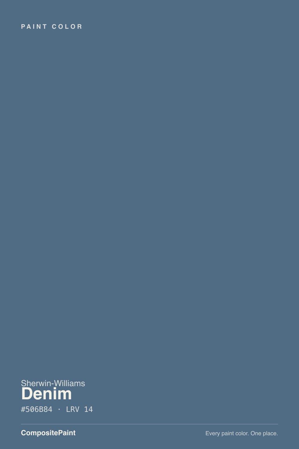
- 3Denim14
- 4Charcoal Blue19
- 5Resolute Blue40
The Fast Verdict
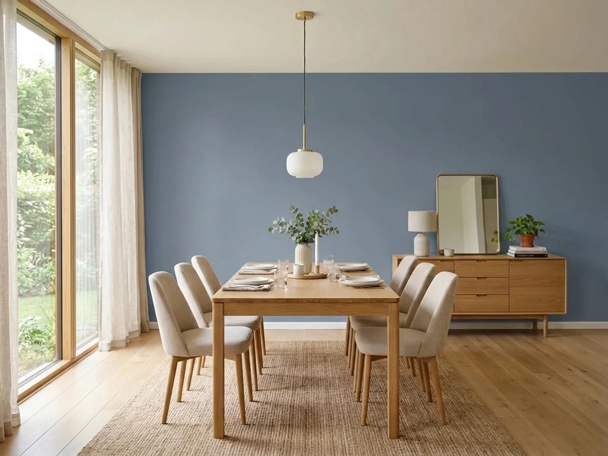
Denim is exactly what the name promises: the blue of a pair of jeans that have been washed a hundred times, with enough gray in it to keep the color grown-up. That gray is why it works in a kid's room without turning into a crayon, and why it still looks deliberate on an island or a front door.
The catch is LRV 14 — this is a dark color, and a dim room will drain the blue out of it and hand you flat slate instead.
Playrooms and kids' rooms with real daylight · a bedroom or office feature wall · islands, vanities and interior doors · front doors on a white or gray house
The room is dim and north-facing · you actually wanted navy · your trim, floors or cabinets are honey oak · you need the room to feel bigger than it is
- A real blue that stays blue — no teal drift, no gray fade in good light
- Grayed enough to read grown-up, so a kid's room survives the kid growing up
- Sherwin-Williams' own kids' color guide backs it, with matching neutrals
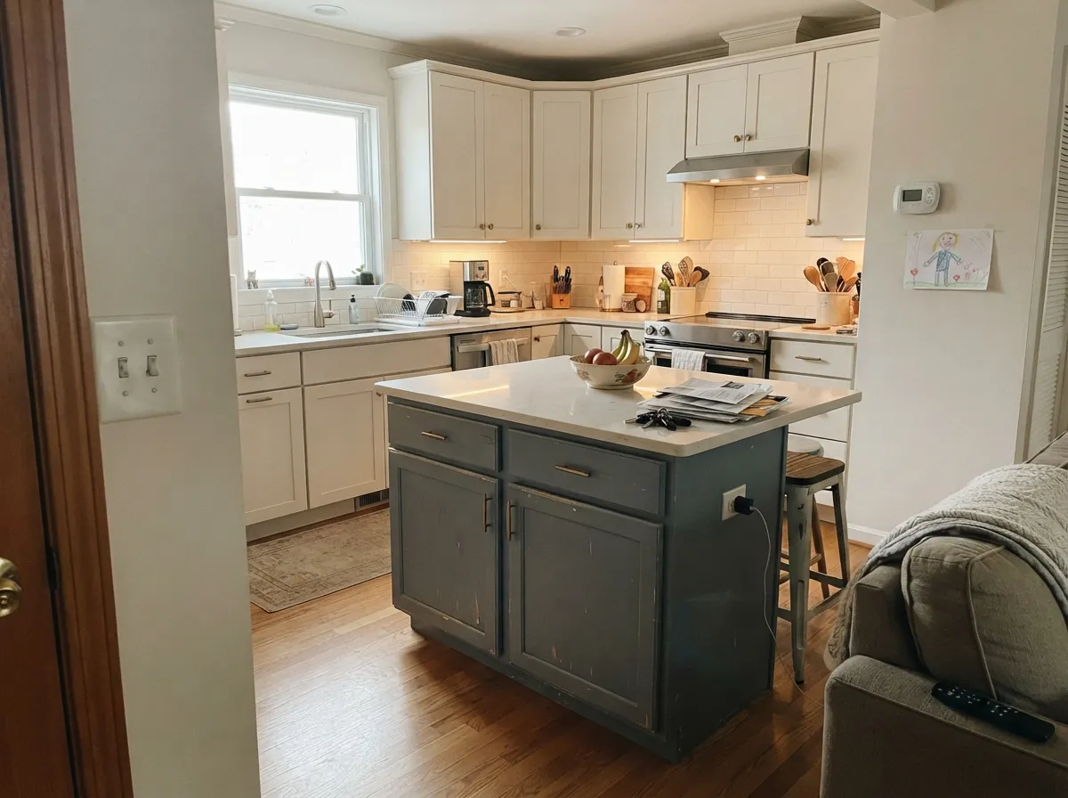
- Excellent on islands, vanities, interior doors and front doors
- Deep enough that plain white trim suddenly looks crisp instead of builder-plain
- LRV 14 — a dim or north-facing room flattens it to cold slate
- Buyers expecting navy get a clearly medium blue
- Honey oak trim and orange floors send it straight to 1990s country blue
- Warm 2700K bulbs mute the blue and can leave a faint violet cast
What Color Is Denim, Really?
A mid-tone blue with a real dose of gray mixed into it — worn denim rather than new denim. The gray is the whole trick. Take it out and you get a primary blue that reads as a theme, the kind of color that only works until the kid turns eleven; leave it in and the same blue passes for a grown-up wall color that a child happens to love. That is the narrow lane Denim occupies, and it is the reason Sherwin-Williams itself puts this color in its Making Spaces Playful guide alongside plain working neutrals like Repose Gray (LRV 58) and Dorian Gray (LRV 39), not alongside primaries.
At LRV 14 it is genuinely dark, and that number does more to decide your result than any undertone talk. Denim absorbs most of the light that lands on it, so a room with one small window and a couple of dim bulbs gets a wall that looks like wet slate, not like jeans. In a room with real daylight or serious lamp wattage it stays clearly, recognizably blue. This is also why so many people use it on one wall, on the lower half under a chair rail, or on cabinets — the color is easier to love in a dose than across four walls of a dark room.
Undertone in one line: blue first, gray second, and it sits on the violet side of blue — never teal, never green. That last part matters more than it sounds. At almost the same depth, Smoky Blue (LRV 15) and Waterloo (LRV 13) both lean gray-green and can pass for slate; Denim keeps its blue and leans slightly toward violet instead. Sherwin-Williams' own catalog files SW 6523 in the purple family, which is a strange thing to read about a color called Denim and a useful clue about which direction it moves.
Where It Shines
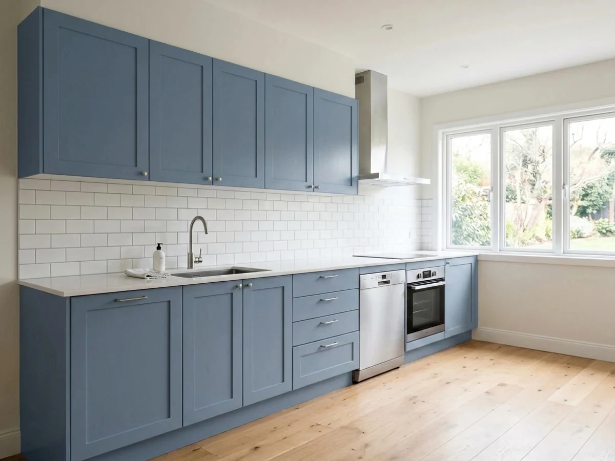
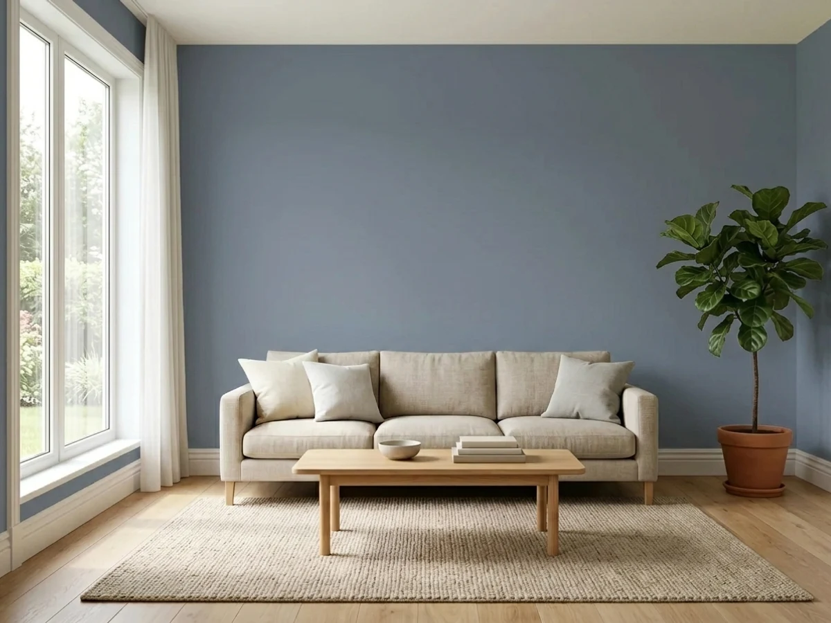
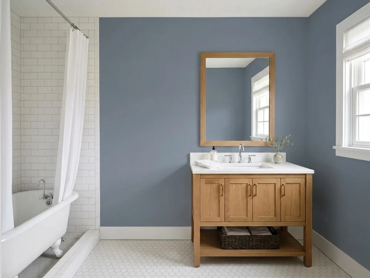
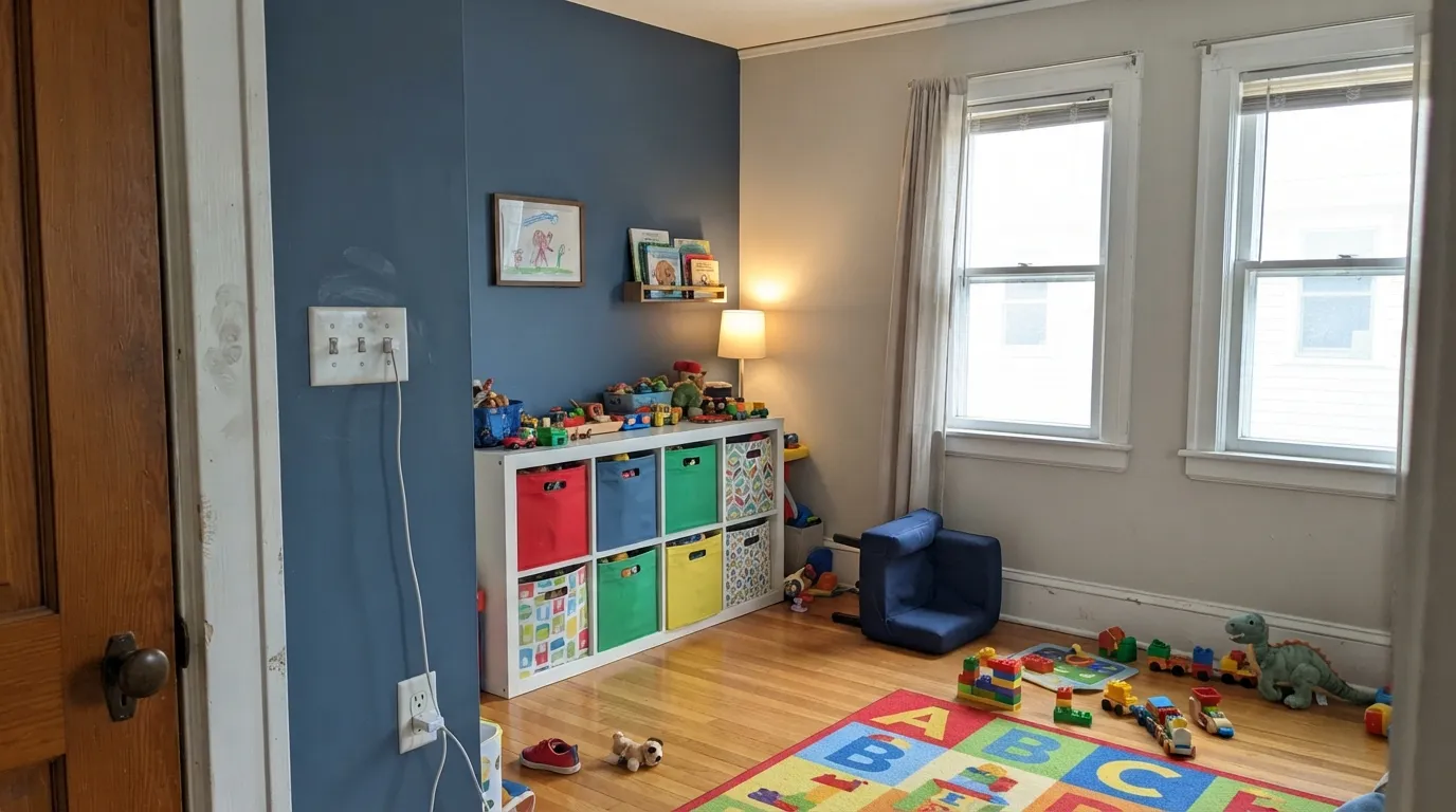
This color is at its best where you want real color without a theme. A playroom or a kid's bedroom with daylight is its home turf — Sherwin-Williams features it in its own kids' color guide, and the reason is obvious on the wall: children read it as blue, adults read it as a considered neutral-ish color, and nobody has to repaint when the dinosaur phase ends. Its second life is on the small commitments: an island, a bathroom vanity, an interior door, a front door. Give it crisp white trim, warm wood, and brass or matte black hardware and it looks like a decision rather than a default.
Where It Fails
The bad Denim stories are boringly predictable, and every one of them can be spotted before you open a can. None are the paint's fault, but if your room matches one, a bigger sample will only confirm what you already suspect.
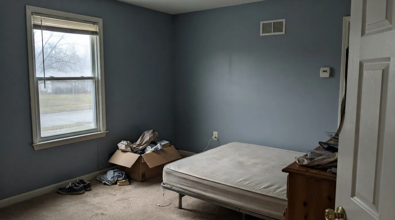
LRV 14 means the wall gives back very little of what you send it. Cool north light with no lamps drains the blue and leaves a flat, cold slate that people describe as gray, dreary and smaller than the room actually is. If the room only has one window, either budget for a lot more light or step up to something like Upward (LRV 39) and keep the family without the darkness.
On a two-inch chip Denim reads nearly navy. On a wall it is unmistakably a medium blue, and buyers who wanted a dark, dramatic, moody room feel short-changed by the second coat. That is not a flaw, it is a mismatch: Naval (LRV 4) or Indigo Batik (LRV 8) are where the drama lives. Denim is for people who want the blue to still look blue at noon.
Orange-yellow oak sits opposite blue, so each side pushes the other: the trim looks more orange, the walls look more saturated, and the whole thing lands squarely in 1990s country blue. It is the single fastest way to make this color look dated. Denim needs walnut, white oak, painted white trim or a big rug between it and anything golden.
Room by Room
The color kids call blue and adults call tasteful. Best as one wall, or the lower half of the walls under a rail, with a light neutral above so the room keeps its brightness. Use satin or eggshell, not flat — this is the one room where walls get touched with sticky hands weekly, and a dark flat wall shows every mark and burnishes when you wipe it.
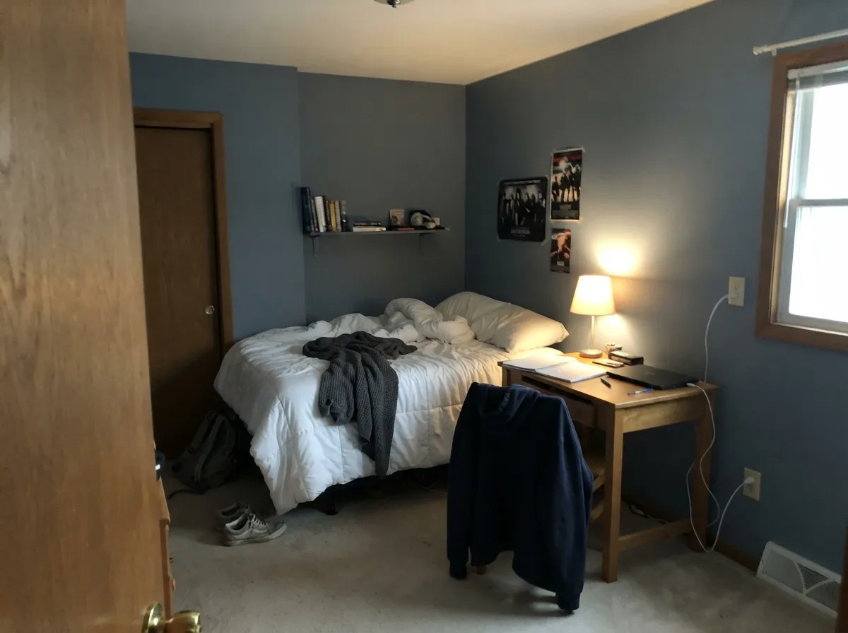
Older kids can carry the depth that a toddler's room cannot, and Denim is one of the few colors that reads cool to a fourteen-year-old without being a phase. Keep the trim and ceiling white so the room does not close in, and add lamps rather than relying on one ceiling fixture.
In a bedroom with real windows this is a calm, enveloping blue that photographs better than it sounds. White or cream bedding does the heavy lifting: it gives the eye somewhere bright to land so the room reads restful instead of heavy. Eggshell on the walls, and 3000K bulbs so the blue keeps its color at night.
A blue that is dark enough to be a good background and quiet enough not to bounce color onto your face on video calls. Put it on the wall behind the desk or behind the camera, not on all four walls of a windowless room, and light the desk properly — an office is the easiest place to get the lumens right.
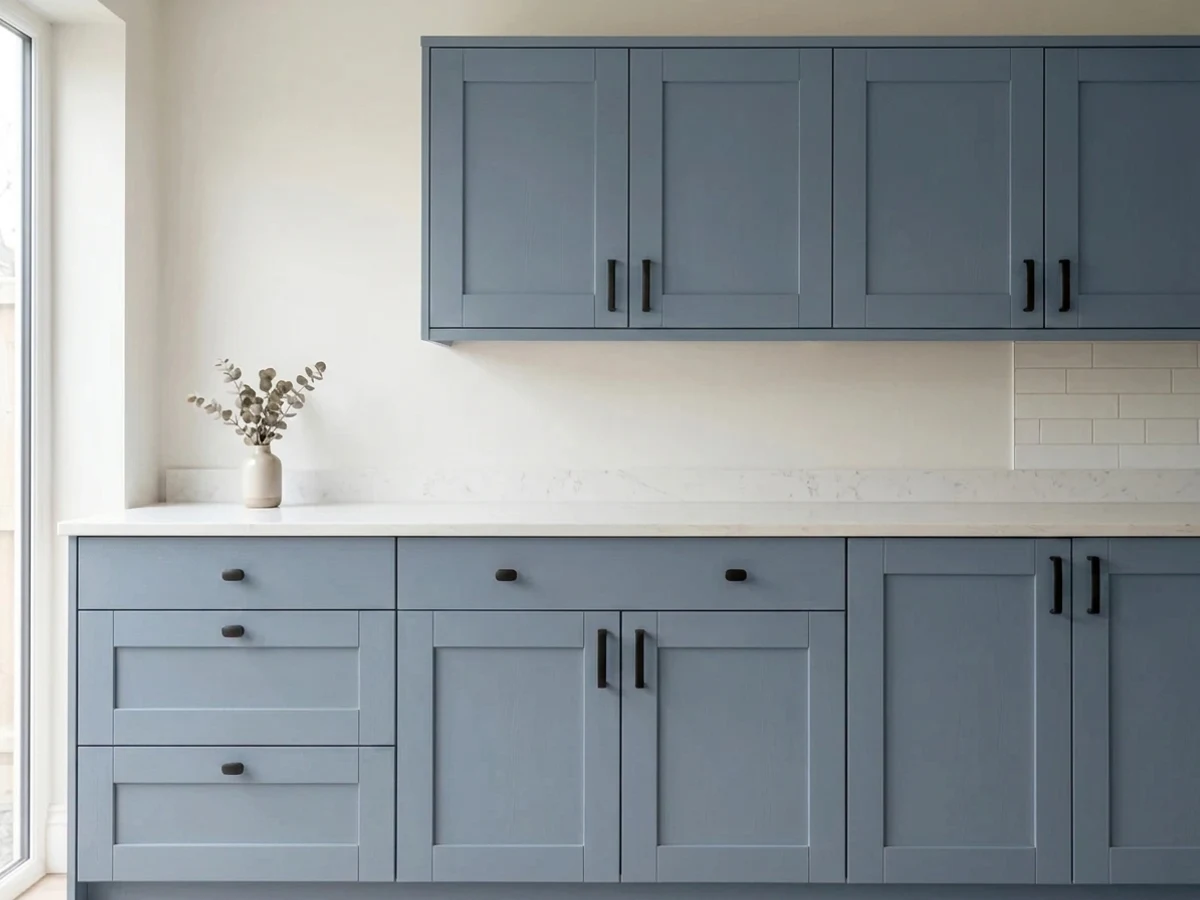
This is a genuinely good cabinet blue: light enough to stay blue under a range hood, dark enough to hide the traffic that kitchen doors take. An island or a run of base cabinets under a soft warm white like Alabaster (LRV 82) is the reliable version. A whole kitchen of Denim cabinets works only if the room is bright. Satin, urethane-fortified cabinet enamel either way.
A mid blue door on a white, greige or light-gray house is one of the safest exterior color moves there is, and Denim is a good one because it stays blue in full sun instead of graying out. On whole exteriors it is a bigger bet: strong sun lightens it noticeably and the shaded north face will look a step deeper, so walk the house with a sample before committing to siding.
Your Light Is the Risk
Bright, steady daylight is where the jean color actually shows up: clearly blue, with the gray visible instead of muddying it. Sample here first.
Cool light plus LRV 14 is the failure case. The blue drains out, the wall goes flat slate, and the room reads smaller and colder than it did in primer.
Cool and steely in morning east light, warmer and deeper by late afternoon. On a west wall at golden hour it can flash faintly violet for an hour — brief, and most people never notice.
2700K bulbs mute the blue toward gray-violet and make the room cozier but less blue; 4000K LEDs bring the color back and make it feel cold and office-like. 3000K is the compromise, and quantity matters more than temperature — a dark wall needs more lumens than you think.
Most complaints about Denim are a light mismatch. Upload a photo of your actual room and see it on your walls — then ask for the same wall in north light or evening lamps before you buy a single sample.
Need It From Another Brand?
Any paint counter can custom-tint Sherwin-Williams SW 6523 directly. If you would rather stay in one brand's own deck, these are the closest stock matches, measured as ΔE2000. Under 2 is a difference you will not see on the wall.
| Brand | Closest color | ΔE | LRV | |
|---|---|---|---|---|
| Behr | Dark RoomBNC-29 · Behr | 1.6 | 14 | Color page → |
| Valspar | Aurora BorealisP037 · Valspar | 2.3 | 13.5 | Color page → |
| PPG / Glidden | Stained GlassPPG1165-6 · PPG / Glidden | 4.1 | 13 | Color page → |
| Glidden | Midship Blue30BB 14/173 · Glidden | 3.7 | 14 | Color page → |
| Dutch Boy | Star Gazing238-6DB · Dutch Boy | 0.0 | 14 | Color page → |
| HGTV Home by Sherwin-Williams | DenimHGSW 2382 · HGTV Home by Sherwin-Williams | 0.0 | 14 | Color page → |
Similar Sherwin-Williams Colors
The nearest shades to Denim within Sherwin-Williams's own range, ranked by perceptual color distance — useful when you want the same look a touch lighter, darker, or warmer.
WCAG 2.1: AA is 4.5 : 1 for normal text, 3 : 1 for large text, AAA is 7 : 1.
Denim vs the Colors You're Also Considering
Every Denim sample board has the same rivals on it. The numbers show the real lightness gap — then it comes down to which risk you would rather live with.
Pick this when the blue should still look blue at noon rather than near-black.
Sherwin-Williams SW 6244 · LRV 4NavalPick this if you actually wanted navy — at LRV 4 it is far deeper and still reads navy after dark.
Pick this when you want a wall people call blue, not a wall people call slate.
Sherwin-Williams SW 7604 · LRV 15Smoky BluePick this for the same depth with the color turned down — it leans gray-green and never overcommits.
Denim Coordinating Colors
The rule with Denim is that it wants clean whites, plain working neutrals, and one warm note — and it wants everything golden-orange kept at a distance. It does not need another blue in the room to look finished, but it layers well with a deeper one if you are painting a door or built-ins. These are the partners that keep showing up in rooms that work:
Why Sherwin-Williams Files a Blue Called Denim Under Purple
Look SW 6523 up on Sherwin-Williams' own site and you land in the purple section. It is a genuinely odd thing to read about a color named after blue jeans, and it is not a typo — the company does the same with Hinting Blue (LRV 68), a pale blue-gray filed in the same family. What the filing describes is not what you will see on the wall. It is a note about which way the blue leans.
In practice that is useful information. Most of the popular mid-depth blues sold as blue-gray lean the other way, toward green: Smoky Blue (LRV 15) and Waterloo (LRV 13) both sit at nearly the same depth as Denim and both can read slate or gray-teal depending on the room. Denim does not do that. It holds its blue and, when it moves, it moves a hair toward violet — which is exactly what you see at golden hour on a west wall, or under warm bulbs at night. If you have sampled blue after blue and kept getting something greener than you wanted, that catalog quirk is the reason this one may be the right answer.
The trade is that Denim has none of the chameleon flexibility those gray-teals offer. It is a blue, it will be read as a blue, and it will not quietly become a neutral in a room that changes its mind about the scheme later.
Denim With Wood Tones, Floors, and Metals
Wood decides this one. Walnut and espresso look expensive against it — dark red-brown and grayed blue is a classic pairing that reads tailored rather than nautical. Pale white oak, natural maple and gray-washed floors are the safe modern option and give a kids' room or office a Scandinavian cast. White painted trim is the reliable default in every one of those cases.
The honest no is golden: honey oak trim, orange-stained cabinets, yellow-toned builder floors. Orange sits opposite blue on the wheel, so the two exaggerate each other, and the specific look that comes out of that combination is 1990s country blue — the single thing that will make this color look old. A large rug helps in a room with golden floors, but with honey oak trim running the whole room, either paint the trim or pick a warmer color.
Metals are easy. Matte black and brushed nickel both read modern against it, unlacquered brass is the warm choice and the one that flatters the blue most, and polished chrome is fine but adds nothing. In a kid's room the practical note matters more than the finish: dark walls show scuffs, so keep the sheen at satin or eggshell and keep a labeled touch-up jar on the shelf.
Three Ready Palettes Built on Denim
A color is never alone on the wall. These are complete combinations in the 60-30-10 pattern, with the reason each one holds together. Every one opens in the visualizer.
This is close to the grouping Sherwin-Williams uses in its own kids' color guide: a plain working greige carrying most of the room, Denim on one plane for the color, and a clean white holding the edges. Repose Gray is the right partner because it stays quiet next to a saturated blue instead of competing with it; Dorian Gray (LRV 39) is the darker swap if you want the neutral to have more weight.
Try this palette in your roomBlue rooms go cold without one warm counterweight, and terracotta is the oldest fix in the book — Cavern Clay sits opposite Denim on the wheel, so a single dose of it makes the blue look richer instead of chilly. Extra White is the deliberate choice here: against LRV 14 walls a soft cream trim would look dingy, and the sharpest white in the deck is finally in the right job.
Try this palette in your roomThe two-tone kitchen that keeps working: a soft warm white on the perimeter so the room stays bright, the blue held to one block where it can be dark without costing light, and one true black note so the scheme reads intentional rather than accidental. Alabaster's warmth is what stops the blue from feeling clinical — a colder white makes the same kitchen look like a showroom.
Try this palette in your roomDenim FAQ
Is Sherwin-Williams Denim blue or purple?
Blue. On a wall nobody will call it purple. The confusion is Sherwin-Williams' own doing — the company files SW 6523 in its purple color family, the same way it files the very pale Hinting Blue (LRV 68) there. What that filing actually tells you is direction: Denim sits on the violet side of blue rather than the green side, so it never drifts teal, and under warm bulbs at night it can pick up a faint violet cast.
Is Denim too dark for a small kids' room?
It can be. At LRV 14 it absorbs most of the light it gets, so a small room with one window will feel smaller and read gray rather than blue. The usual answer is a dose instead of a drench: one wall, or the lower half under a rail with a light neutral above. If the room is both small and dim, Upward (LRV 39) gives you the same blue mood and keeps the light.
What white trim goes with Denim?
A clean white, not a cream. Pure White (LRV 84) is the everyday answer and Extra White (LRV 86) if you want the crispest possible edge. Soft creamy whites look slightly yellowed and tired against a saturated blue this deep. Semi-gloss on the trim, eggshell or satin on the walls.
Is Denim good for kitchen cabinets?
Yes, and it is one of the more forgiving cabinet blues because it is lighter than a navy — the doors stay blue under a hood or in a corner instead of going black. Best on an island or base cabinets with a warm white above. Use a satin urethane-fortified cabinet enamel; standard wall paint on cabinet doors is how people end up repainting in two years.
How is Denim different from Naval?
Depth, mostly. Naval is LRV 4 — a true navy that reads near-black in anything less than good light, and the color you want if drama is the point. Denim at LRV 14 stays visibly a medium blue in daylight and keeps a room feeling colored rather than closed in. If you have been going back and forth between them, the question is really whether you want a dark room or a blue room.
Will Denim look dated?
Less than most blues, with one exception. Grayed mid blues have been in the deck for decades and read as quiet color rather than a trend timestamp. The exception is company: put Denim next to honey oak trim, oak cabinets and a wallpaper border and you get the 1990s country-blue look back at full strength. Against white trim, walnut or white oak, and matte black or brass, it reads current and will keep reading current.
Have you painted with Denim?
Rate it — one tap helps the next reader decide.
Ask a Question