Midnight Blue
Behr's gray-based navy, reviewed honestly: where it glows on cabinets and doors, the light where it goes flat black, and what to pick instead.

Jessica has spec'd whites and neutrals for more than 300 rooms and keeps a sample wall of painted drawdowns in her studio. Every color review is checked against real reader rooms in the comments and re-tested when a formula changes. About the testing process →
- 1Naval4
- 2Midnight Blue9
- 3Smoky Blue15
- 4Wolf Gray21
The Fast Verdict
Midnight Blue is the navy for people who find true navy too loud. Behr grays the blue down with charcoal instead of pushing it toward purple, so it reads moody and modern rather than nautical. At LRV 9 it sits one step above black — deep enough to anchor a kitchen island or a front door, but it needs real light to hold its blue identity; in heavy shade it just reads black.
Kitchen islands and cabinetry · front doors and shutters · powder room vanities · anyone who wants navy without a purple flash
You want a punchier, purer navy (look at Naval) · your entry or exterior wall sits in heavy shade · your floors or trim run honey-orange · you're painting a whole room, not an accent
- A genuine gray-navy — no purple or indigo flash to second-guess
- One of Behr's most dependable island and cabinet colors
- Classic, sellable front-door and shutter color under white trim
- Deep enough (LRV 9) to anchor a room without going full black
- Plays well with brass, white quartz, and light oak
- Loses its blue identity entirely in heavy shade — reads flat black
- Too muted for anyone who wants a crisp, saturated navy statement
- Clashes with honey oak, cherry, and other orange-leaning wood
- Near-black depth means real primer and coat-count planning over lighter existing paint
What Color Is Midnight Blue, Really?
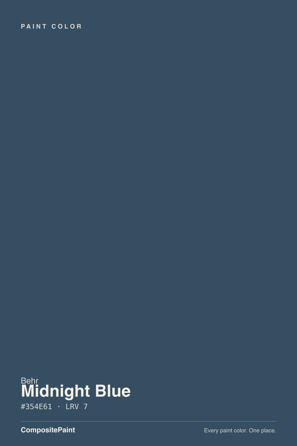
A deep blue built on a charcoal-gray base rather than a purple or indigo one — that gray lean is the whole identity. Behr's N-prefix colors run cooler and more neutral than its numbered navies, and Midnight Blue is a clear example: put it next to a more saturated navy like Sherwin-Williams Naval or Behr's own Dark Navy and Midnight Blue is visibly grayer and less vibrant, closer to a stormy slate-navy than a crisp nautical one. That's the trade some buyers want and the letdown for buyers expecting a punchier blue.
At LRV 9 it is a near-black color, not a mid-tone blue. That depth is what makes it read as a serious, grounding accent — an island, a door, a vanity — rather than a color you'd want covering four walls in most rooms. In strong, even daylight the blue is unmistakable; in anything less, the charcoal base takes over and the color drifts toward plain dark gray or black.
Undertone in one line: navy grayed down with charcoal — never purple, never a true flat black. If it reads pure black on your wall, that's a shaded corner or a room without a warm lamp, not the paint failing.
Where It Shines
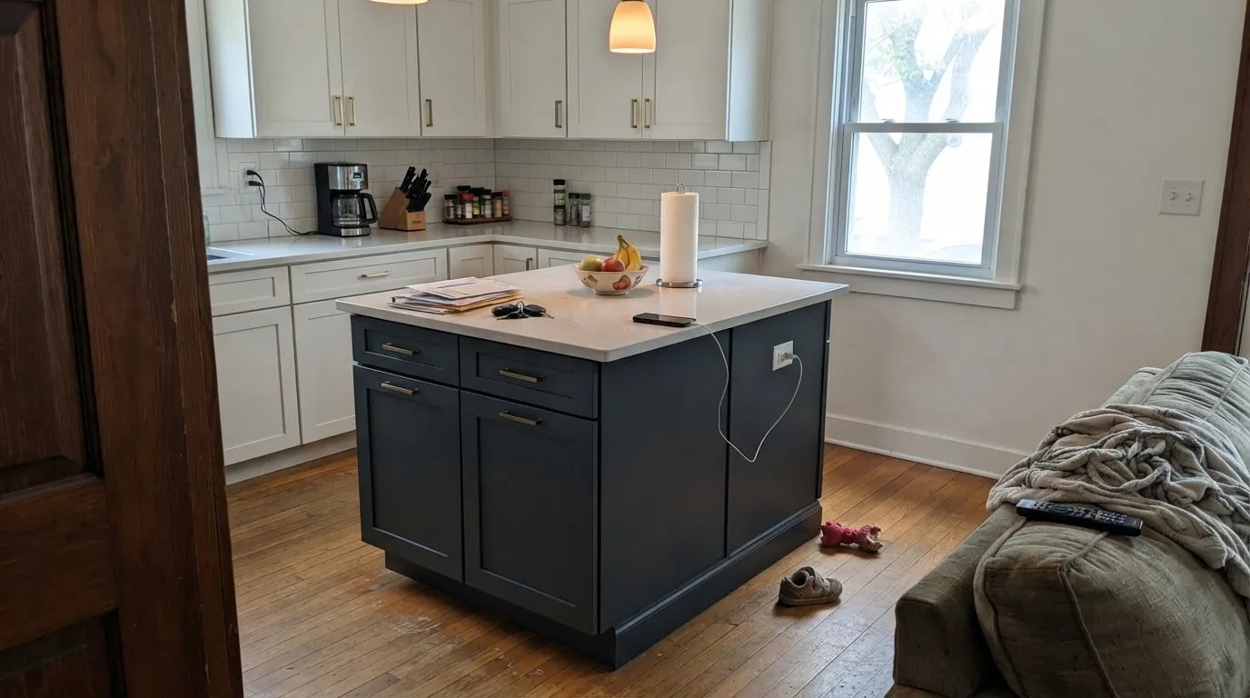
This is a color built for a hard-working accent, not a whole room. Give it a kitchen island under real daylight, a front door with white trim, or a powder-room vanity and the charcoal-navy reads current and expensive — it's one of Behr's most-used cabinet-and-door colors for exactly that reason. Brass hardware, white quartz and light oak all bring the blue forward instead of flattening it toward black.
Where It Fails
Almost every regret story about Midnight Blue comes from one of three predictable situations. None of them are the paint failing — they're the color meeting the wrong light or the wrong wood.
Drop the LRV to 9 and take away the sun, and Midnight Blue stops reading blue at all — it goes flat charcoal-black. That's fine on a front door under a covered porch if you actually want near-black, but it's a letdown on an island in a dim kitchen corner or a north-facing exterior wall. Test the sample where the color will actually live, not by a window.
The cool gray-blue sits at the opposite temperature from orange-leaning wood. Knotty pine, honey oak cabinets, cherry trim — all of it fights Midnight Blue instead of complementing it, and the paint can start to look muddy rather than moody. Walnut, espresso stain, and pale white oak are the safe partners.
Midnight Blue is gray first, blue second — that's the whole appeal for some buyers and the letdown for others. If you pictured a crisp, saturated nautical navy and got something closer to a dark storm-gray, that's the paint doing exactly what its charcoal base promises. Sherwin-Williams Naval or Behr's own Dark Navy both read noticeably bluer.
Room by Room
On an island or a full run of lower cabinets, the gray-navy reads sophisticated against white quartz, butcher block, and brass hardware. Satin or semi-gloss cabinet enamel; keep the perimeter cabinets or walls a warm white so the navy has something to contrast against.
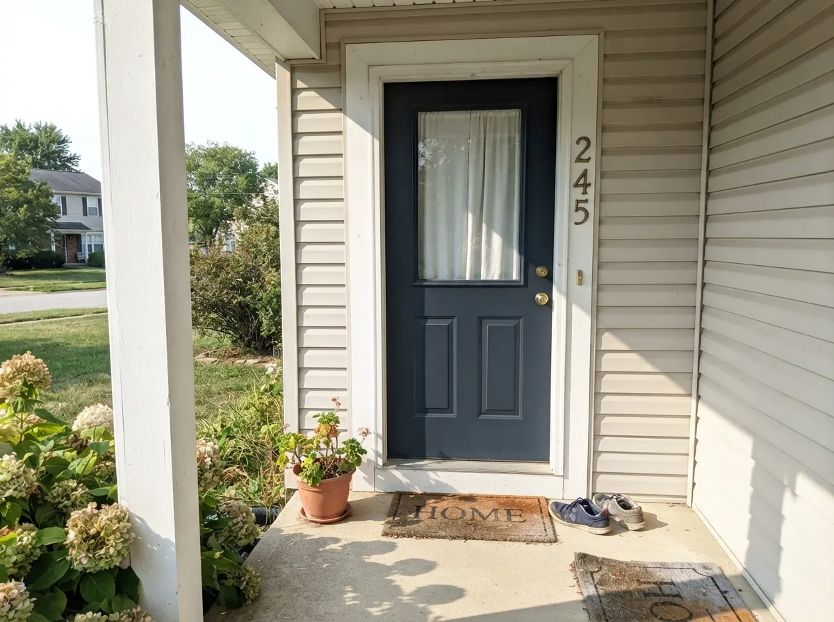
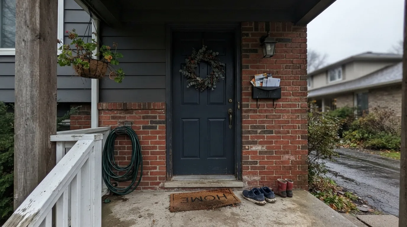
Semi-gloss Midnight Blue against white or light-gray siding is a dependable, sellable exterior pairing. The one caveat: a deeply shaded porch or a north-facing door pushes it toward black — fine if that's the look you want, disappointing if you expected visible navy.
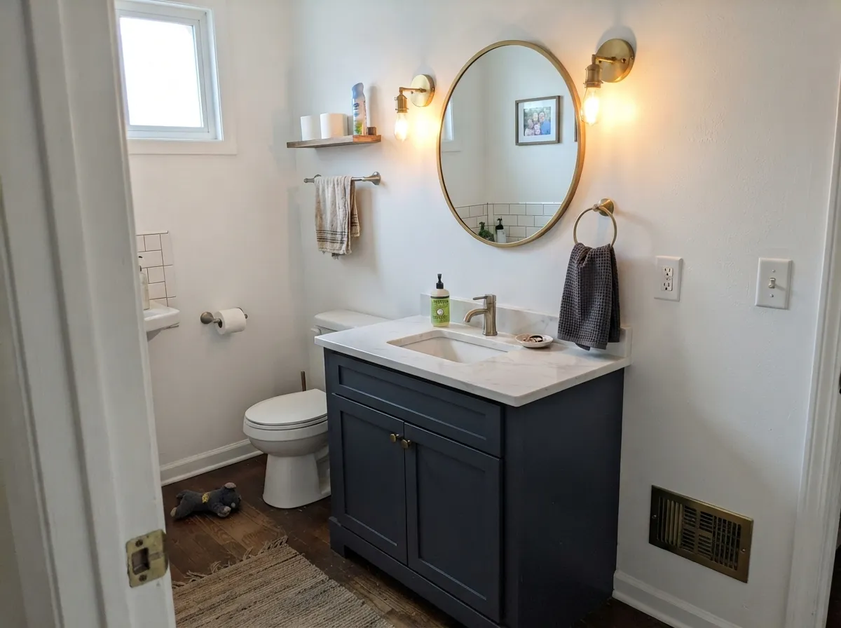
Small rooms take the depth well. A Midnight Blue vanity or four drenched powder-room walls under a brass sconce reads custom, not cave-like, because the room is small enough for the color to stay lit.
One wall, not four — this depth swallows a room without a strong light source and a plan for contrast. Works best as the wall behind a media console or a fireplace, paired with a warm white or light wood.
On a vanity or a single wall next to a walk-in shower it's striking with brass fixtures and white or light marble. Cool-toned LED bathroom lighting flattens it toward black; swap to warm bulbs before you commit.
As a full-body siding color it reads almost black outside of direct sun, a bigger commitment than most buyers expect from a color literally named Midnight Blue. It earns its keep on the door, shutters, and trim instead.
Your Light Is the Risk
Full daylight is where the navy stays navy — the charcoal base keeps it grounded instead of flat. The best case for an island or a bright entry.
Covered porches, north-facing doors, and dim corners drain the blue out entirely and leave charcoal-black. Fine if you want near-black; disappointing if you wanted visible navy.
Warms up slightly at sunrise or sunset hours, then settles back to its gray-navy self the rest of the day. The shift is gentle, not dramatic.
2700K warm bulbs keep some blue visible after dark; cool white LEDs push it toward black. Warm bulbs are worth the swap on a vanity or island.
Most complaints about Midnight Blue are a light mismatch. Upload a photo of your actual room and see it on your walls — then ask for the same wall in north light or evening lamps before you buy a single sample.
Need It From Another Brand?
Any paint counter can custom-tint Behr N480-7 directly. If you would rather stay in one brand's own deck, these are the closest stock matches, measured as ΔE2000. Under 2 is a difference you will not see on the wall.
| Brand | Closest color | ΔE | LRV | |
|---|---|---|---|---|
| Sherwin-Williams | Mineral GraySW 2740 · Sherwin-Williams | 3.7 | 9 | Color page → |
| Benjamin Moore | Deep Space2125-20 · Benjamin Moore | 3.0 | 9 | Color page → |
| Valspar | Plot Twist8006-8F · Valspar | 0.9 | 9 | Color page → |
| PPG / Glidden | Soothing SapphirePPG10-09 · PPG / Glidden | 1.3 | 9 | Color page → |
| Glidden | Soothing SapphirePPG10-09 · Glidden | 1.2 | 9 | Color page → |
| Dutch Boy | Onyx Shade433-7DB · Dutch Boy | 1.3 | 9 | Color page → |
Similar Behr Colors
The nearest shades to Midnight Blue within Behr's own range, ranked by perceptual color distance — useful when you want the same look a touch lighter, darker, or warmer.
WCAG 2.1: AA is 4.5 : 1 for normal text, 3 : 1 for large text, AAA is 7 : 1.
Midnight Blue vs the Colors You're Also Considering
Every Midnight Blue sample board has the same rivals on it. The numbers show the real lightness gap — then it comes down to which risk you would rather live with.
Pick this when you want the charcoal calm instead of a nautical statement.
Sherwin-Williams SW 6244 · LRV 4NavalPick this if you want a purer, more saturated navy with less gray in it — Naval stays visibly blue in more light.
Pick this for the softer, more gray-forward version of the same depth.
Behr S530-7 · LRV 7Dark NavyPick this for more saturation at a similar near-black depth — Dark Navy reads bluer and slightly darker.
Pick this for the Behr-specific charcoal lean, especially if you're already matching a Behr deck.
Benjamin Moore HC-154 · LRV 8Hale NavyPick this if your painter works in Benjamin Moore and you want the industry-standard safe navy — brighter (LRV 6) than Midnight Blue and slightly less gray.
Outerspace ECC-53-3 at LRV 7 and hex #314E64 is the closest Behr neighbor. It is a shade bluer and slightly less gray, so it holds its color a little better in dim light. Moody Black BNC-40 at LRV 7 and hex #324F5D goes the other way, greener and duller, and it reads as black more often than Midnight Blue does. Coal Mine N540-7 at LRV 7 and hex #3D4B61 is the most violet of the group.
Across brands, Magnolia Home Signature JG-91 at LRV 7 has a deltaE of 0.78, which makes it the same color for practical purposes. C2 Nightspot C2-743 at LRV 6 and Sherwin-Williams Indigo Batik SW 7602 at LRV 8 are very close, so sample first. Farrow and Ball Hague Blue No. 30 at LRV 7 has a deltaE of 4.26, close but visibly different side by side, reading grayer and less blue.
Midnight Blue Coordinating Colors
The rule for coordinating with Midnight Blue: clean whites, not cream ones, and either a lighter tonal blue-gray or a deeper, more saturated navy if you want contrast within the same family. It leans on brass and warm wood to keep from reading cold, and it pairs more comfortably with true whites than with warm off-whites.
Midnight Blue on Kitchen Islands
Behr promotes Midnight Blue as part of its own "Blue-Gray Paint Colors" lineup, and its Colorfully Behr feature pages show the color exactly the way most buyers actually use it: as one bold cabinet or island against a warm white wall, not covering a whole kitchen. That's the color's sweet spot — a splash of navy, whether big or small, reads as a deliberate design move rather than a commitment to a dark room.
The gray base is the practical reason it works so well here. A true saturated navy island can fight with wood floors or warm-toned countertops; Midnight Blue's charcoal lean lets it sit next to white quartz, brushed brass, and honey-toned oak floors without clashing the way a bluer navy sometimes does. The one wood it does not get along with is anything orange-leaning at the cabinet or trim level, not the floor.
Midnight Blue With Wood Tones and Floors
Walnut, espresso stain, and pale white oak are the reliable partners — their depth or neutrality lets the gray-navy read intentional rather than muddy. Mid-tone oak floors are fine underfoot even when the cabinetry above is navy, since floor and cabinet don't need to match, just avoid clashing directly at eye level.
The wood to watch is anything honey-orange or cherry-red at cabinet, trim, or door height — knotty pine trim, orange-oak cabinets, cherry doors. Those warm, saturated woods sit at the opposite end of the color wheel from a cool charcoal-navy, and the pairing tends to look dated rather than intentional. Brass and unlacquered bronze hardware both work; polished chrome is the only metal that reads slightly cold against it.
Three Ready Palettes Built on Midnight Blue
A color is never alone on the wall. These are complete combinations in the 60-30-10 pattern, with the reason each one holds together. Every one opens in the visualizer.
A warm white perimeter keeps the kitchen bright while the island carries all the color — the standard two-tone layout, and the gray base in Midnight Blue keeps it from fighting the cream cabinets next to it.
Try this palette in your roomA light-gray body and crisp white trim give the navy door full contrast to work with — the exact setup that keeps Midnight Blue reading blue instead of black, as long as the door itself gets real light.
Try this palette in your roomTwo depths of the same gray-navy family read as a deliberate scheme instead of two random blues, and the lighter Charcoal Blue vanity keeps the small room from going cave-dark under the deep wall color.
Try this palette in your roomMidnight Blue FAQ
Is Midnight Blue a true navy or a gray?
Both, in the sense that matters: it's built on a charcoal-gray base, so in flat or dim light it can pass for dark gray or near-black. Under real daylight the blue is clearly there. If you want a color that stays unmistakably blue in more lighting conditions, Naval or Dark Navy are more saturated choices.
What's the best sheen for cabinets or an island?
Satin or semi-gloss cabinet enamel. Behr sells Midnight Blue specifically in a cabinet, door and trim line in both finishes — satin hides fingerprints a little better, semi-gloss wipes cleaner.
Does it work as a front door color?
Yes — it's one of the more common navy front-door picks, especially with white or light-gray siding. The only caution is a deeply shaded or covered porch, where it will read closer to black than blue.
What white trim goes with Midnight Blue?
A clean, not-too-warm white — Behr White or Polar Bear both work. Avoid a heavily cream trim white next to it; the contrast reads better with a neutral white than a yellow-leaning one.
How many coats does it take over a lighter existing color?
Plan on two coats minimum, and a gray-tinted primer if you're going over a bright white or a very different color like red or yellow. Near-black colors like this one are unforgiving of a rushed single coat.
Will it look good in a small room without much natural light?
As an accent — a vanity, a door, a small drenched powder room with a warm lamp — yes. As the only color in a room with no natural light and no warm bulbs, no: it will read flat and dark rather than rich.
Have you painted with Midnight Blue?
Rate it — one tap helps the next reader decide.
Ask a Question