Undersea
Behr's deep-water blue-teal, reviewed honestly: why it's sold as a cabinet color first, the light it needs to read as anything but black, and what to pick instead.

Jessica has spec'd whites and neutrals for more than 300 rooms and keeps a sample wall of painted drawdowns in her studio. Every color review is checked against real reader rooms in the comments and re-tested when a formula changes. About the testing process →
- 1Naval4
- 2Undersea9
- 3Smoky Blue15
- 4Wolf Gray21
The Fast Verdict
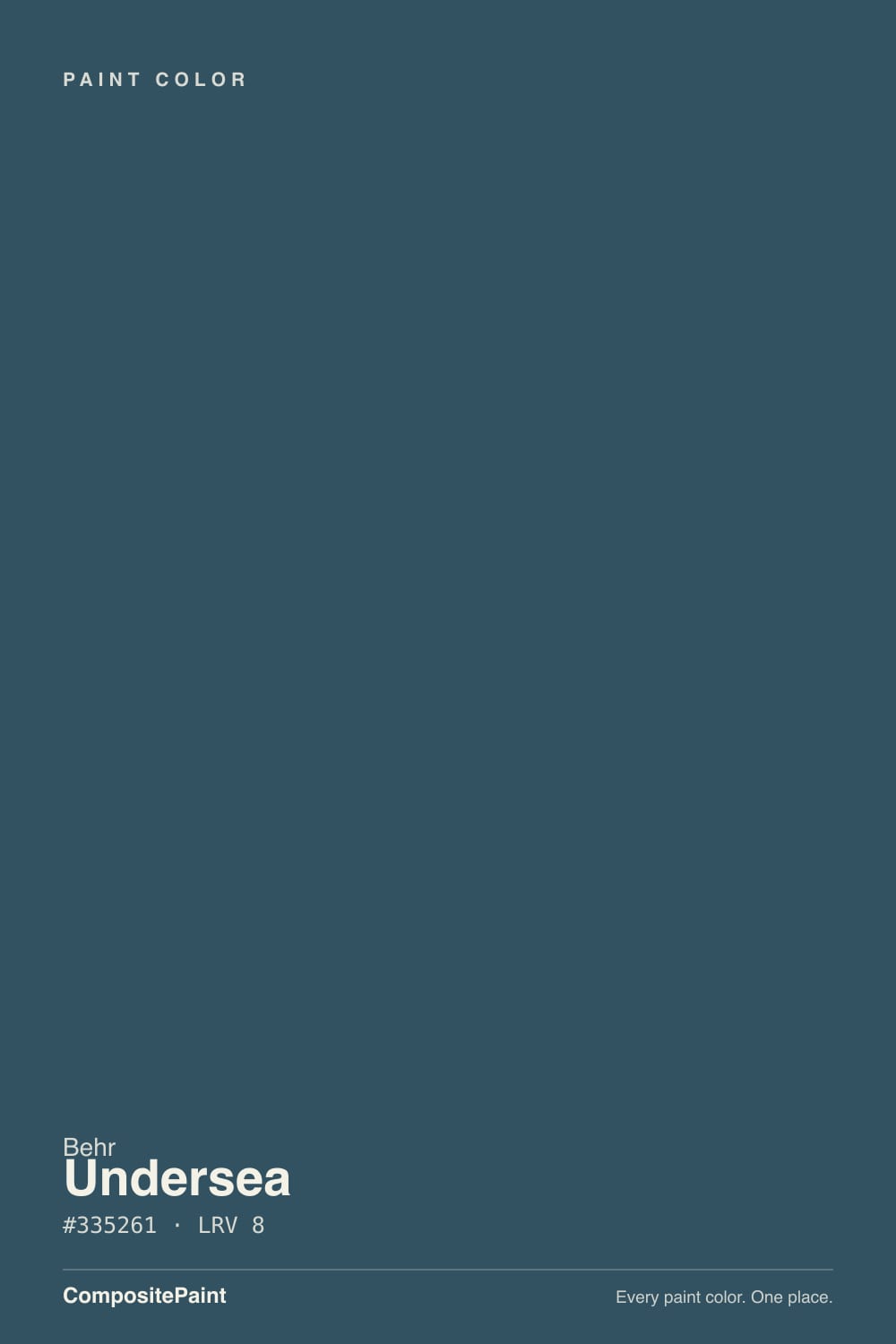
Undersea is Behr's near-black blue-green — a color that shifts between teal and navy depending on how much light hits it. Behr sells S470-7 in its Premium semi-gloss and satin enamel line built for cabinets, doors and trim, and that placement tells you the whole story: this is a hard-surface color first, a wall color second. Give it gloss and real daylight and it looks rich and expensive; leave it flat and shaded and it just reads black.
Kitchen islands and cabinets · front doors and exterior shutters · powder rooms with real light · anyone who wants a navy with a green secret
You want an unambiguous teal or a pure navy · the room is dim, shaded, or windowless · your hardware is chrome or polished nickel · you're set on flat sheen with no accent light
- Sold in Behr's own cabinet/door/trim enamel line — durable and built for wipe-downs
- A genuine in-between color: reads teal, navy, and near-black depending on the light
- Deep enough (LRV 9) to anchor an island or door without washing out
- Warms up beautifully next to brass and matte black hardware
- Works indoors (cabinets, powder rooms) and outdoors (doors, shutters) from one can
- At LRV 9 it reads almost black in any dim, shaded, or unlit spot
- Undertone sits between teal and navy — can read muddy to buyers who wanted one or the other
- Needs a tinted or deep-base primer and 2-3 coats over anything lighter
- Chrome and icy-white pairings flatten its warmth
What Color Is Undersea, Really?
A deep blue-green with the blue in charge — Behr's own line calls it an ocean-depths color, and the name is doing real work here: like water at depth, it shifts between navy and teal depending on how much light reaches it. It isn't sold as a standard wall color first. Behr puts S470-7 in its Premium semi-gloss and satin enamel line, built for cabinets, doors and trim — the same durable, wipeable formula you would use on a front door or a kitchen island, which tells you plainly where the color is meant to earn its keep.
At LRV 9 it sits in true near-black depth, just a shade lighter than a pure navy like Sherwin-Williams Naval (LRV 4) and noticeably deeper than its own brand-mate Hidden Gem (LRV 14). That depth is the whole story: give it gloss and daylight and the blue-green complexity comes forward; starve it of light in a flat sheen in a shaded corner, and it just reads as another dark neutral. Plan the room's light before you plan the color.
Undertone in one line: blue first, a whisper of green second — never a fully saturated teal, never a flat navy. If your sample looks nearly black, that is normal for LRV 9 in low light, not a flaw; if it looks murky and gray-green, check for chrome fixtures or cool white LEDs nearby working against it.
Where It Shines
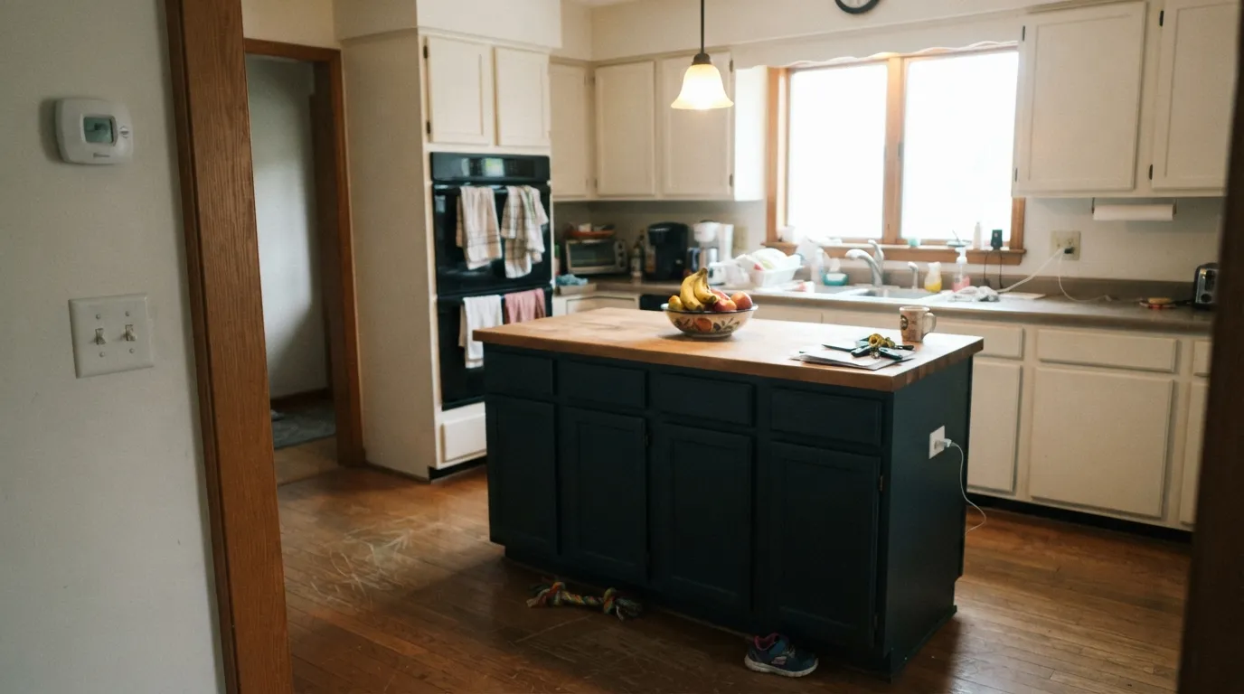
Give it the enamel sheen and real light it is built for and it earns its keep fast: a kitchen island, a front door, a powder room's four walls. This is a color designed to be touched and wiped, not just looked at — Behr's own product line makes that plain — and it rewards exactly the uses that line is built for.
Where It Fails
Most disappointment with Undersea comes down to one of three mismatches, and all three show up before the first coat if you know to look for them. None of them are the paint's fault — but if your situation matches one, sample bigger before committing a whole island or door to it.
At this depth, blue-green ambiguity multiplies instead of settling. If you pictured a crisp aqua teal or a flat, unmistakable navy like Naval, Undersea sits in the gap between them and can read undecided — even a little muddy — in flat light. Pick a side instead: Sherwin-Williams Naval for pure navy, a brighter teal if that's really the goal.
LRV 9 is genuinely dark. Without a window nearby, a sconce, or gloss bouncing light back, cabinets or a wall in Undersea just recede into shadow and the color disappears — readers report it 'basically looks black' in exactly this setup. Add light before you add paint.
Cool, icy metals fight the color's slight warmth and make it look flatter and grayer than it is. Brass, oil-rubbed bronze and matte black all read richer against it — swap the hardware before you blame the paint.
Room by Room
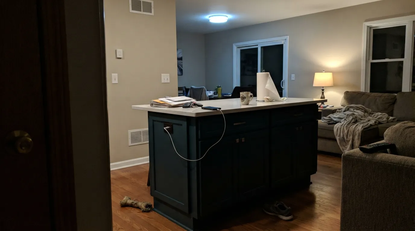
This is the exact use Behr built the SKU for: semi-gloss enamel on an island or full run of cabinets under warm white walls. Wipeable, durable, and rich under brass or matte black hardware — the color's most-documented, most-supported use.
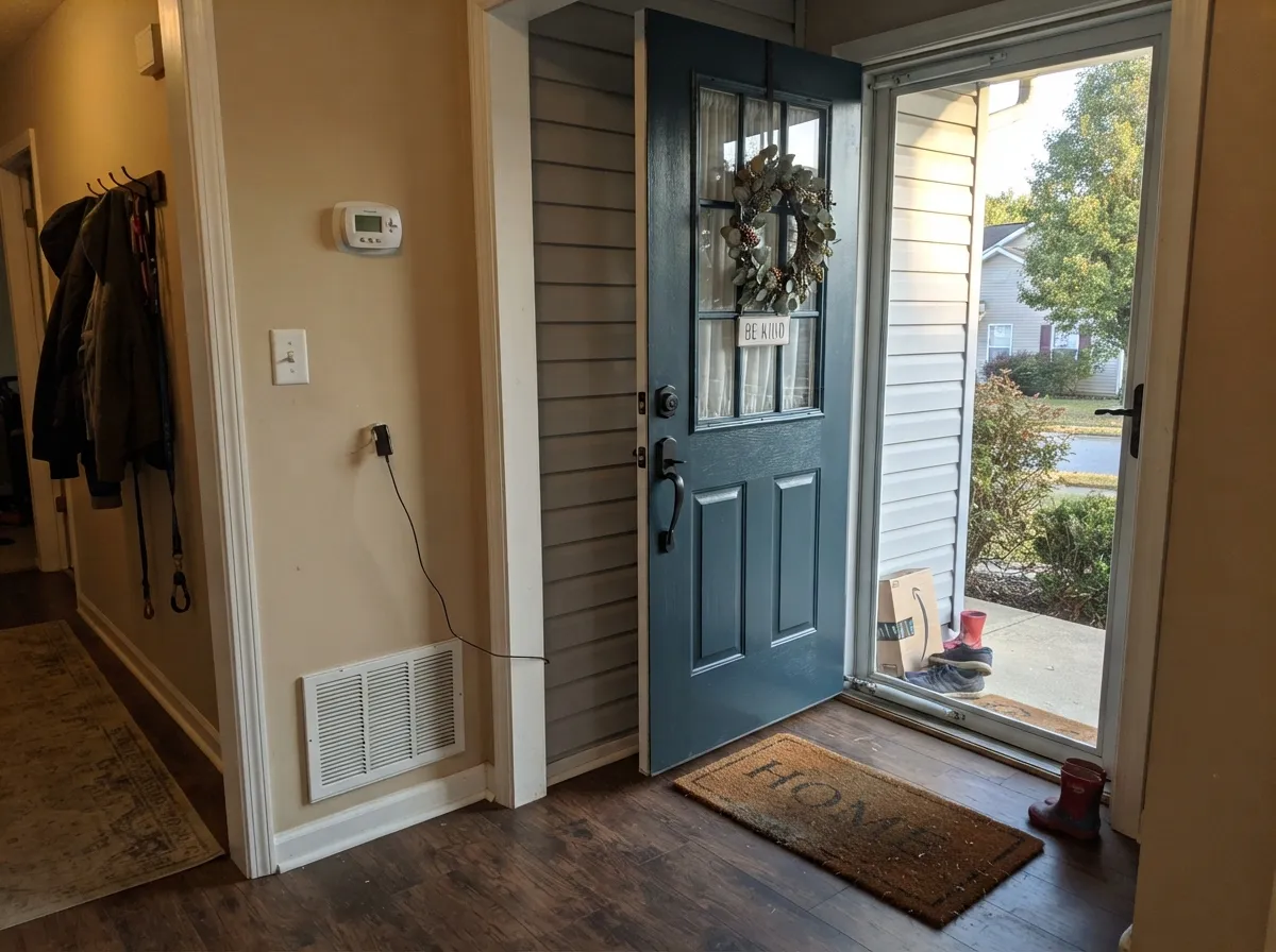
Sold as an interior/exterior enamel specifically for doors and trim. Full sun brings out the blue-green; a covered porch or heavily shaded entry can read nearly black. Sample it at your actual door before ordering the gallon.
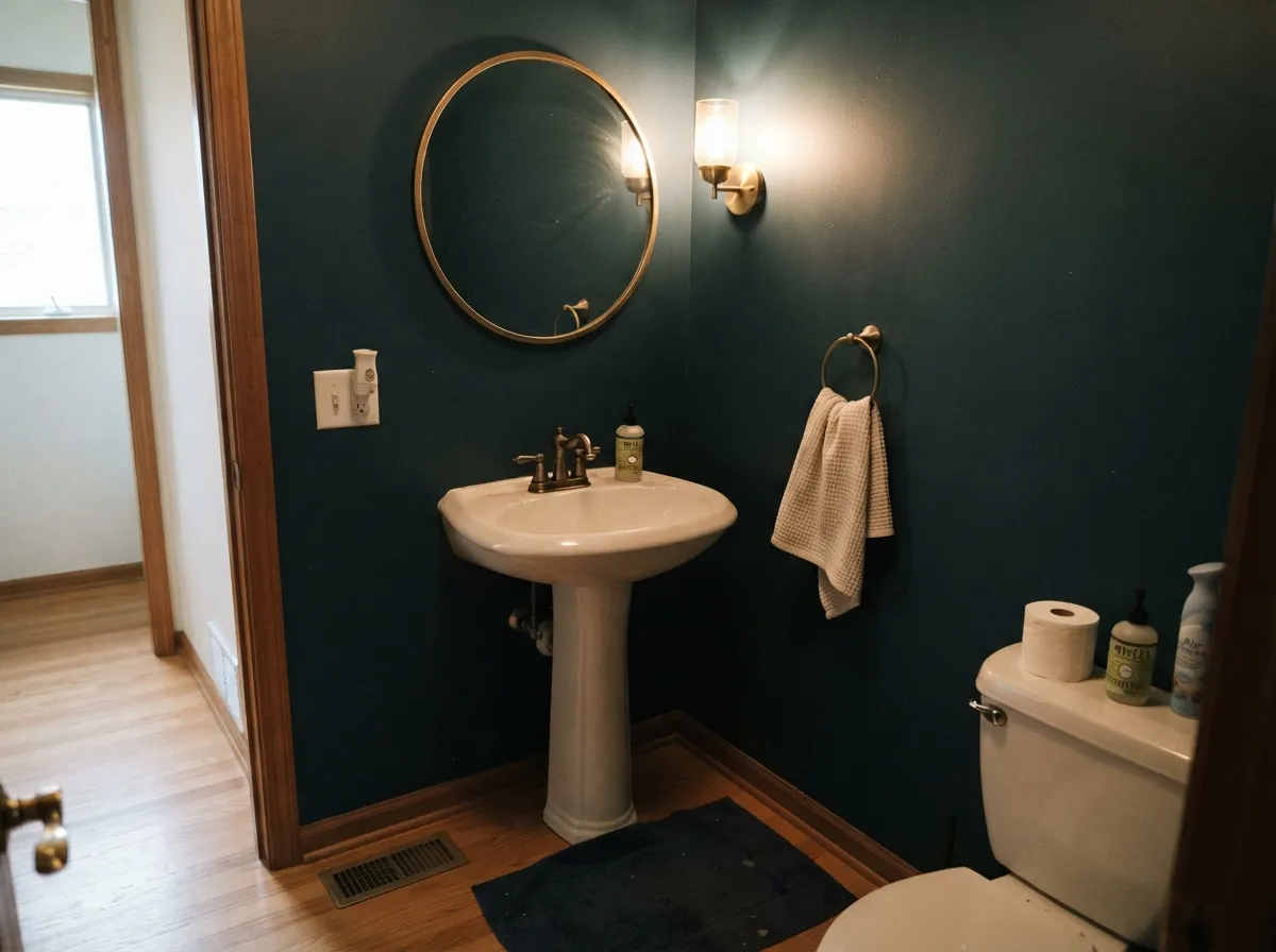
Four walls of a tiny room in Undersea reads like a jewel box, not a cave — dark colors do their best work in low square footage. It needs a real fixture overhead or a sconce, not just hallway light leaking in, or the effect is lost.
A moody, good-looking accent or headboard wall under warm 2700K lamps. Without them, a dim morning or a north-facing window turns it flat and colorless — this is not a bedroom color for anyone who skips bedside lighting.
One wall with genuine daylight works; committing an entire low-light living room to it risks a cave effect. Pair with a light ceiling and plenty of warm-white trim to keep the room from closing in.
Covered by the same satin/semi-gloss enamel line, and it holds up to bathroom humidity and wipe-downs the way the cabinet formula promises. Brass or matte black fixtures and a white or marble-look counter are its best company.
Your Light Is the Risk
Full sun, or a semi-gloss/gloss enamel finish, is what makes the blue-green come forward — the light and finish the color was built for on doors and cabinets.
Without real light bouncing off it, LRV 9 just reads black. A covered porch door or a windowless powder room in flat paint loses the color entirely.
Cooler and more teal-green at midday; the blue pulls forward and it edges toward navy as the light warms toward evening.
Warm 2700K lamps push it toward a rich near-black navy. Cool white LEDs flatten it and can expose a slightly muddy gray-green cast.
Most complaints about Undersea are a light mismatch. Upload a photo of your actual room and see it on your walls — then ask for the same wall in north light or evening lamps before you buy a single sample.
Need It From Another Brand?
Any paint counter can custom-tint Behr S470-7 directly. If you would rather stay in one brand's own deck, these are the closest stock matches, measured as ΔE2000. Under 2 is a difference you will not see on the wall.
| Brand | Closest color | ΔE | LRV | |
|---|---|---|---|---|
| Benjamin Moore | New Providence Navy1651 · Benjamin Moore | 2.4 | 11 | Color page → |
| Valspar | Plot Twist8006-8F · Valspar | 1.4 | 9 | Color page → |
| PPG / Glidden | Soothing SapphirePPG10-09 · PPG / Glidden | 2.5 | 9 | Color page → |
| Glidden | Tundra Pond30BG 10/055 · Glidden | 1.8 | 10 | Color page → |
| Dutch Boy | Onyx Shade433-7DB · Dutch Boy | 3.3 | 9 | Color page → |
| HGTV Home by Sherwin-Williams | OceanusHGSW 3301 · HGTV Home by Sherwin-Williams | 4.3 | 10 | Color page → |
Similar Behr Colors
The nearest shades to Undersea within Behr's own range, ranked by perceptual color distance — useful when you want the same look a touch lighter, darker, or warmer.
WCAG 2.1: AA is 4.5 : 1 for normal text, 3 : 1 for large text, AAA is 7 : 1.
Undersea vs the Colors You're Also Considering
Every Undersea sample board has the same rivals on it. The numbers show the real lightness gap — then it comes down to which risk you would rather live with.
Pick this for the deeper, more clearly blue-navy version — Hidden Gem can drift toward sage-gray in flat light; Undersea never loses its blue.
Behr N430-6A · LRV 14Hidden GemPick this if Undersea feels like too much commitment — the same brand's lighter, greener cousin at LRV 14 reads as color in average light without needing a spotlight.
Pick this for the whisper of green that keeps Undersea from reading like a plain dark blue-gray.
Sherwin-Williams SW 7964 · LRV 7CyberspacePick this if your painter works in Sherwin-Williams and you want the same near-black depth with less green — Cyberspace is a more neutral blue-gray.
Pick this for the green edge — if a flat navy feels like the expected answer, Undersea is the more unusual pick at the same darkness.
Benjamin Moore HC-155 · LRV 7Newburyport BluePick this for a true navy at nearly the same depth — Newburyport stays blue where Undersea leans toward teal.
Pick this if you want a color with more personality than a standard navy — the green whisper is what makes people ask what color it actually is.
Sherwin-Williams SW 6244 · LRV 4NavalPick this for a whole-house or exterior navy that reads unmistakably blue even in bad light — Naval is darker still (LRV 4) with none of the green ambiguity.
Among Behr's own colors, Opera Glasses MQ5-24 (#355363, LRV 8) is the closest neighbor and is very hard to separate from Undersea on a wall. Restless Sea PPU13-20 (#37515E, LRV 8) is a touch grayer, and Midnight In The Tropics S480-7 (#2C5469, LRV 8) is more clearly teal.
Across brands, Dutch Boy Seawater Blue 235-7DB (#2C5264, LRV 8) has a deltaE of 1.5 and Sherwin-Williams Marea Baja SW 9185 (#2E5464, LRV 8) is 1.58, so both are visually identical to Undersea in normal room light. Glidden Blue Bayberry PPG1149-7 (#2D5360, LRV 8) at 2.5 is very close, though worth sampling first.
Farrow and Ball Hague Blue No. 30 (#3F4D57, LRV 7) at 4.99 is close but visibly different side by side, reading grayer and less teal. C2 Nightspot C2-743 (#324A59, LRV 6) at 3.2 is darker and a step more muted.
Undersea Coordinating Colors
Undersea reads best next to warm whites and honest metals — brass, bronze, matte black — and it holds its own beside a true navy or a near-black without turning muddy. Keep chrome and icy whites at a distance; they are the one combination that fights its slight warmth. These are the partners that keep showing up in cabinets and doors that work:
Why Behr Sells Undersea as a Cabinet-and-Door Color First
Behr's own listing for S470-7 puts it in the Premium semi-gloss and satin enamel line built for cabinets, doors and trim, not the standard flat wall-paint line — and that placement tells you where the brand expects the color to work hardest: on hard-wearing, easy-clean surfaces that get touched and wiped daily, not necessarily across an open-plan living room. It is still available as an interior/exterior flat sample too, so walls are a real option, just not the primary billed use.
We could not confirm a specific famous project, viral room, or Color-of-the-Year tie for this exact SKU, so this review is grounded in the color's own numbers — LRV 9, the enamel product line it ships in, the RGB values behind its hex — rather than a trend story. If you have painted it, the comment section below is the best source of real-room evidence we have.
Undersea With Wood Tones and Metals
Walnut, white oak and butcher block all sit comfortably against Undersea — the warm grain keeps the cool blue-green from feeling stark, which is exactly why it shows up so often on kitchen islands with wood countertops or open shelving. Honey oak works too, though the contrast is stronger than with darker woods.
Metal choice matters more than usual at this depth. Brass and oil-rubbed bronze hardware read rich and a little vintage against it; matte black is the safe modern match. Polished chrome or nickel is the pairing to avoid — the cool shine flattens the color and makes it look more gray than blue-green.
Three Ready Palettes Built on Undersea
A color is never alone on the wall. These are complete combinations in the 60-30-10 pattern, with the reason each one holds together. Every one opens in the visualizer.
A warm cream wall and white perimeter cabinets let the island carry all the color; Polar Bear keeps the kitchen bright while Undersea reads deep and rich under brass hardware.
Try this palette in your roomA crisp white body lets the door carry the color instead of fighting the trim; Iron Ore shutters echo the door's darkness without competing for attention, and matte black hardware ties the two together.
Try this palette in your roomSmall rooms take deep color well: four Undersea walls next to a warm white trim and a near-black mirror frame give a tiny powder room the enclosed, jewel-box depth dark colors do best. Add a real sconce, not just hallway light, and brass fixtures finish it.
Try this palette in your roomUndersea FAQ
Is Undersea teal, navy, or green?
All three, a little — a deep blue-green with the blue in charge. Under strong light the green shows more; in shade it reads almost black-navy. Most people land on "petrol" or "deep teal-navy" when asked to name it.
Is Undersea good for kitchen cabinets?
Yes — it is literally sold in Behr's cabinet, door and trim enamel line for exactly this. Semi-gloss on an island or perimeter under warm white walls is the color's best-supported use; use a bonding primer and plan on 2-3 coats over lighter existing cabinets.
What white goes with Undersea walls or cabinets?
A warm-leaning white like Blank Canvas or Polar Bear keeps the room from turning cold; a crisper white like Extra White on an exterior body makes a door read as an intentional dark accent rather than a mismatch.
Does Undersea work on a front door?
Yes — it is sold as an interior/exterior enamel specifically for doors and trim. In full sun it reads a rich blue-green; under a covered porch or in heavy shade it can look nearly black, so sample it at your actual door's light before committing.
How many coats does Undersea need?
Because it sits at LRV 9, going over anything lighter needs a gray- or deep-base-tinted primer first, then plan on 2 coats of the enamel minimum — 3 if the surface underneath is a bright white cabinet or trim color.
What hardware and metals pair with it?
Brass and oil-rubbed bronze warm it up and read expensive; matte black is a safe, easy match too. Polished chrome and nickel are the one metal that fights it — they read cold against the color's slight warmth.
Have you painted with Undersea?
Rate it — one tap helps the next reader decide.
Ask a Question