Platinum
Home Depot's go-to safe light gray, reviewed honestly: the light that keeps it neutral, the light that turns it blue-green, and what to check before you buy five gallons.

Jessica has spec'd whites and neutrals for more than 300 rooms and keeps a sample wall of painted drawdowns in her studio. Every color review is checked against real reader rooms in the comments and re-tested when a formula changes. About the testing process →
- 1Stardew43
- 2Palladian Blue60
- 3Platinum65
- 4Glass Slipper70
- 5Spring Thaw83
The Fast Verdict
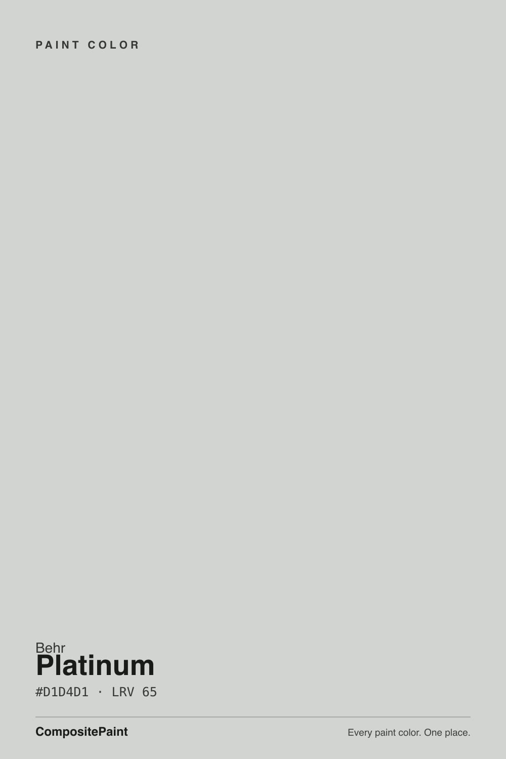
Platinum is the gray Behr built to not be noticed — a light, cool gray with a green base that most people will read as plain, honest gray. It earns its whole-house reputation the boring way: it doesn't yellow, it doesn't fight modern fixtures, and it comes in every sheen from flat walls to cabinet-grade enamel.
The catch is the same green base that keeps it neutral in good light will show its hand — green, blue, sometimes a little violet — the moment the light turns cool or dim.
Whole-house walls in rooms with real daylight · rental turnovers and flips that need one dependable neutral · garages, hallways, offices · exteriors and trim paired with white and near-black accents
You specifically want a warm greige · your room runs mostly on cool LED bulbs with little daylight · you're matching honey oak trim or golden wood floors · you need one color that reads identical in every light
- Genuinely safe, hard-to-mess-up whole-house neutral in real daylight
- Sold in nearly every sheen — flat walls to cabinet-grade enamel — for true one-color rooms
- Doesn't yellow or fight modern black/stainless/white hardware
- Exterior-rated version for siding and trim
- Dependable, boring-on-purpose choice for rentals and flips
- Not a true dead-neutral gray — carries a real green base that shows in the wrong light
- Goes cold and slightly murky under cool LEDs with no daylight
- Needs primer over dark walls or raw drywall or the undertone muddies
- Fights warm honey oak, golden beige, and brass hardware
What Color Is Platinum, Really?
A light, cool gray built on a green base — Behr's own line describes Platinum as a quiet, wistful gray, and independent color reads of PPU26-11 agree on the mechanics even if they disagree on the headline: it is a green-based gray that most eyes will call plain neutral gray in good light, with a cool cast that can lean blue or faintly violet once the light shifts. It is also, by most color-matching sites' side-by-side comparisons, close enough to Behr's own Sterling (780E-3) that painters sometimes reach for either can interchangeably — worth confirming the exact code before you buy, since they live in different Behr collections under different names.
At LRV 65 it sits solidly in the light-but-not-white range: bright enough to keep a room from feeling closed in, with enough body that it reads as a real color choice rather than an off-white. That middle position is exactly why Behr sells it across nearly every sheen and product line — flat and eggshell for walls, satin and semi-gloss enamel for cabinets, doors and trim, and an exterior version for siding — it is built to be the one gray that works everywhere in a house, not a specialty accent.
Undertone in one line: cool and green-based first, with blue or violet showing up as the secondary lean in cooler light — never warm, never beige. If your sample looks flatly gray with no color at all, that is bright, even daylight doing its job; if it looks tinted, that is the room's actual light, not a bad batch of paint.
Where It Shines
Give it real daylight and it does exactly what a builder-grade neutral is supposed to do: disappear in the best way. It is genuinely hard to get wrong on a bright wall, which is why it shows up so often in rental turnovers, flips and new-construction spec sheets — it is inoffensive without going beige, and it doesn't fight granite, quartz, stainless, or black hardware the way a warm greige can. Because Behr sells it in every finish from flat to cabinet enamel, it is also one of the easier colors to run a true one-color room: walls, trim and cabinet doors all in Platinum, separated only by sheen.
Where It Fails
Almost every disappointed report about Platinum comes down to one of three predictable situations, and none of them are really the paint's fault — they're what happens to any cool, green-based light gray under the wrong conditions.
The chip reads clean and plain, but every independent color analysis of PPU26-11 agrees it carries a real green base with a cool, sometimes violet-leaning secondary undertone — it is not a dead-neutral gray, it is a gray that behaves like one under the right light. If the ask is "flat, guaranteed, no personality," sample it big before committing a whole house to it.
Take away real daylight and the green base loses its balance — the wall can go colder and slightly murky under cool-white LEDs, the same complaint that follows almost every cool-based light gray once the sun goes down. Warm 2700K bulbs keep it closer to the soft, quiet gray on the chip; cool bulbs are the actual problem, not the paint.
Painting Platinum straight over a previously dark color, or straight onto raw drywall, lets the old color or the drywall's own warmth bleed through and muddy the delicate green-gray base — this is a documented, specific risk for this color, not generic advice. A stain-blocking white primer first keeps the gray honest instead of turning it dingy after coat two.
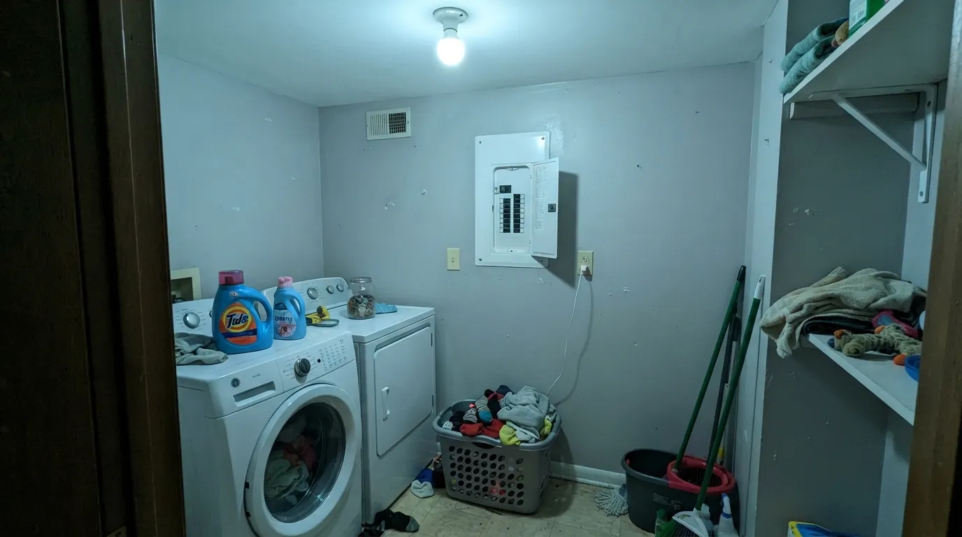
Room by Room
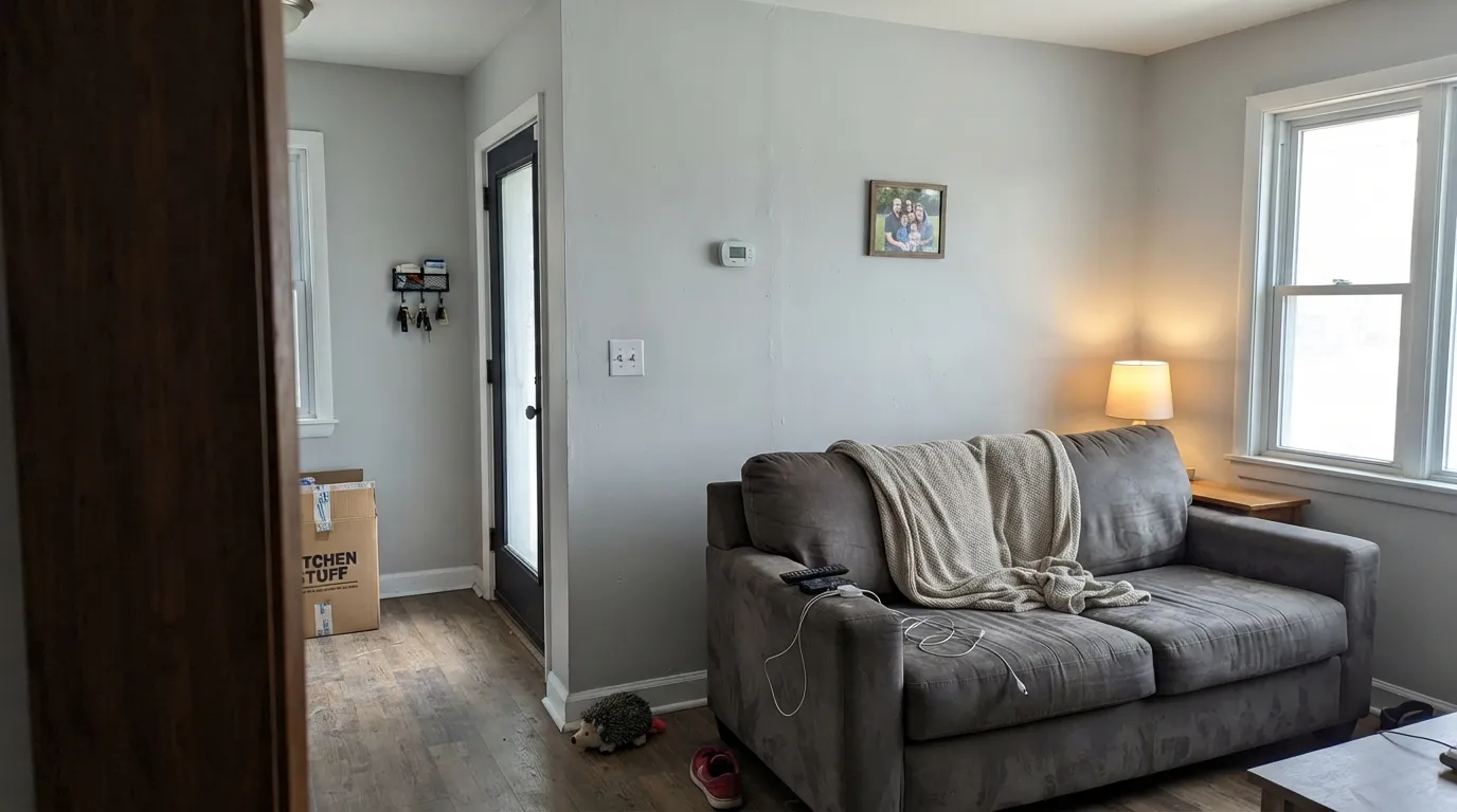
In a room with real windows it reads close to a genuine neutral gray and pairs easily with black hardware, white trim and most wood tones. Flat or eggshell; skip it in a north-facing room with small windows unless you're ready to lean on lamps.
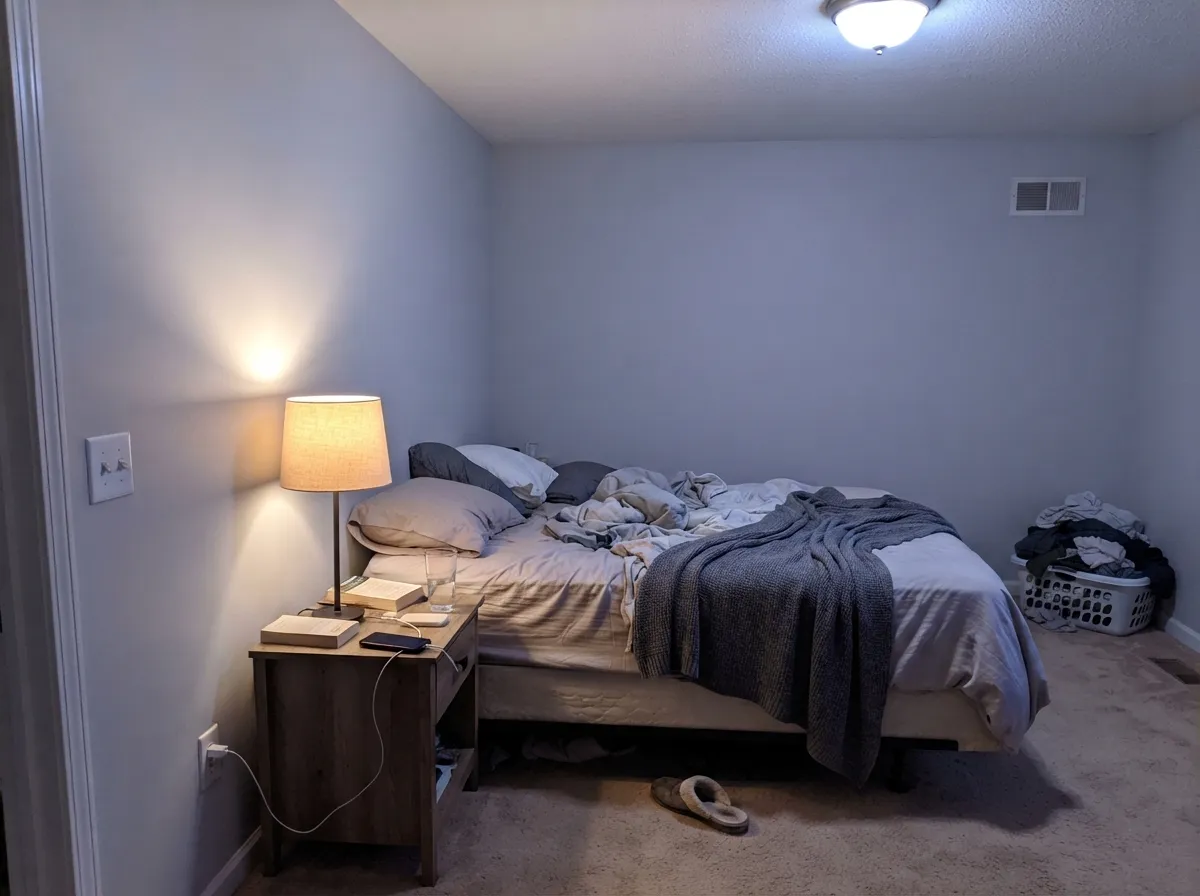
Calm and quiet at night if the lamps are 2700K; under cool overhead LEDs it can feel a little clinical. Pair with a warm white trim (Whisper White, not a stark blue-white) to keep the room from tipping cold.
Behr sells Platinum in satin and semi-gloss enamel specifically for cabinets, doors and trim, and it wipes clean and resists yellowing the way a warm off-white cabinet color can't. Best with white or stainless hardware; it argues with warm brass and honey-toned wood.
This is the room type Platinum is built for: a corridor or open plan that needs one color that won't clash with whatever gets carried through it. Rental owners and flippers reach for it specifically because it rarely needs a second thought.
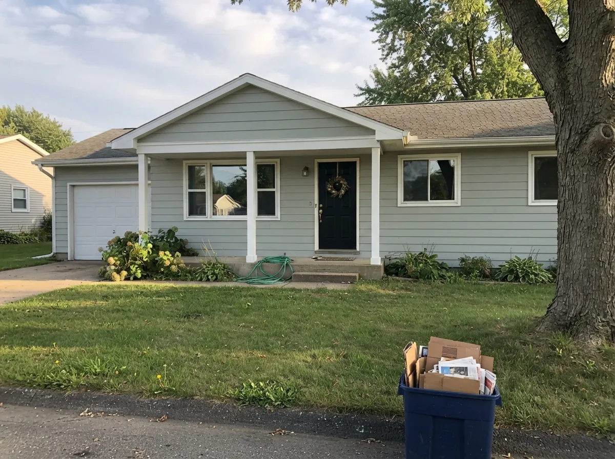
Sold in an exterior-rated version, and it holds its cool cast in full sun better than it does indoors under artificial light. Pairs cleanly with white trim and black shutters or a black door for the current modern-gray-house look.
With white or gray-veined stone, chrome or black fixtures: clean and current. With warm beige tile or gold fixtures, the cool base starts to fight the room — sample against your actual tile before committing.
Your Light Is the Risk
Real daylight is what makes Platinum read close to a genuine neutral gray — the green base calms down and it just looks like clean, quiet gray.
Take away daylight and the green base loses its footing; the wall can look cold, faintly blue-violet, and a little murky. Test with lamps off and on before deciding.
A cloudy day pulls it toward a flatter, cooler gray; direct sun brings out more of the green. Same wall, two honest moods.
2700K warm bulbs keep it soft and gray-green after dark. Cool-white LEDs push it toward blue — swap the bulbs before you swap the paint.
Most complaints about Platinum are a light mismatch. Upload a photo of your actual room and see it on your walls — then ask for the same wall in north light or evening lamps before you buy a single sample.
Need It From Another Brand?
Any paint counter can custom-tint Behr PPU26-11 directly. If you would rather stay in one brand's own deck, these are the closest stock matches, measured as ΔE2000. Under 2 is a difference you will not see on the wall.
| Brand | Closest color | ΔE | LRV | |
|---|---|---|---|---|
| Sherwin-Williams | ReflectionSW 7661 · Sherwin-Williams | 0.8 | 66 | Color page → |
| Benjamin Moore | Silvery Moon1604 · Benjamin Moore | 0.9 | 64 | Color page → |
| Valspar | Morning Lake7004-21 · Valspar | 0.8 | 64.8 | Color page → |
| PPG / Glidden | Wright Cloud WhiteFLLW961 · PPG / Glidden | 0.5 | 65 | Color page → |
| Glidden | TornadoPPG1009-2 · Glidden | 0.7 | 65 | Color page → |
| Dutch Boy | Moonlit Walk434-1DB · Dutch Boy | 2.2 | 64 | Color page → |
Similar Behr Colors
The nearest shades to Platinum within Behr's own range, ranked by perceptual color distance — useful when you want the same look a touch lighter, darker, or warmer.
WCAG 2.1: AA is 4.5 : 1 for normal text, 3 : 1 for large text, AAA is 7 : 1.
Platinum vs the Colors You're Also Considering
Every Platinum sample board has the same rivals on it. The numbers show the real lightness gap — then it comes down to which risk you would rather live with.
Pick this if you're buying at Home Depot and want the same idea across every sheen, from wall flat to cabinet enamel.
Benjamin Moore OC-52 · LRV 65Gray OwlPick this if you're working with a Benjamin Moore painter — same LRV, the same "reads plain, then changes its mind" personality, just a different brand's version of the cool base.
Pick this for a genuinely cooler, more modern gray — Repose Gray can drift lavender in the same cool light that pushes Platinum toward blue-green.
Sherwin-Williams SW 7015 · LRV 58Repose GrayPick this if you want the safety net of a warm greige instead — Repose Gray leans taupe-warm where Platinum leans cool-green, so it's the better call for a room that already runs cold.
Pick this if you want the better-known, more searched-for option with the same Home Depot convenience.
Behr PPU26-12 · LRV 68Solemn SilencePick this for an even lighter, quieter cool gray in Behr's own deck, with less green pull and more true-gray behavior.
Pick this for the anonymous, no-hype version of that same shifting gray, at Home Depot prices.
Sherwin-Williams SW 7057 · LRV 59Silver StrandPick this if you want the chameleon gray with a design pedigree — it went viral through Joanna Gaines projects and shifts through the same green-gray-taupe range.
Inside the Behr deck the neighbors are extremely close. Curio MQ3-22 (#D1D5D1, LRV 66) is a single point lighter and effectively the same color. Sterling 780E-3 (#D3D5D4, LRV 66) is marginally cooler, Salt Glaze PPU12-11 (#CED4D0, LRV 65) is slightly greener, and Halation PPU26-15 (#D1D1CE, LRV 64) drops the green and reads a touch warmer.
Across brands, PPG Wright Cloud White FLLW961 (deltaE 0.49), Glidden Tornado PPG1009-2 (deltaE 0.66), Valspar Morning Lake 7004-21 (deltaE 0.81), Sherwin-Williams Reflection SW 7661 (deltaE 0.85), and Benjamin Moore Silvery Moon 1604 (deltaE 0.95) are all matches at practically any scale.
Magnolia Home Dark Moon JG-74 (deltaE 1.17), Kompozit Metro 0530 (deltaE 1.28), and Farrow and Ball Dimpse No. 277 (deltaE 1.71) are visually identical in normal room light, though Dark Moon's LRV of 62 makes it read slightly deeper. Dunn-Edwards Silver Spoon DE6366 (deltaE 2.04) and Dutch Boy Moonlit Walk 434-1DB (deltaE 2.19) are very close, so sample first. Clare Beigeing (deltaE 3.94) is close but visibly warmer side by side.
Platinum Coordinating Colors
The coordinating rule for Platinum: pair it with plain or warm-based whites and near-blacks, and keep it away from anything golden. Because its own undertone is cool, a warm white trim does more to balance a room than another cool color would; a warm-based dark neutral gives contrast without a temperature fight. These are the partners that keep showing up in rooms that work:
Platinum and Sterling: One Color, Two Names
One thing worth knowing before you buy: several independent color-matching sites that compare paint side by side list Behr Platinum (PPU26-11) and Behr Sterling (780E-3) as visually identical or extremely close — both a light, cool, green-based gray sitting around LRV 65. Behr sells them through different collections under different names, which is common in a deck this large, but it means a painter or a store clerk might hand you either one thinking they're interchangeable.
The practical takeaway: if you're touching up a wall, matching a contractor's quote, or a store is out of one and offers the other, don't assume — check the exact code (PPU26-11 vs. 780E-3) against what's already on the wall before you commit a whole gallon to it.
Platinum for Garages, Rentals, and Turnover Jobs
This is the job Platinum quietly does best. At LRV 65 it's light enough to brighten a garage or a windowless utility space without going stark white, and because it doesn't carry a warm undertone, it won't yellow next to fluorescent shop lights or cool LED fixtures the way a beige or greige can. Behr's Marquee line even backs it with a one-coat guarantee over most existing colors, which matters when the job is one gallon and one weekend, not a design project.
For flips and rental turnovers, the appeal is the same: it's inoffensive without being boring-beige, reads current rather than dated, and photographs cleanly for listings. The one step worth not skipping — priming over a dark existing color or bare drywall — is cheap insurance against the exact muddy, uneven result that would otherwise force a callback.
Three Ready Palettes Built on Platinum
A color is never alone on the wall. These are complete combinations in the 60-30-10 pattern, with the reason each one holds together. Every one opens in the visualizer.
Cool gray, plain white trim, near-black door — this is the safest one-can-per-room palette in Behr's own deck, exactly the combination flippers and landlords reach for because nothing in it needs a second decision.
Try this palette in your roomWhisper White's warmth keeps the room from tipping cold once the sun goes down, and Kendall Charcoal is a warm-based dark gray, so it never fights Platinum's cool cast the way a true black would.
Try this palette in your roomCool gray siding, crisp white trim, near-black accents — the formula behind most new-build gray exteriors right now, and Platinum's exterior-rated line makes it a one-stop pick for the job.
Try this palette in your roomPlatinum FAQ
Is Behr Platinum warm or cool?
Cool. It's built on a green base with a blue or faintly violet secondary lean that shows up once the light turns dim or artificial. In bright daylight it reads close to a plain, genuine neutral gray.
Is Platinum the same color as Behr Sterling?
They're close enough that independent color-matching comparisons list them as near-identical — both cool light grays around LRV 65, sold under different names in different Behr collections. If a can of either is what a store has in stock, confirm the exact code before assuming they'll match a wall painted with the other.
What trim white goes with Platinum walls?
A crisp, plain white like Behr White works for a modern-gray look. If the room runs cold or north-facing, use a warmer white like Whisper White instead — it keeps the pairing from feeling clinical.
Will Platinum look blue or purple in my room?
It can, in cool or dim light — the green base has a blue-violet secondary lean that comes forward without daylight. It's most likely in a north-facing room lit only by cool-white LEDs. Warm 2700K bulbs and any real daylight keep it reading as plain gray.
Can I use Platinum on kitchen cabinets?
Yes — Behr sells it in satin and semi-gloss enamel specifically for cabinets, doors and trim, not just wall paint. It pairs best with white or stainless hardware; brass and warm wood tend to fight its cool base.
How many coats does Platinum need?
Two coats over a similar light color is standard. Going over a dark wall or bare drywall, prime first with a stain-blocking white primer — skipping it lets the old color or the drywall's warmth bleed through and muddy the gray.
Have you painted with Platinum?
Rate it — one tap helps the next reader decide.
Ask a Question