English Channel
The slate-navy everyone reaches for on a kitchen island, reviewed honestly: where it reads navy, the light that turns it violet, and what to pick instead.

Jessica has spec'd whites and neutrals for more than 300 rooms and keeps a sample wall of painted drawdowns in her studio. Every color review is checked against real reader rooms in the comments and re-tested when a formula changes. About the testing process →
- 1Naval4
- 2English Channel11
- 3Charcoal Blue19
- 4Resolute Blue40
The Fast Verdict
English Channel is Behr's answer to the question "I want navy, but not that much navy." A blue-gray built on a true navy base, grayed down and given a whisper of violet-plum, so it sits a full step softer than Hale Navy or Naval without turning into a plain gray. On a kitchen island or a front door it reads confident and current; in a dim room with no lamps it can slide toward flat concrete-violet. It behaves — you just have to give it light.
Kitchen islands and cabinets · front doors and shutters · powder rooms and mudrooms · offices and dens that want moody, not black · anyone who likes Hale Navy but wants one shade lighter and softer
You want an unmistakable, saturated navy · your room is dim and north-facing with no lamps · you're painting a whole open-plan main floor with it · your only trim wood is honey oak
- A navy that reads current and gray-forward, not primary-blue
- Genuinely excellent on kitchen islands, front doors, and shutters
- A full step lighter and softer than Hale Navy or Naval — easier to live with on a big surface
- Deep enough (LRV 11) to hold its color in a bright room
- Flatters brass, black hardware, and walnut equally well
- Not a true saturated navy — buyers expecting Hale Navy-level blue see gray-violet
- Cool north light and no lamps push it toward flat concrete-plum
- One-coat-hide marketing doesn't always match owner experience on doors and cabinets
- Not built for a whole open-plan main floor — it wants one committed surface
What Color Is English Channel, Really?
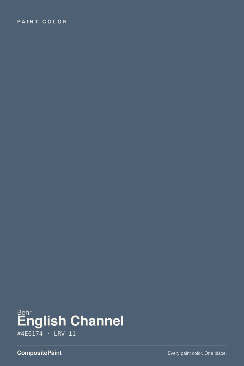
A blue-gray built on a true navy base, then grayed and warmed just enough that it stops reading as straight navy. Behr's own color description leans on charcoal and midnight blue; independent colorists who've sampled it describe the same paint as a cool, muted blue with real gray and violet in it. Both are right — English Channel sits in that narrow band where navy, slate, and a graying violet overlap, and which one you see depends on the light more than on the can.
At LRV 11 it is a medium-dark color, not a near-black. That matters because it puts English Channel a full step lighter and less saturated than Benjamin Moore's Hale Navy (LRV 6) or Sherwin-Williams' Naval (LRV 4) — the two navies most people default to. It sits almost exactly where Benjamin Moore's Van Deusen Blue lands (also LRV 11), which is a useful way to think about it: English Channel is Behr's version of "the navy you pick when true navy feels like too much."
Undertone in one line: blue-gray first, a whisper of violet second, never a true black. Under warm evening light it settles into a soft charcoal-navy; under cool, flat daylight the violet steps forward and the color can read closer to a graying plum-slate. Neither read is wrong — it's the same paint being honest about the room.
Where It Shines
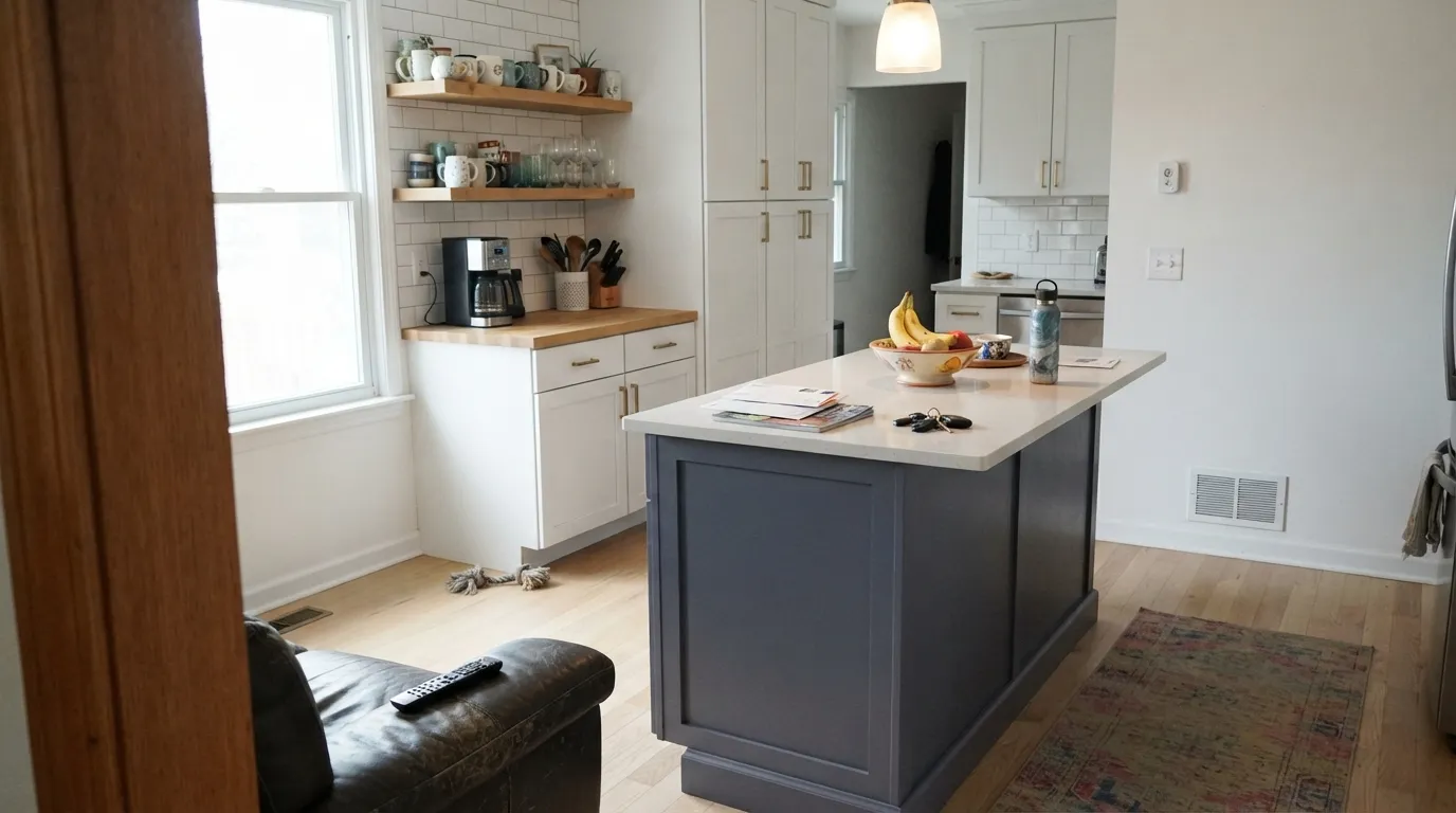
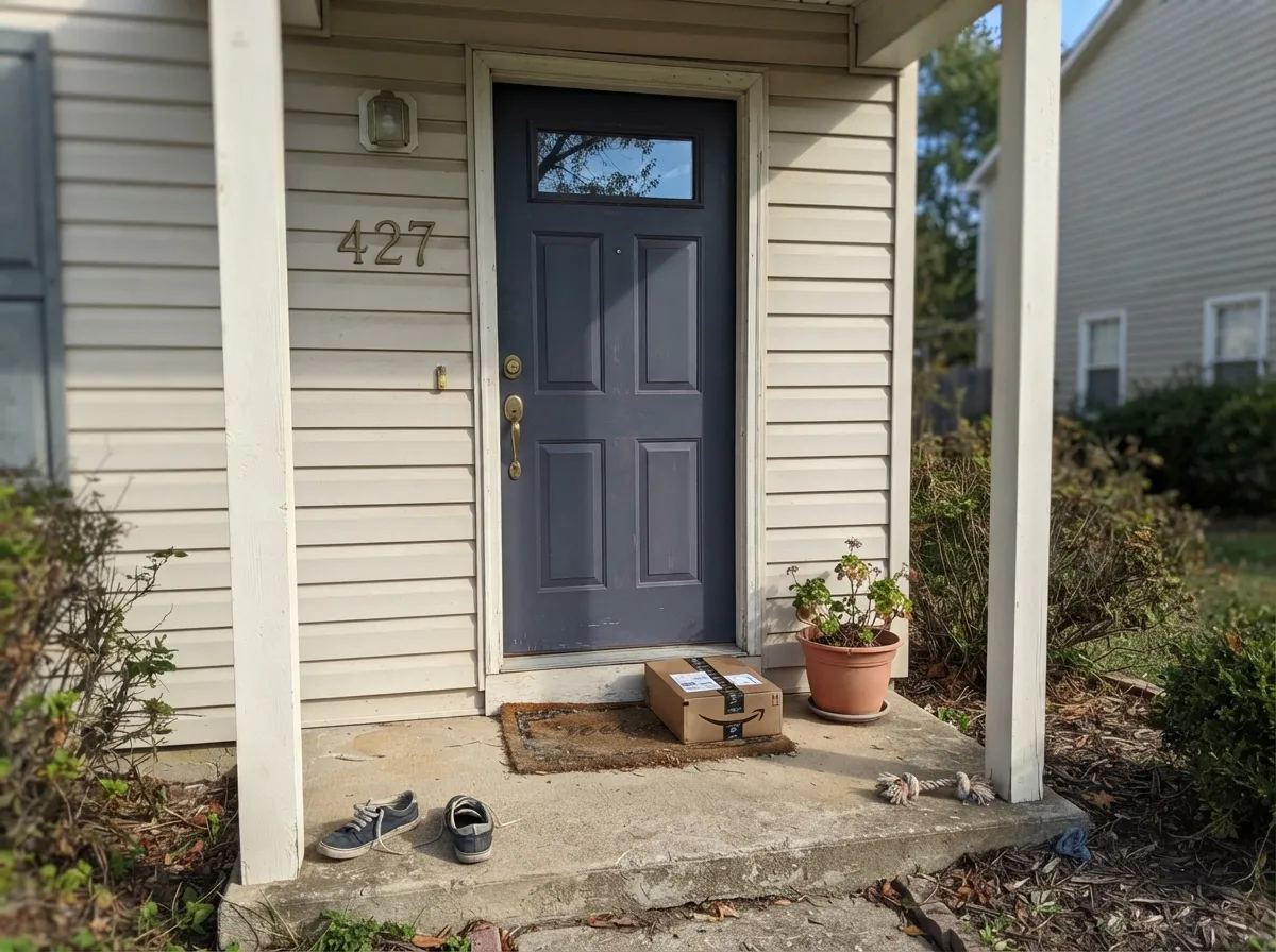
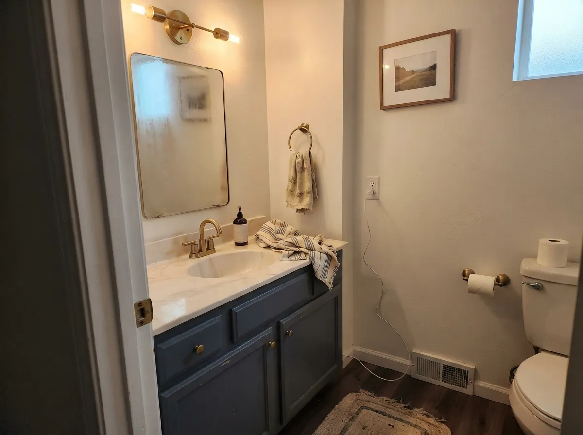
This is a color built for one bold surface, not a whole open floor plan. On a kitchen island under white perimeter cabinets it reads confident and current without swallowing the room; on a front door or a set of shutters it gives a white or light-gray house real depth without going full black. It is equally at home on a powder-room vanity, a mudroom half-wall, or a den where you want moody but not cave-like. Give it brass or black hardware, cream walls, and walnut or white oak, and it looks intentional rather than trendy.
Where It Fails
Almost every disappointed review of English Channel traces back to one of three predictable situations. None of them are the paint's fault — but if your room or your expectation matches one of these, sample it big before you commit a whole kitchen to it.
English Channel is grayed and violet-shifted on purpose — that's what keeps it from reading like every other navy island. If you actually want the saturated, unmistakably-blue navy of Hale Navy or SW Naval, this will look watered-down and a little purple next to it. Go deeper and more saturated instead.
Cool, flat daylight pulls the gray and violet forward and drains the blue, and the color can settle into a dull concrete-plum that reads more "off" than "moody." This is the light situation behind most of the color's flatter online photos. Warm 2700K lamps fix it; cool LEDs make it worse.
Behr markets several English Channel products as one-coat-hide, but owner reviews on the exact product listing report needing a second coat for even coverage on primed doors and cabinets — normal for a color this saturated, but plan the extra coat and the extra can rather than being surprised mid-project.
Room by Room
Perimeter cabinets in a warm white, the island in English Channel, brass or black hardware: this is the pairing the color was made for. Satin cabinet enamel wipes clean and holds up to daily bumps around the handles.
Against white, cream, or light-gray siding it gives real depth without the starkness of black. Full sun reads it a touch more blue and less violet than shade does — sample on the actual door face, morning and afternoon.
Deep enough to feel finished on all four walls of a small room, or just the vanity under a lighter wall color. Pairs cleanly with brass fixtures and a marble or white quartz top.
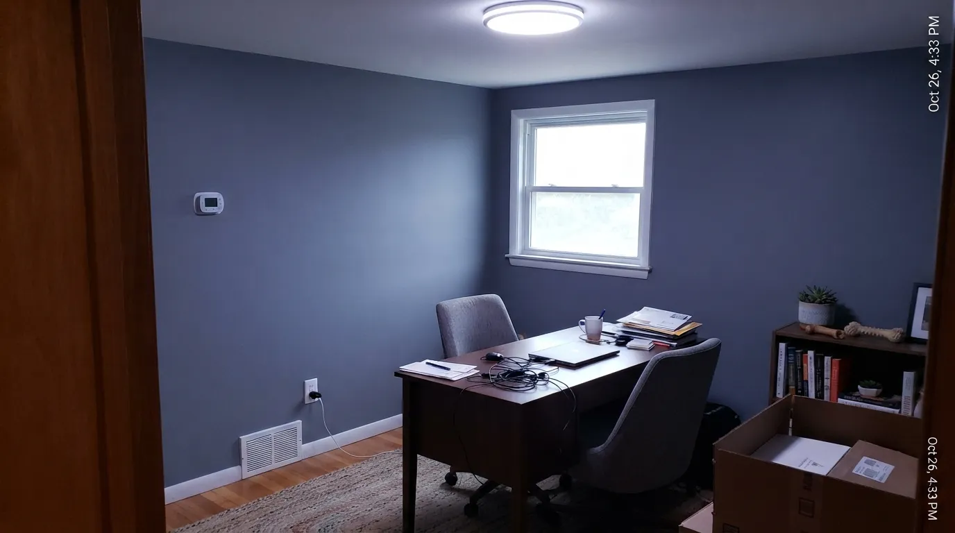
A closed room with warm task lighting and walnut furniture flatters this color; an open office lit only by cool overhead LEDs will flatten it toward gray-violet. Eggshell for durability where a chair meets the wall.
Works well as a single accent wall or headboard wall with warm bedside lamps; painting all four walls in a north-facing bedroom risks the flat, violet-leaning read. Test the exact wall before committing the whole room.
This is a color for one committed surface, not a wall that has to carry an entire open kitchen-living space. Spread across a big open room with mixed light, the shift between navy and violet becomes distracting rather than moody.
Your Light Is the Risk
Even, bright light without direct glare shows the blue clearly and keeps the violet in check. This is the light to sample it in.
Cool flat daylight drains the blue and pushes the color toward dull concrete-violet. Fine if you don't mind the drift; disappointing if you wanted navy.
Full sun on an exterior door reads it more clearly blue; shaded walls indoors let the gray and violet come forward. Sample both before committing an exterior.
2700K lamps settle it into a soft charcoal-navy. Cool white LEDs flatten it and expose the violet — swap the bulbs before you swap the paint.
Most complaints about English Channel are a light mismatch. Upload a photo of your actual room and see it on your walls — then ask for the same wall in north light or evening lamps before you buy a single sample.
Need It From Another Brand?
Any paint counter can custom-tint Behr PPU14-19 directly. If you would rather stay in one brand's own deck, these are the closest stock matches, measured as ΔE2000. Under 2 is a difference you will not see on the wall.
| Brand | Closest color | ΔE | LRV | |
|---|---|---|---|---|
| Benjamin Moore | Vermont Slate1673 · Benjamin Moore | 5.0 | 13 | Color page → |
| Valspar | Smoky Pitch4007-4B · Valspar | 3.4 | 12.1 | Color page → |
| PPG / Glidden | Blue FjordPPG1163-6 · PPG / Glidden | 1.2 | 11 | Color page → |
| Glidden | Blue FjordPPG1163-6 · Glidden | 1.2 | 11 | Color page → |
| Dunn-Edwards | Outer SpaceDE5824 · Dunn-Edwards | 3.1 | 11 | Color page → |
| Farrow & Ball | Stiffkey BlueNO. 281 · Farrow & Ball | 2.4 | 10 | Color page → |
Similar Behr Colors
The nearest shades to English Channel within Behr's own range, ranked by perceptual color distance — useful when you want the same look a touch lighter, darker, or warmer.
WCAG 2.1: AA is 4.5 : 1 for normal text, 3 : 1 for large text, AAA is 7 : 1.
English Channel vs the Colors You're Also Considering
Every English Channel sample board has the same rivals on it. The numbers show the real lightness gap — then it comes down to which risk you would rather live with.
Pick this if you're already buying Behr and want that exact LRV-11 softened-navy lane.
Benjamin Moore HC-156 · LRV 11Van Deusen BluePick this if you want the Benjamin Moore version of almost the identical idea — same depth, same softened navy.
Pick this if full Naval-level darkness feels like too much commitment for the room.
Sherwin-Williams SW 6244 · LRV 4NavalPick this if you want the unmistakable, saturated navy English Channel deliberately steps back from.
Within Behr, Thunder Bay ECC-35-3 shares the LRV of 11 but its hex, #536069, has less blue in it, so it reads as a slate gray. Calligraphy N490-6 at LRV 11, hex #435F6F, pulls toward teal. Alter Ego N550-6 at LRV 11, hex #555F76, is the same depth with a violet lean, which shows up next to a warm white.
Across brands, PPG and Glidden Blue Fjord PPG1163-6 at LRV 11 is a deltaE of 1.17 from English Channel, which is visually identical in normal room light. Farrow and Ball Stiffkey Blue No. 281 at LRV 10 is 2.43 and Dunn-Edwards Outer Space DE5824 at LRV 11 is 3.08, so both are very close but worth sampling first.
Benjamin Moore Vermont Slate 1673 at LRV 13 is a deltaE of 4.99 and noticeably lighter and grayer, so it is close but visibly different side by side. Valspar Smoky Pitch 4007-4B at LRV 12.1 sits at 3.41.
English Channel Coordinating Colors
The rule for coordinating with English Channel is simple: keep everything else warm and quiet, and let this be the one color with an opinion. It pairs beautifully with warm whites, soft grays, brass, and walnut — and it gets along fine with true black as a second dark note, as long as they're kept apart rather than touching. These are the partners that keep showing up in rooms that work:
Why This Family of Colors Is Everywhere Right Now
English Channel belongs to a specific, in-demand lane: navy that's been softened just enough to work as an everyday color instead of a statement. Behr's own naming leans nautical — a nod to the strip of water between England and France — and the color follows the same logic as Benjamin Moore's Van Deusen Blue and Sherwin-Williams' Waterloo, all of which sit within a few points of LRV 11-13. Kitchen islands are the reason this whole family took off: homeowners wanted a dark, confident color that wouldn't fight white perimeter cabinets or read as harshly as a true black-navy.
The honest tradeoff is the one this review keeps returning to: grading a navy down toward gray buys versatility, but it also buys light-dependence. A more saturated navy like Hale Navy or Naval holds its identity in almost any light; English Channel's softer, grayer build is exactly what makes it drift toward violet when the light is cool and flat.
English Channel With Wood Tones and Floors
Walnut, white oak, and black hardware are the natural company for this color — the cooler, grayer base sits comfortably next to both very light and very dark wood without a fight. On a kitchen island, pale white oak floors and a walnut open shelf both work cleanly against it.
Honey oak and orange-leaning golden wood are the one pairing to sample first: the warm-orange cast in that wood can make the color's violet undertone more noticeable by contrast. It isn't a hard no the way it would be for a true violet paint, but a big warm floor next to a small dose of English Channel (an island, a door) reads better than the same color spread across a whole honey-oak room.
Three Ready Palettes Built on English Channel
A color is never alone on the wall. These are complete combinations in the 60-30-10 pattern, with the reason each one holds together. Every one opens in the visualizer.
Crisp white perimeter cabinets let the island carry all the color, so the kitchen reads current instead of themed. Warm Swiss Coffee trim keeps the white from going stark against the navy-gray.
Try this palette in your roomA light siding lets the door carry the color without a fight, and Kendall Charcoal shutters give the facade one grounding dark note instead of two competing ones. Brass house numbers and a light fixture finish it.
Try this palette in your roomWhite Dove trim keeps the room from going cave-like, and Wrought Iron built-ins give one true dark note so the walls read intentional navy-gray rather than accidental purple. Warm lamps do the rest.
Try this palette in your roomEnglish Channel FAQ
Is English Channel a navy blue or a gray?
Both, depending on the light — it's built on a true navy base but grayed and given a touch of violet, so at LRV 11 it reads as a soft slate-navy rather than a saturated primary navy. In bright, even light the blue leads; in dim, cool light the gray and violet come forward.
Is it good for kitchen cabinets and islands?
Yes — this is arguably its best job. On an island under white perimeter cabinets, with brass or black hardware, it reads current and confident. Use a satin cabinet enamel and expect to need a genuine second coat for even coverage.
What trim white goes with English Channel?
A soft, warm white — White Dove or Swiss Coffee — keeps the pairing from feeling cold. A stark, cool white can push the color further toward its violet side by contrast.
How many coats does it actually need?
Plan for two, even on products marketed as one-coat-hide. Owner reviews on the exact Behr listing report needing a second coat for full, even coverage on primed doors and cabinets — normal for a color this dark and saturated.
Does it work on a front door?
Very well, especially against a light or white house. Full sun reads it more clearly blue than shaded walls do indoors, so sample it on the actual door face at different times of day before committing.
Will it look purple instead of navy?
It can, in cool, dim, north-facing light — that violet drift is a real, predictable trait of this color, not a defect. Under warm lamps or bright daylight it settles back into a navy-gray. If you can't guarantee warm light in the room, sample big before painting a whole wall.
Have you painted with English Channel?
Rate it — one tap helps the next reader decide.
Ask a Question