Kensington Blue
A cool, saturated navy from Benjamin Moore's Classics collection, reviewed honestly: where it reads true blue, the room that swallows it whole, and what to pick instead.

Jessica has spec'd whites and neutrals for more than 300 rooms and keeps a sample wall of painted drawdowns in her studio. Every color review is checked against real reader rooms in the comments and re-tested when a formula changes. About the testing process →
- 1Naval4
- 2Kensington Blue10
- 3Smoky Blue15
- 4Wolf Gray21
The Fast Verdict
Kensington Blue is Hale Navy's less-diluted cousin: about the same near-navy depth, more actual blue saturation, less gray mixed in. Benjamin Moore files it quietly in the Classics collection — no Color of the Year campaign, no viral kitchen with a name attached — which means almost nobody is watching it, and almost nobody is warning you about it either. Give it real daylight or a warm lamp nearby and it reads as a confident, genuine blue; starve it of light and it does what every LRV-10 color does: goes flat and dark.
Kitchen islands and cabinets · front doors · home offices and studies · anyone who wants a navy that reads as blue, not gray
Your room runs on cool LEDs with no daylight backup · you want Naval's near-black drama · you're nervous about commitment · you have no warm wood or brass nearby to warm it up
- A genuinely blue navy — less gray-diluted than Hale Navy, less teal than Van Deusen Blue
- Kitchen islands and front doors: reads confident and finished with almost no risk
- Flatters brass, black hardware, and warm wood equally well
- LRV 10 is dark but not Naval-dark — daylight keeps the blue visible, not near-black
- Quiet, unhyped color with almost no bad-review paper trail to worry about
- Needs real daylight or warm lamps — cool LEDs and windowless rooms flatten it fast
- Not dark enough for shoppers chasing Naval's near-black drama
- Little independent owner feedback exists to lean on beyond BM's own file card
- Cool on its own — needs a warm material nearby or the room can feel flat
What Color Is Kensington Blue, Really?
Benjamin Moore's own file card calls Kensington Blue "a classic navy blue that brings a sense of refinement to any space" — part of the Classics collection, the same shelf as Hale Navy and Van Deusen Blue, and about as much marketing as it has ever gotten. There is no Color of the Year story here and no viral Pinterest room with a name attached, just a well-built cool navy that a lot of the paint industry's own colorists reach for when Hale Navy reads a touch too muddy for the job. The lack of fame is not a red flag; some of the deck's most useful colors are the ones nobody talks about.
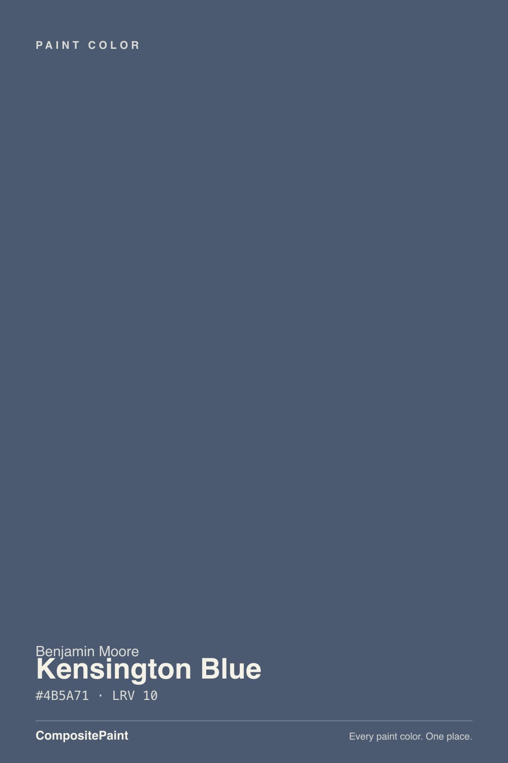
What separates it from its more famous shelfmates is saturation, not depth. Line the hex codes up: Hale Navy (#495264) mutes its blue with a heavier gray wash; Van Deusen Blue (#48637A) leans a full step toward teal-green. Kensington Blue (#4B5A71) sits between them in weight but keeps more actual blue in the mix than either — it reads as the "truest" navy of the three, the one that never quite lets you call it gray or green. At LRV 10 it is nearly as dark as Hale Navy (LRV 6), just light enough that real daylight keeps the blue legible instead of collapsing into a near-black shape.
Undertone in one line: cool, saturated blue — no green flash, no violet flash, no surprise. If your sample looks flat and colorless, that is a light problem, not an undertone problem; this color needs real light to prove it is blue at all.
Where It Shines
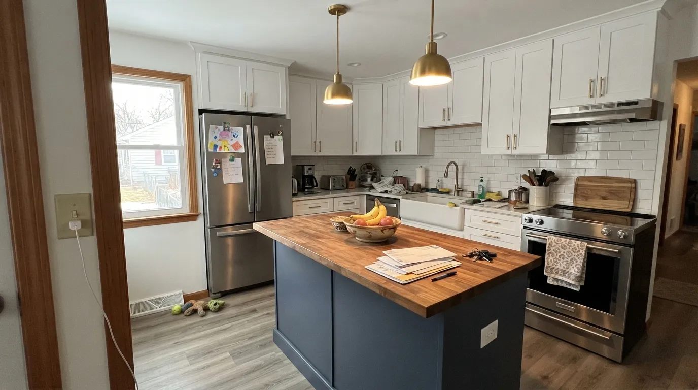
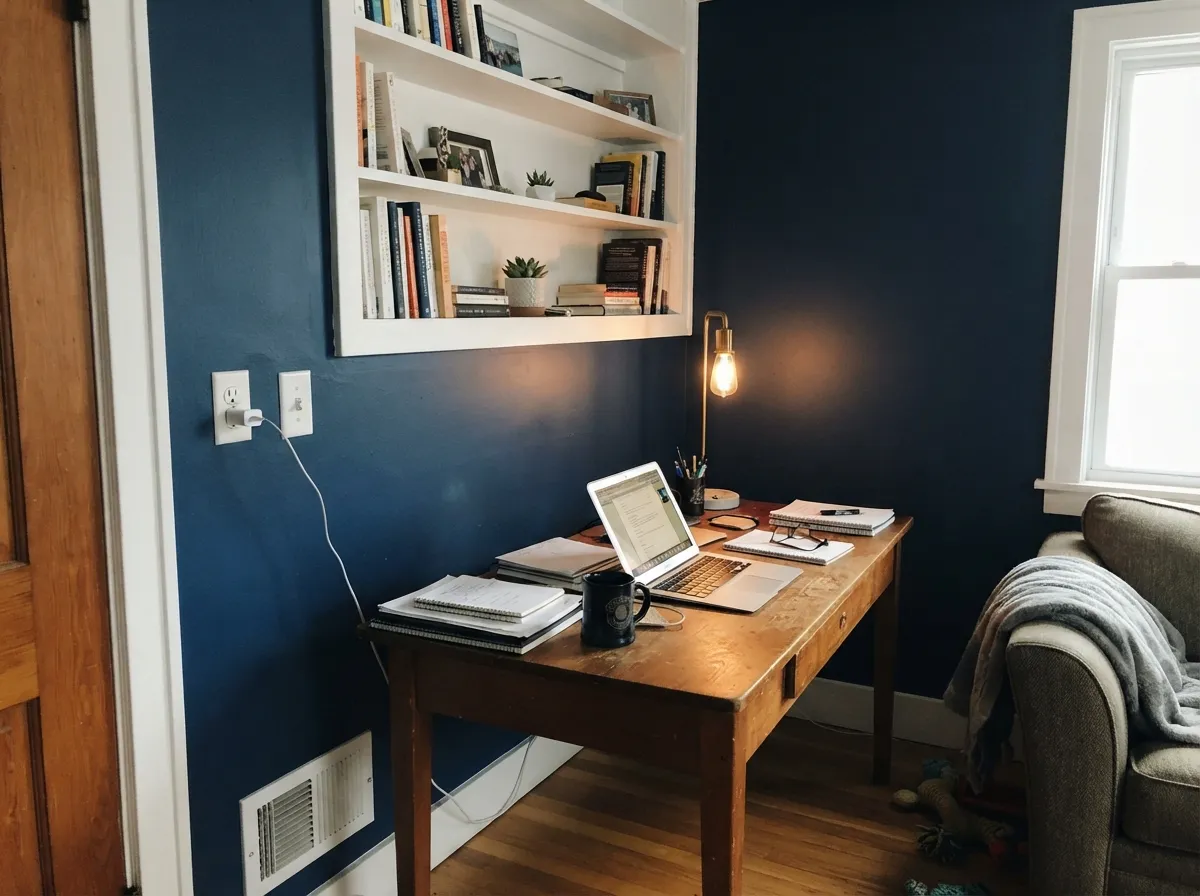
Give it a kitchen island under pendant lights, a front door that catches morning sun, or a study with a window and it earns its keep immediately. It is the paint equivalent of a good navy blazer: dressy without being loud, and it flatters brass hardware, black hardware, and warm wood equally well — a rarer trick than it sounds. The best-documented real-world use of this exact color is a painted kitchen island under white perimeter cabinets, where the contrast does the work and the blue reads as intentional, not accidental.
Where It Fails
The complaint pattern for a color this dark is predictable before the first coat, and Kensington Blue follows it closely — there just isn't a large public paper trail of angry reviews to quote, because it hasn't sold in the volume Hale Navy has. That is useful information on its own: this is a safer bet than its lack of reputation suggests, provided your room matches the light it needs.
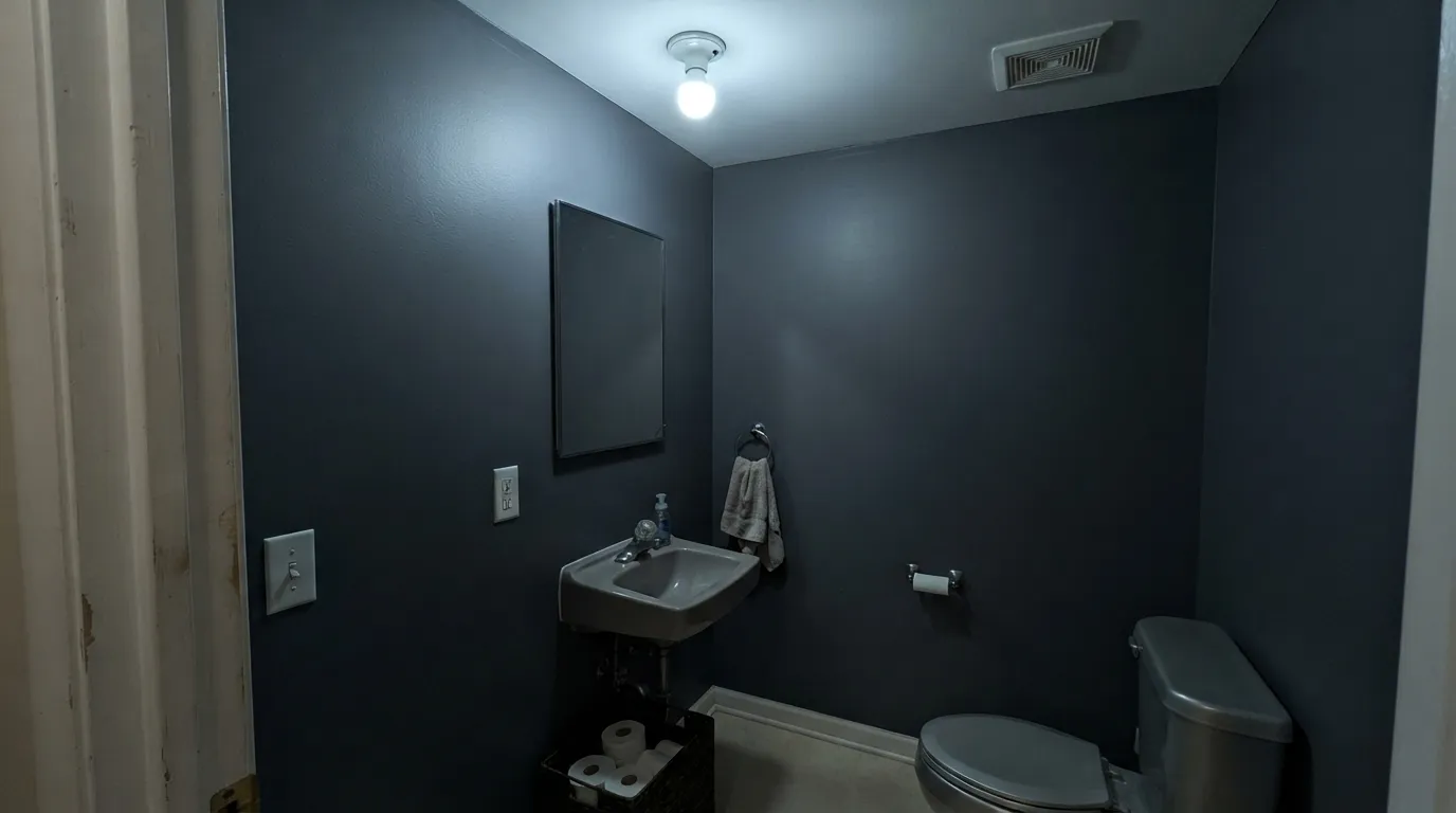
At LRV 10 this color depends on daylight or a warm lamp nearby to read as blue instead of a flat dark shape. A windowless powder room or a hallway lit only by a cool LED overhead will look like any other near-black paint — the blue simply disappears. Test the actual sample in the actual room before committing four walls to it.
SW Naval sits at LRV 4, close to black; Kensington Blue's LRV 10 is meaningfully lighter and more legibly blue by comparison. If you saw a moody, almost-black navy room and want that exact effect, Kensington Blue will look too blue and too light next to it — pick Naval instead.
A cool blue this saturated needs something warm to argue with — brass, walnut, leather, a warm white trim. Paired only with cool grey stone or chrome and nothing warm nearby, the whole room can tip cold and a little flat instead of rich.
Room by Room
A painted island under white perimeter cabinets is the look people search for by name. Satin cabinet enamel, brass or unlacquered hardware, warm wood counters or floor — the contrast is what makes it read expensive rather than heavy.
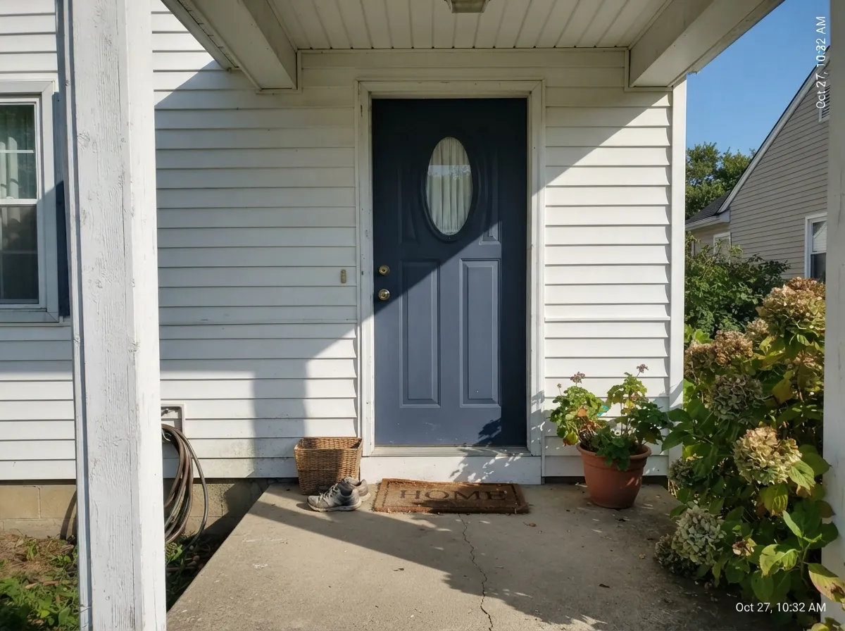
A morning-sun front door on a white or light-gray house reads crisp and confident. Semi-gloss, and step up to a brighter white trim than you would use indoors — full sun forgives contrast that a dim interior can't.
Closed rooms with a desk lamp and a window do well here; the color reads focused and grounded rather than dark, especially with a warm wood desk and a brass task lamp.
Works well as an accent wall or built-ins with south or west light; a full four-wall living room needs genuinely good daylight or it goes flat by late afternoon.
Under warm 2700K bulbs it turns calm and cocooning at night. A north-facing bedroom with no lamp plan will read as a dark blob, not a color.
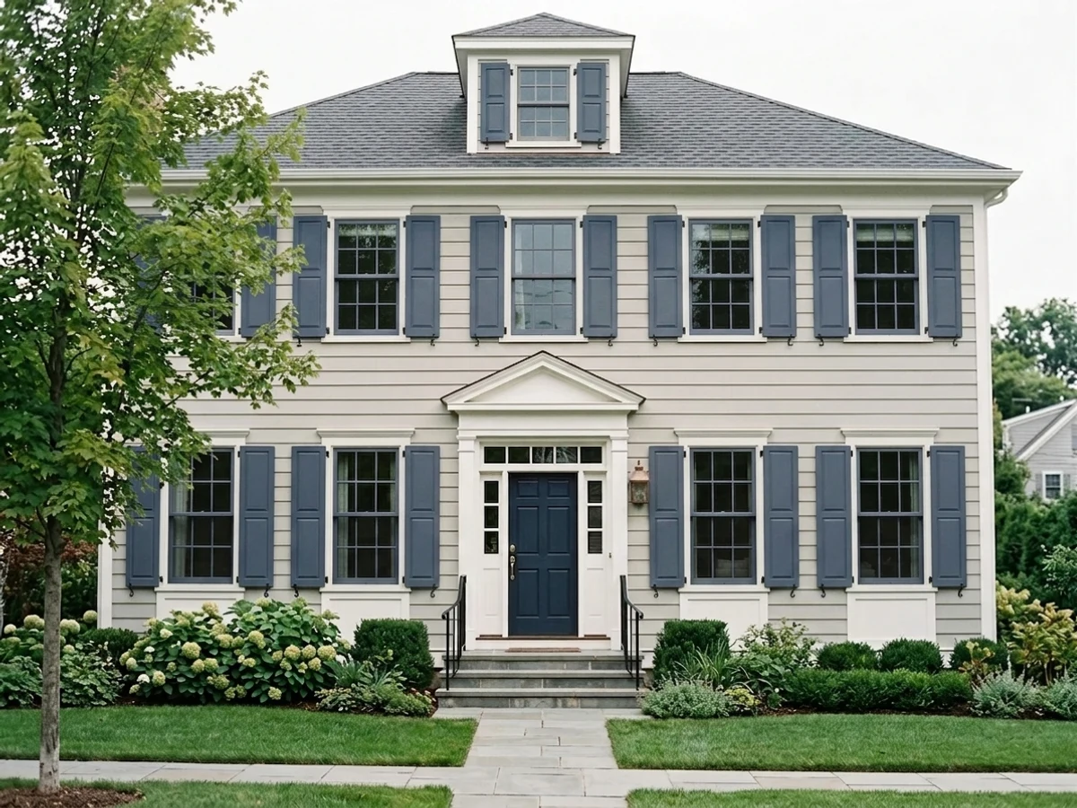
Full outdoor sun keeps the blue legible against white or cream siding; it is a classic, safe shutter color that doesn't need the same light coaching interiors do.
Your Light Is the Risk
The blue stays fully legible and a touch lighter than Hale Navy at the same depth — this is where the color earns its saturation.
Without a warm light source it collapses toward a flat dark shape and the blue reads almost gray. Test before committing a windowless room.
Cooler and more saturated at the sun hours, quieter and darker after — a normal, honest shift for a color this deep.
2700K lamps keep it warm-adjacent and cozy at night; cool white bulbs push it toward flat and colorless — swap the bulb before you swap the paint.
Most complaints about Kensington Blue are a light mismatch. Upload a photo of your actual room and see it on your walls — then ask for the same wall in north light or evening lamps before you buy a single sample.
Need It From Another Brand?
Any paint counter can custom-tint Benjamin Moore 840 directly. If you would rather stay in one brand's own deck, these are the closest stock matches, measured as ΔE2000. Under 2 is a difference you will not see on the wall.
| Brand | Closest color | ΔE | LRV | |
|---|---|---|---|---|
| Sherwin-Williams | Mineral GraySW 2740 · Sherwin-Williams | 4.9 | 9 | Color page → |
| Behr | Infinite Deep SeaS500-7 · Behr | 3.7 | 10 | Color page → |
| Valspar | Dark Night4003-4C · Valspar | 2.0 | 10.2 | Color page → |
| PPG / Glidden | Blue FjordPPG1163-6 · PPG / Glidden | 3.4 | 11 | Color page → |
| Glidden | Approaching Storm90BG 11/101 · Glidden | 5.0 | 11 | Color page → |
| Dunn-Edwards | Midnight SunDET580 · Dunn-Edwards | 1.6 | 10 | Color page → |
Similar Benjamin Moore Colors
The nearest shades to Kensington Blue within Benjamin Moore's own range, ranked by perceptual color distance — useful when you want the same look a touch lighter, darker, or warmer.
WCAG 2.1: AA is 4.5 : 1 for normal text, 3 : 1 for large text, AAA is 7 : 1.
Kensington Blue vs the Colors You're Also Considering
Every Kensington Blue sample board has the same rivals on it. The numbers show the real lightness gap — then it comes down to which risk you would rather live with.
Pick this for more actual blue and less gray in the mix — Hale Navy is muted where Kensington Blue is saturated.
Benjamin Moore HC-154 · LRV 6Hale NavyPick this if you want the softer, more gray-diluted navy that photographs well in almost any room.
Pick this for the purer, less green-leaning blue of the two — Van Deusen drifts toward teal, Kensington Blue doesn't.
Benjamin Moore HC-156 · LRV 11Van Deusen BluePick this if you want a touch of teal-green pulling the navy toward the water instead of the sky.
Kensington Blue is listed twice, as 840 and as CC-780, with the same hex #4B5A71 and the same LRV 10. Indi Go-Go CSP-565, LRV 9, is the closest sibling and is a shade deeper and more saturated. Van Deusen Blue HC-156 at LRV 12 is the better-known navy; it is two points lighter and reads greener, so side by side Kensington Blue looks more violet. Evening Dove 2128-30, LRV 10, is the grayed version of the same depth.
Across brands, Diamond Vogel Into the Stratosphere 0627 and Dunn-Edwards Midnight Sun DET580, both LRV 10, are visually identical in normal room light at deltaE 1.38 and 1.60, and Behr Script Ink N540-6, LRV 10, is close behind at 1.92. Valspar Dark Night 4003-4C, LRV 10.2, and C2 Major Tom C2-760, LRV 9, are very close but worth sampling first. Farrow & Ball Stiffkey Blue No. 281 and Sherwin-Williams Mineral Gray SW 2740 are close but visibly different side by side.
Kensington Blue Coordinating Colors
The rule for coordinating with Kensington Blue is the same rule that works for any saturated cool navy: pair it with something warm, and save true grays and stark whites for accents rather than the whole room. Warm-white trim, warm wood, brass and black hardware all pull their weight against it; cold grey stone and chrome are the one combination that can make the whole room feel flat. These are the partners that keep showing up in rooms that work:
Kensington Blue on Kitchen Islands and Cabinets
This is the job Kensington Blue is actually known for. Search for it by name and the pattern is consistent: a single navy island or run of lower cabinets under white perimeter cabinetry, with the island doing all the color work while the rest of the kitchen stays neutral and resells easily. It is a lower-risk move than painting an entire kitchen a saturated blue, and it reads custom rather than trendy because the contrast, not the color alone, is what people notice first.
The pairing that makes it work: a butcher block or warm stone counter, brass or unlacquered hardware, and a pendant light or two directly over the island so the color never sits in shadow. Cool white quartz and chrome hardware are the one combination to test carefully first — nothing warm to argue with can leave the island reading flat instead of rich.
Kensington Blue on Exteriors and Front Doors
Outdoors, full sun is the most forgiving light this color will ever see, and a front door is the lowest-commitment way to use it. Against a white, cream, or light-gray house it reads as a classic, confident navy door with none of the light-dependence that makes it trickier on interior walls — daylight is simply more reliable outside than in most rooms. Brass or black hardware both work; a wreath or planter in warm wood tones finishes the look.
The one detail worth checking before painting: a north-facing or heavily shaded entry alcove behaves more like a dim interior room than an exterior wall, so give it the same test-sample treatment you would give an interior accent wall rather than assuming outdoor light will save it.
Three Ready Palettes Built on Kensington Blue
A color is never alone on the wall. These are complete combinations in the 60-30-10 pattern, with the reason each one holds together. Every one opens in the visualizer.
White Dove keeps the perimeter light and warm so the island reads as the one deliberate color decision in the room; Kendall Charcoal on a range hood or light fixtures adds a second dark note without competing with the blue.
Try this palette in your roomA plain white body with brighter Chantilly Lace trim gives the door enough contrast to read clearly even on a shaded entry wall; outdoors in full sun it is the classic, confident navy-door look.
Try this palette in your roomEdgecomb Gray's warmth keeps the room from feeling cold before the blue arrives; Wrought Iron ties the scheme to black hardware and supplies the darkest note in the room, so Kensington Blue reads as the color, not the shadow.
Try this palette in your roomKensington Blue FAQ
Is Kensington Blue more blue or more gray?
More blue, deliberately. Line it up next to Hale Navy and the difference is saturation: Hale Navy mutes its blue with more gray, Kensington Blue keeps more of the actual color. It never quite reads as a neutral the way some "navy" paints do.
Is it the same as Hale Navy?
No — close in depth but different in character. Hale Navy (LRV 6) is grayer and slightly darker; Kensington Blue (LRV 10) is a touch lighter and noticeably more saturated. Pick Kensington Blue if a Hale Navy sample looked muddy or flat to you.
Does it work on kitchen cabinets or an island?
Yes — it is one of its best-documented uses. A painted island in Kensington Blue under white perimeter cabinets is a common, well-liked look. Use a satin urethane-fortified cabinet enamel and give it brass or black hardware.
What white trim goes with it?
White Dove indoors for a soft, warm pairing; Chantilly Lace or a plain white outdoors on a front door for more crisp contrast. Avoid pairing it only with cool grey stone or chrome with nothing warm nearby — the whole scheme can read cold.
Will it look black in a dim room?
Close to it. At LRV 10 this color depends on real daylight or a warm lamp to read as blue rather than a flat dark shape. If your room is genuinely dim and windowless, look at a lighter blue-gray instead.
Is Kensington Blue a trending color right now?
Not in the loud, Color-of-the-Year sense — it has no major campaign or viral room behind it. It quietly sits in Benjamin Moore's Classics collection as a dependable, less-famous alternative to Hale Navy and Van Deusen Blue, which for a paint color is a pretty good place to be.
Have you painted with Kensington Blue?
Rate it — one tap helps the next reader decide.
Ask a Question