The Best Living Room Paint Colors
Twenty-two living room paint colors that hold up at noon and at lamplight — Pale Oak, White Dove, Accessible Beige, Sea Salt, Evergreen Fog, Hale Navy, Pigeon and more, grouped by light direction, room size, quiet color, and depth.

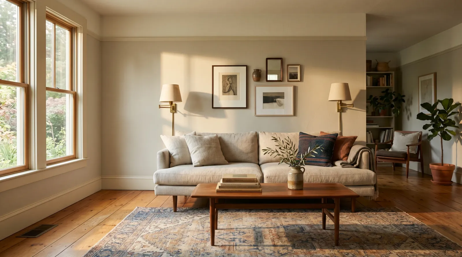
A living room color has to hold up across a demanding stretch of hours. You see it in flat midday light, in long afternoon sun, and in the warm pool of a single lamp at 9pm. No other room asks that. A bedroom gets judged at night, a kitchen at breakfast, but the living room gets judged all day, by you and by everyone who visits.
That is why light decides this, not the chip. The same greige is a warm, held color on the south side of the house and a flat grey-brown on the north side. If you want the reasoning behind that, how light direction changes paint color covers it properly, and LRV explained covers the reflectance numbers I keep quoting below.
So the twenty-two colors here are grouped by the problem you are actually solving — cool north light, a small room, a wall that wants some color without becoming a statement, or a room you want to close in around you. Pick the group first, then pick the color inside it. If none of them land, the living room color hub has the wider shortlist and living room color ideas has real rooms to look at.
What Is the Best Paint Color for a Living Room?
For most living rooms it is a warm neutral in the LRV 55 to 70 band — Benjamin Moore Pale Oak (OC-20), Sherwin-Williams Agreeable Gray (SW 7029), or Sherwin-Williams Accessible Beige (SW 7036). They stay warm when the daylight goes cool, they sit behind any sofa fabric, and they do not argue with the wood already in the room.
Three reasons that band works. First, a living room usually has the most mixed materials of any room in the house — oak floor, walnut table, a wool rug, brass, a television that is a black rectangle no matter what you do. A mid-light neutral is the only wall that lets all of that coexist. Second, that band is bright enough to bounce light around a room that often has windows on only one wall, without going so bright that it glares at 2pm. Third, it survives furniture changes. You will replace the sofa before you repaint.
Deep colors and quiet greens are not the wrong answer — they are just the answer to a different question. Go there when the room has real daylight and you want it to feel like somewhere rather than like a background.
The Everyday Warm Neutrals
These are the colors that fit the most living rooms with the least risk. All six sit between LRV 55 and 70, all six are warm without being beige, and all six will still look right in ten years. If you are choosing under pressure, choose from here. The greige round-up goes deeper on this family.
Benjamin Moore Pale Oak (OC-20)
Pale Oak is the living room neutral I recommend more than any other. It carries enough warmth to feel held in cool morning light and enough grey to stay quiet under afternoon sun. The faint pink in the undertone softens skin tones at dusk, which is what you want in a room you entertain in.
It works in nearly every orientation. North-facing rooms get the most from it, because the pink quietly counteracts the cool daylight. In strong west-facing afternoon sun it warms further toward a soft creamy beige — pleasant, but sample it if you were hoping for grey.
Trim and ceiling: Benjamin Moore White Dove (OC-17) in satin on the trim, same color flat on the ceiling.
Sherwin-Williams Agreeable Gray (SW 7029)
Agreeable Gray earns its name. It sits very close to true neutral with the faintest warm cast, which is why designers reach for it when the rest of the room is busy. In a living room with patterned upholstery, mixed wood tones, and a gallery wall, Agreeable Gray quietly steps back and lets the room be the room.
It is the most light-flexible pick here. North, east, south, west — it holds its character in all four, which makes it the safest answer when you cannot confidently name the orientation. The one shift to watch for is a slight purple-grey cast at dusk under cool LED bulbs; 2700K lamps solve it.
Trim and ceiling: Sherwin-Williams Pure White (SW 7005) in satin on the trim, same color flat on the ceiling.
Sherwin-Williams Accessible Beige (SW 7036)
Accessible Beige is the warmest of the safe neutrals and probably the single most-painted living room color in the country right now. The gold in the base is what does the work — it puts a little life back into a room that gets flat light, and it makes cheap oak flooring look deliberate rather than builder-grade.
Warm afternoon light pushes it further gold. In a west-facing living room at 5pm it can read almost tan, which some people love and some people do not. In a cold north room it can drift slightly flat, and that is the one case where I would step to Revere Pewter instead.
Trim and ceiling: Sherwin-Williams Pure White (SW 7005) in satin on the trim, same color flat on the ceiling. A creamy white next to Accessible Beige makes it look yellow.
Benjamin Moore Revere Pewter (HC-172)
Revere Pewter is the living room greige that almost never misbehaves. Warm enough to feel held in morning light, grey enough to stay quiet at night. The green in the undertone is the important part: it stops the color going pink under warm lamplight, which is where most greiges fall apart once the sun is down and the reading lamp is on.
It sings in east and south-facing living rooms. In a strong north-facing space under 4000K LEDs it can drift green enough to read dusty. Check your bulbs before you judge the sample; under 2700K it stays exactly where you want it.
Trim and ceiling: Benjamin Moore Simply White (OC-117) in satin on the trim, same color flat on the ceiling.
Behr Even Better Beige (DC-010)
Even Better Beige is the Behr answer to Accessible Beige, and it is a genuinely good one. The clay warmth keeps it from going cold under a north window, and there is just enough grey in it that it never tips into yellow the way a straight beige does at 5pm. If you are painting a large open living room and the gallon count matters, this is the one I would use.
Buy it in Marquee or Ultra rather than the base line if the wall is currently a different color — mid-tone greiges are where one-coat claims quietly stop being true. Our interior wall paint round-up covers which lines actually cover in two.
Trim and ceiling: Behr Blank Canvas (DC-003) in satin on the trim, same color flat on the ceiling.
Valspar Filtered Shade (4003-1B)
Filtered Shade is the pick for a living room that already has a lot of warmth in it — orange-toned oak floors, a leather sofa, a brick fireplace. Most greiges add warmth on top of warmth and the room goes amber. This one stays almost perfectly neutral, so the wood reads as the warm thing in the room and the wall does not compete.
The flip side is that it needs those warm materials. In a room with grey flooring and a grey sofa it will go cold and slightly institutional. Do not use it as a general-purpose neutral; use it as a counterweight.
Trim and ceiling: Valspar Bistro White (7006-4) in satin on the trim, same color flat on the ceiling.
Best Living Room Colors for a North-Facing Room
North light is cool, dim, and constant — no direct sun at any hour of the day. It pulls the warmth out of almost everything, turns greys flat, and makes crisp whites look clinical. These four are built to push back. There is more on why in beige and greige undertones.
Benjamin Moore White Dove (OC-17)
The warm white I trust most in a living room. White Dove carries just enough yellow to feel inviting in cool north-facing morning light without drifting into custard at dusk. On long walls with tall windows it gives you the brightness of a white without the chill of a builder pure white, and it is the trim color I recommend under half the wall colors on this page.
Best in north-facing living rooms with one bright window and a lot of cool daylight. In a very bright south-facing room it reads distinctly creamy; step to Simply White if you want a true neutral white there, or see the warm white round-up for the near neighbours.
Trim and ceiling: Same color on the trim in satin, same color flat on the ceiling. A monochrome White Dove envelope is one of the simplest and most flattering wraps in a living room.
Benjamin Moore Edgecomb Gray (HC-173)
Edgecomb Gray is the north-facing living room answer I reach for first when a white feels too plain. It is warm enough to fight the blue cast north light drops on everything, light enough that a dim room does not close in, and greige enough that it never reads as plain beige in the one good hour of light you get.
It is genuinely a north-and-east color rather than a universal one. Put it in a bright south-facing room and the tan comes forward until it reads as a warm beige, which is not what most people are after when they buy it.
Trim and ceiling: Benjamin Moore Simply White (OC-117) in satin on the trim, same color flat on the ceiling. The clean white gives the warm greige an edge to push against.
Farrow & Ball Setting Plaster (No. 231)
Setting Plaster is the specialist pick, and in a north-facing living room it does something no grey can: it actively adds warmth to the light rather than just surviving it. The pink is real but muted — in cool north light it reads as a warm plaster neutral, not a pink room, which is exactly why it has stayed in the deck for decades. At dusk with lamps on, it is the most flattering wall in this article.
Be honest about the risk. In a west-facing room with evening sun it will read distinctly pink, and if that is not what you signed up for you will notice it every single day. Sample it in the actual room before you buy the gallons.
Trim and ceiling: Farrow & Ball Pointing (No. 2003) in eggshell on the trim, same color flat on the ceiling. A cool white makes the pink jump forward.
PPG Sourdough (PPG1084-3)
Sourdough is the budget-friendly version of the same idea — a warm, softly golden neutral that gives a cool room something to hold onto. It sits a step lighter and a step yellower than Setting Plaster, so it works better in a north-facing living room that is also small and needs the reflectance.
Its weakness is strong afternoon sun, where the gold comes forward and it can read faintly yellow-tan against white trim. It is a north and east color; keep it there and it behaves.
Trim and ceiling: PPG Delicate White (PPG1001-1) in satin on the trim, same color flat on the ceiling.
Best Paint Colors for a Small Living Room
Small living rooms — apartment front rooms, narrow row-house parlours, anything under about 140 square feet — need light bounced around and they need the corners to stop announcing themselves. All three of these are above LRV 80 and all three are worth color drenching: same color on walls, trim, and ceiling.
Sherwin-Williams Alabaster (SW 7008)
Alabaster is the small-living-room white for rooms that already get decent daylight. The greige in the base stops it going creamy in afternoon sun, so it stays a white rather than an off-white, and against a white sofa or white shelving it holds its own instead of looking dirty by comparison. That is a real problem with warmer whites and it is worth knowing before you paint 400 square feet of it.
Its weak spot is a cold north-facing room, where the grey base comes forward and it can read slightly flat. In that case go to White Dove or Shoji White instead. Shades of white has the full comparison if you are stuck between three chips.
Trim and ceiling: Same color on the trim in satin, same color flat on the ceiling. If you want a little definition, Benjamin Moore Chantilly Lace (OC-65) on the trim gives a crisper edge without a color change.
Behr Blank Canvas (DC-003)
Blank Canvas is the highest-reflectance pick here, and in a genuinely dark small living room — one window, or a window shaded by a porch — that extra bounce is worth having. It is warm enough not to go blue in a room lit mostly by lamps, which is where cooler bright whites fail badly after sunset.
It is not the pick for a bright room. Above about LRV 84 in strong daylight you start getting glare off the wall itself, and a room that bright is tiring to sit in. Save it for the dark ones, and budget two coats.
Trim and ceiling: Same color throughout, flat on the ceiling and satin on the trim. In a small room, skip the trim contrast entirely.
Valspar Bistro White (7006-4)
Bistro White is the most neutral of the three — bright, warm enough to avoid the blue chill, but without the yellow that makes some warm whites look aged next to a modern sofa. In a small living room with contemporary furniture and black window frames, this is the one that keeps the scheme crisp rather than cottagey.
Watch it against a warm oak floor. With honey-toned wood it can read slightly cool by contrast, and you will want either a warmer white or a rug to bridge the two.
Trim and ceiling: Same color on the trim in satin, same color flat on the ceiling.
Living Room Colors With a Hint of Color
These are for people who want the wall to be something without wanting a statement. All four are muted, low-chroma, and shift through the day — which is what makes them feel alive on a long wall instead of flat. Sage and grey-green are the story of 2026 living rooms, and this is why: they read as a neutral from across the room and as a color up close.
Sherwin-Williams Sea Salt (SW 6204)
Sea Salt is the living room color for people who want a hint of color without committing to one. It reads green in some light and blue-grey in other light, and that gentle shift is what makes it feel alive instead of flat. In a coastal-leaning room with linen drapes, pale wood, and natural fibres, it drapes the room in a way a true neutral cannot.
It is at its best in east and south-facing rooms with real daylight. In a dim north-facing living room it flattens into a generic pale grey and loses the green that made it interesting in the first place.
Trim and ceiling: Benjamin Moore White Dove (OC-17) in satin on the trim, same color flat on the ceiling. A pure white trim makes Sea Salt read slightly clinical; a warm white lets the sage come forward.
Sherwin-Williams Evergreen Fog (SW 9130)
Evergreen Fog is a full step deeper than Sea Salt and it changes what the room does. At LRV 30 the wall becomes the darkest surface in a light room, which is the classic way to make a seating area feel gathered rather than scattered. It is green enough to feel considered without being a color anyone would describe as green, and it is one of the few sages that does not go minty under LED.
It works in almost any orientation. In strong afternoon light the grey comes forward and it reads nearly neutral; in a dimmer room the green settles in. Both versions are good. Pair it with warm brass and unbleached linen — see colors that go with sage for the wider palette.
Trim and ceiling: Sherwin-Williams Pure White (SW 7005) in satin on the trim, same color flat on the ceiling.
Benjamin Moore October Mist (1495)
October Mist sits neatly between the two above at LRV 47, which is the most useful spot on the sage scale for a living room with average light. Light enough not to darken the room, deep enough that the color actually registers on a long wall. The faint yellow is what keeps it from going cold, and it is why it looks so right against oak and rattan.
In a room lit by cool 4000K bulbs it can shift toward a dusty grey-green that reads slightly dull. Warm bulbs bring the color back. In strong direct sun it lifts and looks almost celadon.
Trim and ceiling: Benjamin Moore Swiss Coffee (OC-45) in satin on the trim, same color flat on the ceiling. The warm cream keeps the green from going grey at the edges.
Farrow & Ball Pigeon (No. 25)
Pigeon is the living room color you choose when you want the wall to do half the design work. It carries the chalky pigment depth Farrow & Ball is known for, and it shifts through the day — slate-grey at 10am, soft sage at 2pm, almost olive at dusk under warm lamplight. In a room with panelled walls or historic millwork, very little else looks quite right.
It needs daylight to earn its keep. In a dim north-facing living room it flattens into a generic mid-grey and you have paid a premium for nothing. Best in east, south, and west-facing rooms with real light coming in.
Trim and ceiling: Farrow & Ball Pointing (No. 2003) in eggshell on the trim, same color flat on the ceiling. The warm yellow-cream brings Pigeon’s green forward instead of letting it go grey.
Deep and Cozy Living Room Colors
Dark living rooms have stopped being a risk and started being a choice. The rule that matters: a deep color needs either real daylight or three separate light sources after dark. Give it one ceiling fixture and it will read as a cave every evening of its life.
Benjamin Moore Hale Navy (HC-154)
Hale Navy is the deep living room color I trust most. It reads navy in daylight and almost black-blue under lamplight — dignified at 3pm, cocooning at 9pm. Against warm oak, brass, and a vintage wool rug it does the slow grown-up thing a bright accent wall never will. The grey in it is what keeps it out of nautical territory.
It needs light. In a south or west-facing living room with afternoon sun, Hale Navy glows. In a small north-facing room it goes flat and slightly grey, which kills the exact mood you painted it for. Colors that go with navy covers the upholstery and accent choices that keep it from going heavy.
Trim and ceiling: Benjamin Moore White Dove (OC-17) in satin on the trim, same color flat on the ceiling. The soft cream warms the navy without fighting it. Pure white ceilings against Hale Navy go icy.
Sherwin-Williams Naval (SW 6244)
Naval is a full step darker and a shade truer blue than Hale Navy. Where Hale Navy hedges toward slate, Naval commits — at LRV 4 it is very nearly a dark neutral, and on all four walls of a living room with a fireplace and built-ins it produces the library effect people are usually chasing.
It is unforgiving of bad drywall. At this depth every seam, patch, and roller lap shows under raking window light, so skim and sand properly first, and use a matte or flat rather than eggshell. On a single fireplace wall it is much more forgiving and still gives you most of the drama.
Trim and ceiling: Sherwin-Williams Pure White (SW 7005) in satin on the trim, ceiling in the wall color for full drench or Pure White flat if you want the room to feel taller.
PPG Chinese Porcelain (PPG1160-6)
Chinese Porcelain is the deep blue for people who want the color to actually read as blue rather than as near-black. There is enough chroma in it to survive lamplight without collapsing into charcoal, which is what separates it from most navies once the sun goes down. In a living room with white trim, warm wood, and a lot of books, it looks considered rather than dark for the sake of it.
It is a color, not a neutral, so treat it that way. It fights orange-toned wood and terracotta tile; it flatters walnut, brass, cream, and anything faded and indigo.
Trim and ceiling: PPG Delicate White (PPG1001-1) in satin on the trim, same color flat on the ceiling.
Sherwin-Williams Urbane Bronze (SW 7048)
Urbane Bronze is the warm alternative to a navy, and in a living room it is often the better call. Because the base is brown-green rather than blue, it stays warm under lamplight instead of going cold, and it sits beautifully against oak, leather, and black metal window frames. On a fireplace wall with a dark stone surround it is close to unbeatable.
Full-room drench works if the room has a big window. In a room with average light I would put it on one wall or on built-in shelving and keep the rest in a warm neutral — the contrast is what makes the depth read as deliberate.
Trim and ceiling: Sherwin-Williams Alabaster (SW 7008) in satin on the trim, same color flat on the ceiling. The warm white is what keeps the scheme from going grim.
Farrow & Ball Dead Salmon (No. 28)
Dead Salmon is the warm mid-tone that has quietly taken over from grey in design-led living rooms. The grey in the base is doing all the work — it stops the pink from ever announcing itself, so what you get is an enveloping, dusty clay wall that flatters skin, wood, and almost every textile in the room.
It is unusually stable across the day, which is rare for a color this warm: soft and earthy at noon, deep and glowing under lamps. Where it struggles is next to cool grey furniture, which it makes look blue. Commit to the warm scheme or pick something else.
Trim and ceiling: Farrow & Ball Pointing (No. 2003) in eggshell on the trim, same color flat on the ceiling.
Trim, Ceiling, and Sheen
The wall color gets all the attention and the trim decision does more work. A warm neutral against a cold builder white looks unfinished, because the trim reads as the “real” white and the wall reads as dirty by comparison. Match the temperature: warm wall, warm white trim. There is more on getting that relationship right in choosing paint color against trim.
For sheen, the living room default is eggshell on the walls, satin or semi-gloss on trim and doors, flat on the ceiling. Eggshell survives a vacuum cleaner and a dog and still wipes clean, and it does not turn a table lamp into a hot spot the way satin walls do. On a deep color, drop to matte — sheen exaggerates every drywall flaw and a dark wall has nowhere to hide. Our sheen guide has the full trade-off, and best trim paint covers which enamels level out without brush marks.
Ceilings are worth one sentence: a flat white ceiling is the safe default, but in a room with a deep wall color, taking the ceiling to the same color one shade lighter removes the harsh line at the top of the wall and makes the room feel taller rather than shorter. Ceiling paint picks covers the products that spatter least overhead.
Open Plan and Accent Walls
Most living rooms now open onto a kitchen or a dining area, which means the wall color is not really a living room decision at all. The rule I use: one neutral runs continuously through the shared space, and a second, deeper color is used on a defined element — an island, a fireplace wall, a run of built-ins. Where two colors meet, break them at an inside corner or a door casing. A color change mid-wall always looks like a mistake, even when it was not. Color flow in an open floor plan works through the sightline rules properly.
On accent walls specifically: the version that works is a deeper shade of the same family as the main wall, or a deep neutral like Urbane Bronze or Hale Navy on the wall that already has an architectural reason to be different — the fireplace, the wall behind the shelving. The version that does not work is a bright contrast color on a random wall, which reads as an unfinished paint job to everyone except the person who chose it.
Colors to Avoid in a Living Room
Cool grey. Repose Gray and its neighbours are still perfectly good paints, but a cool grey living room now reads as a specific decade rather than as neutral, and it goes lifeless the moment the daylight drops. If you want grey, take the warm side of the family.
Pure builder white on the walls. It is not actually neutral. In north light it goes blue and clinical; at 9pm under warm lamps it goes yellow. A warm white like White Dove or Alabaster is the same idea done properly.
High-gloss on large wall areas. Every lamp and every window becomes a bright reflection, and every drywall seam becomes visible under raking afternoon light. Save the shine for the trim.
A color chosen from the store’s lighting. Paint stores run bright, cool, overhead fluorescents that almost nobody has at home. A chip that looks like a gentle greige under that light can be flatly beige in your actual room.
How to Choose Between Them
Start with the room, not the color. If the living room faces north, pick White Dove, Edgecomb Gray, Setting Plaster, or Sourdough. If it is under about 140 square feet, pick Alabaster, Blank Canvas, or Bistro White and drench walls, trim, and ceiling in it. If you have real daylight and you want the wall to be something, go to Sea Salt, October Mist, Evergreen Fog, or Pigeon. If you have real daylight and you want the room to close in around you at night, go to Hale Navy, Naval, Chinese Porcelain, Urbane Bronze, or Dead Salmon. If you cannot confidently name the orientation, Agreeable Gray or Pale Oak is the safe default and always has been.
Then test properly. Buy three sample pots, paint letter-sized swatches on poster board rather than on the wall, and prop them against the wall behind the sofa. Look at them three times: at 10am, at 3pm, and at 9pm with only the lamps on. Then move each board into the darkest corner of the room, because that is where a color fails first — a greige that looks warm on the bright wall can go a flat grey-brown four feet from the window.
If you want to see a color on your own living room wall before any of that, upload a photo of the room to the visualizer and try the shortlist on it. It is the cheapest version of the test, and it eliminates the obvious misses before the sample pots even arrive. When you have landed on one, the living room paint calculator will tell you how many gallons the room actually takes.
Ask a Question