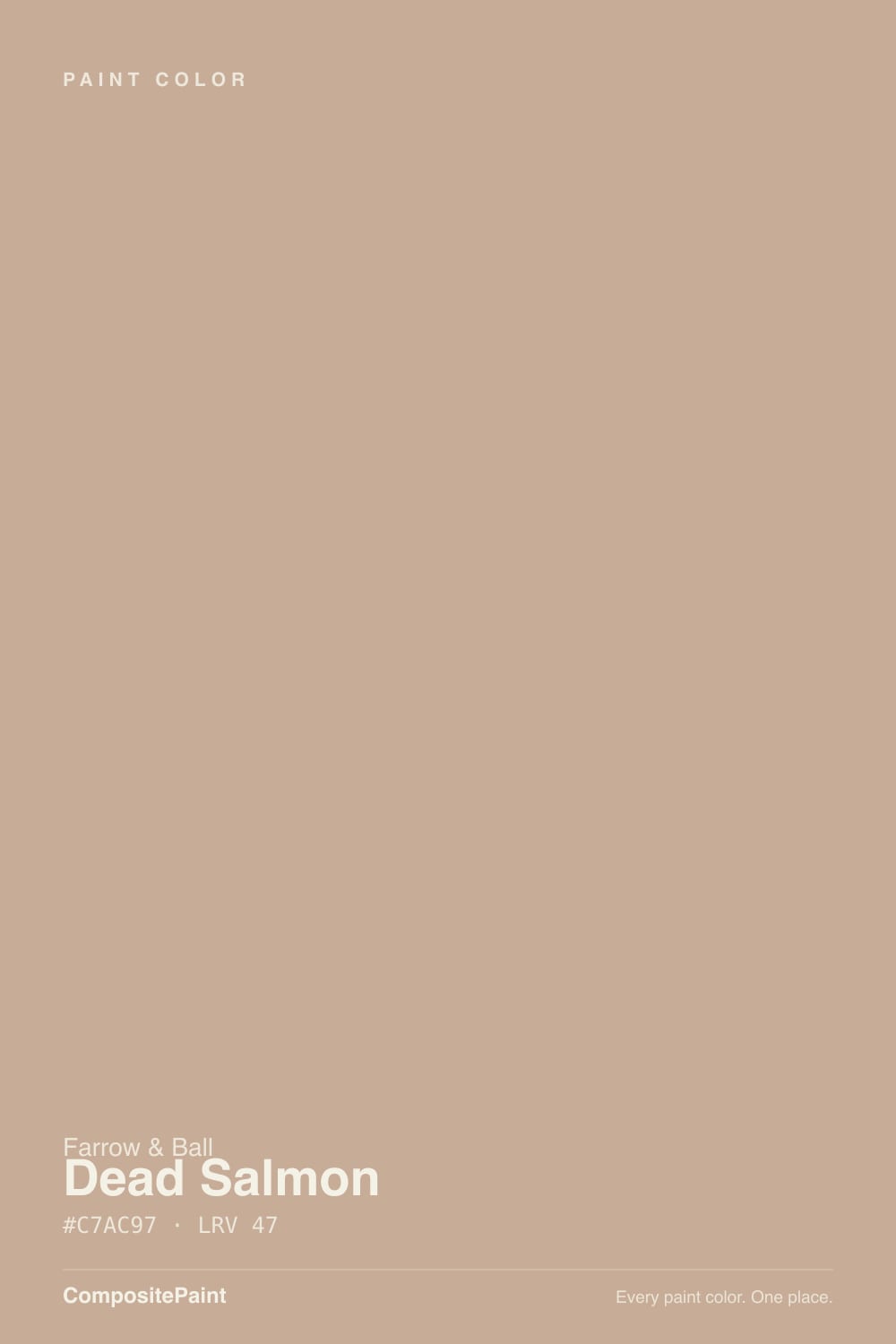
Dead Salmon
The cult muted pink-beige, reviewed honestly: the rooms where it turns historic and velvety, the light that strips it to drab mushroom, and what to pick instead.

Jessica has spec'd whites and neutrals for more than 300 rooms and keeps a sample wall of painted drawdowns in her studio. Every color review is checked against real reader rooms in the comments and re-tested when a formula changes. About the testing process →
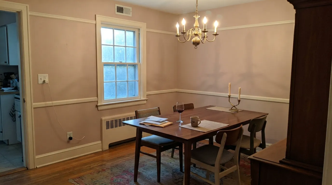
- 1Anonymous20
- 2Felted Wool28
- 3Dead Salmon35
- 4Revere Pewter55
- 5Agreeable Gray60
The Fast Verdict
Dead Salmon is Farrow & Ball's most famous argument in a can: a mid-tone mushroom-pink that some people swear is brown and others swear is salmon, and both are looking at the same wall. Named for an 1805 painter's invoice at Kedleston Hall — dead meaning matt, salmon meaning the colour — it became the brand's social-media signature because it looks expensive, historic, and slightly unwell in the best way. Buy it for candlelit dining rooms and lamplit bedrooms. Do not buy it hoping for pink.
Candlelit dining rooms · snug bedrooms with warm lamps · kitchen cabinets and color-drenched powder rooms · historic interiors that want pink without candy
You actually wanted a true pink or a true beige · the room is dim and north-facing · honey oak floors are staying · your trim stays a cool bright white
- Genuinely complex pink-beige — historic and expensive-looking when the light is right
- Mid-tone (LRV 35) with enough body to color-drench a dining room or powder room
- Excellent on kitchen cabinets as a dose instead of another navy
- Pairs beautifully with walnut, brass, linen, and warm off-whites
- A real F&B signature: the name is famous, the rooms that work are distinctive
- Not reliably pink — buyers expecting salmon often get drab mushroom
- Dim north light strips the warmth and leaves a heavy, lifeless brown
- Fights honey oak, orange stain, and cool bright-white trim
- Too shifting and too mid-tone for most exteriors or a no-risk whole-house neutral
What Color Is Dead Salmon, Really?
A muted, earthy pink-beige with a brown-mushroom body — and the split personality is the whole point. Farrow & Ball colour curator Joa Studholme, who has used it extensively in her own home and ranks it in her personal top ten, puts it plainly: some people see mushroom, some people see pink, and it is certainly more pink in very bright light. The name is not a dead fish. It comes from a painter's invoice for the library at Kedleston Hall, dated 1805: dead described the flat, chalky finish, salmon the colour. Farrow & Ball files it with the browns. Instagram files it with the pinks. The wall does both.
At LRV 35 it is a genuine mid-tone, the same depth as Pigeon, not a pale wash and not a mood-cave. Setting Plaster sits at LRV 56 — the paler, crisper plaster-pink that started a design trend. Dead Salmon is the richer, older cousin: more body, more brown, less candy. Four walls will read a step deeper and more colored than the chip, which is why testers who loved a small square sometimes panic once the room wraps. Plan for mid-tone. It will not brighten a dark room.
Undertone in one line: warm salmon first, mushroom-brown second — never blue, never yellow-ochre the way Setting Plaster is. If your sample reads drab taupe, the light is cold or dim. If it reads clearly pink, that is south sun or 2700K lamps doing it. Both versions are the same paint being honest about the room, which is why the name keeps winning arguments on the internet.
Where It Shines
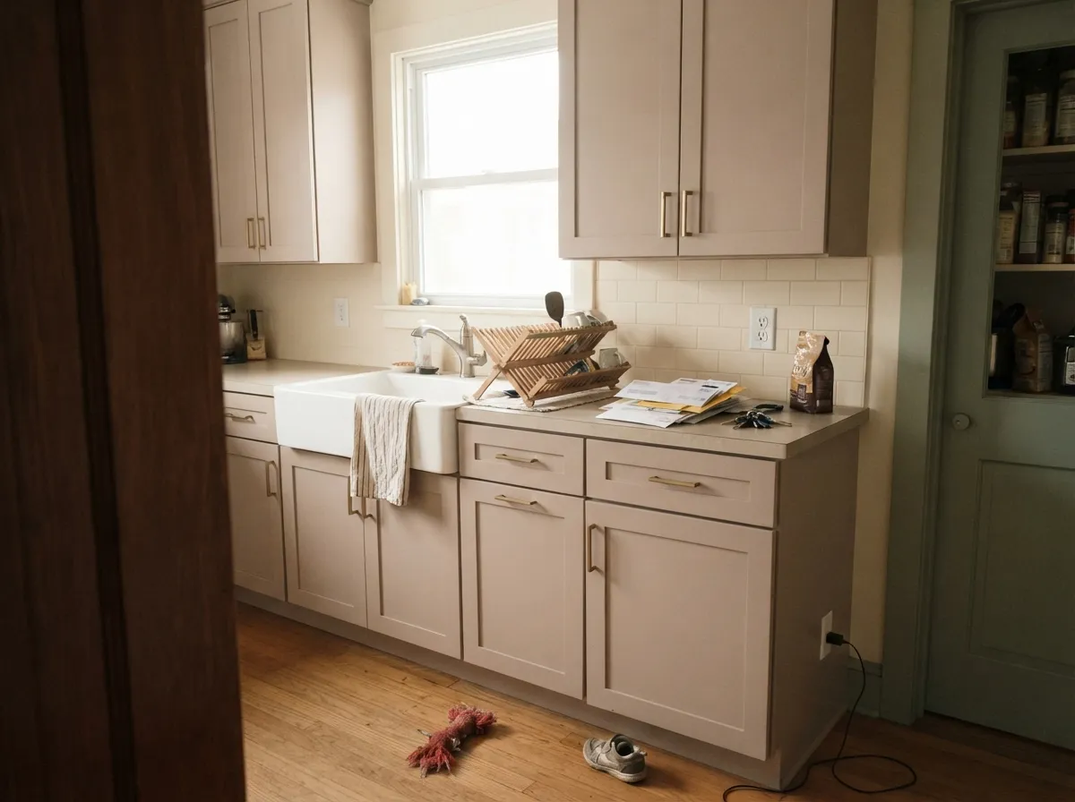
Give it warm light and this color earns the cult following. Farrow & Ball itself sells it as a backdrop for candlelit dining rooms, and that is still the best job: under 2700K lamps or actual candles the brown recedes, the salmon comes forward, and the room feels historic without a costume. Its second home is the dose, not the whole house — satin cabinets, a color-drenched powder room, a snug bedroom — where the muted pink-beige reads custom instead of themed. Walnut, unlacquered brass, linen, and a warm off-white like Pointing are the company it was mixed for.

Where It Fails
Almost every regret story about Dead Salmon follows one of three scripts, and all three are visible on a sample board before anyone opens a gallon. None of them are the paint's fault — but if your room matches one, this is not your pink-beige, and a bigger sample will only confirm it.
On the chip, and in the Instagram close-up, it looks like faded salmon. On four walls in ordinary daylight it often does not. Owners post the patch that 'does not look pink' next to rosier samples and call it drab. Joa is not being poetic: a lot of people see mushroom. If a true dusty pink is the brief, Setting Plaster is the F&B answer. Dead Salmon is a brown that remembers being pink.
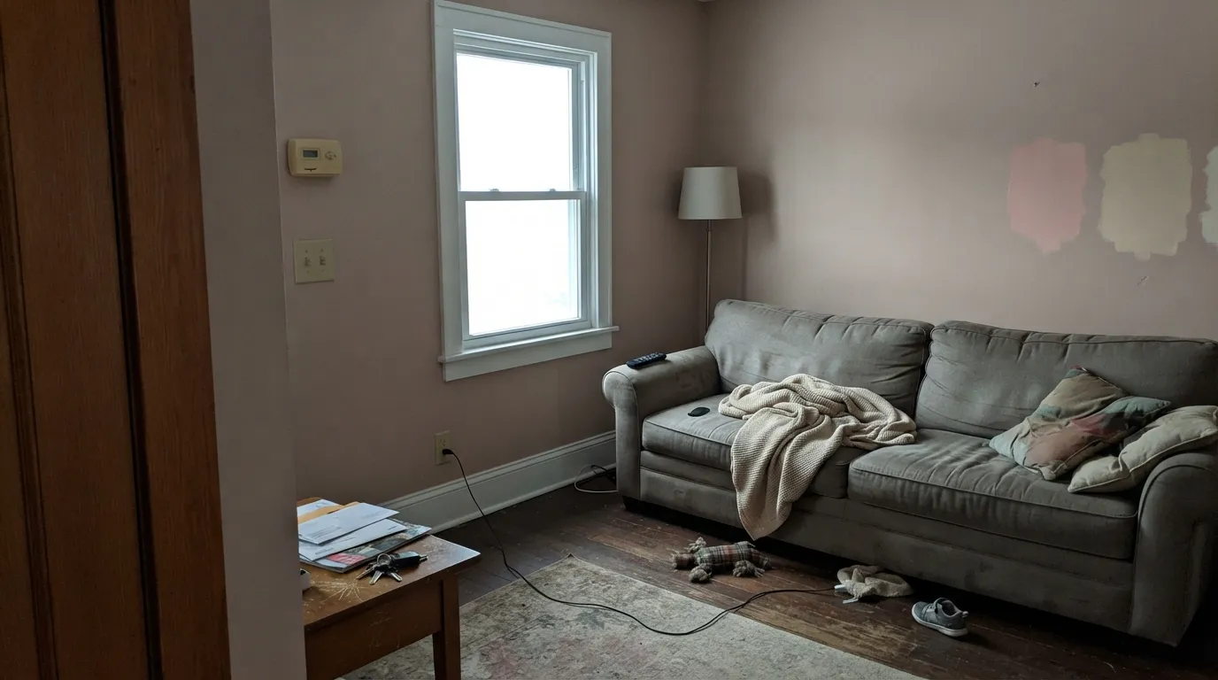
Cool grey daylight strips the salmon and leaves a heavy, lifeless mushroom that readers describe as dingy. Mid-tone plus cold light is a mud formula, not a historic one. If the room faces north and you will not add 2700K lamps, pick Setting Plaster (lighter, more pink) or a greige with no pink to lose, like Pashmina.
Golden oak and orange builder stain sit across the wheel from this muted pink-brown, so the floor goes more orange and the wall goes bruised. A cool, bright trim white does the other damage: it makes the walls look fleshy and dirty by comparison. Dead Salmon wants walnut or pale oak, and a warm off-white on the woodwork — Pointing, Slipper Satin, or White Dove — never a gallery white.
Room by Room
This is the job Farrow & Ball wrote the copy for. Color-drench the walls in matte, keep Pointing or Slipper Satin on the trim, light it with 2700K or candles, and the mushroom-pink turns velvety instead of drab. Walnut table, linen, unlacquered brass. Open to a cool-grey kitchen is the one dining-room fight — give both rooms the same warm trim white.
A south- or west-facing bedroom with cream linen and warm bulbs is the snug, grounding version designers keep recommending. Matte or Estate Emulsion; Pointing or White Dove on trim. North bedrooms need the lamps as part of the paint job or the walls go heavy. White bedding, not yellow-beige, which reads dirty against it.
Satin or Modern Eggshell on shaker boxes under Pointing or Dimity walls is the grown-up alternative to another navy island. It loves unlacquered brass, copper, and warm stone; it fights honey-oak boxes you were hoping to keep. A whole kitchen of Dead Salmon walls plus boxes is a strong bet — beautiful in a closed, lamplit galley, loud in an open white loft.
Works in a closed, lamplit living room with walnut, linen, and art. Riskier in open plans, where a mid-tone pink-brown has to negotiate with whatever the kitchen and hall are doing. Sample the darkest wall, not the sun patch. If the rest of the house is cool grey, this will look like a different property.
Small rooms take the depth well. Wrap walls, trim, and even the ceiling in one colour, change only the sheen, and a windowless powder room reads intentional instead of leftover. Keep bulbs at 2700K — cool vanity LEDs will taupe it overnight. A full bathroom with grey stone or blue tile is a different argument; the pink-brown will look dirty against cool stone.
Full sun pinks it harder than any interior sample, and shade drops it to a muddy mushroom that reads as faded from the street. A sheltered front door on a stone or cream house is the only honest exterior job, in Full Gloss or Exterior Eggshell. For a whole facade, this is the wrong depth and the wrong undertone.
Your Light Is the Risk
Bright, warm light is when the salmon actually shows — the pink Joa promised. The wall reads buff-pink, not brown, and this is the colour people thought they were buying.
Cool grey daylight kills the pink and leaves a heavy mushroom-taupe. Fine if you wanted brown; disappointing if you sampled it as salmon. Add lamps or pick something paler.
Pinker at the sun hours, browner in shade and on overcast mornings — the 'dead salmon' early-light complaint from owners who love it at night. Watch a sample at 8am and 6pm.
2700K lamps and candles bring the historic salmon-warmth Farrow & Ball sold it for. 4000K LEDs flatten it to taupe-brown — swap the bulbs before you repaint.
Most complaints about Dead Salmon are a light mismatch. Upload a photo of your actual room and see it on your walls — then ask for the same wall in north light or evening lamps before you buy a single sample.
Need It From Another Brand?
Any paint counter can custom-tint Farrow & Ball No. 28 directly. If you would rather stay in one brand's own deck, these are the closest stock matches, measured as ΔE2000. Under 2 is a difference you will not see on the wall.
| Brand | Closest color | ΔE | LRV | |
|---|---|---|---|---|
| Sherwin-Williams | Threshold TaupeSW 7501 · Sherwin-Williams | 1.8 | 34 | Color page → |
| Behr | Postmodern MauvePPU5-15 · Behr | 1.5 | 35 | Color page → |
| Benjamin Moore | Whispering Woods1012 · Benjamin Moore | 1.3 | 35 | Color page → |
| Valspar | Faint Maple2008-9C · Valspar | 2.4 | 35.8 | Color page → |
| PPG / Glidden | Cuppa CoffeePPG1076-4 · PPG / Glidden | 1.9 | 36 | Color page → |
| Glidden | Cuppa CoffeePPG1076-4 · Glidden | 2.2 | 36 | Color page → |
Similar Farrow & Ball Colors
The nearest shades to Dead Salmon within Farrow & Ball's own range, ranked by perceptual color distance — useful when you want the same look a touch lighter, darker, or warmer.
WCAG 2.1: AA is 4.5 : 1 for normal text, 3 : 1 for large text, AAA is 7 : 1.
Dead Salmon vs the Colors You're Also Considering
Every Dead Salmon sample board has the same rivals on it. The numbers show the real lightness gap — then it comes down to which risk you would rather live with.
Pick this when you want the richer, older, more historic version of that idea, with real mid-tone body.
Farrow & Ball No. 231 · LRV 56Setting PlasterPick this if you want the paler, crisper plaster-pink that started the trend — more clearly pink, less mushroom, and it holds warmth better in a dimmer room.
Pick this when the pink-brown is the point, not an accident you might get in certain light.
Farrow & Ball No. 229 · LRV 52Elephant's BreathPick this if you want the F&B chameleon that reads beige, grey, or faintly pink depending who's asking — lighter, greyer, safer as a whole-room neutral.
Templeton Pink (No. 303) shares the same LRV of 47 but reads as a cleaner, slightly more lifted pink-beige. Choose Dead Salmon when you want a dustier, more grounded clay tone, and Templeton Pink when you want the blush to feel a touch fresher.
Jitney (No. 293), LRV 46, is close in lightness but leans more toward neutral greige, with less obvious pink. If Dead Salmon looks too rosy in your light, Jitney is the calmer, more taupe alternative at nearly the same brightness.
Smoked Trout (No. 60), at LRV 41, is darker and more muted. It gives you a similar warm putty character with more depth and shadow, which suits rooms where you want the walls to feel a little moodier. Sample all three side by side, since the differences are subtle on a chip but obvious across a full wall.
Dead Salmon Coordinating Colors
The rule for coordinating with Dead Salmon: warm off-whites, olive greens, and near-blacks — and keep cool greys and golden woods at arm's length. It wants cream more than beige, walnut more than honey, brass more than chrome. These are the partners that keep showing up in rooms that work:
Kedleston Hall, a Cult Name, and Why Instagram Will Not Let Go
The name is the brand in miniature. An 1805 invoice for painting the library at Kedleston Hall called the finish dead salmon — dead for the matt, salmon for the hue — and Farrow & Ball kept the wording. Colour curator Joa Studholme has used it throughout her own house and still lists it in her top ten. CNN titled a whole brand history 'Dead Salmon and Elephant's Breath.' Farrow & Ball does not name a Color of the Year; it does not need to. The oddball name did the marketing.
That is why the colour became a social-media signature: it photographs as expensive muted pink in warm light, then owners discover the mushroom. Joa's own favourite scheme pairs it with a deep red on the lower wall, Dead Salmon above. If you came here from a Reel and the chip looks browner than the thumbnail, believe the chip in your actual light, not the thumbnail. The rooms that work — dining rooms at night, cabinets, a snug bedroom — are still the reason the name stuck.
Dead Salmon With Wood Tones and Floors
This decision gets made at the floor. Walnut, teak, espresso and pale unstained white oak are the easy yes — the cooler or redder brown lets the salmon read as atmosphere instead of flesh. Terracotta tile, limestone and warm marble with brown veining sit comfortably against it. Cream linen and unlacquered brass are the textiles and metals it was waiting for.
The honest no is golden: honey oak floors, orange builder stain, yellow-beige carpet, honey-oak kitchen boxes you hoped to keep. Yellow-orange exaggerates the pink-brown until the wall looks bruised and the wood looks pumpkin. A large rug helps a hallway; it will not save a kitchen. If that floor is staying, Pashmina or Elephant's Breath keep a muted warm wall without the fight.
Metals are simple: unlacquered brass, antique bronze, copper and aged nickel all work. Polished chrome is the one that leans showroom-cold and makes the walls look dated. Matte black hardware is fine; it is not as flattering as brass.
Three Ready Palettes Built on Dead Salmon
A color is never alone on the wall. These are complete combinations in the 60-30-10 pattern, with the reason each one holds together. Every one opens in the visualizer.
This is the historic F&B dining-room recipe: mid-tone pink-brown walls, a warm off-white on the woodwork so the walls do not look dirty, and one near-black note so the scheme reads deliberate. Off-Black is the soft black that flatters whatever sits next to it. Light it warm.
Try this palette in your roomWhite Dove keeps the edges soft without the icy contrast that makes Dead Salmon look fleshy. Pelt is the aubergine that reads black until the light finds it — one deep note, same warm family, so the bedroom goes velvety at night instead of themed-pink.
Try this palette in your roomDimity is the warm cream that belongs in sunny F&B kitchens, so the cabinets can carry the colour without the whole room going mushroom. Calke Green is a warm heritage sage that reads olive, not gray-green — the classic complement that stops the pink-brown from floating. Brass hardware, not chrome.
Try this palette in your roomDead Salmon FAQ
Is Dead Salmon pink or brown?
Both, depending on the light — and that is the honest answer, not a dodge. Joa Studholme says some people see mushroom and some see pink, and it is more pink in very bright light. On four walls in ordinary rooms a lot of owners get brown first. If you need it to read pink all day, Setting Plaster is the more reliable F&B pink. If brown-with-a-memory-of-salmon is interesting to you, this is the colour.
What trim white goes with Dead Salmon?
A warm off-white. Pointing is the in-family default; Slipper Satin if you want a quieter English cream; White Dove if your painter is in Benjamin Moore. A cool bright white makes the walls look fleshy and slightly dirty — the most common pairing mistake with this colour. Eggshell on the trim, matte on the walls.
Does it work in a north-facing room?
Only with warm lamps as part of the plan. North light strips the salmon and leaves a heavy mushroom that people describe as drab. In a north dining room that you actually use at night, 2700K bulbs can still make it beautiful. In a north bedroom you never lamp, it will not. Sample the actual wall on an overcast morning before you commit.
How is it different from Setting Plaster?
Setting Plaster is paler (LRV 56) and a touch more crisp — the plaster-pink that started a design trend, built on yellow ochre. Dead Salmon is deeper (LRV 35), browner, more mushroom, more historic. Designers who find Setting Plaster too sweet often land here; people who find Dead Salmon too heavy often go back to Setting Plaster. They are cousins, not twins.
Does Dead Salmon work with oak floors?
Depends on the oak. Walnut, teak, espresso and pale unstained white oak are excellent. Golden honey oak is the clash: yellow-orange pushes the walls toward bruised pink-brown and the floor toward pumpkin. A large rug is a patch, not a cure. If that floor is staying wall-to-wall, Pashmina keeps the mood without the fight.
Is it good on kitchen cabinets?
Yes — as a dose. Satin Dead Salmon boxes under a warm cream wall (Pointing or Dimity) look custom and less expected than navy. A whole kitchen of this colour on walls and boxes is a closed-room, lamplit decision. Use a durable satin or Modern Eggshell, and do not pair it with honey-oak remaining boxes or cool grey stone.
Have you painted with Dead Salmon?
Rate it — one tap helps the next reader decide.
Ask a Question