Calke Green
Farrow & Ball's warm, olive-leaning sage from a Calke Abbey breakfast room, reviewed honestly: the light where it turns golden, the exact rooms it disappoints in, and what to pick instead.

Jessica has spec'd whites and neutrals for more than 300 rooms and keeps a sample wall of painted drawdowns in her studio. Every color review is checked against real reader rooms in the comments and re-tested when a formula changes. About the testing process →
- 1Essex Green6
- 2Vintage Vogue12
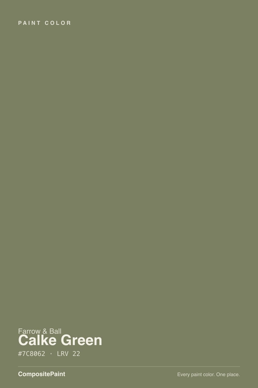
- 3Calke Green22
- 4Evergreen Fog30
- 5Clary Sage41
The Fast Verdict
Calke Green is Farrow & Ball's own definition of a sage — not the pale, gray-green kind that flooded American kitchens after 2022, but a deeper, warmer, distinctly yellow-leaning olive named for a National Trust breakfast room in Derbyshire. At LRV 22 it sits at true cabinet-and-woodwork depth: dark enough to read as a real color decision, light enough to still look green rather than black in a photo. The undertone is the whole story here — this is a warm sage, and shoppers hunting for the cool, blue-green kind (usually meaning Farrow & Ball's own Green Smoke) end up surprised by how yellow it reads next to that sample.
Kitchen cabinets and islands · dining rooms and breakfast rooms with warm morning light · front doors and exterior masonry (F&B sells a matched exterior line) · anyone who wants a green that reads antique English country house, not 2023 sage-cabinet trend
You want a cool, blue-leaning sage · your kitchen runs on cool white LED downlights with no daylight backup · you're working to a big-box paint budget · you want a pale, barely-there green
- A genuine heritage color — traced to a real historic room, not invented for a trend cycle
- Warm, settled olive-sage that reads expensive on cabinets and paneling
- Sold in a matched exterior masonry finish rated for years outdoors
- Washable, mold-resistant interior finish built for kitchens and bathrooms
- Depth (LRV 22) that hides scuffs and fingerprints far better than a pale sage
- Genuinely yellow-warm — disappointing if you wanted a cool blue-green sage
- Cool LED light without daylight backup turns it muddy olive-brown
- Farrow & Ball pricing is a real premium over big-box paint
- Reads dingy next to a stark, cool white — needs a warm neutral partner
What Color Is Calke Green, Really?
Calke Green takes its name from Calke Abbey, a National Trust house in Derbyshire, England, where Farrow & Ball found the original shade in the breakfast room and cleaned it up for the modern deck. That pedigree matters more than marketing trivia — this is one of the handful of F&B colors built directly off a specific historic room rather than a studio blend, and it shows in the finished wall: it reads old, settled and slightly dusty rather than crisp or graphic.
At hex #7C8062 and LRV 22, it sits at almost exactly the same lightness as Sherwin-Williams Dried Thyme and Retreat, two of the closest American cabinet greens in our own deck (both LRV 21). But look at what's underneath the number: Calke Green's blue channel is the lowest of the three, which is the technical way of saying what testers keep saying in plain English — this is the warmest, most yellow-leaning of the group. One side-by-side comparison against Farrow & Ball's own better-known green, Green Smoke, called Calke Green noticeably too yellow for a moody blue-green brief. That's not a flaw; it's the identity of the color.
Undertone in one line: warm olive-sage with a genuine yellow cast — never blue, never gray enough to pass as a true sage-gray. If your sample looks murky or brownish, that's a cool bulb or a north room starving it of daylight, not the paint misbehaving; if it looks almost khaki in strong sun, that's honest too — this color leans that direction on purpose.
Where It Shines
Give it a kitchen with real daylight, wood and brass, and Calke Green does exactly what English country-house colors are built to do. It's become a fixture in cabinet-and-wallpaper kitchen pairings that design blogs keep circling back to — Farrow & Ball's own guidance pairs it with a soft, warm off-white on the walls rather than anything stark, keeping the whole room in one warm family instead of setting up a fight. Its second home is the front door: it's one of the F&B colors sold in a matched Exterior Masonry finish, built to hold color on brick, render and stucco for years, not just months.
Where It Fails
Almost every disappointed take on Calke Green comes down to the same mismatch: someone wanted a cooler, grayer, more greige-adjacent sage and got a genuinely warm, yellow-leaning olive instead. None of these are the paint failing — they're the undertone being honest. But if your room or your expectation matches one of these, this is not your green.
Calke Green is warm first. Testers comparing it directly to Farrow & Ball's own Green Smoke — the brand's more famous blue-green — call Calke Green noticeably yellower. If you pinned a cool, spa-like sage to your mood board, this will read too golden on the wall. In our deck, SW Evergreen Fog or BM October Mist sit closer to a true gray-green.
At LRV 22 this color needs light to work with, and cool 4000K-plus LEDs pull the yellow toward a flat, muddy olive-brown instead of a clear sage. Under-cabinet and can lighting should run warm (2700K); a kitchen lit entirely by cool overhead cans is the most common source of regret.
Farrow & Ball doesn't reach for a bright white on its own sample cards — the brand's guidance pairs it with a soft, warm off-white instead. Put Calke Green cabinets next to icy white counters or trim and the green looks dingy by contrast; a warm cream trim keeps the room in one family.
Room by Room
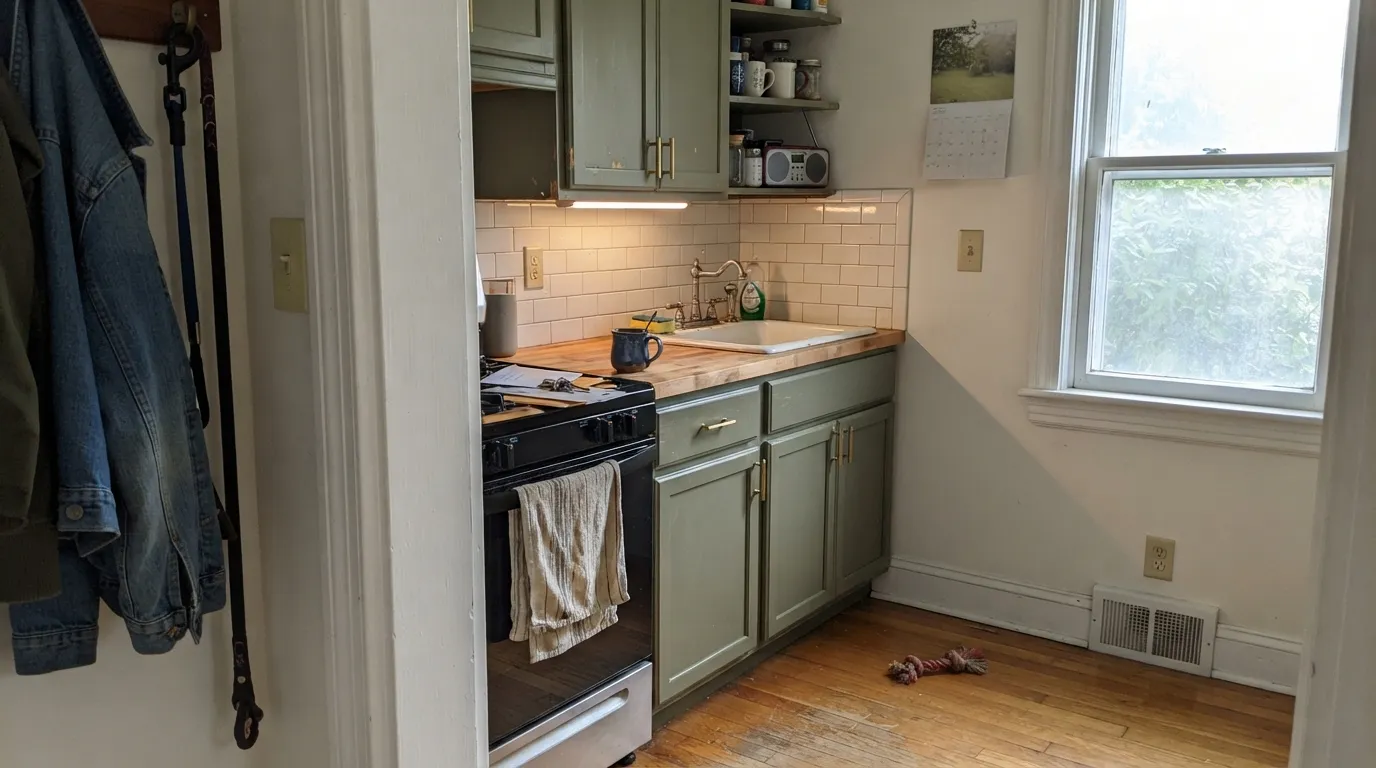
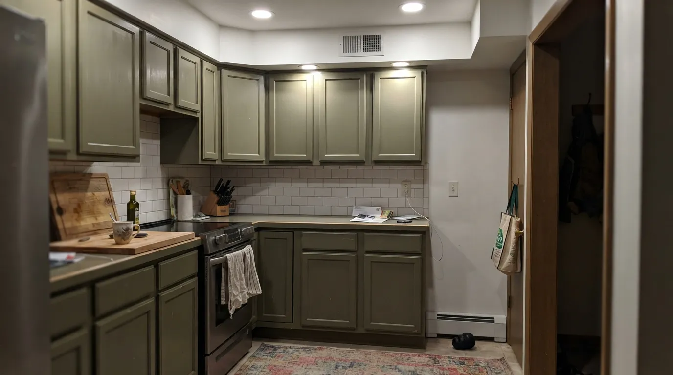
Cabinets, islands and paneling are where this color earns its reputation. Farrow & Ball's washable interior finish is built for kitchen and bathroom walls, and the warm olive reads settled and expensive against brass hardware and butcher block — it's the color behind most of the heritage-kitchen pairings that keep showing up with botanical wallpaper.
This is quite literally where the color came from — a Calke Abbey breakfast room. Morning light is warm and low-angle, exactly the light this olive-sage flatters most; it's a strong pick for a room used mainly at breakfast and dinner rather than all day under overhead light.
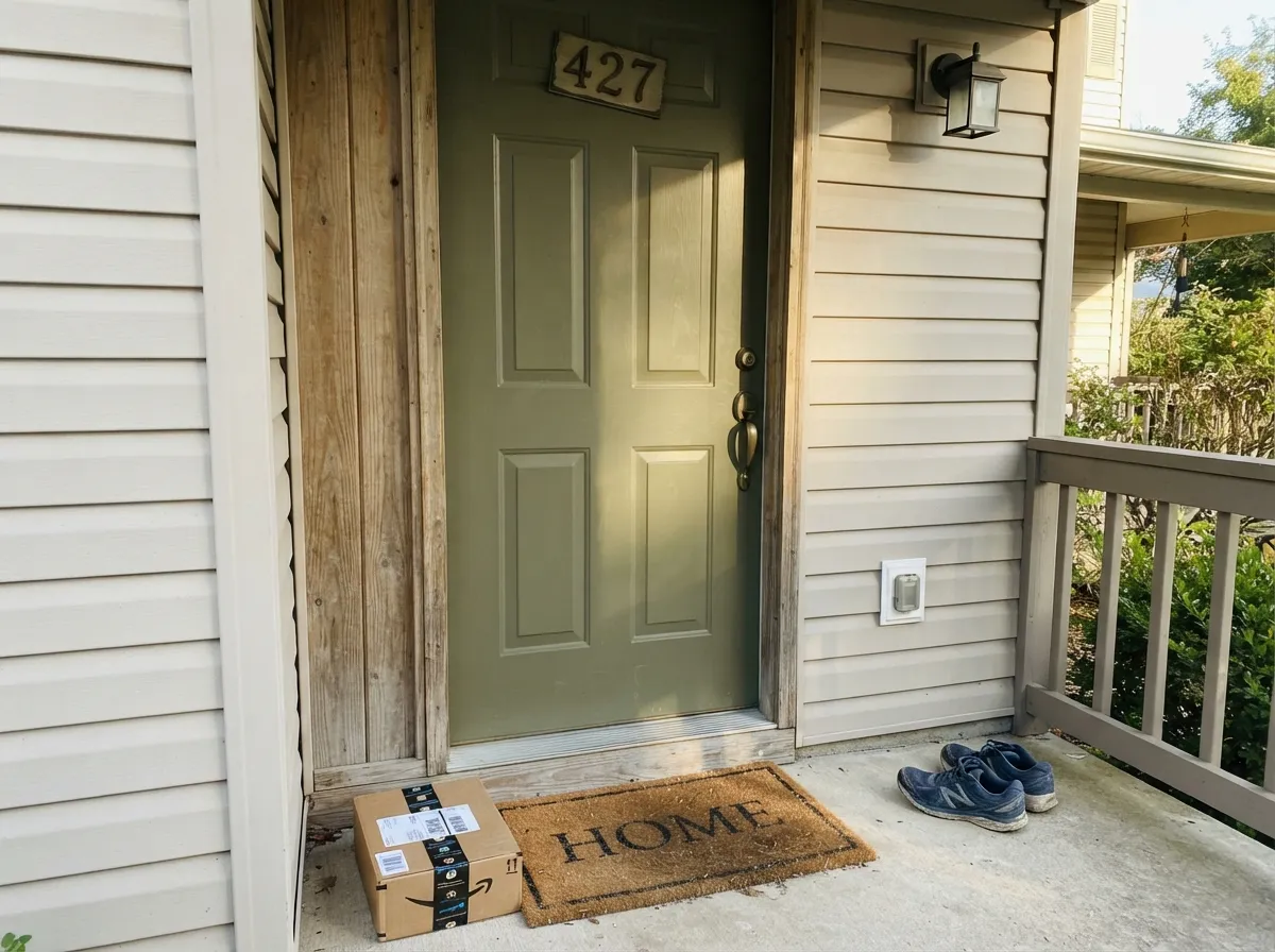
Farrow & Ball sells a dedicated Exterior Masonry version rated to resist flaking and fading on brick, render and stucco. On a front door or shutters against a light-neutral house, it reads as a classic English racing-green front door rather than the sage-cabinet trend.
The same depth that works on cabinets works on a mudroom's lower walls or bench — dark enough to hide scuffs and coat-hook marks, warm enough not to feel cold when you walk in from outside.
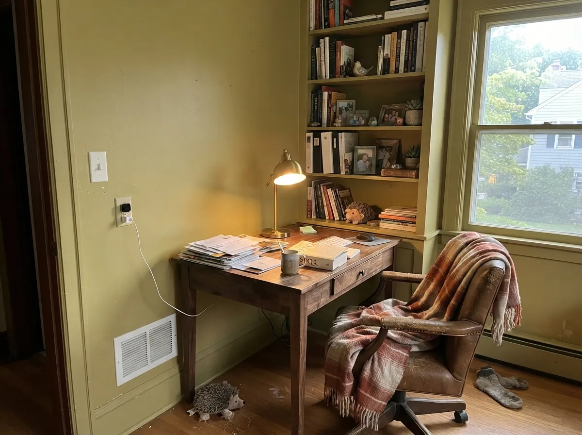
On its own, walls and woodwork together, it makes a small study feel like a library. Best with warm wood shelving and brass task lighting; skip it if the room only gets flat afternoon north light.
The washable Modern Emulsion finish is mold-resistant enough for a bathroom, and it looks rich against brass fixtures and a warm wood vanity. In a windowless powder room lit only by a cool overhead fixture, add a warm sconce or skip it — see the fails section.
Your Light Is the Risk
The light it was named for. Low-angle warm sun through an east-facing breakfast room brings out the sage without pushing it toward khaki.
No daylight backup, cool-temperature bulbs: the warmth drains out and it reads as a flat, muddy olive-brown. Swap to 2700K before blaming the paint.
Warmest and most sage-green near sunrise and sunset; flattest and most olive-brown under harsh midday overhead light.
2700K warm bulbs push it toward a cozy, deep olive at night. Cool white bulbs flatten it and can make it look almost khaki-brown.
Most complaints about Calke Green are a light mismatch. Upload a photo of your actual room and see it on your walls — then ask for the same wall in north light or evening lamps before you buy a single sample.
Need It From Another Brand?
Any paint counter can custom-tint Farrow & Ball No. 34 directly. If you would rather stay in one brand's own deck, these are the closest stock matches, measured as ΔE2000. Under 2 is a difference you will not see on the wall.
| Brand | Closest color | ΔE | LRV | |
|---|---|---|---|---|
| Sherwin-Williams | Gallery GreenSW 15 · Sherwin-Williams | 2.8 | 22 | Color page → |
| Behr | Gazebo GreenMQ6-16 · Behr | 2.5 | 21 | Color page → |
| Benjamin Moore | Cedar Path454 · Benjamin Moore | 0.7 | 23 | Color page → |
| Valspar | Ginkgo Tree5006-4B · Valspar | 2.6 | 22 | Color page → |
| PPG / Glidden | Wright Quiet GreenFLLW618 · PPG / Glidden | 1.2 | 21 | Color page → |
| Glidden | Awning Stripe Green70GY 22/165 · Glidden | 3.1 | 22 | Color page → |
Similar Farrow & Ball Colors
The nearest shades to Calke Green within Farrow & Ball's own range, ranked by perceptual color distance — useful when you want the same look a touch lighter, darker, or warmer.
WCAG 2.1: AA is 4.5 : 1 for normal text, 3 : 1 for large text, AAA is 7 : 1.
Calke Green vs the Colors You're Also Considering
Every Calke Green sample board has the same rivals on it. The numbers show the real lightness gap — then it comes down to which risk you would rather live with.
Pick this for the more distinctly yellow-olive cast — Dried Thyme reads a touch grayer and cooler by comparison.
Sherwin-Williams SW 6186 · LRV 21Dried ThymePick this if you want the same warm cabinet-green depth from an American brand at American paint-store prices.
Pick this if you specifically want the olive-yellow warmth Retreat was built to soften.
Sherwin-Williams SW 6207 · LRV 21RetreatPick this for a slightly cooler, grayer cabinet green at nearly the identical depth — Retreat calms the yellow down.
Sap Green No. 199 (hex #747C51, LRV 19) is the closest sibling but reads noticeably greener and a touch darker. It has less of Calke Green's warm khaki softness, so choose Sap Green when you want the color to clearly say green, and Calke Green when you want an earthier, more olive result.
Green Smoke No. 47 (LRV 19) goes the other way. It is a cooler, grayer, more blue-leaning green, so in the same light it looks calmer and less yellow. Pick Green Smoke for a smoky, restful room and Calke Green when you want warmth and a bit more energy.
Dibber No. 312 (hex #7E775B, LRV 18) and Broccoli Brown No. 198 (LRV 18) both slide toward brown. Next to them Calke Green looks distinctly green rather than muddy, which is the deciding factor if you want the yellow-green to stay legible.
Calke Green Coordinating Colors
The rule for coordinating with Calke Green matches Farrow & Ball's own sample cards: stay warm. It wants a soft, warm off-white rather than a stark one, welcomes brass and warm wood without hesitation, and pairs well with a near-black for contrast rather than a cool charcoal. These are the closest partners in our own deck:
Calke Green's Own Story: A Breakfast Room at Calke Abbey
Farrow & Ball built Calke Green directly off a real room: the breakfast room at Calke Abbey, a National Trust property in Derbyshire that spent decades sealed up and largely untouched before it opened to the public. The brand describes the shade as a cleaned version of what they found there — not a reinvention, just the original color with a couple of centuries of grime and fading accounted for.
That origin is why it reads differently than the sage-green wave that hit American kitchens starting around 2022. Most of those colors were built cool and pale, aimed at feeling fresh and Scandinavian. Calke Green was already decades old when Farrow & Ball put it in the deck, and it reads that way on purpose — heavier, warmer, and more like something you'd find already painted in an old house than something you chose off a trend board.
Calke Green With Wood Tones and Floors
Warm wood is this color's natural partner: oak, walnut and butcher block all sit comfortably next to it because the undertones agree. Brass and unlacquered bronze hardware read as intentional rather than trendy against it, which is a big part of why it keeps showing up in heritage-kitchen features.
The one flooring to test carefully is a cool gray — gray-washed wood, gray tile, gray-veined stone. None of them are wrong with Calke Green, but they pull against its warmth instead of extending it, and the green can read slightly more khaki-brown than intended in that company. A big sample board propped against the actual floor, not just the wall, is worth doing before committing to cabinets.
Three Ready Palettes Built on Calke Green
A color is never alone on the wall. These are complete combinations in the 60-30-10 pattern, with the reason each one holds together. Every one opens in the visualizer.
Swiss Coffee keeps the walls warm and soft so the cabinet green never looks dingy by contrast; Wrought Iron on an island or door hardware trim adds the one near-black note the room needs without fighting the olive.
Try this palette in your roomA soft, neutral white body keeps the house calm so the door can carry the color; charcoal shutters echo the green's depth without competing with its warmth — the classic English-cottage front-door formula.
Try this palette in your roomPainting walls and woodwork the same olive-sage turns a small office into a library; a warm cream ceiling keeps the room from feeling like a cave, and a deep brown bookcase interior echoes the same warm family.
Try this palette in your roomCalke Green FAQ
Is Calke Green warm or cool?
Warm. It's a yellow-leaning olive sage, not a blue-green — testers who compare it directly to Farrow & Ball's own Green Smoke consistently call Calke Green the yellower of the two. If you want a cooler sage, look at SW Evergreen Fog or BM October Mist instead.
Is it good for kitchen cabinets?
Yes — it's one of the more common cabinet and island choices in the Farrow & Ball range, and the brand's washable Modern Emulsion finish is built specifically for kitchen and bathroom walls. At LRV 22 it hides scuffs and fingerprints better than a pale sage will.
Can I use it outside, on a front door?
Yes. Farrow & Ball sells a dedicated Exterior Masonry version for brick, render and stucco, claimed to resist flaking and fading for years when applied per their instructions. It's a strong, traditional choice for a front door or shutters against a light-neutral house.
What white goes with Calke Green?
A soft, warm off-white, not a stark bright one. Farrow & Ball's own pairing guidance reaches for a warm neutral rather than anything cool — in our deck, BM Swiss Coffee or BM White do the same job. A cold white trim makes the green look dingy by comparison.
How does it compare to Green Smoke, Farrow & Ball's other famous green?
Green Smoke leans blue-green and reads cooler and moodier; Calke Green is the warmer, more yellow-olive sibling. If your inspiration photo is a deep, almost teal-green door, that's probably Green Smoke, not this color — sample both before you commit.
Is Farrow & Ball worth the price for a color like this?
That's a real trade-off, not a marketing question. You're paying a premium over big-box paint for a hand-crafted-feeling depth of color and a heritage name most American brands don't have an equivalent for. If you just want 'a warm sage,' SW Dried Thyme or SW Retreat get you close to the same LRV 21-22 depth for a fraction of the price.
Have you painted with Calke Green?
Rate it — one tap helps the next reader decide.
Ask a Question