The Best Greige Paint Colors
Twenty-two greige paints that hold their character across light shifts — Revere Pewter, Agreeable Gray, Accessible Beige, Edgecomb Gray, Repose Gray, Pale Oak, Mega Greige and more — grouped by light direction, room size, and how dark you want to go. Hex, LRV, trim pairings.

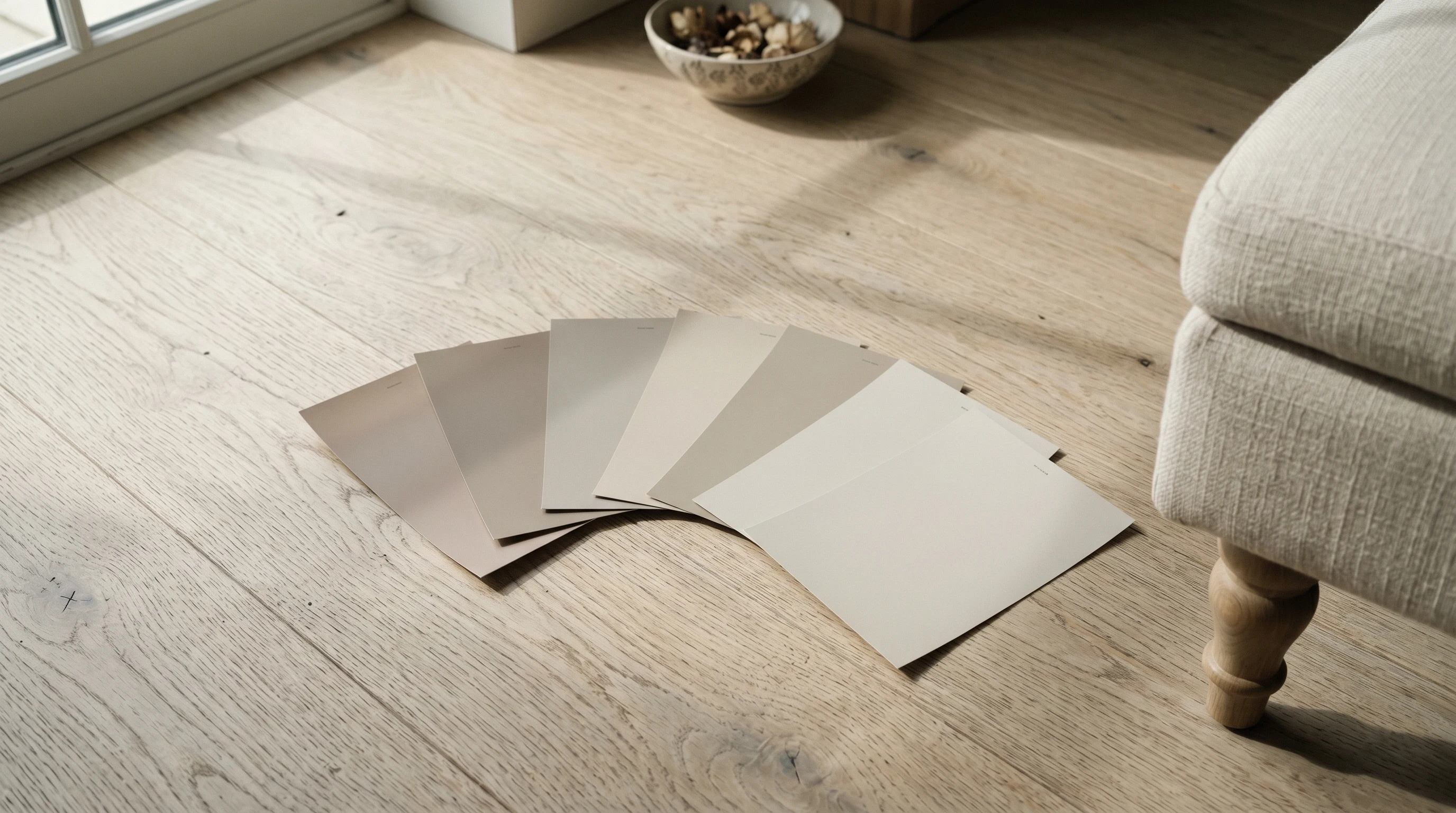
Greige is the color clients ask for when they’ve been burned by a real grey. The grey went blue on a north-facing wall, or cold under the LEDs, or sterile next to oak floors, and now they want “something warmer but still grey.” That’s greige. A grey with enough yellow or brown undertone to keep the room from going clinical, but not so much warmth that it slides into beige.
The trouble is the truce isn’t stable. The same greige sits one way under north-facing morning light and another way under western afternoon sun. The chip in the store rarely tells you which way yours will lean, and the two most common greige disasters — the wall that turned tan and the wall that turned lavender — both start with a chip chosen under fluorescent light in a showroom.
So the twenty-two below are grouped by the problem you’re solving, not by brand. Find the group that matches your room, then choose inside it. If you want the reasoning behind the numbers, LRV explained covers the light-reflectance scale, how light direction changes paint color covers why the same chip behaves differently on the north side of the house, and beige and greige undertones covers the undertone words I keep using. The full greige color hub has the wider deck if none of these land, split further into light greige and dark greige.
What Makes a Color Greige
A frame for the LRV numbers below: LRV is how much light a color throws back, from 0 (black) to 100 (pure white). Greige as a category lives roughly between LRV 37 and 74.
- LRV 65 and up — reads as a warm off-white with a whisper of grey. Good for small rooms and dark rooms. Announces nothing.
- LRV 55 to 65 — the classic greige band. Reads clearly as a color without dominating. This is where Revere Pewter, Agreeable Gray, and Accessible Beige all sit.
- LRV 45 to 55 — you can feel the color now. Good for rooms with real daylight, and the band where greige starts working on cabinets.
- Below LRV 45 — deep greige, drifting toward taupe. Accent walls, islands, exteriors, and libraries.
The other number that matters is the undertone, which no brand prints on the chip. Greiges lean one of four ways: green-yellow (Revere Pewter), gold-brown (Accessible Beige), violet-grey (Balboa Mist), or clean neutral (Repose Gray). The lean is what makes one greige look right over your floors and the next one look muddy. Gray undertones explained walks through how to spot it on a chip before you buy the gallon.
What Is the Most Popular Greige Paint Color?
Sherwin-Williams Agreeable Gray (SW 7029) is the most-used greige in American homes, with Benjamin Moore Revere Pewter (HC-172) second and Sherwin-Williams Accessible Beige (SW 7036) third. All three sit between LRV 55 and 60, all three work in most orientations, and all three are stocked at every store that carries the brand.
Popular is not the same as right for your room, but it does mean something practical: these three have been mixed millions of times, every painter knows how they behave, and the comparison you’re about to run has already been run by everyone else. Our side-by-sides cover the ones people actually agonize over — Agreeable Gray vs Revere Pewter and Accessible Beige vs Agreeable Gray.
Greige, Beige, and Taupe Are Not the Same Thing
People use these three words interchangeably at the paint counter and then get a wall they didn’t order.
Beige is warm and sandy, built on a yellow base. It reads creamy against white trim.
Greige is beige with grey folded in until the yellow stops shouting. It reads grey-brown against white trim, and it changes character through the day in a way beige doesn’t.
Taupe is greige gone deeper and browner, usually with a pink or purple cast underneath, typically below LRV 50. It reads like wet stone.
The line between them is genuinely blurry — Behr Perfect Taupe and Sherwin-Williams Mega Greige are close cousins despite the naming. If you want the wider neutral family, what counts as a neutral color sorts the whole group out.
The Safest Greiges for a Whole House
These four take the most rooms, tolerate the most floors, and are the safest choice when one color has to run through a hallway, a living room, and an open kitchen. If you’re painting an open plan, read color flow in an open floor plan before you commit to a single color everywhere.
Benjamin Moore Revere Pewter (HC-172)
The greige I recommend most often. Revere Pewter holds together better than any of its peers across light shifts. In north-facing morning light it stays a true warm grey — never blue, never cold. In west-facing afternoon sun it warms up just enough to feel held, without sliding into beige. The faint green in the undertone is what stops it going pink under lamplight, which is where most greiges fall apart after dark.
It sits beautifully against oak, walnut, and unlacquered brass. In a north-facing room under 2700K LEDs it stays itself; under 4000K it sharpens into a cleaner grey. If you want one greige to commit to without sampling six, this is the one. Its lighter sibling is covered in Revere Pewter vs Edgecomb Gray.
Trim and ceiling: Benjamin Moore White Dove (OC-17) in satin on the trim, same color flat on the ceiling. A bright blue-white makes Revere Pewter look dingy.
Sherwin-Williams Agreeable Gray (SW 7029)
Agreeable Gray is the greige for people who want grey but won’t tolerate cold. It carries less brown than Revere Pewter and more pure grey, which makes it the safer pick in a modern interior with cool-toned floors and a white kitchen. At LRV 60 it’s bright enough to keep a room open and dark enough to still register as a color.
In strong north-facing light it can lean very faintly violet — a known quirk, not a flaw. In west-facing afternoon light it holds its grey character without warming much, which is exactly what people are buying it for. If your sample looks slightly lavender at dusk, the room is doing what the paint always does. Two useful comparisons: Agreeable Gray vs Repose Gray and Agreeable Gray vs Pale Oak.
Trim and ceiling: Sherwin-Williams Pure White (SW 7005) in satin on the trim, same color flat on the ceiling. The clean white keeps the violet from coming forward.
Sherwin-Williams Accessible Beige (SW 7036)
Accessible Beige is the warm end of the greige range, and the “beige” in the name is honest. On the wall this reads closer to beige than to grey, especially in west-facing afternoon light where it can almost glow. In north-facing morning light it cools back into proper greige territory.
This is the greige for sunlit rooms with warm wood floors and brass fixtures, and it’s the one I’d pick for a living room that needs to feel lived in rather than styled. Not the greige for a dim north-facing den, where it can flatten into something muddy. Pair with cream trim, never with a bright blue-white — the contrast tips the wall into yellow.
Trim and ceiling: Sherwin-Williams Alabaster (SW 7008) in satin on the trim, same color flat on the ceiling. Alabaster is warm enough to keep the pairing quiet.
Benjamin Moore Collingwood (OC-28)
Collingwood is the underrated one on this list. It’s a half-step lighter and cooler than Revere Pewter, and it has a gentleness that photographs well — it’s the color that makes a room look calm in listing photos without looking beige. In practice it behaves like Agreeable Gray with slightly more grey and slightly less gold.
The violet base is real, and in a north-facing room with a lot of cool daylight it can drift a touch mauve. That reads as sophisticated over grey-toned floors and as odd over red oak. Sample it against your actual floor, not against the trim.
Trim and ceiling: Benjamin Moore Simply White (OC-117) in satin on the trim, same color flat on the ceiling. The clean white gives the soft greige an edge to push against.
Warm Greiges for North-Facing and Dim Rooms
North light is cool, dim, and constant. It pulls the warmth out of everything and it will make a cool greige look like wet cement. These three actively add warmth back into the room.
Behr Sculptor Clay (PPU5-08)
Sculptor Clay is Behr’s answer to Revere Pewter, and the match is closer than the price gap suggests. The clay cast in the name is real. There’s a touch more brown in this than in the BM equivalent, which makes it cozier in west-facing light and a shade heavier in north-facing light — heavier being exactly what a dim room usually needs.
In Marquee finish the coverage is good enough that most repaints land in two coats. Best in rooms with warm wood and warm metals; less successful against cool white kitchens, where the brown undertone can read dated next to crisp cabinets. If you like the color but want something with a green rather than brown lean, see Revere Pewter vs Behr Castle Path.
Trim and ceiling: Behr Ultra Pure White in satin on the trim, or Benjamin Moore White Dove (OC-17) if you want the softer edge.
Farrow & Ball Elephant’s Breath (No. 229)
Hex: #C7BEB3 · LRV: 52 · Undertone: warm grey with a magenta core
Elephant’s Breath is the greige with an actual personality. There’s a pink-magenta running under the grey that makes it glow in dim light instead of going flat, which is why it works in north-facing rooms that defeat everything else. Under lamplight in the evening it does something almost no American greige does — it stays warm without turning yellow.
Be honest about the risk. In strong afternoon sun the magenta comes forward and some people read the room as pink. Sample a full board and live with it for two days before you buy. In panelled rooms, dining rooms, and old houses it’s hard to beat.
Trim and ceiling: Farrow & Ball Pointing (No. 2003) in eggshell on the trim, same color flat on the ceiling. A cool white makes the pink jump forward.
Sherwin-Williams Shiitake (SW 9173)
Shiitake is what you paint when Accessible Beige is too light to hold a big room together. At LRV 51 it’s a real mid-tone — it has weight, it takes a shadow well, and it makes white trim look intentional rather than accidental. It’s a mushroom color in the honest sense: warm, slightly muddy, entirely unfussy.
It needs some light. In a windowless room it goes brown and closes in. In a room with one decent window on any side but north, it does the thing people want from greige — it makes the wood in the room look better than it is.
Trim and ceiling: Sherwin-Williams Alabaster (SW 7008) in satin on the trim, same color flat on the ceiling.
Light Greiges for Small and Dark Rooms
Above about LRV 65, a greige stops being a wall color and starts being a warm off-white with a memory of grey. That’s the right move in small rooms, hallways, and any space that needs to bounce light. All six of these are worth drenching — same color on walls, trim, and ceiling — and all six are covered in the wider light greige hub.
Benjamin Moore Edgecomb Gray (HC-173)
Edgecomb Gray is the lighter, gentler cousin of Revere Pewter, and probably the single most useful color in this section. The higher LRV means it reads almost as an off-white in bright south-facing rooms. In dimmer north-facing spaces it settles into a quiet warm greige that flatters linen, oak, and aged brass.
Best in rooms where you want the color to drape rather than declare itself — primary bedrooms, hallways, the kind of room you want to feel held without noticing why. Under cool LEDs it loses warmth and slides toward plain off-white; keep the bulbs at 2700K if you want the greige to stay visible. See also Edgecomb Gray vs Pale Oak.
Trim and ceiling: Benjamin Moore Simply White (OC-117) in satin, or the same color in satin if you’re drenching.
Benjamin Moore Pale Oak (OC-20)
Pale Oak is the whisper. At LRV 69 it barely reads as a color in daylight — it looks like a white that someone warmed up by half a degree — and then at dusk the greige arrives and the walls settle. That two-faced quality is why it’s a favorite in bedrooms and why it frustrates people who wanted to see the color in the store.
The faint pink is the thing to watch. Against a cool grey floor it can read blush. Against oak, jute, and cream it reads as the most flattering white you’ve owned. It’s a strong choice for a small bathroom or a windowless hall.
Trim and ceiling: Same color in satin on the trim, flat on the ceiling. If you want a crisper edge, Benjamin Moore Chantilly Lace (OC-65) on the trim only.
Benjamin Moore Balboa Mist (OC-27)
Balboa Mist is the coolest of the light greiges, and the violet is not subtle once the room is painted. In a south-facing room full of warm sun that violet is a gift — it keeps the wall from going cream. In a north-facing room it can tip fully lavender, which is the most common complaint about this color and entirely predictable.
Use it when your floors and fixtures are cool-toned and a warm greige would clash. Skip it if the room has red oak or orange-toned cabinetry. Edgecomb Gray vs Balboa Mist is the comparison that settles most of these decisions.
Trim and ceiling: Benjamin Moore Chantilly Lace (OC-65) in satin on the trim. A creamy white fights the violet and both lose.
Sherwin-Williams Drift of Mist (SW 9166)
Drift of Mist is the SW answer to Pale Oak and Balboa Mist at once — lighter than Agreeable Gray, less committed to a lean than either BM option. It’s the safest light greige to pick without sampling, because there’s not much undertone to go wrong.
That neutrality is also its limitation. In a bright room it can read as plain builder off-white, and you lose the reason you chose a greige. Best in dim rooms and small rooms where the job is bouncing light, not making a statement. See Agreeable Gray vs Drift of Mist if you’re deciding how light to go.
Trim and ceiling: Sherwin-Williams Pure White (SW 7005) in satin on the trim, same color flat on the ceiling.
Benjamin Moore Classic Gray (OC-23)
Classic Gray is the lightest color in this article, and it belongs in the greige conversation rather than the white one because of what it does next to real white trim: it holds just enough grey to keep the wall from disappearing. On its own you’d call it a warm white. Next to Chantilly Lace it’s clearly a color.
This is the whole-house pick for people who want the greige effect without any commitment, and it’s excellent in stairwells and open plans where the light changes from room to room. If it reads too pale for you, step down to Pale Oak. If you’re weighing it against actual whites, shades of white covers the neighbors.
Trim and ceiling: Benjamin Moore Chantilly Lace (OC-65) in satin on the trim, same as walls on the ceiling.
Farrow & Ball Skimming Stone (No. 241)
Skimming Stone is what a light greige looks like with a real pigment load behind it. Same LRV band as Balboa Mist and Pale Oak, but where those go flat under a lamp, this stays chalky and dimensional — the F&B trick, and the reason the price is what it is. In a hallway with no natural light it looks like plaster rather than paint.
It’s warm enough for north light and light enough for a small room, which is a rare combination. In Estate Emulsion it’s fragile; in Modern Emulsion it’s wipeable and worth the swap in a family hallway.
Trim and ceiling: Farrow & Ball Pointing (No. 2003) in eggshell on the trim, same color flat on the ceiling.
Cool Greiges for Sunny South- and West-Facing Rooms
A room with strong afternoon sun will warm any greige by a step or two. In those rooms a warm greige turns tan by 4pm. These are the ones with enough grey in the base to survive it.
Sherwin-Williams Repose Gray (SW 7015)
Repose Gray is the greige for people who really wanted grey. It sits a clear step cooler than Agreeable Gray with the same brightness, which makes it the right answer in a south- or west-facing room where a warmer neutral would go yellow by afternoon. Against white cabinets and cool quartz it looks deliberate; against golden oak it can look cold.
The one thing to watch is dim light, where the violet base comes forward and the wall can read faintly purple-grey. In a room with real sun that never happens. Repose Gray vs Light French Gray covers the next step cooler if this still isn’t grey enough.
Trim and ceiling: Sherwin-Williams Extra White (SW 7006) in satin on the trim, same color flat on the ceiling.
Sherwin-Williams Worldly Gray (SW 7043)
Worldly Gray is the cool end of usable greige, and the one to pick when Agreeable Gray reads too warm and Repose Gray reads too cool. It carries a barely-there green-grey undertone that some rooms love and some don’t, so this one needs sampling more than the others on the list.
In north-facing rooms it stays cool and quiet. In west-facing afternoon light it warms just enough to read as proper greige instead of pale grey. Pair with cool wood floors — white oak, ash — and cool-toned trim. Avoid it against red oak, where the green undertone reads as a clash. See Worldly Gray vs Agreeable Gray for the direct comparison.
Trim and ceiling: Sherwin-Williams Pure White (SW 7005) in satin on the trim, same color flat on the ceiling.
Valspar Filtered Shade (4003-1B)
Filtered Shade is the least dramatic color in this article and I mean that as a compliment. It’s a greige with almost no undertone agenda — no gold, no green, only the faintest cool cast — which makes it the low-risk choice for a rental, a flip, or any room where you can’t sample properly first. It sits at the same LRV as Repose Gray with a hair less violet.
It won’t do anything interesting either. In a room with beautiful light and good millwork, spend the extra on something with depth. In a hallway with three doors and a light switch, this is exactly right.
Trim and ceiling: Valspar Ultra White in satin on the trim, same color flat on the ceiling.
PPG Whiskers (PPG1025-3)
Whiskers is PPG’s closest thing to Agreeable Gray, and if you’re already buying PPG or Glidden it saves you a trip. Same brightness band, a touch more warmth, and slightly less of the violet flicker that Agreeable Gray shows in cool light. It’s a genuinely good whole-house neutral that gets overlooked because the brand doesn’t market colors the way SW does.
In a west-facing room it holds its greige character into the evening. In a north-facing room it’s on the cool side of neutral and benefits from warm bulbs. Worth comparing directly: Agreeable Gray vs PPG Whiskers.
Trim and ceiling: PPG Delicate White in satin on the trim, same color flat on the ceiling.
Behr Castle Path (730C-3)
Castle Path is the greige for people who are tired of greige. The green is much more present than in Worldly Gray — in daylight it reads as a soft sage that happens to be grounded in grey, and in the evening the grey takes over. It’s the color that makes a beige-tiled bathroom or a dated oak floor look intentional instead of unfortunate.
It is not a whole-house neutral. It’s a room color, and it wants a room with some daylight. In a dim space it goes grey-green and murky.
Trim and ceiling: Behr Ultra Pure White in satin on the trim. A cream trim pulls the green toward olive.
Farrow & Ball Cornforth White (No. 228)
Cornforth White is the greige for people who care about how a wall reads at dusk. F&B’s pigment load gives it a depth the American greiges don’t quite reach. The wall looks chalky in the best way, and the color shifts gently through the day: a clean pale grey in north-facing morning light, a soft warm greige by late afternoon.
It is genuinely expensive. The reward is a finish that drapes under candlelight, sits well next to historic millwork, and never reads flat. Best in dining rooms, libraries, and panelled rooms. Skip it in a builder-grade rental — the depth is wasted there.
Trim and ceiling: Farrow & Ball Wimborne White (No. 239) in eggshell on the trim, same color flat on the ceiling.
Deep Greiges for Accent Walls, Cabinets, and Exteriors
Below LRV 50, greige stops being a backdrop. These three are for islands, built-ins, a single wall behind a bed, or the whole exterior of a house. The dark greige hub has more if you want to go further down.
Sherwin-Williams Anew Gray (SW 7030)
Anew Gray is Agreeable Gray with the lights turned down — same family, three steps deeper. At LRV 47 it’s the sweet spot for a room where a pale greige has been disappearing: it holds a shadow, it makes white trim pop, and it still reads as a neutral rather than a statement.
It’s also the greige I’d pick first for kitchen cabinets in a room with white countertops, because it’s dark enough to separate from the counter without turning the kitchen into a grey box. Agreeable Gray vs Anew Gray is the comparison to read if you’re deciding how deep to go.
Trim and ceiling: Sherwin-Williams Alabaster (SW 7008) in satin on the trim. On cabinets, a scuff-resistant enamel — the cabinet paint round-up covers which ones actually hold up.
Sherwin-Williams Mega Greige (SW 7031)
Mega Greige is where the category ends and taupe begins. At LRV 37 it’s a real mid-dark color — on all four walls of a room with good light it feels enveloping and expensive; in a dim room it feels like a basement. Most people should use it on one wall, on an island, or on the exterior.
On exteriors it’s excellent, because it’s dark enough to hide dirt and warm enough not to look like primer. Paired with a cream trim and a black door it’s one of the most reliable exterior schemes going.
Trim and ceiling: Sherwin-Williams Creamy (SW 7012) in satin on the trim. Inside, keep the ceiling light — a deep greige ceiling drops the room.
Behr Perfect Taupe (PPU18-13)
Perfect Taupe is the crossover color, and the pink base is what makes it work — it keeps the depth from going cold the way a deep grey does. On a bedroom accent wall it’s soft and enveloping. On a bathroom vanity or a mudroom bench it looks like furniture rather than paint.
Watch it against beige tile, where the two warm tones can fight. Against white tile, black hardware, and oak it’s one of the best-value deep neutrals on the shelf.
Trim and ceiling: Behr Ultra Pure White in satin on the trim, same or lighter on the ceiling.
What Colors Go With Greige
Greige is a backdrop color, which means the interesting decision is what you put in front of it.
- Whites — soft, never stark. White Dove, Alabaster, and Pointing all sit well against warm greige; Chantilly Lace and Extra White suit the cooler ones. Best warm whites and best cool whites sort out which side you’re on.
- Greens — sage, olive, and deep forest are the easiest partners, because greige already has grey in it and green-grey is a natural pairing.
- Blues — navy and slate work with cool greiges. Against a warm gold-based greige a bright blue can look like a mistake; a muted denim blue won’t.
- Black — matte black hardware, window frames, and a black front door give a greige room the contrast it otherwise lacks. This is the single cheapest way to make greige look current rather than 2018.
- Warm accents — terracotta, rust, mustard, and unlacquered brass all pick up the warm side of a greige and make the whole scheme read intentional.
The full breakdown, with specific pairs and which greige each one suits, is in colors that go with greige.
Trim, Ceiling, and Sheen
Three rules that save most greige rooms.
Don’t fight the wall with the trim. The most common greige mistake is a warm greige next to a bright blue-white trim, which makes the wall look dirty and the trim look plastic. Warm greige wants a warm white; cool greige can take a clean one. Choosing paint color against trim has the full logic.
Keep the sheen low. Matte or eggshell on walls. Greige lives on subtle undertone, and satin bounces enough light to flatten the color into one read. Satin belongs on trim, semi-gloss on doors. The sheen guide covers the durability trade-off if you have kids and dogs.
Consider drenching the light ones. Anything above LRV 65 — Pale Oak, Classic Gray, Skimming Stone — is better wrapped over walls, trim, and ceiling in a small room. Removing the contrast lines removes the corners, and the room stops announcing its size.
How to Choose Between Them
Start with the window, not the chip.
North-facing. Pick a warm greige: Revere Pewter, Sculptor Clay, Elephant’s Breath, or Edgecomb Gray. Skip Balboa Mist and Repose Gray, which both go cold and can drift violet here.
South- or west-facing. Pick a cooler greige that can absorb the extra warmth: Repose Gray, Worldly Gray, Filtered Shade, or Balboa Mist. Accessible Beige will read distinctly beige in this light, which is fine if that’s what you want.
East-facing. Almost anything works. The room is warm in the morning and neutral after, so pick on furniture rather than on light.
Small or dark room. Go above LRV 65 — Pale Oak, Drift of Mist, Classic Gray, or Skimming Stone — and drench it.
A room that needs weight. Anew Gray, Mega Greige, or Perfect Taupe on one wall, cabinets, or an island.
Then test properly. Buy three sample pots, paint letter-sized swatches on poster board rather than straight onto the wall, and move the boards around the room. Look at them at 9am, 2pm, and 7pm with the lamps on. A greige you chose at noon will surprise you at breakfast, and the surprise is rarely a happy one. If you’d rather not buy pots at all yet, peel-and-stick samples go up and come off cleanly, and you can upload a photo of your actual room to the visualizer and try the shortlist on your own walls before anything gets ordered.
Ask a Question