The Best Warm White Paint Colors
Seven warm whites that actually behave well on a wall — White Dove, Simply White, Swiss Coffee, Alabaster, Creamy, F&B Pointing — with hex, LRV, undertone, and the light each one needs.

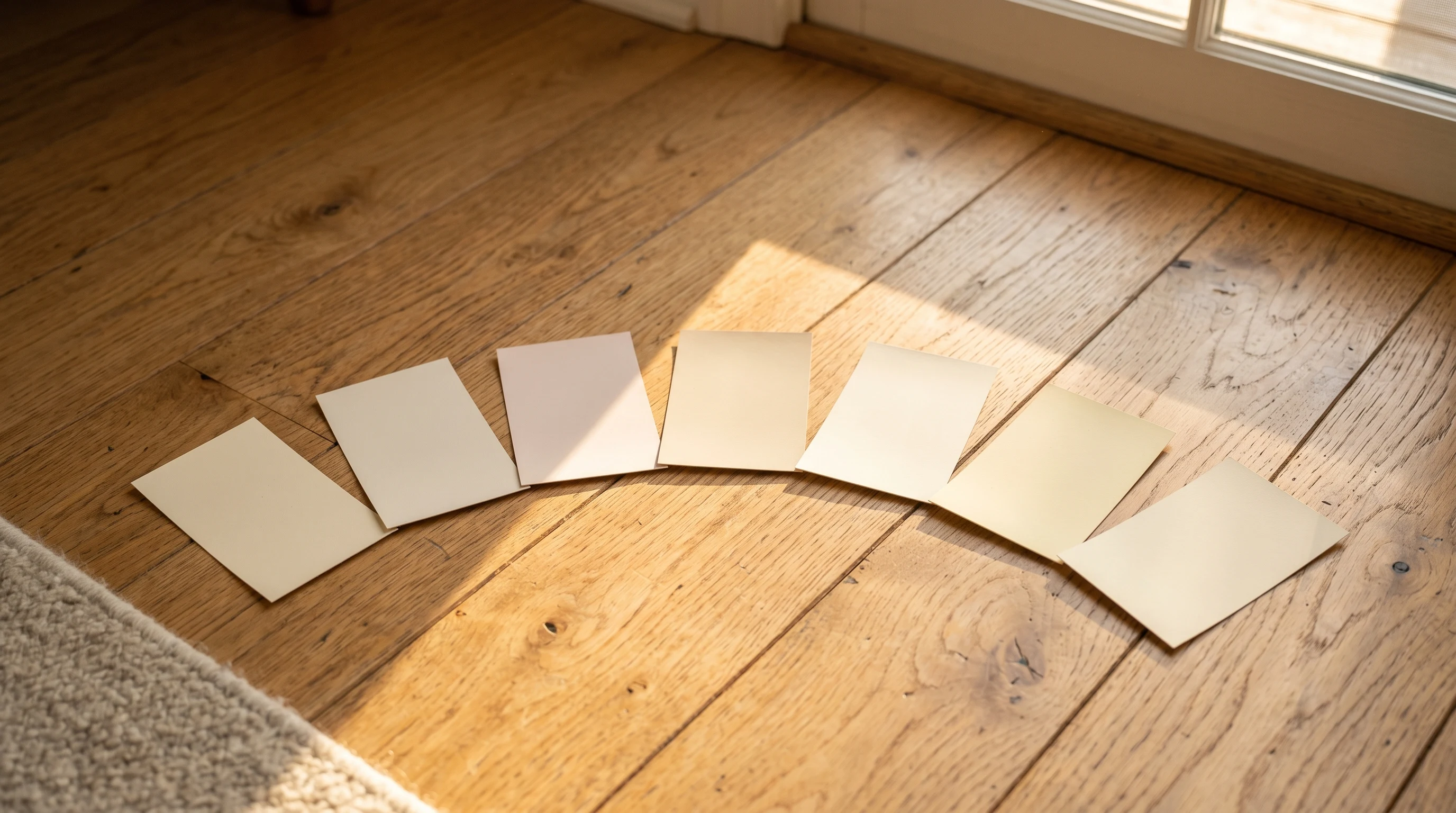
The trouble with whites is that they almost never look white. In a north-facing living room they go cool and a little blue. In late-afternoon western light they warm up and read almost cream. The same paint, the same wall, two different rooms.
That’s why a “warm white” round-up needs honesty about light before it gets to hex codes. Every white below is genuinely warm — it carries a yellow, cream, or soft pink undertone — but each one wants a particular room and a particular hour. Pick for the hour you live there, not the hour you stand in the paint aisle.
A quick frame for the LRV numbers in each profile: anything above 80 reads as a true white on the wall. Anything in the 70s starts feeling like a soft cream. Below 70 and you’ve left white behind and entered off-white territory, which is its own conversation.
Benjamin Moore White Dove (OC-17)
Hex: #F0EFE2 · LRV: 83.16 · Undertone: soft yellow cream
The warm white I recommend most often. It carries enough yellow to feel inviting in north-facing light, without ever tipping into custard. White Dove sits beautifully against warm oak floors, brass fixtures, and unlacquered wood trim. It quiets a room instead of brightening it.
It sings in north-facing and east-facing rooms, where its undertone fights the cool morning cast. In strong western afternoon light it can lean a touch yellow. If your room is bright and south-facing all day, you may want something a hair cleaner.
Benjamin Moore Simply White (OC-117)
Hex: #F4F1E6 · LRV: 89.52 · Undertone: clean yellow, almost neutral
Simply White is the warm white for people who think they want a cool white. It reads almost neutral on a chip, but on the wall there’s enough warmth to keep it from going clinical under LEDs. Color of the year a few years back for a reason — it flatters trim, cabinetry, and modern interiors without being precious.
Best in south- and west-facing rooms with strong daylight. In a dim north-facing space it can flatten out and lose its character. Pair with crisp white trim (the same color in satin works) for an all-white scheme that still feels alive.
Benjamin Moore Swiss Coffee (OC-45)
Hex: #EEEADC · LRV: 83.93 · Undertone: warm cream with a whisper of green-yellow
Swiss Coffee is the cozy one. It’s noticeably warmer than White Dove and reads almost as a soft cream against bright white trim. In farmhouse and traditional interiors it does what people think White Dove does — it makes the room feel held. Looks gorgeous against natural linen, aged brass, and warm wood.
It needs strong, warm light to be at its best. In a north-facing room under 4000K LEDs it can read slightly green-yellow, which is fine if you want that and a problem if you don’t. Best in west-facing afternoon rooms and any space with abundant daylight.
Sherwin-Williams Alabaster (SW 7008)
Hex: #EDE7DA · LRV: 82 · Undertone: warm with a faint pink-cream cast
Alabaster was Sherwin-Williams’ color of the year in 2016, and it’s still the warm white most painters reach for from that line. It carries a barely-there pink-cream undertone that flatters skin tones and makes a room feel a little softer than a pure yellow white would. It sits well against both warm and cool wood floors.
Strong in east-facing morning rooms, bedrooms, and any space you want to feel restful. It can go a touch dusty under cool LEDs (3500K and up), so check your bulbs. Pair with linen drapes and aged brass for a quiet, layered scheme.
Sherwin-Williams Creamy (SW 7012)
Hex: #EDE3CC · LRV: 81 · Undertone: unapologetic warm cream
Creamy is the warmest white in this round-up. It reads as a soft cream on the wall, not as a white, and that’s the point. In a 1920s bungalow with original oak trim, in a south-facing kitchen with brass pendants, in any room where you want warmth to be the headline — Creamy delivers.
It does not behave in a cool north-facing room. There it flattens and reads slightly muddy. Save it for sunlit rooms with warm materials, and don’t fight its character by pairing it with cool greys.
Behr Swiss Coffee (HDC-NT-08)
Hex: #F1EAD6 · LRV: 84 · Undertone: soft cream, slightly warmer than BM Swiss Coffee
Behr’s Swiss Coffee is a near-cousin to Benjamin Moore’s, not an identical match. It runs a hair warmer and a hair lighter, and the Behr Marquee formula covers in two coats over a mid-tone existing wall, which Benjamin Moore Regal often won’t. For renters repainting a builder-beige room and budget-conscious whole-house repaints, this is the warm white that earns the savings.
Best in west-facing and south-facing rooms. In north-facing spaces it holds its warmth surprisingly well because the LRV stays high. Buy a sample pot and test against your trim before you commit — the slight warmth shift from the Benjamin Moore version matters more than you’d guess.
Farrow & Ball Pointing (No. 2003)
Hex: #EEE7D3 · LRV: 83.5 · Undertone: warm yellow-cream, with the F&B depth
Pointing is the warm white for people who care about how paint reads at dusk. F&B’s pigment load gives it a depth and softness that the American whites don’t quite reach — the wall looks almost chalky in the best way, and the color shifts gently through the day. Against historic millwork, panelled rooms, and English-country palettes, nothing else looks quite right.
It is genuinely expensive. The reward is a finish that flatters under candlelight, drapes well in low light, and never reads flat. Best in dining rooms, libraries, north-facing parlors, and any room where you want the white to do half the design work.
How to Choose Between Them
If your room faces north and you live there in the morning, pick White Dove or Alabaster. If it faces west and you live there at dusk, pick Swiss Coffee or Creamy. If it’s south-facing and bright all day, Simply White or Pointing will hold their character without going yellow.
Buy three sample pots, paint A4-sized swatches on poster board (not directly on the wall — the existing color contaminates the read), and look at them at 9am, 2pm, and 7pm before you commit. A warm white you chose at noon will surprise you at breakfast.