The Best Cool White Paint Colors
Seven cool whites that read crisp without going clinical — Chantilly Lace, Decorator's White, Pure White, Extra White, High Reflective White, All White, Super White — with hex, LRV, and the light each one needs.

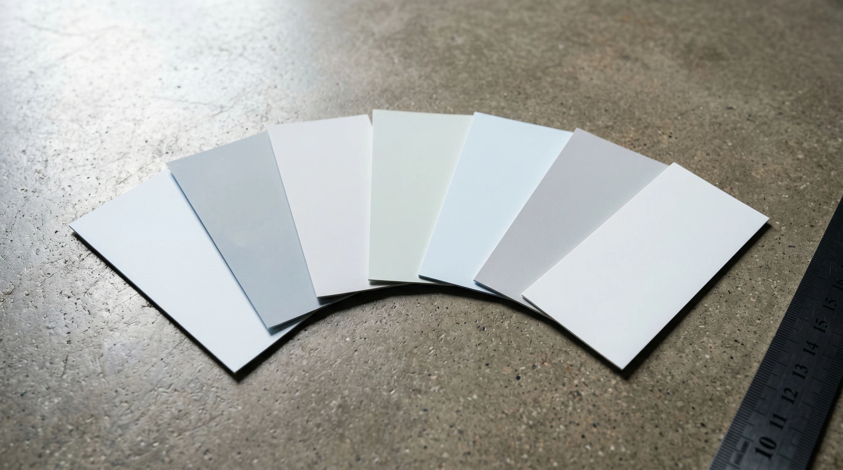
Cool whites are the ones people reach for and then panic about. The chip looks perfect at the store. Then it goes up on a north-facing wall and the homeowner stands there asking why the room feels like a dentist’s office.
A genuinely cool white is the right call when warm whites read yellow against your floors, when LEDs are pushing everything cream, when there’s a navy or deep green on the next wall and you need the trim to actually punch. Every white below is honestly cool. They differ in how cool, and in which kind of light they take before they go grey or sterile.
A quick frame for LRV: a true crisp white sits in the high 80s to mid 90s. Above 90 is a near-pure white and will bounce light hard. Below 85 a cool white drifts toward off-white-grey territory, which is a different decision.
Benjamin Moore Chantilly Lace (OC-65)
Hex: #F4F4EF · LRV: 90.04 · Undertone: clean, barely-blue, almost neutral
The cool white I recommend most often. Chantilly Lace reads as a true crisp white without ever going icy or sterile. There’s a whisper of blue undertone, quiet enough that the paint never tips into nursery-blue or hospital-grey. It sits beautifully against stainless, polished nickel, black window frames, and cool grey floors.
It does its best work in north-facing rooms and any space with strong daylight. In a dim, warm, west-facing room under 2700K bulbs it can read very slightly cream. Pair with crisp white trim (the same color in satin) for a unified scheme.
Benjamin Moore Decorator’s White (OC-149)
Hex: #ECEEE5 · LRV: 84.61 · Undertone: soft cool grey, the faintest green
Decorator’s White is what designers reach for when they want a cool white that still has body. It’s a touch lower LRV than Chantilly Lace, which means it drapes instead of bouncing — the wall has presence instead of vanishing. The undertone is genuinely cool but carries the slightest green-grey cast, which keeps it from going blue.
It sings in modern and transitional interiors with mid-tone wood floors. Against warm white oak, it reads as a quiet companion instead of a contrast. In north-facing light it can lean almost greige. If you want a cool white that doesn’t shout, this is it.
Sherwin-Williams Pure White (SW 7005)
Hex: #EDEAE0 · LRV: 84 · Undertone: softest cool, with a touch of warmth to keep it kind
Pure White is the most-specified white in the Sherwin-Williams line. It reads cool without being aggressive about it. There’s just enough warmth in the undertone to keep it human, and just enough coolness to keep it from going cream. Painters call it the “no-fail white” and they’re mostly right.
It works in nearly any light. North-facing rooms get a clean true white. South-facing rooms get a slightly softer version. Trim, cabinets, walls, ceilings — it’s a workhorse. If you can only test one cool white, test this one.
Sherwin-Williams Extra White (SW 7006)
Hex: #EAEAE2 · LRV: 86 · Undertone: firmly cool, with a blue-grey lean
Extra White is what you want when Pure White isn’t cool enough. It has a more noticeable blue-grey undertone, which makes it the right cool white for sleek modern interiors, black-and-white kitchens, and rooms with cool grey or polished concrete floors. Against warm wood, it can feel like the wrong choice.
Best in bright south- and east-facing rooms where the daylight balances the cool cast. In dim or heavily north-facing spaces it can push toward grey, and on a cloudy day it can read almost institutional. Use it deliberately, not as a default.
Sherwin-Williams High Reflective White (SW 7757)
Hex: #F4F2EB · LRV: 93 · Undertone: nearly neutral cool, the highest-LRV white SW sells
This is the ceiling white. With an LRV in the 90s, High Reflective White does exactly what its name says. It bounces light into the room. On walls it can feel almost too bright in a small space, but on a ceiling above a darker wall color, it’s the difference between a room that feels low and a room that feels lifted.
It’s also the right pick for trim against deep saturated walls. Against a navy or charcoal wall, Chantilly Lace looks crisp; High Reflective White looks crisper. Use it when contrast is the point.
Farrow & Ball All White (No. 2005)
Hex: #EFEDE2 · LRV: 85 · Undertone: the purest white F&B makes — no added pigment
All White is the F&B white with no added pigment in the formula. That sounds like marketing until you see it on a wall. It reads cool because the absence of warming tints lets the room’s own light dictate the cast. In a north-facing parlour it reads cool and quiet. In a south-facing kitchen it warms gently with the sun.
It does its best work in rooms with great natural light and good materials. Against historic millwork, on panelled walls, in libraries and dining rooms, nothing else looks quite like it. Expensive, and worth it where it belongs.
Benjamin Moore Super White (PM-1)
Hex: #F1F1ED · LRV: 87.65 · Undertone: the coolest BM white — slight blue-violet cast
Super White is BM’s coolest white and it doesn’t apologise for it. There’s a faint blue-violet undertone that reads as genuinely cool against almost any other color. On trim against a warm yellow wall, it pops as a true clean white. On a ceiling above warm walls, it keeps the ceiling from going cream.
On walls it’s a deliberate choice — best in modern white-on-white kitchens, contemporary baths, gallery-style hallways. In a traditional room with warm wood floors and brass fixtures, it can fight the materials. Pick it when you want the white to be a statement, not a backdrop.
How to Choose Between Them
If your room faces north and you want a clean true white, pick Chantilly Lace or Pure White. If you want a cool white with more body, Decorator’s White. If you need a ceiling or a trim color that bounces light against a deep wall, High Reflective White or Super White. For sleek modern rooms with cool floors, Extra White. For rooms where the light itself is the design, All White.
Sample on poster board, not the wall. The existing color contaminates the read. Look at the swatch at 9am, 2pm, and 7pm. A cool white that reads beautifully at noon may go grey at breakfast, and the breakfast hour is the one you’ll notice.