Color Flow in an Open Floor Plan
Color flow in an open floor plan means choosing wall colors that move through one big space without hard breaks. Here is how to plan the palette room by room.

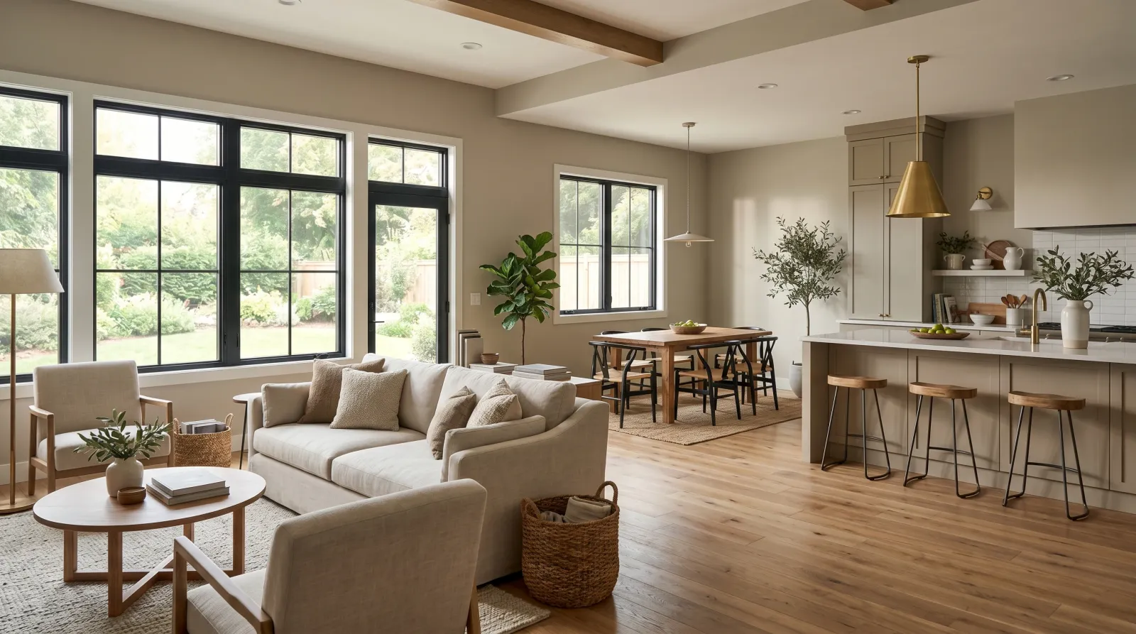
Stand in the doorway of an open floor plan and you see the living room, the dining table, and the kitchen island at once. That single sightline is the whole problem. In a house with walls, each room is its own little world. Here, the colors live together in one breath, and the moment one argues with the next, the eye catches on the seam.
Color flow is the practice of choosing wall colors that move through a connected space without those hard breaks. It usually means one main field color carried across every wall the eye sees at once, with accents pulled from the same undertone so they read as relatives. Most open plans hold together on three to five colors total: one wall color, one trim-and-ceiling white, and one or two accents that sit on the same warm or cool side.
The goal isn’t sameness. It’s that nothing snags.
TL;DR
- Pick one main wall color and carry it across every wall you can see in a single sightline.
- Keep accents in the same undertone family so they read warm with warm, cool with cool. Three to five colors total for the whole open footprint.
- Zone with the floor, lighting, the island, and a rug before you reach for a second wall color.
- Test the color at both ends of the room because the same paint reads cooler by the windows and warmer in the back corners.
- Rooms that close behind a door can break the palette completely. Flow only governs what you see at once.
What Color Flow Actually Means
Flow is about sightlines, not square footage. The rule applies to anything you see together from one standing spot. The living room you see from the kitchen, the dining nook open to both, the hallway that frames it all as you walk in.
A single color reads differently as it travels across that footprint. Near a wall of windows it goes cooler and a little flat. In the back corners, away from daylight, the same paint warms up and deepens. That isn’t the color failing. It’s light direction doing what it always does, and in an open plan you get to watch it happen across forty feet of the same wall.
So the first job is choosing a color that holds its character under both conditions. A greige with a green-grey undertone stays calm by the windows and stays calm in the corner. A greige leaning pink or peach reads sweet in warm afternoon light and slightly muddy in the cool morning end. The same paint, two readings.
When to Use a Single Carried Color
Use one carried wall color when:
- The living, dining, and kitchen areas share open walls with no door between them.
- You want the space to feel larger and calmer, which a continuous mid-LRV neutral does better than anything.
- The architecture is the star (big windows, beams, a stair) and you want the walls to recede behind it.
- Your floors run continuously through the space, which they usually do in an open plan.
A warm white in the 75 to 82 LRV range, or a greige in the 55 to 65 range, is the workhorse here. It bounces enough light to keep the far corners from going cave-dark, and it sits quietly behind furniture.
When NOT to Force One Color Everywhere
Break the palette when:
- A room closes behind a door. Bedrooms, offices, powder rooms, and laundry rooms are out of the sightline and can go anywhere they like.
- One zone has a very different light exposure, like a north-facing reading corner off a south-facing great room. You can shift the depth of the same undertone there without changing families.
- You want a deliberate anchor. A single structural wall behind the dining table, or the kitchen island, can take a deeper color as long as it shares the undertone of the main field.
Don’t paint every open zone a different color hoping for “interest.” In a connected space that reads as chaos, not variety. The interest should come from changing the tone of one undertone, not from switching to a different one.
How to Build the Palette
Start with the main wall color, then draw everything else from it.
| Role | What to choose | Why |
|---|---|---|
| Main walls | One neutral, LRV 55–82 | Carries the whole sightline, recedes behind furniture |
| Trim & ceiling | One white sharing the wall’s undertone | Frames every zone the same way, ties it together |
| Anchor / accent 1 | A deeper version of the main undertone, LRV 20–40 | Defines one wall or the island without breaking flow |
| Accent 2 (optional) | A muted partner from the same warm/cool side | Pillows, a door, lower cabinets; small doses only |
The trick that keeps a big open space from feeling chopped is the trim. When every window, baseboard, and doorway wears the same white, the eye reads one envelope even if a wall color shifts inside it. For the deeper conversation on warm versus cool whites, see how white undertones work.
For the accents, stay on one side of the temperature line. If your main color reads warm, your blues should be warm-grey blues and your greens should be sage rather than emerald. A cool main color wants cool partners. Mixing a warm wall with a cold accent is the most common way an open plan starts to feel restless.
How Do You Separate Zones Without Walls?
Paint is the wrong first tool for it. The strongest zone dividers in an open plan aren’t wall color at all.
- The floor. A large rug under the living seating draws a clear boundary the eye respects instantly.
- Lighting. A pendant cluster over the island and a separate fixture over the dining table tell you where one zone ends.
- The island and cabinets. Painting lower cabinets or an island a deeper shade of the wall’s undertone defines the kitchen while the connecting walls stay continuous.
- A single anchored wall. One structural wall in a color-blocked treatment can mark the dining zone without changing the walls around it.
If you do want a wall-color change between zones, make it a tonal step within the same undertone, not a leap to a new color. Two greiges three LRV points apart can quietly suggest “this is the dining area” without anyone noticing the shift.
Common Mistakes
- Choosing the color from a chip in one spot. A chip held by the window lies about the back corner. Tape a large sample at both ends of the space and look at each at the hour you use the room.
- Mixing warm and cool accents. A warm oatmeal wall with a cold steel-blue cushion reads off, even when each is lovely alone. Keep the whole palette on one temperature side.
- Too many colors. Past five, an open plan stops flowing and starts feeling like several small rooms that happen to share a floor. Subtract before you add.
- Forgetting the ceiling. Open plans often have one big continuous ceiling. A blue-white ceiling over a warm-white wall fights the room. Pull the ceiling toward the wall’s undertone.
- Ignoring the fixed finishes. Your floor and cabinets already set a temperature. A cool grey wall over warm honey oak floors will feel slightly wrong no matter how pretty the grey is on its own.
Where to Start Shopping
Pull a shortlist of neutrals in the LRV range your light can support, then sort them by undertone before anything else. Browse the color hub to narrow by family, and lean on the undertone guide to make sure your accents stay on the same warm or cool side as the main field.
Sample big, sample at both ends of the room, and sample at the hour you live there. The paint you choose here is the paint you’ll see from every chair in the house. Let it audition in the full space before you commit.