Paint Undertones Explained: Warm, Cool, and How to Spot Them
Paint undertones explained in plain words. How to tell warm from cool, why your white looks pink, and a simple way to spot the undertone before you buy.

An undertone is the faint second color hiding inside a paint that looks, at a glance, like one thing. A gray that reads blue in the morning. A white that goes faintly pink by a north window. A beige that turns slightly green next to your oak floor. The main color is what you think you bought. The undertone is what the room actually shows you, and it can shift the whole feel of a space by a wide margin even when the difference on the chip is only a few percent of pigment.
Undertones live in nearly every paint because pure, pigment-free color looks dead on a wall. Mixers add a trace of warm or cool pigment to give it life, and that trace is the undertone. The catch is that you almost never see it on the little chip in the store. You see it on the wall, in your light, against your floor and trim.
TL;DR
- Undertone is the secondary color underneath the main one. Warm undertones lean yellow, peach, or red. Cool ones lean blue, green, or violet.
- You can’t reliably spot it on a small chip. Hold the swatch against pure white paper and the undertone jumps out.
- Light controls how the undertone reads. North light pulls cool tones forward; south and west light warm everything up.
- Whites, grays, and greiges are the worst offenders because the undertone is most of what you see.
- Test a large sample on the actual wall, at the hour you use the room, before you commit a gallon.
What an Undertone Actually Is
Think of any paint as having a top note and a base note, the way a scent does. The top note is the color name on the can. The base note is the undertone, and it carries the color’s temperature.
Temperature is the useful word here. Warm undertones sit on the yellow-orange-red side and make a room feel cozier, lower, closer. Cool undertones sit on the blue-green-violet side and make a room feel airier, cleaner, sometimes a little crisp. A “warm white” and a “cool white” can have nearly the same light reflectance value, so they’re equally bright, yet they give a room two completely different moods.
Saturated colors hide their undertones better because the main color is loud enough to drown the base note out. It’s the quiet colors that catch people. Whites, grays, greiges, soft blues, pale greens. The closer a paint gets to neutral, the more the undertone runs the show.
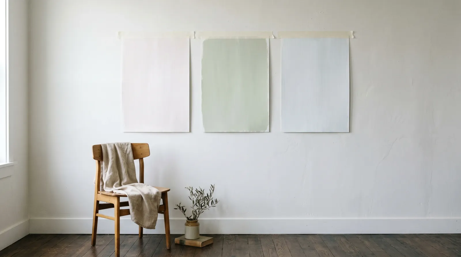
How to Spot an Undertone
 Against true white paper, a “white” paint’s undertone stops hiding. The creamy cast on the left is a warm yellow undertone you’d never catch on the chip alone.
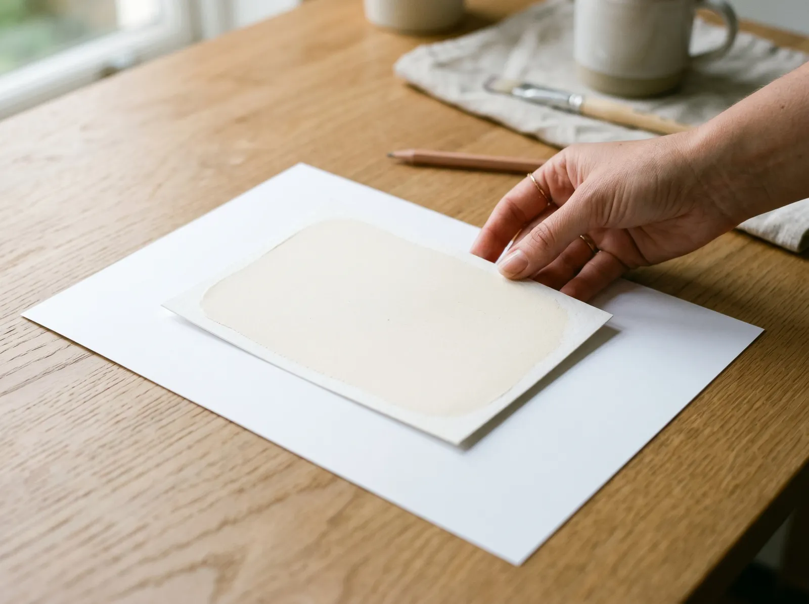
The single best trick costs nothing. Take the paint chip and lay it flat against a sheet of pure printer paper in daylight. The paper is the closest thing to true, undertoned white that you have on hand. Next to it, the paint can’t hide.
- A warm white reads creamy, buttery, or slightly muddy.
- A cool white reads crisp, grey, or faintly steely.
- A pink-based white shows a rosy blush; a green-based one looks faintly dirty or sage.
Do the same with grays and greiges and you’ll see them split into camps fast. One gray goes blue, the next goes brown, a third turns faintly purple. They looked identical in the store.
A second method: gather three or four chips in the same family and compare them to each other. The bluest one makes the others look warm; the warmest one makes the rest look cool. Relative comparison teaches your eye what to look for. After a dozen rounds, you start seeing the undertone the way you’d hear a wrong note in a song.
Why Your White Looks Pink
The paint didn’t betray you. The light did. This is the question I get texted most at 11pm, usually with a photo attached, and the answer is almost always the room rather than the can.
North-facing rooms get soft, indirect, cool light all day. That cool cast pulls any blue, green, or violet undertone forward and can make a warm pink-based white read genuinely rosy on a grey afternoon. Swing west and the late-day sun runs warm and golden, so a yellow-based white warms further into cream while a cool gray loses its edge and sits flat.
Bulbs do the same thing indoors. Warm LEDs (2700K) lay a yellow wash over everything, flattering warm colors and muddying cool ones. Daylight LEDs (4000K and up) add blue, sharpening cool tones and making warm whites look slightly dingy. The sheen plays in too. A higher gloss bounces more light and can exaggerate an undertone, which is one more reason to read the sheen guide before you lock a finish.
The fix is the same every time. Tape a big sample to the wall and look at it morning, midday, and night. The undertone you choose for a 4pm kitchen will read differently over breakfast.
Warm vs Cool Undertones
| Warm undertone | Cool undertone | |
|---|---|---|
| Leans toward | Yellow, peach, red, brown | Blue, green, grey, violet |
| Feels | Cozy, soft, grounded | Crisp, airy, calm |
| Best light | Holds up in north light; glows in west | Sings in south light; can go cold in north |
| Pairs with | Wood, brass, linen, cream trim | Stone, chrome, white trim, glass |
| Common trap | Reads dingy under daylight LEDs | Reads sterile or blue in low light |
Neither camp is better. It’s about matching the undertone to the light the room gets and the materials already in it. Warm undertones sit beautifully against oak, walnut, and brass. Cool undertones drape well over a room with stone, steel, and a lot of glass. When the paint’s temperature agrees with the room’s fixed materials, everything settles.
How Undertones Decide a Palette
A room reads “right” when the undertones agree across surfaces, even when the colors differ. Warm white trim against a warm greige wall. Cool gray walls with a clean cool-white ceiling. The eye doesn’t analyze it, but it feels the harmony.
It also feels the clash. Put a blue-gray wall next to a trim with a yellow-cream undertone and the trim suddenly looks dirty, the wall looks colder, and nobody can say why. Two grays at the same LRV can fight hard if one runs blue and the other runs taupe. This is the quiet reason so many “I don’t know, it just looks off” rooms look off.
When you’re building a scheme, pick the temperature first. Then choose every color (wall, trim, ceiling, an accent wall if you’re doing one) so its undertone sits on the same side of the line. You can mix warm and cool on purpose for contrast, but do it knowingly, not by accident.
Common Mistakes
- Choosing from the chip alone. The chip is too small and lit by store fluorescents. The undertone you buy is rarely the one you saw. Always sample on the wall.
- Testing on white primer. Bright primer skews your read of the sample’s temperature, the same way pure paper exposes it. Paint two coats on a poster board instead and float it around the room.
- Forgetting the floor and trim. A greige that’s lovely on its own can go green next to honey oak or pink next to red-toned brick. Hold the sample against the surfaces it’ll actually live beside, and remember that a wall finish reads differently against a painted brick surface than against smooth drywall.
- Ignoring the bulbs. People test in daylight, buy, then live with the room under warm LEDs at night and wonder why the cool gray went flat. Test under your real bulbs too.
- Matching by name, not by undertone. Two “warm whites” from different brands can sit on opposite sides of the line. Compare the swatches directly, never the labels.
Where to Start
You don’t need a color degree to get this right. Buy a few sample pots, paint a couple of poster boards with two coats each, and move them around the room across a full day. Watch what the undertone does at the hours you actually use the space. The color that holds steady and quietly agrees with your floor and light is the one to buy.
If you’re stuck between a warm and a cool version of the same color, choose for the light the room lacks. A dim north room wants the warm one to push back against the cool cast. A bright south room can carry the cool one without going cold. Pick for the hour you live there.