Choosing Paint by Room Light Direction
How light direction changes paint color in a room. North, south, east, and west light each shift your color, and here is how to choose for the wall you actually live with.

A color is only the light it reflects. Change the light and you change the color, even though nothing in the can has moved. That is why the same greige can read warm and inviting in one room and grey and tired in the room next door. The single biggest driver of that shift, more than the bulb or the floor, is which way the windows face. North, south, east, and west light each have a temperature and a habit, and once you know them you can choose a color for the wall you actually live with instead of the chip on the store rack.
TL;DR
- North-facing light is cool, soft, and steady all day. Colors read cooler and a little flat. Lean warm to compensate.
- South-facing light is bright, warm, and direct for most of the day. Colors lift and warm. You can go richer and deeper without the room going dim.
- East-facing light is warm and golden in the morning, then cool and flat by afternoon. Choose for the hour you use the room.
- West-facing light is dim and cool early, then floods warm and golden in late afternoon. Warm colors can glow or go orange.
- Always test on a sample board in the actual room, at the hour you live there.
Why Light Direction Changes a Color
Daylight is not one color. It shifts in temperature depending on the angle of the sun and whether the light reaches you straight or bounces off the sky first. North-facing windows never see direct sun in the northern hemisphere, so they collect the cool blue of open sky. South-facing windows take the sun head-on for hours, so they pour in warm, full-spectrum light. East and west catch the sun at a low, golden angle, but at opposite ends of the day.
A paint color responds to whatever it is given. Hand it cool light and the cool notes in the color come forward. Hand it warm light and the warm notes wake up. This is why a wall’s undertone matters so much: the undertone is the quiet part of the color that the light decides to amplify or mute. If you want to understand that quiet part better, see the undertones explainer.
North-Facing Rooms
North light is the cool, even, slightly flat light that artists build studios around. It never gets a direct sun cast, so it stays consistent from breakfast to dinner. The trade-off is that it drains warmth out of a color and adds a faint blue-grey drape over everything.
Whites go cool here and can tip toward grey or pale blue. Greys read colder and sometimes a little institutional. The fix is to push warm. A soft white with a cream or yellow base holds its warmth. Warm greiges, soft buttery whites, and gentle earthy colors like terracotta or warm sage all stay grounded in north light. If you want a true crisp white in a north room, expect it to read a few points cooler and a touch lower in LRV than the chip promised, so go a shade warmer and brighter than instinct says.
Steer clear of cool greys, pale blues, and stark gallery whites in a north room unless a cool, quiet mood is the goal. The light will deepen that coolness rather than balance it.
South-Facing Rooms
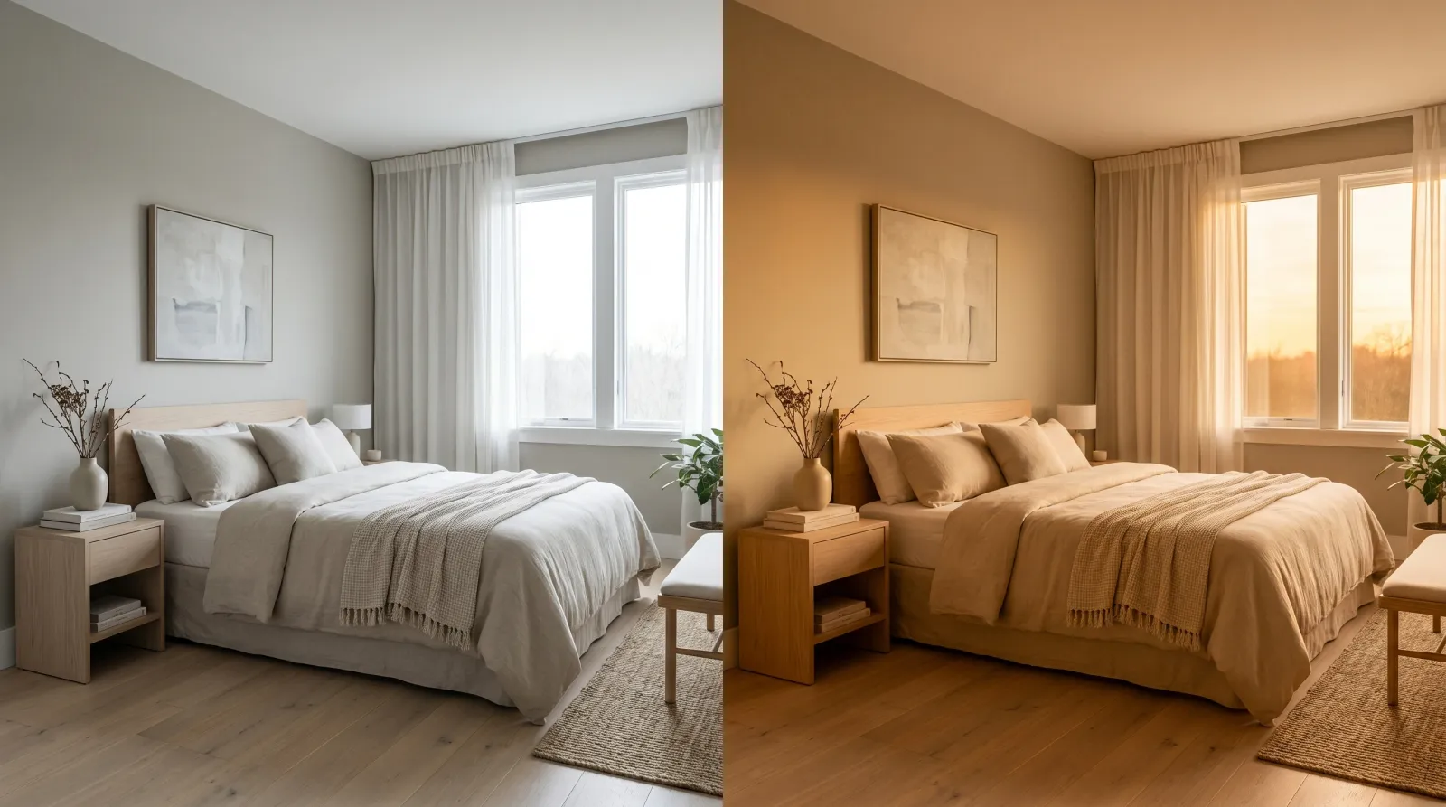
South-facing rooms are the easy ones. Strong, direct sun for most of the day lifts every color and warms it, so the room manufactures its own brightness. You can drop into deeper, richer colors without the space going dim, and cool colors stay balanced instead of going cold.
This is where moody blues, forest greens, and saturated charcoals earn their place. The abundant warm light keeps them from collapsing into a cave. A north-facing room would swallow those same colors. A south-facing one holds them up.
The one thing to watch is summer. Full midday sun on a saturated warm wall, a deep ochre or a hot red, can make the color feel loud and almost vibrating. If the room takes brutal afternoon sun, a slightly cooler or more muted version of the color you love will sit easier through the bright months.
 The same paint, two rooms, two readings. The light did all of it.
East-Facing and West-Facing Rooms
East and west rooms share a quirk: their light changes character across the day, so the color you choose has to survive two very different moods.
East-facing rooms get warm, golden light in the morning and cool, flat, bluish light by afternoon. A breakfast nook or a bedroom you wake up in benefits from a color chosen for that golden morning hour. By late day the same wall will read cooler and quieter, which suits a room you stop using after lunch.
West-facing rooms run the opposite way. Mornings are dim and a little cool. Then late afternoon brings a flood of warm, low-angle gold that can make warm colors glow beautifully or tip a beige toward orange. Living rooms and dining rooms used in the evening reward a color picked for that late warm light. Just be honest about how strong that western glow gets, because it will pull every warm note in the color forward at once.
When Light Direction Matters Most, and Least
This decision matters most in rooms with one strong window orientation and time spent at a predictable hour: a north-facing home office used all day, a west-facing living room used at night, a nursery you want calm in the morning. The light is doing real work on the color there, and choosing against it shows.
It matters less in rooms with windows on two or three sides, where the light averages out, and in small interior spaces with no daylight at all, where the bulb does the deciding instead of the sun. In a windowless powder room, choose for the bulb temperature and stop worrying about direction.
How the Four Directions Compare
| Direction | Light quality | Reads | Lean toward |
|---|---|---|---|
| North | Cool, soft, steady all day | Cooler, flatter, greyer | Warm whites, greiges, earthy colors |
| South | Bright, warm, direct | Lighter, warmer | Anything; deep and rich hold up well |
| East | Warm AM, cool PM | Golden early, flat later | Colors that suit the morning hour |
| West | Cool AM, warm PM | Dim early, glowing late | Warm colors that flatter evening light |
For the brightness side of this, the LRV guide explains how much light a color bounces back, which pairs with direction to predict how a room will feel.
Common Mistakes
- Choosing in the store. Store fluorescents have nothing to do with your windows. A color that sings under those lights can go grey in north daylight. Take the chip home and put it on the wall.
- Testing on the wrong wall. A north and a south wall in the same room read differently. Sample on the specific wall you are painting, not the brightest one.
- Looking once. Light moves all day. Check your sample in the morning, at midday, in late afternoon, and under your lamps at night before you commit.
- Fighting north light with cool color. A cool grey in a north room compounds the chill instead of balancing it. Warm up to correct, not down.
- Painting the wall before sampling. Paint a board and move it around. A wet test patch dries differently and locks you in before you have really looked.
How to Test for Light Direction
Pull three or four colors you like and paint each one on a separate poster board or foam board, two coats, large enough to read from across the room. Lean them against the wall you plan to paint, not propped near a window where the light is unrepresentative. Then live with them for a day. Morning, midday, late afternoon, lamp-lit night. Watch which one holds its character through the swing and which one falls apart at a certain hour.
The board that stays itself in the light you use most is your color. When you are ready to match a favorite, browse colors by undertone and LRV to find the closest mix, and read up on white undertones if a white is in your shortlist, because whites are the most light-sensitive color you will ever choose.