Beige and Greige Undertones Explained
Greige undertones explained in plain words. How to spot pink, green, purple, and yellow in a beige or greige before it lands on your wall and reads wrong.

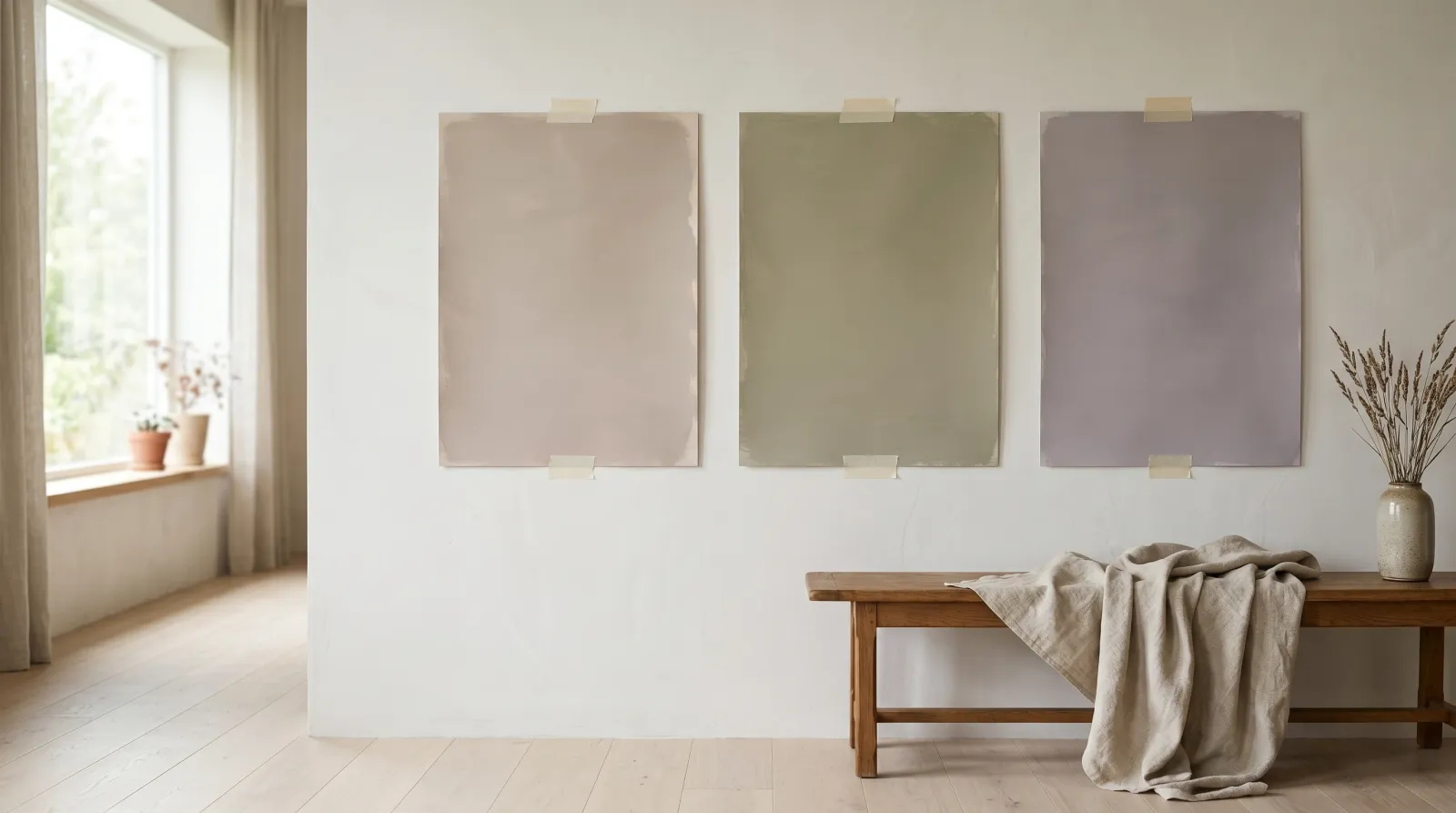
A client once described the greige she’d chosen as “warm, like wet sand.” On the chip, in the store, it was. Two weeks later she sent me a photo of her north-facing dining room and the walls had gone the color of a faint bruise. Soft purple. The paint hadn’t changed. The light had pulled out an undertone that was always sitting inside the mix, quietly, waiting for the right room to show itself.
Beige and greige are the most-painted neutrals in American homes, and they are also the two that go wrong most often. A beige is a warm light brown built on yellow, gold, or red pigment. A greige is a beige with grey worked in, so it sits between warm and cool and refuses to commit. Neither is ever truly neutral. Under the surface, every one of them leans some direction — green, purple, pink, or yellow — and that lean, the undertone, is what decides whether the room feels settled or slightly off.
Once you learn to read greige undertones, you stop being ambushed by them.
TL;DR
- Beige is a warm light brown; greige is beige with grey mixed in, so it can swing warm or cool.
- Neither is neutral. Every one leans green, purple, pink, or yellow under the surface.
- The undertone is faint on the chip and loud on the wall, because color intensifies at scale.
- North light pulls cool undertones forward (green, purple); warm west light pulls pink and yellow.
- Hold the swatch to pure white paper, then paint a board and lean it on the wall in your own light before you commit.
What an Undertone Is, in a Beige
The color you see on a beige chip is the mass tone, the obvious surface color. Underneath it sits a second color, mixed into the base in small amounts, that shifts how the whole thing reads. That’s the undertone. It’s faint on a 2-inch chip and loud on a 200-square-foot wall, because color intensifies as the area grows.
Greige has more room to wander than beige does. Beige is anchored in warmth, so its undertones stay in the warm family most of the time (gold, peach, a touch of red). Greige carries grey, and grey can swing cool, so a greige can lean a cool green or a cool purple that a pure beige rarely shows. That’s why greige is harder to choose. It has more directions to surprise you in.
For the full primer on warm versus cool and how to spot either, see the paint undertones explainer. This page narrows in on the two neutrals that trip people up most.
The Four Undertones You Meet Most
Beige and greige split into a handful of leans. These four cover most of what’s on the shelf.
| Undertone | How it reads | Where it goes wrong | Pairs with |
|---|---|---|---|
| Green | Muddy, sage, slightly drab | North light, next to cool grey floors | Warm wood, cream, soft gold |
| Purple | Mauve, dusty, faintly violet | Grey afternoons, north-facing rooms | Cool white trim, pewter, grey stone |
| Pink | Rosy, blush, soft warm | Beside cool flooring or blue-grey tile | Warm wood, brass, ivory |
| Yellow | Gold, creamy, sometimes dingy | Under warm LED bulbs, can go beige-builder | Crisp white trim, navy, terracotta |
Green and purple are the two that catch people in north-facing rooms, because cool light strengthens cool undertones. Pink and yellow show up more in warm western light. A greige can hold two of these at once and trade off depending on the hour, which is why the same wall can look mauve at breakfast and golden at dinner.
How to Spot the Undertone Before You Buy
The white-paper test does most of the work, and it costs nothing.
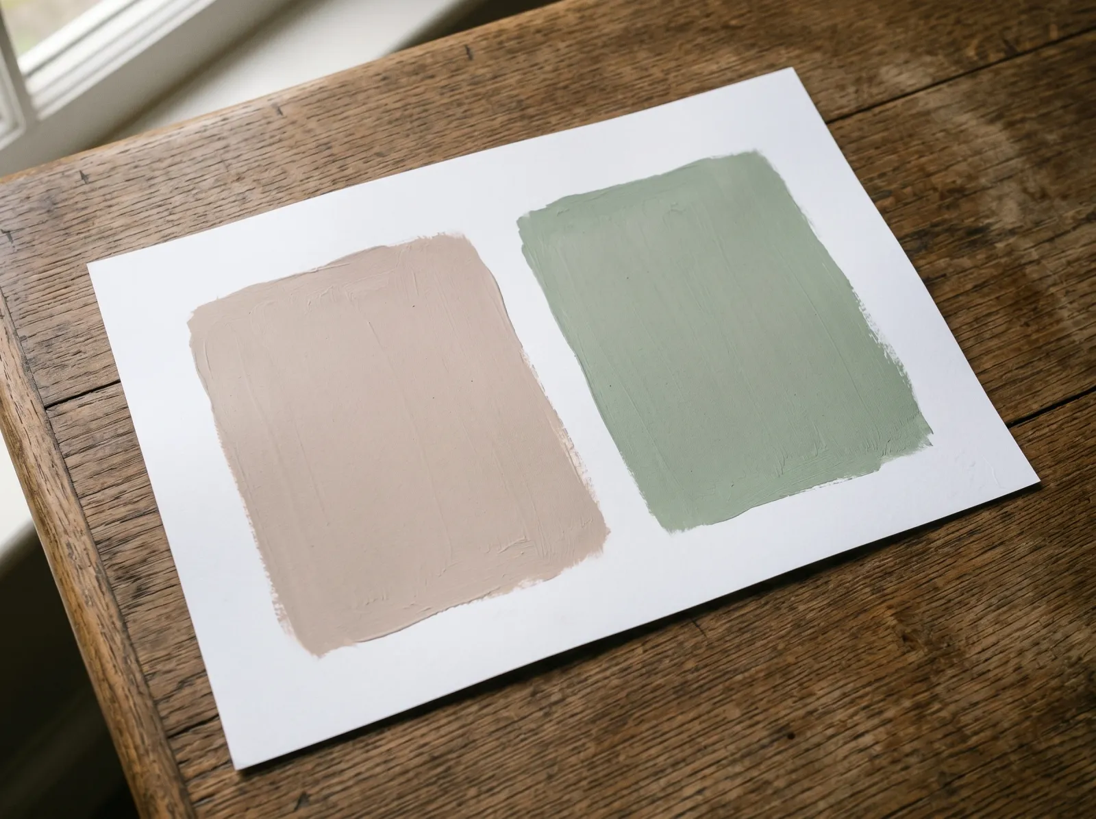 Against pure printer-white paper, the undertone has nowhere to hide.
Hold the swatch flat against a sheet of plain printer-white paper in daylight, near a window. True white has no undertone of its own, so it strips your greige bare. Creamy and gold means yellow. A muddy grey-green cast means green. A faint rosiness means pink. A whisper of violet means purple. Do this with two or three swatches at once and the differences jump out that wouldn’t show one at a time.
Then go bigger. Paint a 2-foot board with two coats, let it dry, and lean it against the wall in the actual room. Look at it morning, midday, and lamp-lit. Undertones strengthen at scale and shift with the light, and a board catches both in a way a chip never will. The number that tells you how light the color will read, its Light Reflectance Value, is printed on the back of the chip and worth writing on the front before you shop.
How Light Direction Changes the Reading
Your greige will read differently depending on which way the room faces, and this is where most regret comes from.
North-facing rooms get cool, soft, indirect light all day. That light drags cool undertones forward, so green and purple greiges deepen and warm beiges can go flat and grey. If your room faces north, lean toward a greige with a warm undertone to push back against the cool, and test it on the wall before you commit a whole room.
South and west rooms run warm, especially in the afternoon. Warm light amplifies yellow and pink and can make a gold-leaning beige read almost orange near sunset. East rooms get warm morning light that cools off by afternoon, so the same wall changes character across the day.
Bulbs matter as much as windows. Warm white LEDs (2700K) add yellow and flatter warm greiges. Daylight bulbs (4000K and up) add blue and can turn a warm beige cool and a little clinical. Choose for the light you actually live in, not the showroom’s fluorescents.
When NOT to Lean on Greige
Greige isn’t the right call everywhere.
- Rooms with almost no natural light. A weak hallway or an interior bathroom flattens a greige into grey or mud. A cleaner warm white or a deliberate color holds up better than a neutral that needs light to look alive.
- When your fixed finishes already fight it. Cool blue-grey tile next to a pink-greige wall makes the pink scream. If the floor, counters, or tile are locked in, match the wall’s undertone to them, not against them.
- As a no-risk default. Greige earned its reputation as the safe choice, and that reputation makes people skip the testing. The undertone risk is real. A “safe” greige in the wrong light is one of the most common repaints I get called about.
Common Mistakes
- Choosing greige from the chip alone. A 2-inch square under store lighting tells you the color exists, not how it behaves. The undertone that’s invisible on the chip can dominate the wall. Always sample at scale.
- Ignoring the floor. A greige is only half the equation. Lean the board against your actual flooring. A green-greige over warm oak can look lovely; the same greige over cool grey laminate can go drab. The room reads the two together.
- Mismatching trim undertone. Warm greige walls with a cool blue-white trim look subtly wrong even when you can’t say why. Pair a warm greige with a warm or creamy white, a cool greige with a crisp cool white. When the baseboards and trim agree with the wall, the room settles.
- Testing in only one light. A greige that’s perfect at 2pm can turn on you at breakfast. Look at the board at the hours you use the room.
- Forgetting the next room. Open-plan homes flow one neutral into the next. A greige that reads warm in the living room can clash with a cooler greige two steps away. Sample them side by side.
Where to Look When You Shop
Most major brands publish the undertone and LRV for every neutral, and the popular ones have a documented lean worth knowing before you buy. Benjamin Moore Revere Pewter is a warm green-grey greige. Sherwin-Williams Agreeable Gray runs warm with a faint green. Edgecomb Gray sits warmer and softer. Repose Gray leans cool with a touch of purple in north light. Treat the names as a starting point, not a guarantee, because your light has the final say.
For a wall repaint where the undertone decision matters most, the whole-room paint walkthrough covers prep and coverage. If your greige is going over older drywall, the drywall painting guide handles the surface first. And to browse neutrals sorted by LRV and undertone, the grays and greiges collection lays out what each one does next to wood and metal.
A greige is a promise the chip can’t keep on its own. Hold it to white paper, lean a board against the floor, and look at it in your own light at your own hours. The undertone is always in there. Your job is just to see it before the painter does.
Related
Frequently asked questions
What undertones does greige have?+
How do I tell the undertone of a beige?+
Why does my greige look purple (or green, or pink)?+
Is greige warm or cool?+
What pairs well with a greige wall?+
- Paint undertones explained
- What is LRV? Light Reflectance Value, explained
- White undertones explained
- Grays and greiges, sorted by LRV