CP

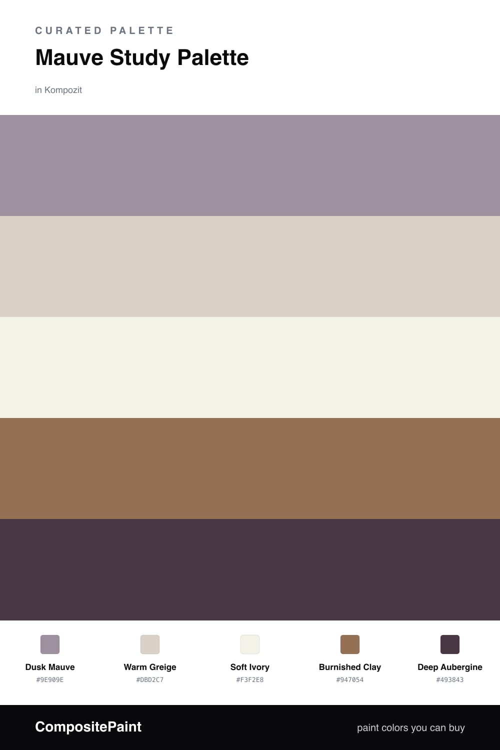
Mauve Study Palette — Dusk Mauve & Burnished Clay

A grounded, layered 5-color scheme for a study: dusty mauve walls, a soft greige backdrop, warm trim white, burnished clay woodwork, and a deep aubergine accent, every color matched to real paint you can buy.

By David Chen · Formulation Lead & Resident Chemist

Dusk Mauve
Walls
Kompozit Cut Heather · 1303
#9E909E
LRV 30
Warm Greige
Backdrop & Built-ins
Kompozit Mossy Shade · 0195
#DBD2C7
LRV 65
Soft Ivory
Trim & Ceiling
Kompozit Twinkle Twinkle · 0355
#F3F2E8
LRV 88
Burnished Clay
Desk & Wood
Kompozit Cavern Sand · 0165
#947054
LRV 19
Deep Aubergine
Bookcase Accent
Kompozit Purple Shadow · 1215
#493843
LRV 5
View palette in

A study should feel like a held breath, quiet, a little serious, the kind of room where the light stays low and the walls almost lean in to listen. That is what Dusk Mauve does here. Think of it as the gray you get when you fold a drop of plum into clay: it reads as a soft neutral in daylight and warms into dusty rose by lamplight. It is mauve, but the grown-up, grounded kind.

Around it I keep things earthy and warm. A Warm Greige backdrop carries the built-ins and any paneling so the mauve has a calm partner, and a Soft Ivory on the trim and ceiling lifts the whole thing without the cold snap of a bright white. Burnished Clay is the wood note, the desk, the shelves, the floor, and it is what stops the scheme from drifting cool. Clay and mauve share a brown undertone, so they sit together the way coffee sits with chocolate.

For the one deep gesture, run Deep Aubergine on a single bookcase or the back of an alcove. Keep it to about one-fifth of the room at most, no more, or it stops being an accent and starts being the whole mood. Used small, it gives the eye a dark corner to rest in, and it makes the mauve glow.

Buy These Colors

Each color matched to the closest real paint in every brand, by ΔE2000. Kompozit first; take any SKU to the store — these mix on demand.

Dusk Mauve
#A78A92 · LRV 28 · Walls
Kompozit Cut Heather · 1303 ΔE 5.95
Backdrop Anita · BD-AN ΔE 15.34
Behr Cameo Rose · PPU17-15 ΔE 4.49
Benjamin Moore Mulberry Wine · 1251 ΔE 3.1
Clare Shade · PNT100-MD-14 ΔE 16.7
Dunn-Edwards Ash Hollow · DE6046 ΔE 5.21
Farrow & Ball Sulking Room Pink · No. 295 ΔE 6.02
Magnolia Home Homebody · JG-136 ΔE 10.23
PPG / Glidden Gothic Amethyst · 1046-5 ΔE 1.69
Sherwin-Williams Thistle · SW 6283 ΔE 2.12
Valspar Mellow Mauve · 1004-7C ΔE 1.66
Warm Greige
#DAD2C6 · LRV 65 · Backdrop & Built-ins
Kompozit Mossy Shade · 0195 ΔE 0.81
Backdrop Real Real · BD-RR ΔE 2.55
Behr Windrush · HDC-CT-19 ΔE 0.68
Benjamin Moore Alaskan Skies · 972 ΔE 1.93
Clare Beigeing · PNT100-LT-18 ΔE 2.72
Dunn-Edwards Fine Grain · DE6213 ΔE 1.1
Farrow & Ball Shaded White · No. 201 ΔE 2.4
Magnolia Home Stoneware Pieces · JG-55 ΔE 4.08
PPG / Glidden Gray Beige · 14-30 ΔE 0.82
Sherwin-Williams Natural Tan · SW 7567 ΔE 1.31
Valspar Warm Putty · 6006-1A ΔE 0.45
Soft Ivory
#F4F0E7 · LRV 87 · Trim & Ceiling
Kompozit Twinkle Twinkle · 0355 ΔE 1.68
Backdrop Tabula Rasa · BD-TR ΔE 1.54
Behr Nude W-f-210 · W-F-210 ΔE 1.21
Benjamin Moore Pink Damask · 890 ΔE 1
Clare Wing It · PNT100-LT-24 ΔE 2.49
Dunn-Edwards Antique Paper · DE6218 ΔE 0.47
Farrow & Ball Pointing · No. 2003 ΔE 2.1
Magnolia Home Silos White · JG-107 ΔE 1.17
PPG / Glidden Crumb Cookie · 18-01 ΔE 1.21
Sherwin-Williams White Flour · SW 7102 ΔE 0.58
Valspar Crisp Cotton · 7007-4 ΔE 0.81
Burnished Clay
#9A6B4B · LRV 18 · Desk & Wood
Kompozit Cavern Sand · 0165 ΔE 3.36
Backdrop Old Soul · BD-OS ΔE 18.39
Behr Toasted Chestnut · 240F-5 ΔE 3.02
Benjamin Moore Penny · 2163-30 ΔE 1.59
Clare Big Apple · PNT100-DP-30 ΔE 12.95
Dunn-Edwards Brown Eyes · DE5265 ΔE 1.13
Farrow & Ball Picture Gallery Red · No. 42 ΔE 10.64
Magnolia Home Remote Trail · JG-165 ΔE 12.1
PPG / Glidden Foxfire Brown · 1069-6 ΔE 1.95
Sherwin-Williams Wheat Penny · SW 7705 ΔE 2.74
Valspar Chestnut Beach · 3002-7A ΔE 1.67
Deep Aubergine
#4A3340 · LRV 4 · Bookcase Accent
Kompozit Purple Shadow · 1215 ΔE 2.8
Backdrop After Hours · BD-AH ΔE 19.94
Behr Wild Raisin · S-G-700 ΔE 1.21
Benjamin Moore Dark Purple · 2073-10 ΔE 1.1
Clare Blackish · PNT100-DP-54 ΔE 14.98
Dunn-Edwards Preserve · DEA193 ΔE 5.4
Farrow & Ball Pitch Black · No. 256 ΔE 13.05
Magnolia Home Plum Suede · JG-102 ΔE 4.04
PPG / Glidden Black Magic · 1001-7 ΔE 13.22
Sherwin-Williams Merlot · SW 2704 ΔE 3.66
Valspar Virtuoso · M215 ΔE 4.03

Questions

Will mauve walls make a study feel too small or dark?

No, if you keep it on the walls and let the trim go lighter. Dusk Mauve here is muted and grayed, so it recedes the way a soft neutral does rather than closing in. Reserve the deep aubergine for one shelving wall and the room still reads roomy.

How do I keep mauve from looking pink in a study?

Pair it with the warm greige and the clay wood tones, not with bright whites. The brown and gray notes in those neighbors pull the mauve toward dusty plum instead of pink, especially under warm 2700K bulbs.

Similar Palettes

Closest schemes by color — not by label.