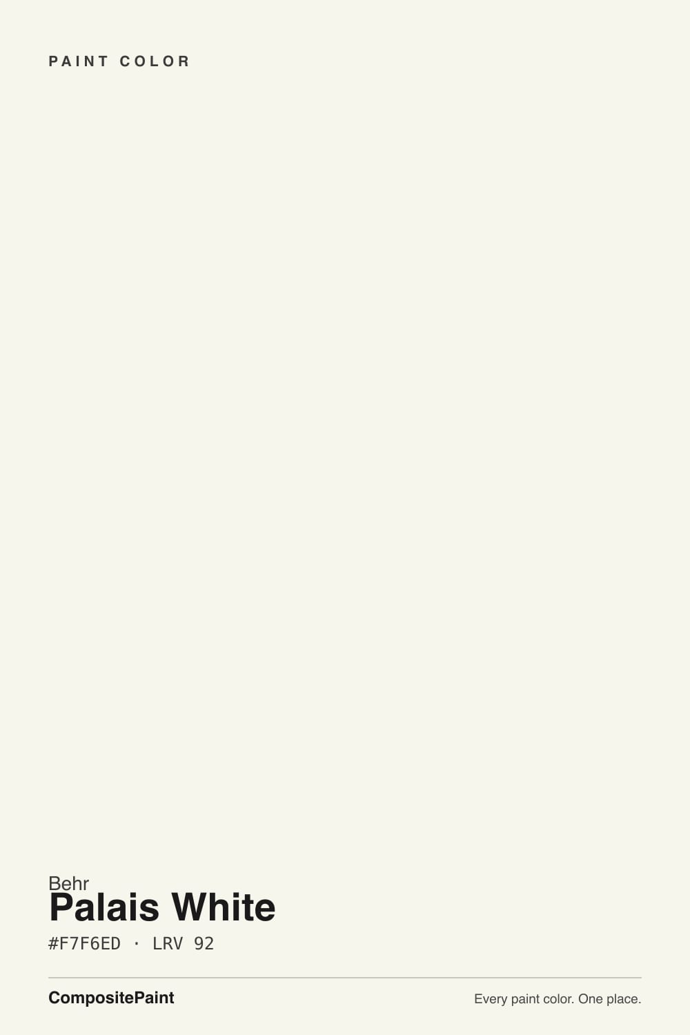
Palais White
A budget Behr white with a fancier name than its job: bright on paper, warm on the wall, and honest about which light it needs to behave.

Jessica has spec'd whites and neutrals for more than 300 rooms and keeps a sample wall of painted drawdowns in her studio. Every color review is checked against real reader rooms in the comments and re-tested when a formula changes. About the testing process →
- 1Classic Gray74
- 2Alabaster82
- 3Palais White87
- 4Sleek White92
- 5Ultra Pure White97
The Fast Verdict
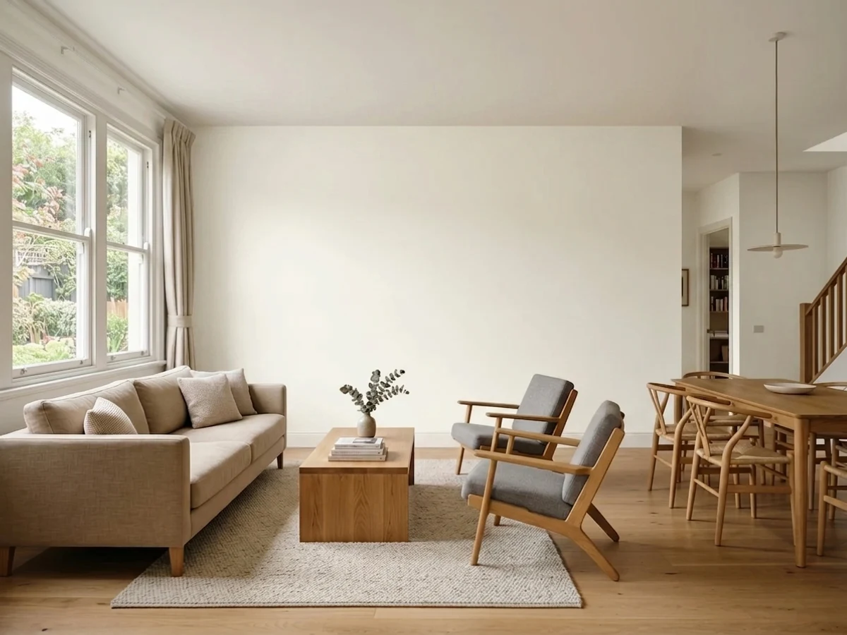
Palais White has a designer name and a budget-store life: it is Behr's Premium Plus low-odor "paint and primer in one," the gallon most DIYers grab at Home Depot without a stylist in the room. On paper it is bright — LRV 92, the same bracket as Chantilly Lace — but it carries a real yellow-cream undertone underneath, which is an unusual combination. Cool north or east light balances that tension into a calm, workable white; full south or west sun lets the cream win and pushes it toward sunny, sometimes peachy, cream.
Budget whole-house white in a north- or east-facing room · baseboards and crown molding over a darker wall color · north-facing bedrooms · anyone who wants warmth without paying for a name-brand white
Your room gets strong south or west sun all day · you already have stark cool-white trim in place · your stone or tile is cool blue-gray · you are painting over a dark wall with only one coat budgeted
- Genuinely bright (LRV 92) while still carrying real warmth — an unusual combination in the Behr deck
- Cool north or east light balances the yellow-cream into a calm, easy white
- Budget-friendly Premium Plus paint-and-primer formula, with a matching Behr Marquee exterior
- The classic trim-and-molding white for framing a deeper wall color
- Flatters warm stone, wood, and oil-rubbed bronze without any extra effort
- Strong south or west sun pushes the yellow-cream hard, occasionally into a peach flash
- Reads dingy next to a stark, cool-toned white trim or gray
- Some Home Depot reviews report old color or primer ghosting through after only two coats over a dark wall
- Far less discussed than Behr's bigger-name whites, so there is less real-world data to lean on
What Color Is Palais White, Really?
"Palais" is French for palace, and that is about the only luxurious thing about this color. Behr files it as a Premium Plus interior flat — the low-odor, paint-and-primer-in-one line built for volume, not for design-blog features — with a matching Behr Marquee exterior formula under the same GR-W15 number. There is no Color of the Year campaign behind it, no viral before-and-after, no designer name attached. Palais White has built its following the unglamorous way: painters and landlords keep buying the gallon because it does the job at a fair price, not because a magazine told them to.
At LRV 92 it sits in the same bright, near-white bracket as Chantilly Lace and Ultra Pure White — both cool, crisp whites. Palais White does not behave like its neighbors. It carries a genuine warm yellow-cream undertone underneath that brightness, and that pairing is unusual: most whites this reflective are cool and neutral, while most warm creams (Swiss Coffee, White Dove) sit lower, in the LRV 80–85 range. Palais White tries to be both bright and warm at once, and that tension is exactly why it swings so hard with the light — north and east exposures let the bright-white side hold; full south or west sun lets the cream take over.
Undertone in one line: warm yellow-cream, with a whisper of peach showing up in strong afternoon sun — never gray, never a true cool white despite the high LRV number. If your sample reads flat and slightly chalky, that is a cool north room or a cool-white LED doing its job correctly, not a flaw in the paint.
Where It Shines
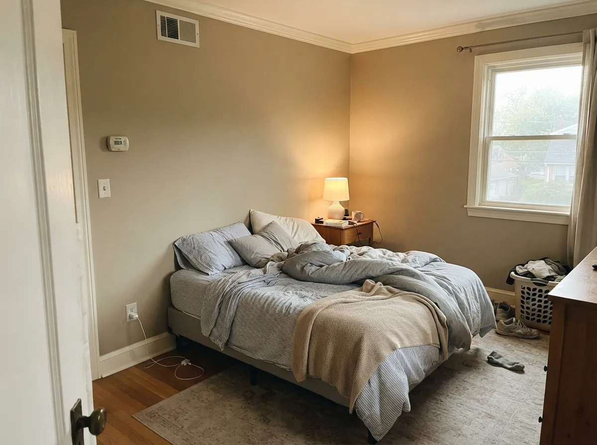
Give it a north- or east-facing room and it earns its keep: a genuinely bright white that still feels warm instead of clinical, at a price that does not punish a whole-house repaint. Its other honest strength is trim — on baseboards and crown molding it gives a soft, traditional frame to a deeper wall color without the cost of a boutique white. It is not chasing a design trend; it is just a dependable Behr gallon doing a normal job well.
Where It Fails
The complaints about Palais White fall into three predictable buckets, and none of them are mysterious once you know the color's real behavior. If your room or your plan matches one of these, sample big before you commit — this color is more light-sensitive than its bright LRV number suggests.
Palais White's yellow-cream undertone reads warm and a little dingy the moment it sits beside a true cool white like Behr Ultra Pure White or a cool gray finish. The trim wins, and the wall looks unwashed by comparison. Keep trim in the same warm family, or go one full step warmer on the trim than you think you need.
Strong afternoon light pushes the yellow-cream hard, and some readers report a genuine peach flash by late day — the color's closest color-match neighbors include a pale pink, which tells you how close that edge is. If your room bakes in west sun all afternoon, sample on that actual wall, not near a north window.
Home Depot reviews for the Premium Plus gallon are mixed for exactly this reason: some painters report the old color or the primer ghosting through after only two coats over a deep existing wall. It is a budget-line formula, not a designer-tint formula — prime with a gray-tinted primer over anything dark and plan on two full finish coats, three if the old color was saturated.
Room by Room
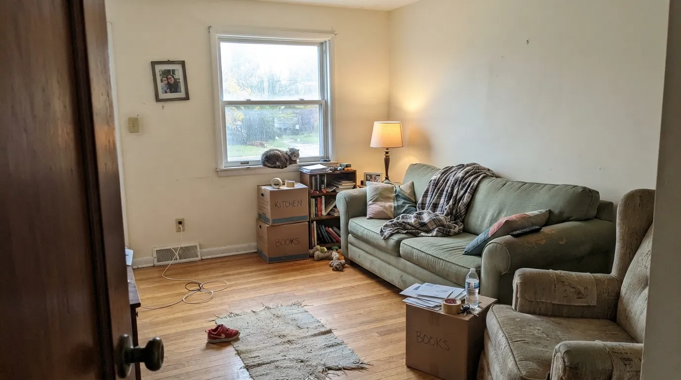
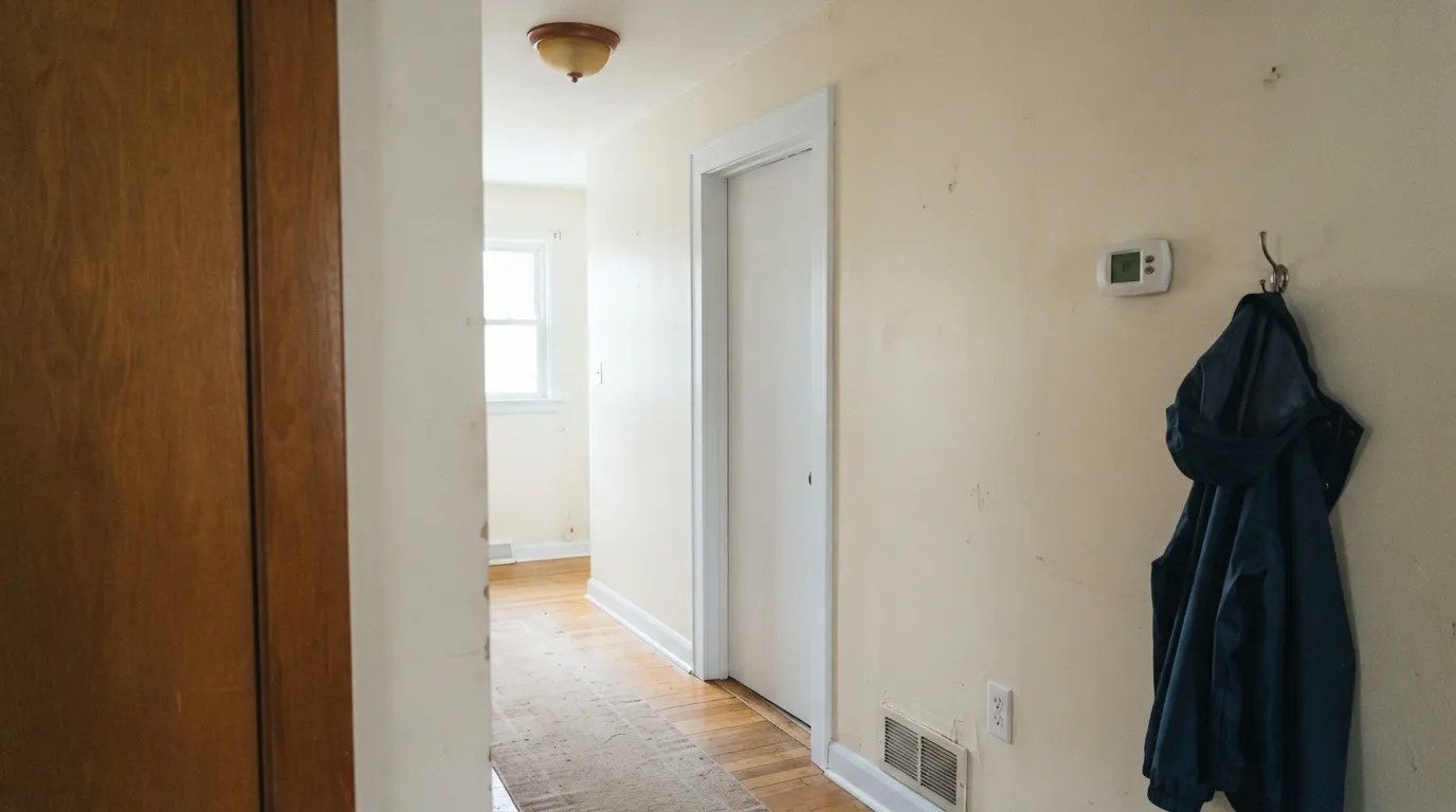
In north or east daylight it is a genuinely good budget white: bright enough to feel finished, warm enough to avoid the sterile look of a straight cool white. In a west-facing great room, sample first — afternoon sun will push it noticeably creamier than the chip.
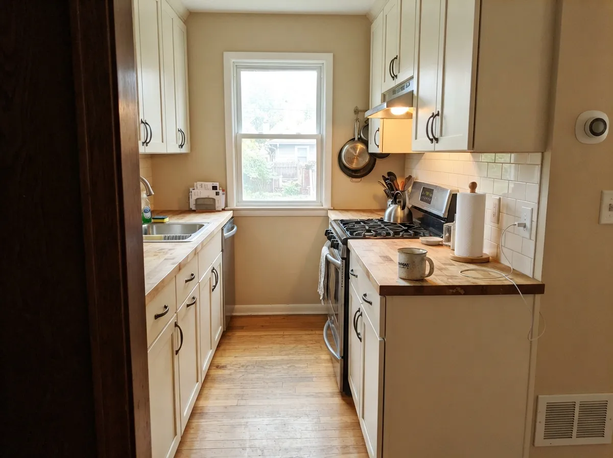
It can work beautifully on cabinets against warm counters and oil-rubbed bronze, but designers flag this exact color as one that makes people nervous on cabinets — the warmth is more assertive there than on a wall. Get a large sample board under your actual kitchen light before painting fifteen doors.
This is the color's best-known use: baseboards and crown molding in Palais White give a soft, traditional perimeter around a deeper wall color — sage, terracotta, warm greige — without the sharp edge a stark white trim would cut. Semi-gloss holds up to cleaning.
A north-facing bedroom is where the yellow bias gets neutralized into a calm, balanced warm white — one of the few rooms where this color's light-dependence works entirely in your favor. In a bright south room, it will read noticeably creamier at night under warm bulbs.
With warm stone, wood vanities, and bronze fixtures it is comfortable and inexpensive. With cool blue-gray tile or chrome, the warmth starts to argue with the room — the same clash as the stark-white-trim problem, just in tile form.
The same number ships as a Behr Marquee exterior formula, so it is genuinely built for siding and trim, not just walls. Expect full sun to read it noticeably warmer and creamier than the interior chip suggests — pair with warm-toned trim rather than a cool charcoal if you want the whole facade to agree.
Your Light Is the Risk
Cool daylight balances the yellow-cream base into a calm, workable warm white — the exposure this color was practically built for.
Direct afternoon light pushes the cream hard; expect a distinctly sunny cast, sometimes a whisper of peach against pale stone or tile.
In a room that gets both morning and evening sun it visibly drifts — balanced and bright at 9am, noticeably creamier by 5pm. Sample through a full day if the room has more than one window direction.
2700K bulbs push it further into cream, sometimes toward that faint peach. Cool white LEDs flatten it back toward a plain, slightly chalky off-white.
Most complaints about Palais White are a light mismatch. Upload a photo of your actual room and see it on your walls — then ask for the same wall in north light or evening lamps before you buy a single sample.
Need It From Another Brand?
Any paint counter can custom-tint Behr GR-W15 directly. If you would rather stay in one brand's own deck, these are the closest stock matches, measured as ΔE2000. Under 2 is a difference you will not see on the wall.
| Brand | Closest color | ΔE | LRV | |
|---|---|---|---|---|
| Sherwin-Williams | WhitetailSW 7103 · Sherwin-Williams | 0.5 | 86 | Color page → |
| Benjamin Moore | Cloud White967 · Benjamin Moore | 1.5 | 85 | Color page → |
| Valspar | Cravat8007-5C · Valspar | 1.5 | 88 | Color page → |
| PPG / Glidden | Crumb CookiePPG18-01 · PPG / Glidden | 1.5 | 87 | Color page → |
| Glidden | Crumb CookiePPG18-01 · Glidden | 1.0 | 87 | Color page → |
| Dutch Boy | Aged Marble006W · Dutch Boy | 1.3 | 87 | Color page → |
Similar Behr Colors
The nearest shades to Palais White within Behr's own range, ranked by perceptual color distance — useful when you want the same look a touch lighter, darker, or warmer.
WCAG 2.1: AA is 4.5 : 1 for normal text, 3 : 1 for large text, AAA is 7 : 1.
Palais White vs the Colors You're Also Considering
Every Palais White sample board has the same rivals on it. The numbers show the real lightness gap — then it comes down to which risk you would rather live with.
Pick this for the brighter, less-assertive version — Palais White is the lighter-handed warm white of the two.
Behr HDC-MD-08 · LRV 90Whisper WhitePick this if you want more committed warmth on cabinets — it is deeper and creamier, and it punishes a rushed second coat just as much.
Pick this if you want that same brightness with real warmth instead of Ultra Pure White's coolness.
Behr 1850 · LRV 92Ultra Pure WhitePick this if you actually want a crisp, cool white at the same brightness — Ultra Pure White is the cold-blooded twin at the identical LRV.
Benjamin Moore Simply White 2143-70 is the closest cross-brand match in the data, at hex #F6F6ED, LRV 90 and a deltaE of 0.48, which is a true match rather than a near one. Clare Timeless PNT100-LT-04 at LRV 91 and a deltaE of 0.49 is the same story. Valspar Gauzy White V152 at LRV 91 and deltaE 0.6 is also a match. Note that Behr has its own Simply White BWC-01 at LRV 92, so the two names are easy to confuse when ordering.
Sherwin-Williams High Reflective White SW 7757 at LRV 93 and deltaE 1.37 is brighter and cleaner, and would be visually identical in normal room light, though it is the crisper of the two on a large wall.
Farrow and Ball All White No. 2005 at LRV 92 and deltaE 2.28 is very close but worth sampling first, since it drops the yellow lean. PPG Delicate White PPG1001-1 at LRV 88 and deltaE 2.54 is a step darker and cooler.
Palais White Coordinating Colors
The rule for coordinating with Palais White is the same as any warm white: keep the neighbors warm, and save the cool colors for a deliberate contrast, not an accident. It pairs easily with warm greiges, warm woods, and true blacks, and it argues with cool blue-grays and stark cool whites. These are the partners that keep it looking intentional:
Why Palais White Doesn't Have a Color-of-the-Year Story
Search for Palais White and you will not find a design-blog feature, a celebrity kitchen, or a Color of the Year press release — and that absence is the honest story here. Behr's own marketing puts its spotlight on names like Blank Canvas and Swiss Coffee; Palais White sits quietly in the Premium Plus lineup, the budget "paint and primer in one" line most homeowners buy because it is affordable and low-odor, not because a stylist recommended it.
That is not a strike against the color. Plenty of the paint actually going on American walls is bought this way — for a rental turnover, a starter-home refresh, a landlord repaint between tenants — and Palais White does that job competently: it is brighter than most budget whites, it is warm enough to feel inviting rather than institutional, and it is priced to repaint without agonizing over it. If you came here hoping for a viral before-and-after, you will not find one. If you came here needing an honest, inexpensive warm white for a north-facing room, this is a genuinely good one.
Palais White With Wood Tones and Floors
Warm wood is the safe pairing here, the same as with any yellow-cream white: oak, walnut, and honey-toned floors all sit comfortably next to Palais White because the undertones agree with each other rather than fighting. Oil-rubbed bronze and aged brass hardware read as intentional against it, and terracotta tile is a natural extension of the same warm family.
Cool-toned floors are the one pairing that needs a sample first — gray-washed wood or cool LVP will pull Palais White's warmth into relief, and depending on the light the wall can start to look faintly yellow next to a very cool gray floor. It is not a hard no, but bring a large sample board and lay it directly on the actual floor before committing a whole room.
Three Ready Palettes Built on Palais White
A color is never alone on the wall. These are complete combinations in the 60-30-10 pattern, with the reason each one holds together. Every one opens in the visualizer.
One color at two sheens keeps a budget repaint feeling deliberate instead of cheap, and the near-black door supplies the one dark note the scheme needs. Because both colors ship under the Behr name, a painter can match everything from one store trip.
Try this palette in your roomAgreeable Gray keeps the room from tipping too warm, Palais White cabinets bring the brightness without going stark, and the navy island gives the kitchen its one saturated note. Oil-rubbed bronze hardware ties the warmth together.
Try this palette in your roomA small room can take the risk a whole house can't: Palais White keeps the space feeling open, the near-black vanity gives it real contrast, and one terracotta accent wall behind the mirror turns the room into a deliberate jewel box instead of an afterthought.
Try this palette in your roomPalais White FAQ
Is Palais White warm or cool?
Warm — a genuine yellow-cream undertone — but it is unusually bright for a warm white at LRV 92, which is why it can look almost neutral in the right light and distinctly creamy in the wrong one. Cool light balances it; warm sun pushes the cream forward.
Is it good for kitchen cabinets?
It can be, but sample first. Designers specifically flag this color as one that makes people nervous on cabinets because the warmth reads more assertively there than on a wall. Test a large board under your actual kitchen light, warm bulbs and daylight both, before committing to a full set of doors.
How is Palais White different from Behr Swiss Coffee?
Swiss Coffee is the more committed, more classic warm off-white, LRV 80 — the warmest of Behr's safe off-whites, and it shows. Palais White is brighter (LRV 92) with a lighter touch of the same warmth, closer to a near-white than a true cream. Pick Swiss Coffee for unmistakable warmth, Palais White for brightness with a hint of it.
Does it work on exteriors?
Yes — the same GR-W15 number ships as a Behr Marquee exterior formula, so it is a real exterior paint, not just an interior color pressed outside. Expect full sun to read it warmer and creamier than the interior chip, and pair it with warm-toned trim rather than a cool charcoal for the facade to agree with itself.
How many coats does it need over a dark wall?
More than two, and prime first. Home Depot reviews for the Premium Plus gallon include real reports of old color or primer showing through after just two coats over a saturated wall. Use a gray-tinted primer over anything dark, then budget two full finish coats — three if the previous color was deep.
Is Palais White a well-known color, or an obscure one?
Genuinely obscure, and that is not a knock. It has no Color of the Year history and no viral design-blog moment — it is a Home Depot budget gallon that quietly does its job. If you want a well-documented white with a big community of reviews behind it, Behr Swiss Coffee or Ultra Pure White have far more real-world data. If you want a fair-priced warm white and are willing to sample carefully, Palais White is an honest, unglamorous pick.
Have you painted with Palais White?
Rate it — one tap helps the next reader decide.
Ask a Question