Sulking Room Pink
The famous powdery mauve that sits between pink and brown, reviewed honestly: the rooms where it turns velvety, the light that turns it into a brown cave, and what to pick instead.

Jessica has spec'd whites and neutrals for more than 300 rooms and keeps a sample wall of painted drawdowns in her studio. Every color review is checked against real reader rooms in the comments and re-tested when a formula changes. About the testing process →
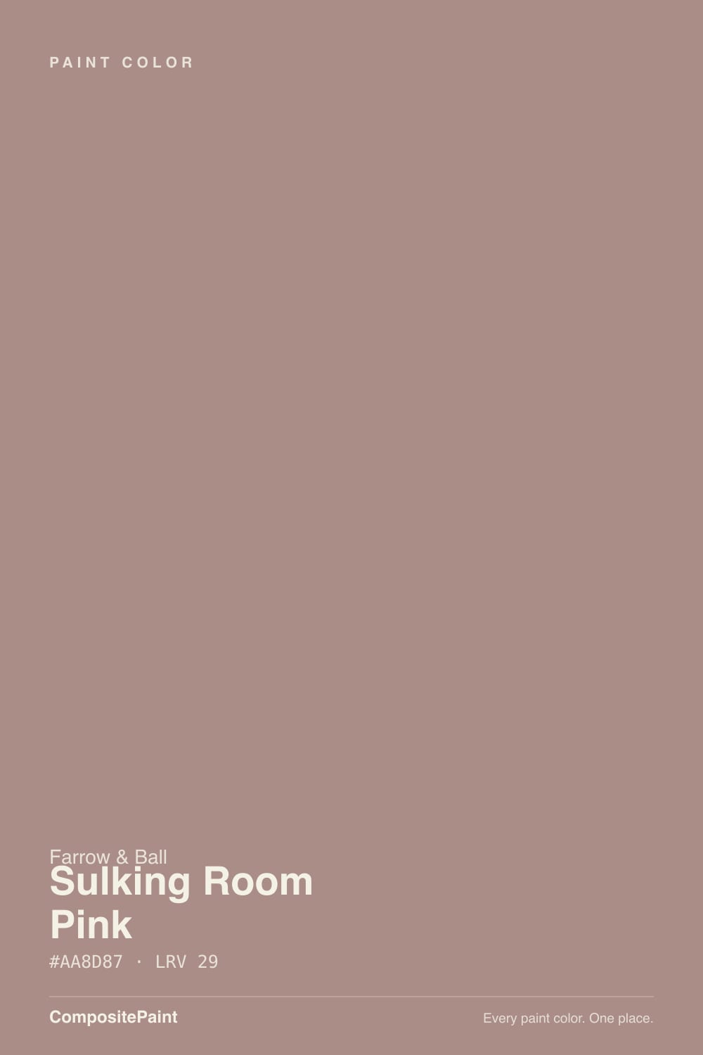
- 1Turkish Coffee5
- 2Porpoise13
- 3Sulking Room Pink29
The Fast Verdict
Sulking Room Pink is the pink for people who insist they hate pink: a muted, powdery rose with enough brown in it to pass for a dusty neutral, until the light moves and the mauve comes back. Named for the French boudoir — bouder, to sulk — it still does that job: dressing rooms, powder rooms, lamplit bedrooms. Buy it for the dusk-colored wall. Do not buy it hoping for a clear blush, and do not put it in a windowless box with no lamps.
Powder rooms and dressing rooms · lamplit bedrooms that should feel like dusk · color-drenched small rooms · anyone who wants pink without the candy
You actually want a clear pink · the room is a windowless box with no lamps · you are keeping bright builder-white trim · you need a light-reflecting whole-house color
- Pink that behaves like a dusty brown-neutral — mauve without the candy
- Powder rooms and dressing rooms look custom with one color decision
- Deep enough (LRV 29) to hold its color in a bright south room
- Color-drenching walls and woodwork is its native language
- Shifts from powdery rose to cocoa-plum through the day, on purpose
- Dim, unlit rooms go brown-cave — the number-one owner complaint
- Not a true pink: buyers expecting blush get taupe-rose by noon
- Bright builder-white trim makes it look dated or dingy
- Too deep and light-hungry for a whole-house, north-facing scheme
What Color Is Sulking Room Pink, Really?
A dusty rose with brown pulled through it — and the brown is the whole trick. Clean pinks go nursery the moment they hit four walls; the earth in Sulking Room Pink strips the sweetness so the color lands as powdery mauve, not blush. Farrow & Ball named it for the boudoir, from the French bouder, to sulk: a private dressing room, not a statement wall. Brand ambassador Patrick O'Donnell calls it the moodiest pink in the deck, earthy enough that it never goes candy, and that is the version you actually get — if the light cooperates.
At LRV 29 it is a genuine mid-to-deep tone, in the same depth band as a smoky violet, not a pastel. That number is why it works as a dark-ish neutral in a bright room and why it collapses in a dim one. Plan for the wall to read a step deeper and browner than the chip: in full daylight it holds a chalky rose; after dark it sinks toward cocoa with a plum edge. Sample it on the wall you will live with, at the hour you actually use the room — the foil chip is a different color.
Undertone in one line: dusty rose first, brown second, a gray-mauve third. If your sample reads as dirt, the room is dim or the bulbs are cool. If it reads as pink, that is south sun or 2700K lamps doing it. Both versions are the same paint being honest about the light.
Where It Shines
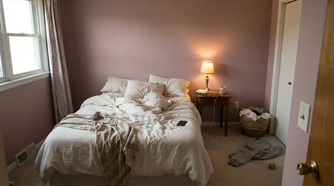
This color is built for small, intentional rooms you use at night. Under 2700K lamps the rose comes back without the candy, which is why designers keep putting it in powder rooms — one of them calls it a favorite because everyone looks good against it. Its second home is the bedroom that should feel like dusk all day: cream linen, walnut, brass, and the complementary white Farrow & Ball picked for it, Skimming Stone. Color-drench the woodwork in the same Dead Flat and the room reads custom instead of painted. Give it real texture — linen, wool, unlacquered brass — and the powdery quality stops looking like a trend and starts looking like plaster.
Where It Fails
Almost every regret story about Sulking Room Pink follows one of three scripts, and all three are predictable before the first coat. None of them are the paint's fault — but if your room matches one, this is not your color, and a bigger sample will only confirm it.
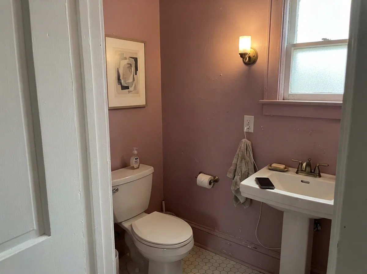
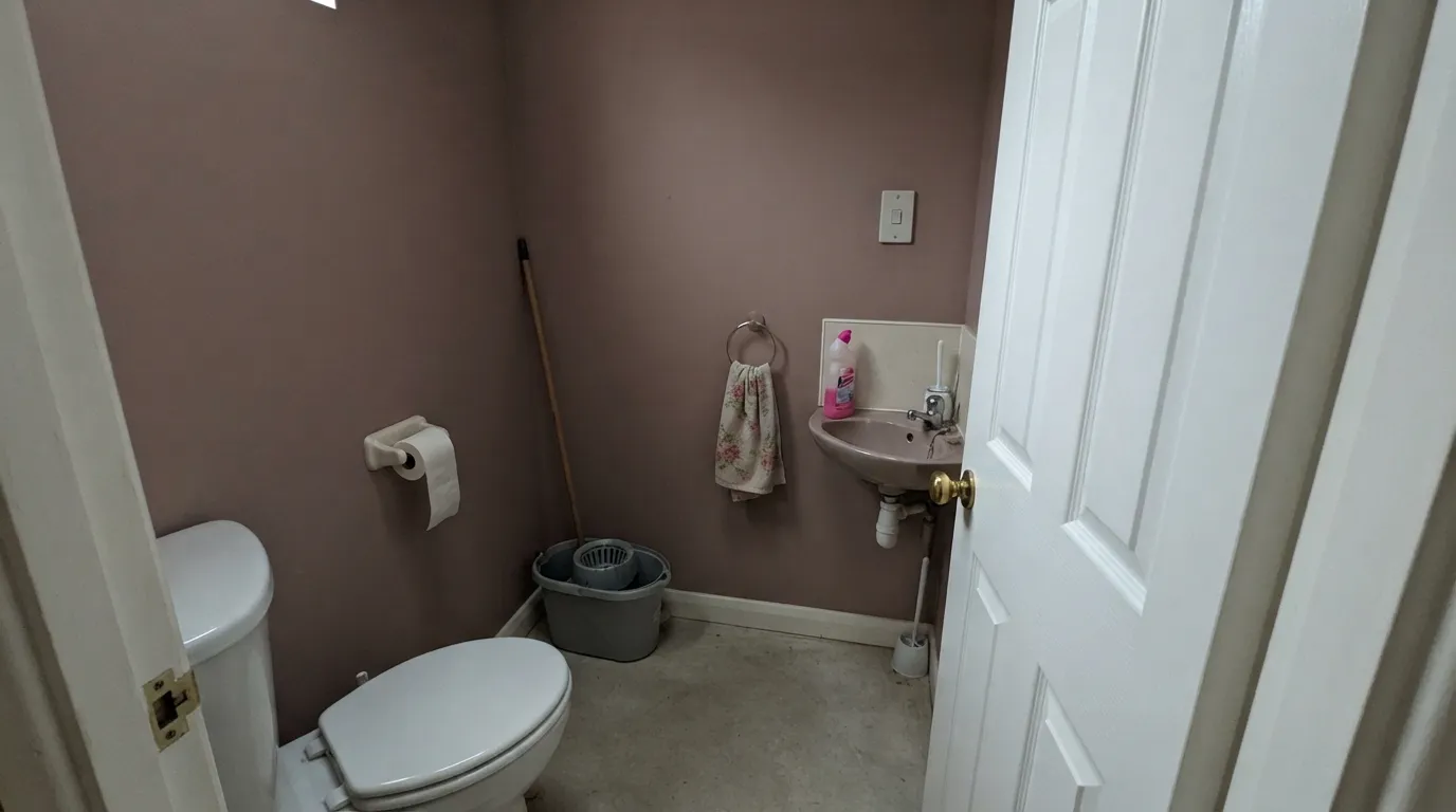
The most-quoted owner complaint is a small downstairs cloakroom that looked like a little brown cave once the pink left the room. Dim north bedrooms and windowless baths do the same thing: with no warm light, the brown and gray take over and you are left with dirt, not mauve. Lamps are part of this paint job. If you refuse them, pick a lighter plaster-pink.
On the chip it can pass for a dusty rose. On four walls it sits between pink and light brown, and some hours it will not look pink at all. If your goal is blush, this is too earthy; look at Setting Plaster and let it stay peachy. If your goal is a true brown, this will flash mauve the first sunny morning and surprise you.
A crisp, cool white next to this color is the fastest way to make it look dated. Owners who kept the rest-of-house bright trim report the walls going bubblegum instead of vintage, or dingy instead of powdery. The fix is a stony, slightly pink-leaning white — Skimming Stone is the one Farrow & Ball names — or color-drench the woodwork and skip the contrast.
Room by Room
The signature use. A small powder room can take the depth, and color-drenching walls, woodwork, and even the ceiling in Dead Flat is the move that makes it look expensive. Put a warm sconce on — without it you get the brown cave. Brass and a pale stone top keep it from going themed.
Dusk on the walls all day, velvet at night, if the room has a window and 2700K bulbs. Matte or Dead Flat hides texture; Skimming Stone trim keeps the edge soft. North-facing bedrooms with no lamps are the exception: too dark, too brown. Cream bedding, not beige, which reads yellow against the mauve.
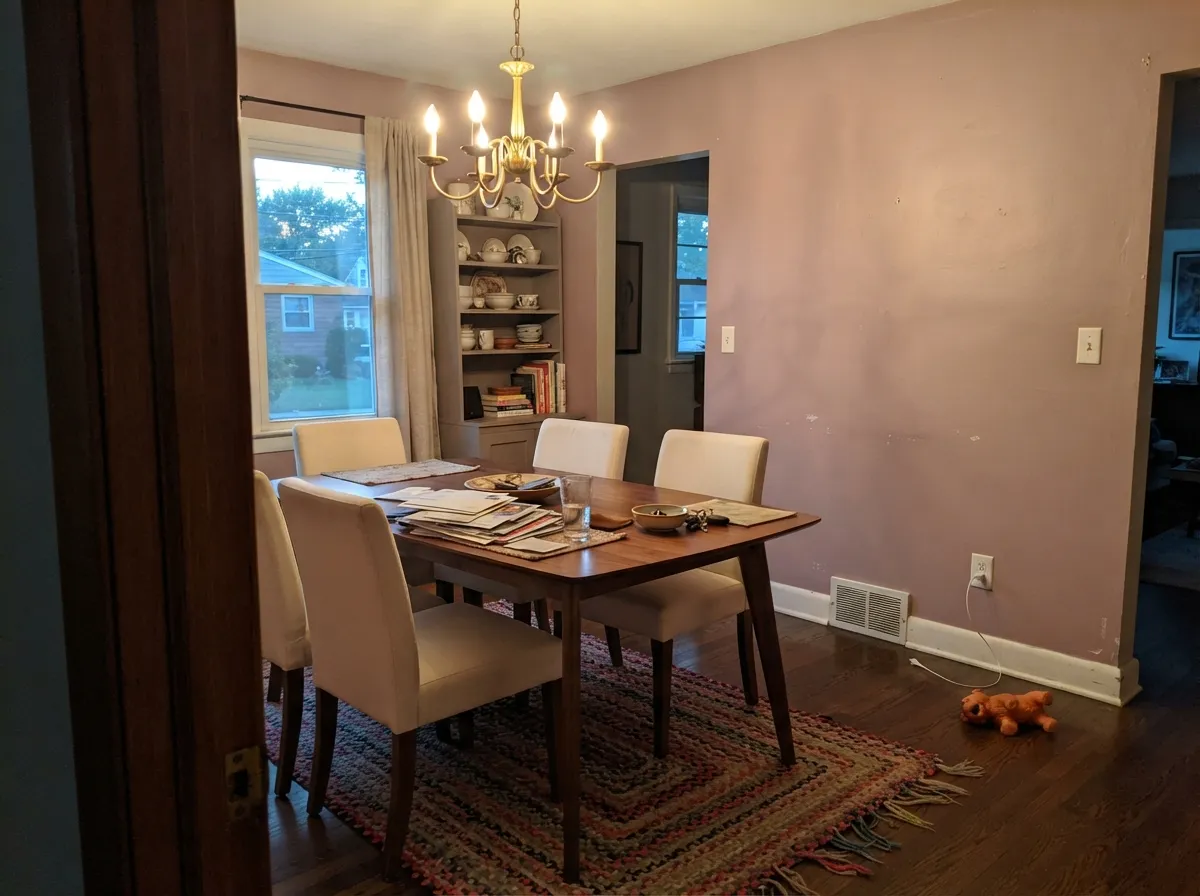
Formal rooms with little noon sun are a natural fit. Evening lamps pull the rose forward; the brown keeps it from going pretty over dinner. Walnut table, unlacquered brass, linen chairs. Eggshell only if you need wipeability; Dead Flat if you want the chalk.
Real rooms use it as a dusty, grown-up backdrop that is more interesting than greige and less loud than a true pink. It works in a closed office with a window; it is a harder sell in a dark basement den. Keep metal warm and skip the neon task lamp.
Beautiful in a closed, lamplit sitting room color-drenched or paired with Skimming Stone. Riskier in an open plan, where it has to negotiate kitchen wood and whatever the adjacent rooms wear. Setting Plaster next door is the safe handoff — lighter, peachier, same family.
A full kitchen of mauve-brown cabinets is a bold bet, and a losing one over golden oak. An island or a pantry door under Pointing walls can work in satin or Modern Eggshell. Full outdoor sun bakes the powdery quality toward faded dirt; this is an interior color.
Your Light Is the Risk
South or west sun keeps it a powdery rose with earth in it — the version people fell for on the chip. Morning light is the pinkest read; this is the light to sample in first.
Cool gray daylight and unlit cloakrooms cancel the rose and leave a flat brown cave. Fine if you half-wanted dirt; disappointing if you wanted mauve.
Morning: clearly rosy. Midday: a warm blush-gray that some people call a non-neutral neutral. Golden hour can flush it toward faded terracotta. After dark it sinks to cocoa with plum in the corners.
2700K bulbs put the rose back without losing the depth — treat warm lamps as part of the spec. Cool white LEDs (4000K and up) strip the warmth and leave a dusty taupe-brown. Swap bulbs before you repaint.
Most complaints about Sulking Room Pink are a light mismatch. Upload a photo of your actual room and see it on your walls — then ask for the same wall in north light or evening lamps before you buy a single sample.
Need It From Another Brand?
Any paint counter can custom-tint Farrow & Ball No. 295 directly. If you would rather stay in one brand's own deck, these are the closest stock matches, measured as ΔE2000. Under 2 is a difference you will not see on the wall.
| Brand | Closest color | ΔE | LRV | |
|---|---|---|---|---|
| Sherwin-Williams | Redend PointSW 9081 · Sherwin-Williams | 4.5 | 30 | Color page → |
| Behr | Cameo RosePPU17-15 · Behr | 2.9 | 28 | Color page → |
| Valspar | Monkeypod8004-5E · Valspar | 2.9 | 29 | Color page → |
| PPG / Glidden | TanglewoodPPG1073-5 · PPG / Glidden | 4.2 | 30 | Color page → |
| Glidden | Mocha Mauve60YR 30/094 · Glidden | 2.8 | 30 | Color page → |
| Dutch Boy | Plum Punch402-4DB · Dutch Boy | 2.9 | 29 | Color page → |
Similar Farrow & Ball Colors
The nearest shades to Sulking Room Pink within Farrow & Ball's own range, ranked by perceptual color distance — useful when you want the same look a touch lighter, darker, or warmer.
WCAG 2.1: AA is 4.5 : 1 for normal text, 3 : 1 for large text, AAA is 7 : 1.
Sulking Room Pink vs the Colors You're Also Considering
Every Sulking Room Pink sample board has the same rivals on it. The numbers show the real lightness gap — then it comes down to which risk you would rather live with.
Pick this when you want the moodier, browner, boudoir version that reads as a dusty neutral until the light moves.
Farrow & Ball No. 231 · LRV 56Setting PlasterPick this if you want the lighter plaster-pink that started the trend — peachier, airier, more obviously pink.
Pick this when the mauve is the point, and you want the wall to sit between pink and brown on purpose.
Farrow & Ball No. 28 · LRV 35Dead SalmonPick this if you want the cult pink-beige that never quite picks a side — warmer, more taupe, less mauve.
Sulking Room Pink Coordinating Colors
The rule for coordinating with Sulking Room Pink: stony warm whites, tonal dusty pinks, and near-blacks that still have color in them — and keep bright builder white at arm's length. It pairs with Skimming Stone far better than with a crisp white, loves walnut and brass, and layers with both a lighter plaster-pink and a deeper aubergine. These are the partners that keep showing up in rooms that work:
Why It Is Called Sulking Room Pink
The name is not a mood board. A sulking room is an English take on the French boudoir, from bouder, to sulk: a small private room off the bedroom where you dressed, wrote letters, and hid from the household. Farrow & Ball built No. 295 for that job — a muted rose with brown in it, powdery rather than pretty — and it still behaves like a dressing-room color more than a living-room one.
That is also why it keeps showing up in powder rooms and not on whole open-plan floors. Designers reach for it when a client wants pink without the nursery, or a dusty neutral that is not greige. It has never been a Color of the Year, and it does not need to be: the mauve revival simply circled back to a color that was already sitting in the deck, waiting for the gray decade to end.
Sulking Room Pink With Wood Tones and Floors
This decision gets made at the floor, not the fan deck. Walnut and espresso are the easy friends — the red-brown depth makes the mauve read dusty and deliberate. Pale white oak and painted floors are safe and give the room a softer English-country cast. The brown in the paint is what lets it sit next to oak more peacefully than a true violet would.
The honest caution is golden honey oak and orange-stained trim. Yellow-orange pulls the rose forward so the walls look pinker than your sample, and the floor looks more orange in return. A large rug between them is the practical fix; if the golden floor is staying wall to wall, Dead Salmon is the calmer cousin. Cream carpet is fine; cool gray carpet will push the walls browner.
Metals are the easy part: unlacquered brass, antique bronze, and warm aged gold all work. Polished chrome is the one that leans cold against it and makes the pink look dusty by comparison.
Three Ready Palettes Built on Sulking Room Pink
A color is never alone on the wall. These are complete combinations in the 60-30-10 pattern, with the reason each one holds together. Every one opens in the visualizer.
Tonal mauve layering is what keeps this from going themed: two depths of the same dusty-rose family, separated by the stony off-white Farrow & Ball names as the complementary. Skimming Stone matters here — a bright builder white would make the walls look dingy, and Pelt only shows its aubergine when the lamp finds it.
Try this palette in your roomColor-drench the tiny room, then give the door one near-black note so the scheme reads deliberate. Railings only flashes its blue in real light, which is enough contrast without a cold black. Pointing on the ceiling keeps a windowless powder room from going cave — unless you are committing to a full drench, in which case skip it and add a warmer sconce.
Try this palette in your roomThe plaster-pink that started the trend and the moodier boudoir pink can live in the same house if the trim does not change. Setting Plaster takes the open, brighter rooms; Sulking Room Pink takes the closed, lamplit ones. Skimming Stone — the off-white that already flashes pink — is the handshake between them.
Try this palette in your roomSulking Room Pink FAQ
Is Sulking Room Pink actually pink?
Sometimes. In morning sun and under 2700K lamps it is a dusty rose. By midday it can pass for a warm blush-gray, and in a dim room it is frankly brown. On four walls nobody will call it a clear pink. If blush is what you actually want, this is the wrong color; that mismatch is behind a lot of the bad reviews.
What trim white goes with Sulking Room Pink?
Skimming Stone is the one Farrow & Ball names — a stony off-white that already flashes pink, so the walls stay powdery instead of dingy. Pointing is the warmer, creamier house white if you want more glow. A stark bright white is the pairing owners regret: it makes the color look dated or bubblegum. Semi-gloss or eggshell on the trim, Dead Flat on the walls — or skip the contrast and color-drench.
Is it too dark for a bedroom?
Not if the bedroom has a window and warm lamps. At LRV 29 it is mid-depth, not charcoal, and a south or west bedroom is one of its best rooms. A north-facing bedroom with no lamps is a different story: owners looking for a lighter sister of the same tone are not wrong. Sample at night before you commit.
Does Sulking Room Pink work with oak floors?
Better than a true violet does, because the brown in it can sit next to oak instead of fighting it. Walnut, espresso, and pale unstained oak are the easy wins. Golden honey oak is the risk: the yellow in the floor can push the walls pinker than you sampled. A large rug helps; wall-to-wall orange stain is a reason to look at Dead Salmon instead.
Setting Plaster or Sulking Room Pink?
Setting Plaster is the lighter, peachier plaster-pink (LRV 56) that started the dusty-pink trend. Sulking Room Pink is a full step deeper and browner (LRV 29) — boudoir, not plaster. If you want air and daylight, Setting Plaster. If you want dusk and a color that can pass for a dusty neutral, this one.
Should I color-drench the whole room?
In a powder room, dressing room, or small bedroom, yes — walls, woodwork, and sometimes the ceiling in Dead Flat is how this color earns its keep. In an open living room, color-drenching four walls is a bigger bet; keep Skimming Stone on the trim so the house still connects. Either way, plan the lamps. A drenched room with no warm light is just a darker cave.
Have you painted with Sulking Room Pink?
Rate it — one tap helps the next reader decide.
Ask a Question