CP

Mauve Study Palette — Dusk Mauve & Espresso Walnut

A soft five-color study scheme led by a dusky mauve, balanced with warm greige, a clean trim white, walnut wood, and a deep plum accent — every color matched to real paint you can buy.

By Jessica Williams · Color Stylist & Interior Editor

Dusk Mauve
Walls
Kompozit Cut Heather · 1303
#9E909E
LRV 30
Soft Greige
Cabinets or Vanity
Kompozit Power Lunch · 0572
#D4D1C7
LRV 64
Quiet White
Trim & Ceiling
Kompozit Queen Anne's Lace · 0558
#F0ECE2
LRV 84
Espresso Walnut
Wood & Floors
Kompozit Deep Shadow · 0445
#514A3D
LRV 7
Deep Plum
Accent
Kompozit Eleanor Ann · 1229
#40373E
LRV 4
View palette in

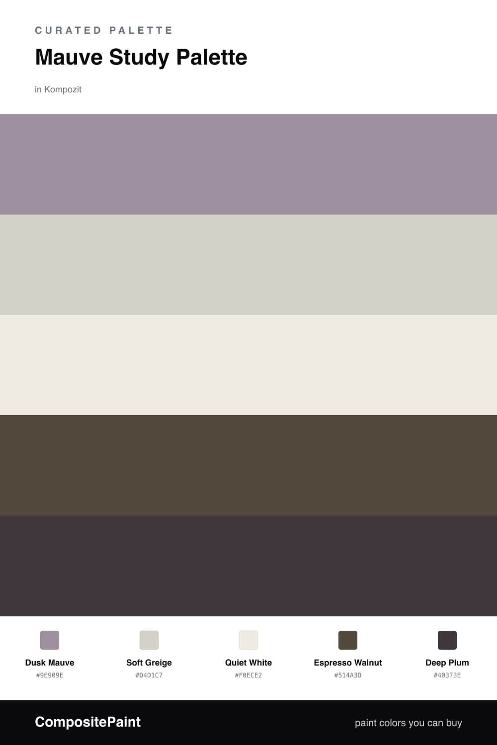
Mauve is having a quiet moment in 2026, and a study is the perfect place for it. Dusk Mauve on the walls feels thoughtful and a little romantic — soft enough to settle the mind, warm enough to read as cozy in afternoon light.

I like to keep the supporting cast gentle. Soft Greige on built-in cabinets or a vanity grounds the mauve, while Quiet White on the trim and ceiling keeps everything fresh and lets the wall color breathe.

The depth comes from below and behind. Espresso Walnut floors anchor the room, and a few Deep Plum touches — a chair, a frame, a shelf back — give the scheme a richer, slightly moody edge that makes the mauve glow.

Buy These Colors

Each color matched to the closest real paint in every brand, by ΔE2000. Kompozit first; take any SKU to the store — these mix on demand.

Dusk Mauve
#A98C95 · LRV 29 · Walls
Kompozit Cut Heather · 1303 ΔE 5.7
Backdrop Anita · BD-AN ΔE 15.59
Behr Cameo Rose · PPU17-15 ΔE 4.95
Benjamin Moore Mauve Blush · 2115-40 ΔE 5.3
Clare Shade · PNT100-MD-14 ΔE 16.9
Dunn-Edwards Ash Hollow · DE6046 ΔE 5.53
Farrow & Ball Charleston Gray · No. 243 ΔE 12.63
Magnolia Home Homebody · JG-136 ΔE 10.49
PPG / Glidden Gothic Amethyst · 1046-5 ΔE 1.88
Sherwin-Williams Thistle · SW 6283 ΔE 1.41
Valspar Mellow Mauve · 1004-7C ΔE 2.34
Soft Greige
#D8CFC4 · LRV 63 · Cabinets or Vanity
Kompozit Power Lunch · 0572 ΔE 2.92
Backdrop Real Real · BD-RR ΔE 3.17
Behr Mineral · UL170-15 ΔE 0.94
Benjamin Moore Sea Froth · 2107-60 ΔE 1.46
Clare Flatiron · PNT100-LT-17 ΔE 0.97
Dunn-Edwards Fine Grain · DE6213 ΔE 1.38
Farrow & Ball Shaded White · No. 201 ΔE 3.2
Magnolia Home Stoneware Pieces · JG-55 ΔE 4.71
PPG / Glidden River Rock · 18-02 ΔE 1.67
Sherwin-Williams Modern Gray · SW 7632 ΔE 0.57
Valspar Rabbit's Foot · 8004-9B ΔE 1.94
Quiet White
#F2EDE6 · LRV 85 · Trim & Ceiling
Kompozit Queen Anne's Lace · 0558 ΔE 1.68
Backdrop Jane · BD-JA ΔE 2.36
Behr Flurries · HDC-WR14-1 ΔE 0.5
Benjamin Moore Vintage Taupe · 2110-70 ΔE 1
Clare Wing It · PNT100-LT-24 ΔE 1.64
Dunn-Edwards Windmill · DE6064 ΔE 2.47
Farrow & Ball Wevet · No. 273 ΔE 2.69
Magnolia Home Silos White · JG-107 ΔE 1.53
PPG / Glidden Cow's Milk · 1053-1 ΔE 0.81
Sherwin-Williams Ibis White · SW 7000 ΔE 0.83
Valspar Bistro White · 7006-4 ΔE 0.96
Espresso Walnut
#5A4636 · LRV 7 · Wood & Floors
Kompozit Deep Shadow · 0445 ΔE 7
Backdrop It's a Date · BD-IT ΔE 2.21
Behr Moose Trail · N190-7 ΔE 0.92
Benjamin Moore Taupe · 2110-10 ΔE 1.85
Clare Blackish · PNT100-DP-54 ΔE 10.76
Dunn-Edwards Northern Territory · DEA158 ΔE 4.19
Farrow & Ball Mahogany · No. 36 ΔE 7.4
Magnolia Home Wooded Acres · JG-122 ΔE 5.39
PPG / Glidden Racy Raisin · 16-24 ΔE 6.2
Sherwin-Williams Van Dyke Brown · SW 7041 ΔE 1.5
Valspar Buckeye · 8005-8G ΔE 1.9
Deep Plum
#46303A · LRV 4 · Accent
Kompozit Eleanor Ann · 1229 ΔE 6.19
Backdrop After Hours · BD-AH ΔE 19.12
Behr Embarcadero · 140F-7 ΔE 1.33
Benjamin Moore Caponata · AF-650 ΔE 4.11
Clare Blackish · PNT100-DP-54 ΔE 14.48
Dunn-Edwards Black · DEA187 ΔE 12.28
Farrow & Ball Pitch Black · No. 256 ΔE 12.18
Magnolia Home Moments · JG-150 ΔE 10.41
PPG / Glidden Black Magic · 1001-7 ΔE 12.64
Sherwin-Williams Marooned · SW 6020 ΔE 5.41
Valspar Noblesse Oblige · 8004-2G ΔE 5.97

Questions

Why does mauve work so well in a study?

Mauve sits between gray and purple, so it feels calm and grown-up without going cold. It softens the light in a focused room and keeps the space from feeling stark while you work.

How do I keep the scheme from feeling flat?

Lean on contrast in the wood and accent. The walnut floors and deep plum give the soft mauve something to push against, so the room reads layered rather than washed out.

Similar Palettes

Closest schemes by color — not by label.