CP

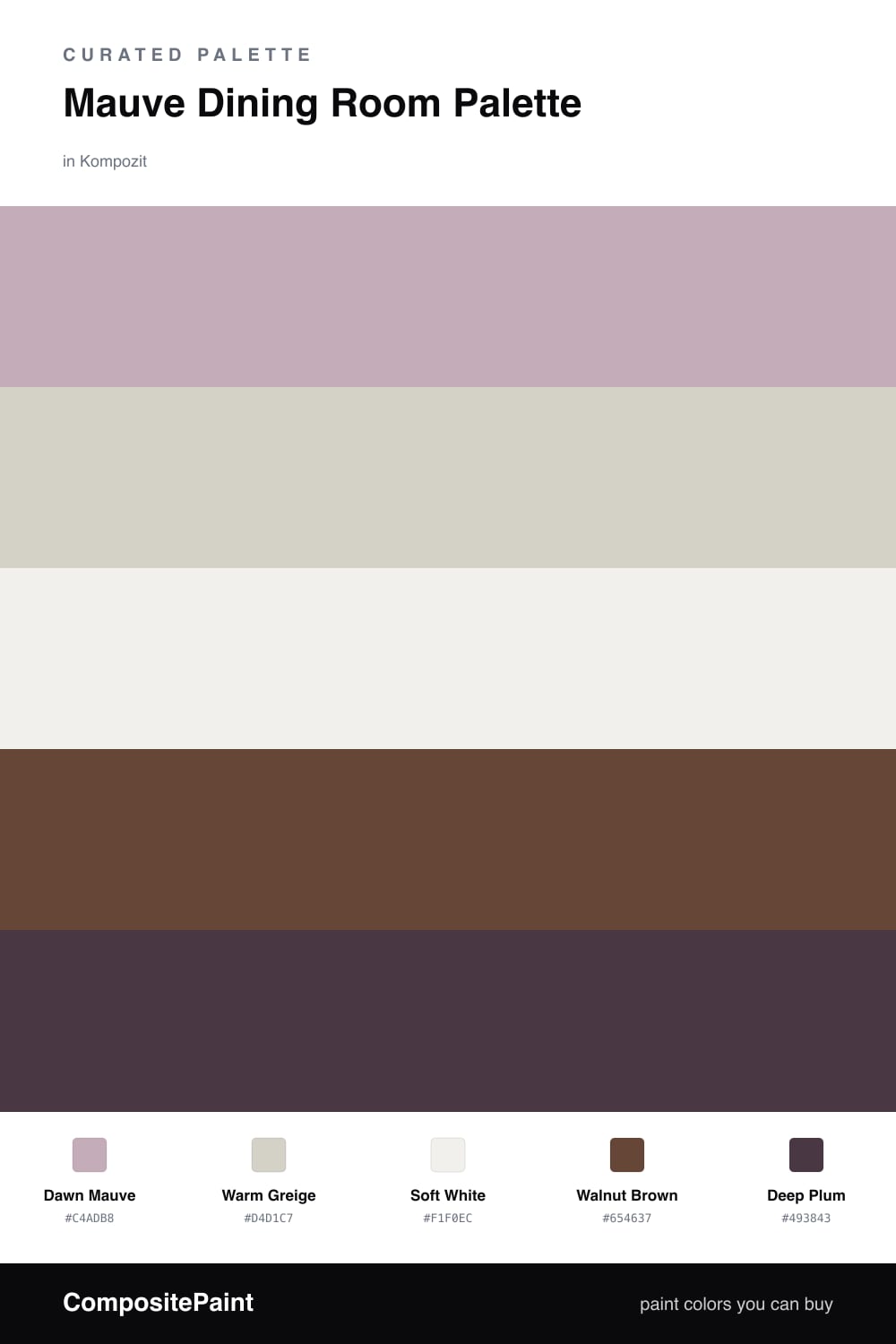
Mauve Dining Room Palette — Dawn Mauve & Warm Greige

A soft five-color dining room scheme led by dawn mauve, balanced with warm greige, a clean white, walnut wood, and a deep plum accent — every color matched to real paint you can buy.

By Jessica Williams · Color Stylist & Interior Editor

Dawn Mauve
Walls
Kompozit Desireé · 1219
#C4ADB8
LRV 45
Warm Greige
Trim & Ceiling
Kompozit Power Lunch · 0572
#D4D1C7
LRV 64
Soft White
Cabinets or Vanity
Kompozit White Shoulders · 1265
#F1F0EC
LRV 87
Walnut Brown
Wood & Floors
Kompozit Hideaway · 0137
#654637
LRV 7
Deep Plum
Accent
Kompozit Purple Shadow · 1215
#493843
LRV 5
View palette in

Mauve is having a real moment in 2026, and the dining room is where it shines. This scheme puts Dawn Mauve on the walls — a quiet, dusty shade that glows soft pink in morning light and deepens to a moody rose after dark. It is the kind of color that makes a room feel held.

Around it, Warm Greige on the trim and ceiling keeps things grounded, while Soft White on built-ins or a vanity adds a breath of fresh air. The pairing lets the mauve stay the star without ever feeling heavy.

For depth, I lean on Walnut Brown in the floor and table, and a small dose of Deep Plum as the accent — think dining chairs, a sideboard, or velvet drapes. Keep the mauve dominant, the neutrals quiet, and let that plum show up just enough to make the whole table feel intentional.

Buy These Colors

Each color matched to the closest real paint in every brand, by ΔE2000. Kompozit first; take any SKU to the store — these mix on demand.

Dawn Mauve
#C3A8AE · LRV 43 · Walls
Kompozit Desireé · 1219 ΔE 2.73
Backdrop Rosita · BD-RO ΔE 8.4
Behr Hydrangea Bouquet · HDC-CT-08A ΔE 3.13
Benjamin Moore Magic Potion · 1250 ΔE 3
Clare Subrosa · PNT100-MD-76 ΔE 9.37
Dunn-Edwards Wispy Mauve · DE6045 ΔE 4.97
Farrow & Ball Cinder Rose · No. 246 ΔE 3.06
Magnolia Home Vintage Collection · JG-99 ΔE 8.85
PPG / Glidden Lighthearted Rose · 1049-4 ΔE 3.69
Sherwin-Williams Chaise Mauve · SW 6016 ΔE 5.51
Valspar Mediterranean Sunset · V078-3 ΔE 2.36
Warm Greige
#D8CFC4 · LRV 63 · Trim & Ceiling
Kompozit Power Lunch · 0572 ΔE 2.92
Backdrop Real Real · BD-RR ΔE 3.17
Behr Mineral · UL170-15 ΔE 0.94
Benjamin Moore Sea Froth · 2107-60 ΔE 1.46
Clare Flatiron · PNT100-LT-17 ΔE 0.97
Dunn-Edwards Fine Grain · DE6213 ΔE 1.38
Farrow & Ball Shaded White · No. 201 ΔE 3.2
Magnolia Home Stoneware Pieces · JG-55 ΔE 4.71
PPG / Glidden River Rock · 18-02 ΔE 1.67
Sherwin-Williams Modern Gray · SW 7632 ΔE 0.57
Valspar Rabbit's Foot · 8004-9B ΔE 1.94
Soft White
#F3EEE7 · LRV 86 · Cabinets or Vanity
Kompozit White Shoulders · 1265 ΔE 2.11
Backdrop Jane · BD-JA ΔE 2.38
Behr Flurries · HDC-WR14-1 ΔE 0.52
Benjamin Moore Alabaster · 876 ΔE 1.01
Clare Wing It · PNT100-LT-24 ΔE 1.56
Dunn-Edwards Light Beige · DE6211 ΔE 0.55
Farrow & Ball Pointing · No. 2003 ΔE 3.08
Magnolia Home Silos White · JG-107 ΔE 1.51
PPG / Glidden Cow's Milk · 1053-1 ΔE 0.85
Sherwin-Williams Arcade White · SW 7100 ΔE 0
Valspar Wooly Lamb · V156 ΔE 0
Walnut Brown
#5C463A · LRV 7 · Wood & Floors
Kompozit Hideaway · 0137 ΔE 3.61
Backdrop It's a Date · BD-IT ΔE 1.59
Behr Moose Trail · N190-7 ΔE 2.1
Benjamin Moore Mahogany · ES-60 ΔE 2.69
Clare Blackish · PNT100-DP-54 ΔE 10.93
Dunn-Edwards Northern Territory · DEA158 ΔE 1.61
Farrow & Ball Mahogany · No. 36 ΔE 6.01
Magnolia Home Wooded Acres · JG-122 ΔE 5.76
PPG / Glidden Racy Raisin · 16-24 ΔE 4.33
Sherwin-Williams Fairfax Brown · SW 2856 ΔE 2.21
Valspar Momentous Occasion · 8005-10G ΔE 3.34
Deep Plum
#4A2F3C · LRV 4 · Accent
Kompozit Purple Shadow · 1215 ΔE 4.53
Backdrop After Hours · BD-AH ΔE 21.37
Behr Wild Raisin · S-G-700 ΔE 0.68
Benjamin Moore Dark Purple · 2073-10 ΔE 2.53
Clare Blackish · PNT100-DP-54 ΔE 16.32
Dunn-Edwards Black · DEA187 ΔE 14.24
Farrow & Ball Pitch Black · No. 256 ΔE 14.18
Magnolia Home Moments · JG-150 ΔE 12.42
PPG / Glidden Black Magic · 1001-7 ΔE 14.53
Sherwin-Williams Merlot · SW 2704 ΔE 2.73
Valspar Virtuoso · M215 ΔE 5.67

Questions

Why does mauve work so well in a dining room?

Mauve sits between pink and gray, so it feels soft without turning sweet. In a dining room it warms up under candlelight and flatters skin tones across the table, which is exactly what you want when people gather to eat.

How do I keep the scheme from feeling flat?

Lean on contrast in your wood and accent. The walnut floors and a touch of deep plum on chairs or a sideboard give the eye somewhere to land, so the gentle mauve walls read as calm rather than washed out.

Similar Palettes

Closest schemes by color — not by label.