Blush Study Palette — Petal Blush & Inkwell Plum
A soft five-color study scheme led by warm blush, balanced with greige, a crisp white, walnut wood, and a deep plum accent — every color matched to real paint you can buy.
By Emily Roberts · DIY Editor & First-Timer's Guide
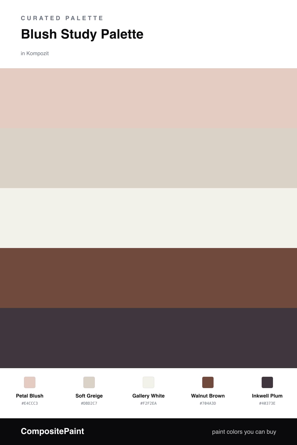
A study should feel quiet and a little personal, and blush does that without going cold. Petal Blush on the walls is warm and soft — think of it as a barely-there clay pink that glows in lamplight rather than shouting at you.
To keep it from feeling too sweet, lean on Soft Greige for a vanity or built-in cabinet and Gallery White on the trim and ceiling so the edges stay crisp. Walnut Brown comes in through your desk and floors, adding that grounded, woody warmth that makes a room feel settled.
Then save Inkwell Plum for the smallest details — a chair, a shelf back, a stack of frames. That one deep note is what pulls the whole thing together and keeps this 2026-leaning blush room feeling calm, modern, and easy to work in.
Buy These Colors
Each color matched to the closest real paint in every brand, by ΔE2000. Kompozit first; take any SKU to the store — these mix on demand.
Questions
Not when the blush stays soft and warm like this one. It reads more like a gentle clay than a candy pink, so it feels calm and grown-up rather than loud, and the greige and white keep it grounded.
Use it in small doses — a built-in shelf back, a desk chair, or the frames on the wall. A little of that dark plum gives your eye something to land on and makes the blush look intentional instead of sweet.
Similar Palettes
Closest schemes by color — not by label.