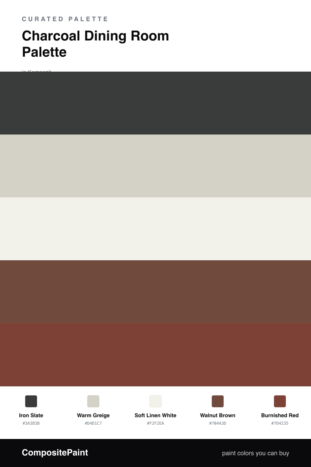
Charcoal Dining Room Palette — Iron Slate & Warm Greige
A grounded, cocooning 5-color scheme for dining rooms: deep charcoal walls, warm greige, soft trim, walnut wood, and a burnished red accent, every color matched to real paint you can buy.
By Maya Patel · Reviews Editor & Product Tester
A dining room is the one place a deep color earns its keep. You sit, you linger, you want the walls to close in a little. This palette puts Iron Slate on the walls — a charcoal with just enough warmth that it reads soft by candlelight instead of cold and corporate.
To keep it from going heavy, Warm Greige opens things up as a backdrop or a single lighter wall, and Soft Linen White on the trim and ceiling gives the charcoal a clean edge without the glare of a bright white. Walnut Brown in the table and floors does the grounding work, tying the dark walls to something natural.
The move that makes this room is Burnished Red — a muted, brick-leaning red on a buffet, a chair set, or art. Keep it to one surface. Against all that charcoal it warms the whole scheme and gives your eye somewhere to land.
Buy These Colors
Each color matched to the closest real paint in every brand, by ΔE2000. Kompozit first; take any SKU to the store — these mix on demand.
Questions
You can, and it reads as cocooning rather than dark if you keep the trim and ceiling in the soft white and let warm wood and lighting break it up. If the room is small or north-facing, paint three walls charcoal and leave one in the warm greige so the space still breathes.
Lean on the warm tones around it. The walnut wood, burnished red, and a linen white instead of a stark bright white all pull the charcoal warm. Add brass or aged-bronze lighting and the gray stops feeling industrial and starts feeling intimate.
Similar Palettes
Closest schemes by color — not by label.