Limousine Leather
The Behr near-black nobody asks for by name, reviewed honestly: what the paint actually delivers instead of the leather-brown its name promises, where it disappears, and what to buy instead.

Jessica has spec'd whites and neutrals for more than 300 rooms and keeps a sample wall of painted drawdowns in her studio. Every color review is checked against real reader rooms in the comments and re-tested when a formula changes. About the testing process →
- 1Limousine Leather4
- 2Oyster Catch9
The Fast Verdict
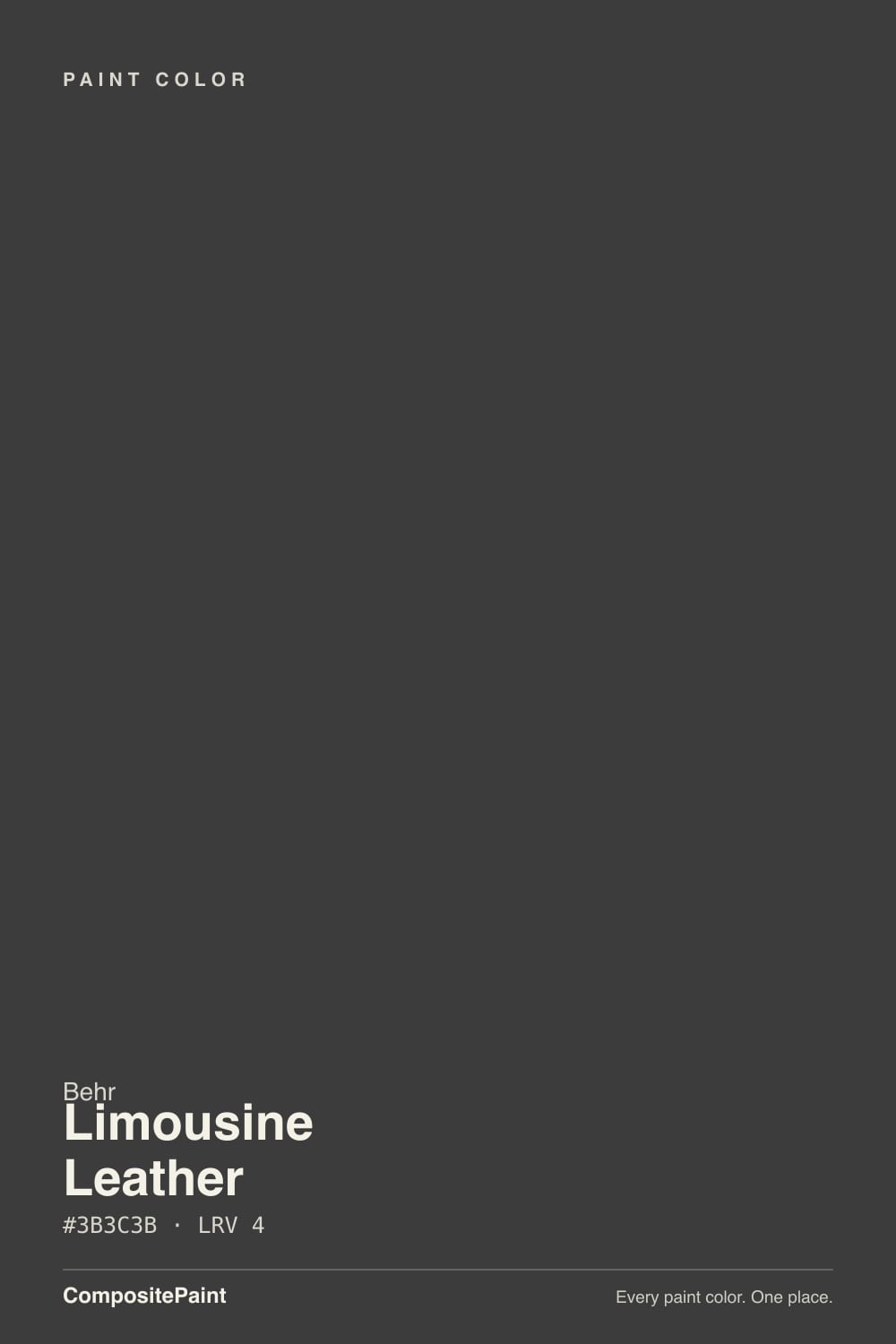
Limousine Leather is a name mismatch wearing a paint chip. Nothing about the actual color is leather or brown — it is a genuinely neutral graphite-black, about as close to zero hue as a Behr color gets, sitting at LRV 4 next to true blacks like Tricorn Black. There is no famous room behind it, no Color of the Year year, no viral Reddit thread — it is a quiet standard-deck black that shows up on front doors and kitchen islands because it works, not because anyone asked for it by name. That honesty is the whole review: buy it for what it is, not what it's called.
Front doors and shutters that get real daylight · a kitchen island or cabinets that want black without a blue or brown lean · one accent wall in a room with a real window · anyone who wants a black without a marketing story attached to it
You read "leather" and want an actual warm saddle-brown · your room has one small window and no accent lighting · you're painting more than a single wall or a single piece of cabinetry · you want a color with a known design pedigree to reassure you before you commit
- Genuinely neutral graphite-black — no confirmed blue, green, or brown undertone to second-guess
- Reads convincingly black in real light despite technically being a very dark gray at LRV 4
- Works cleanly on front doors, shutters, islands, and cabinets without fighting other colors
- No trend timestamp to worry about — a plain neutral doesn't date the way a fashionable dark does
- Widely stocked at any Behr counter, no special order needed
- The "leather" name overpromises a warm brown the paint doesn't deliver
- No design pedigree or famous room to lean on if you're nervous about committing
- At LRV 4 it needs real daylight or accent lighting or it just reads as a dark void
- Visually close to several better-known near-blacks, so there's little reason to specifically ask for it by name over them
What Color Is Limousine Leather, Really?
Start with the name, because it is the first thing that goes wrong. "Limousine Leather" reads like a rich chocolate or espresso-brown — the kind of color that shows up in luxury-car interiors. The paint itself is nothing like that. At hex #3B3C3B the red, green, and blue channels sit within a single point of each other, which is about as close to a true neutral gray as a paint color gets. There is no confirmed warm or cool lean here, no violet secret, no green tell under sun the way some of Behr's other near-blacks carry — it is closer to a flat graphite than to anything you'd call leather.
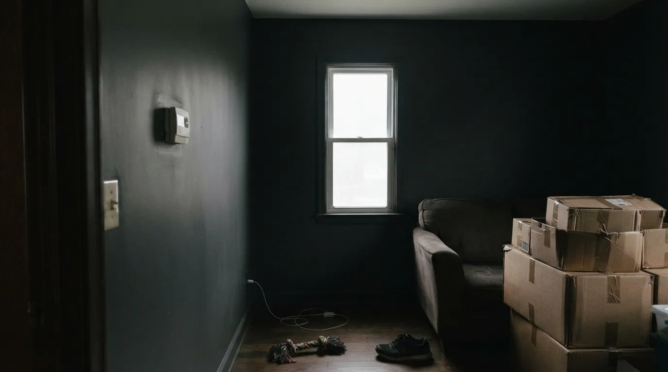
At LRV 4 it is genuinely dark: deeper than Behr's own Cracked Pepper (LRV 5), a shade below Benjamin Moore Wrought Iron (LRV 6), and only one point lighter than the reference true black in most decks, Sherwin-Williams Tricorn Black (LRV 3). That puts it firmly in near-black territory, where color depends almost entirely on how much real light the surface gets. In strong daylight it reads as a crisp, intentional graphite-black; in a shaded corner it reads as nothing — a dark absence rather than a color choice.
There is no confirmed marketing push behind Limousine Leather — no Color of the Year year, no designer-blog moment, no viral before/after. It sits in Behr's standard rack deck as one of dozens of dark neutrals, picked up mostly by people who already knew they wanted a plain, undramatic black and grabbed the swatch closest to true neutral. That is not a knock — a color doesn't need a story to do its job — but if you're hoping the name signals some famous pedigree, there isn't one to point to.
Where It Shines
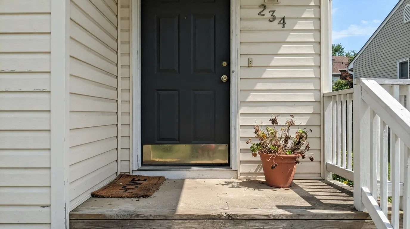
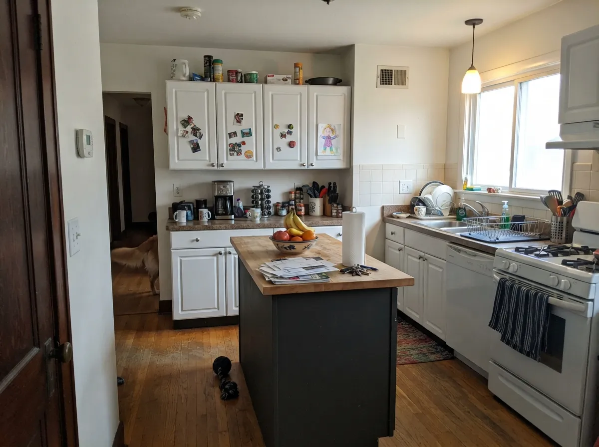
Give it strong, direct light and a small, deliberate surface, and it earns its keep. A front door or a set of shutters in full sun reads as a clean, confident black with none of the blue or brown undertone drama some "designer blacks" carry — what you see on the chip is close to what you get on the door. Indoors, it does the same quiet job on a kitchen island or a run of cabinetry: enough contrast to anchor a room, without a backstory to argue about.
Where It Fails
Almost every disappointing Limousine Leather story comes from one of three predictable mismatches, and none of them are the paint's fault — the color is simply not what the name or the ambition suggested.
If you bought this on the name alone, expecting a rich saddle or espresso brown, you will open the can to a neutral graphite-black instead. The hex reads virtually colorless — no confirmed warm brown lean at all. If brown-black leather is the goal, look at a warm near-black like Sherwin-Williams Black Fox or Van Dyke Brown, not this one.
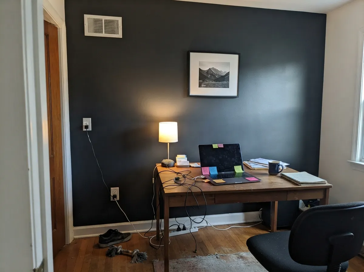
At LRV 4 the surface reflects almost nothing back. In a dim room with no accent lighting, walls in this color stop reading as "black paint" and start reading as a shadowed gap in the room. It needs a real light source — daylight or a dedicated fixture — to look like a decision instead of an accident.
Because there's no famous room or designer case study to point to, going big with this color is a bet with no reassurance behind it. Cracked Pepper and Wrought Iron at least have a reputation to lean on if a whole room in near-black feels risky; Limousine Leather has none. Keep it to a door, an island, or one wall with strong light, and save the whole-room commitment for a color with a track record.
Room by Room
Full exterior sun is where the neutral graphite reads cleanest and most intentional. Semi-gloss holds up to weather and shows just enough sheen to keep it from looking flat and dead.
A single island or a run of lower cabinets in Limousine Leather anchors a room without the color arguing with warm wood or cool stone — because it doesn't lean either way. Satin cabinet enamel wipes clean around handles.
One wall behind a desk or shelving reads sharp and grounded if the room has a window nearby. In a windowless interior office, skip it — there's nothing for the color to catch.
Small rooms take deep neutrals well, and a powder room usually runs on fixture light anyway, which flatters this color more than daylight does. Matte or eggshell.
Workable as a headboard-wall accent with a reading lamp nearby, but a full bedroom in an LRV 4 neutral with no strong light plan will feel like a cave rather than cozy. Test the actual corner you're painting first.
This is not a whole-room color. Without a proven design case behind it, and at this depth, a full room reads heavy and flat rather than dramatic. Keep the ambition to a wall, a door, or cabinetry.
Your Light Is the Risk
Full sun on a front door or shutters is where the neutral graphite looks crisp and deliberate — the color's best case by far.
Without a window or a fixture nearby, an LRV 4 surface goes from "black paint" to "dark gap in the wall." Test the actual spot, not a bright showroom.
On a cloudy day the door reads flatter and softer; full sun sharpens the edges and the graphite reads truer. Both are honest, just different moods.
Warm bulbs keep the neutral gray from feeling cold at night; cool LEDs can nudge it slightly flatter and more clinical. Warm bulbs are the safer default here.
Most complaints about Limousine Leather are a light mismatch. Upload a photo of your actual room and see it on your walls — then ask for the same wall in north light or evening lamps before you buy a single sample.
Need It From Another Brand?
Any paint counter can custom-tint Behr MQ5-05 directly. If you would rather stay in one brand's own deck, these are the closest stock matches, measured as ΔE2000. Under 2 is a difference you will not see on the wall.
| Brand | Closest color | ΔE | LRV | |
|---|---|---|---|---|
| Sherwin-Williams | GreenblackSW 6994 · Sherwin-Williams | 1.5 | 4 | Color page → |
| Benjamin Moore | Blacktop2135-10 · Benjamin Moore | 1.8 | 6 | Color page → |
| Valspar | Black HeronV120-3 · Valspar | 1.4 | 4.5 | Color page → |
| PPG / Glidden | Starless SkyPPG0995-7 · PPG / Glidden | 0.8 | 5 | Color page → |
| Glidden | Onyx Black00NN 05/000 · Glidden | 2.1 | 5 | Color page → |
| Dutch Boy | Ebony Sky438-6DB · Dutch Boy | 3.7 | 5 | Color page → |
Similar Behr Colors
The nearest shades to Limousine Leather within Behr's own range, ranked by perceptual color distance — useful when you want the same look a touch lighter, darker, or warmer.
WCAG 2.1: AA is 4.5 : 1 for normal text, 3 : 1 for large text, AAA is 7 : 1.
Limousine Leather vs the Colors You're Also Considering
Every Limousine Leather sample board has the same rivals on it. The numbers show the real lightness gap — then it comes down to which risk you would rather live with.
Pick this for a truer, more purely neutral graphite with no undertone story to track.
Behr PPU18-01 · LRV 5Cracked PepperPick this if you want Behr's actual famous black — the one with a real reputation, and a violet flash to watch for in strong sun.
Pick this if you're staying in the Behr line and want essentially the same neutral depth off the shelf.
Sherwin-Williams SW 6258 · LRV 3Tricorn BlackPick this if you want the deck's actual reference true black — one point darker and the color most designers default to first.
Pick this when you want the plain neutral version, with no green lean to plan cabinet or trim colors around.
Sherwin-Williams SW 6994 · LRV 4GreenblackPick this if you want a near-black with a confirmed, documented green tint rather than a purely neutral one.
Pick this for the flatter, more purely neutral graphite with no green softness to it.
Benjamin Moore 2124-10 · LRV 6Wrought IronPick this for a softer, more forgiving near-black with an actual design reputation behind it if you want reassurance before committing to a full wall.
Inside the Behr deck the differences are small. Madison Avenue QE-64 (#3C3D3D, LRV 5) and Raven Black PPF-59 (#3D3D3D, LRV 5) are a hair lighter and flatter in tone. Black Lacquer T13-3 (#3F3E3E, LRV 5) is the lightest of the group. Stealth Jet 780F-7 (#353C39, LRV 4) is the one real departure, with visibly more green in the mix.
Across brands, Kompozit Black Licorice 0529 (deltaE 0.75) and PPG Starless Sky PPG0995-7 (deltaE 0.77) are matches. Dunn-Edwards Carbonized Wood DESS50, Farrow and Ball Smelt Black No. G18, Valspar Black Heron V120-3, and Sherwin-Williams Greenblack SW 6994 all land between deltaE 1 and 1.5, which is visually identical in normal room light.
Benjamin Moore Blacktop 2135-10 (deltaE 1.81), Glidden Onyx Black (deltaE 2.15), and Rust-Oleum Charcoal 285144 (deltaE 3.08) are very close but worth sampling first. Dutch Boy Ebony Sky 438-6DB (deltaE 3.74) and Clare Blackish (deltaE 3.97) are close but visibly different side by side.
Limousine Leather Coordinating Colors
Because it doesn't lean warm or cool, Limousine Leather is an easy neutral to pair with almost anything — the coordinating work is less about matching undertone and more about giving it enough contrast to read as a decision. Bright and soft whites do the heavy lifting; a warm greige softens the jump between them.
A Name Without a Story — and Why That's Fine
Every near-black in this price range seems to come with a backstory: a Color of the Year year, a designer's signature room, a viral before-and-after. Limousine Leather has none of that. It sits in Behr's standard rack deck as one of dozens of dark neutrals, and nothing in the available research turns up a famous project, a trend-report mention, or even much conversation about it by name — it's simply a color people grab off the swatch wall because it looks like a plain, honest black.
That is worth saying plainly rather than inventing a story to fill the gap: this is not a color with a pedigree, and it doesn't need one. It does the job of a neutral near-black competently and without drama. If you want a black with a reputation to point to when a guest asks about it, Cracked Pepper or Tricorn Black have one; if you just want the color to work and disappear into the room's function, Limousine Leather does that quietly.
Limousine Leather With Wood Tones and Floors
Because the color carries no confirmed warm or cool lean, it sits comfortably next to most wood tones — walnut, white oak, and honey oak all read fine against it, since there's no undertone fighting to happen in the first place. This is one of the real advantages of a genuinely neutral near-black over a warm or cool one: it doesn't force a conversation with the floor.
The one place to test first is a very cool-toned, gray-washed floor paired with cool-white LED lighting — two cool neutrals stacked can read a little clinical together. Warm lamp light or a wood tone with any red in it fixes that instantly.
Three Ready Palettes Built on Limousine Leather
A color is never alone on the wall. These are complete combinations in the 60-30-10 pattern, with the reason each one holds together. Every one opens in the visualizer.
Warm off-white siding lets the door do all the contrast work; the greige shutters bridge the two so the near-black door reads as a deliberate accent rather than a hole in the facade.
Try this palette in your roomA bright, everyday white keeps the room from going heavy while the island carries the entire color statement. Silver Drop's greige keeps the transition from white to near-black from feeling stark.
Try this palette in your roomA near-white wall lets a window keep feeding light to the room even where the built-ins go dark; the greige trim keeps the jump from white to near-black from reading like two unrelated decisions.
Try this palette in your roomLimousine Leather FAQ
Is Limousine Leather actually brown, like the name suggests?
No. Despite the name, the color itself is a neutral graphite-black — the red, green, and blue values are almost identical, which is about as close to true neutral as a paint color gets. If you want an actual warm leather-brown, this is the wrong can; look at a documented warm near-black instead.
Is it a true black or a dark gray?
Technically a very dark neutral gray at LRV 4, one point lighter than the deck's reference true black, Sherwin-Williams Tricorn Black (LRV 3). In real light it reads convincingly as black; the LRV number only matters for how much light it needs to look that way.
Is it good for a front door?
Yes — this is its strongest use. Full exterior sun shows the neutral graphite at its cleanest and most intentional, with semi-gloss sheen holding up to weather.
Can I use it on a kitchen island?
Yes. Because it doesn't lean warm or cool, it won't argue with either warm wood tones or cool stone counters the way some near-blacks do. Satin cabinet enamel is the right finish.
Will it work in a small, dim room?
Only with real light backup — a window nearby or a dedicated fixture. At LRV 4 it reflects almost nothing, so a dim room with no accent lighting will read as a dark gap rather than a painted wall.
How is it different from Behr's other blacks, like Cracked Pepper?
Cracked Pepper (LRV 5) is Behr's actual famous black, with a documented violet flash in strong sun. Limousine Leather has no comparable reputation and no confirmed undertone story — it is simply a more purely neutral, quieter option a shade darker.
Have you painted with Limousine Leather?
Rate it — one tap helps the next reader decide.
Ask a Question