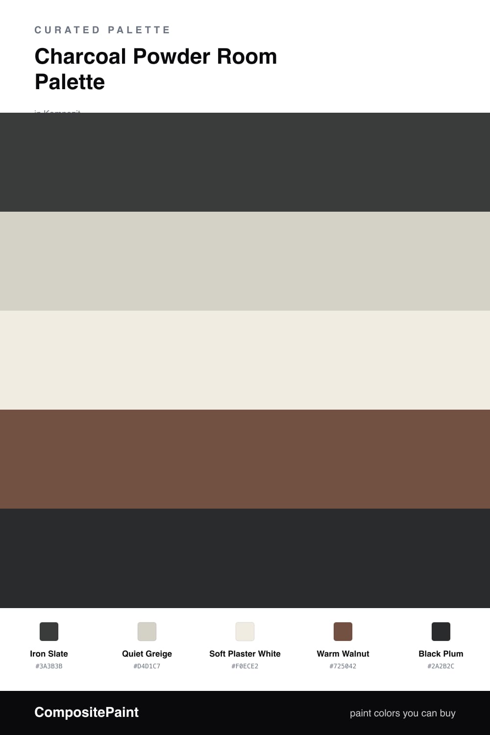
Charcoal Powder Room Palette — Iron Slate & Warm Walnut
A moody five-color powder room scheme led by deep charcoal, warmed with greige, crisp white, walnut, and a black-plum accent — every color matched to real paint you can buy.
By David Chen · Formulation Lead & Resident Chemist
A powder room is the one place you can be bold without living in the color all day, and charcoal is the smartest way to use that freedom. Iron Slate wraps the walls in a deep, slightly cool gray that feels modern and calm, while Soft Plaster White on the vanity keeps the room from closing in on itself.
The trick to keeping charcoal warm instead of cold is the supporting cast. Quiet Greige on the trim and ceiling softens the edges, and Warm Walnut on a floating shelf or wood floor adds the honey tone that makes the gray feel inviting rather than industrial.
For 2026 the move is contrast you have to lean in to notice. A touch of Black Plum on a mirror frame, a sconce, or hardware reads as near-black from across the room, then reveals a quiet purple cast up close. Keep charcoal as the lead, let the walnut warm it, and use that plum in the smallest dose.
Buy These Colors
Each color matched to the closest real paint in every brand, by ΔE2000. Kompozit first; take any SKU to the store — these mix on demand.
Questions
A small room is exactly where charcoal shines. Powder rooms get short visits, so a deep color reads as cozy and dramatic instead of heavy. Add a warm light bulb and a big mirror and the space feels rich, not cramped.
Go with eggshell or matte for the walls so you do not see every flaw, then put the trim and vanity in satin or semi-gloss. The slight shine on the woodwork makes the flat charcoal look intentional and clean.
Similar Palettes
Closest schemes by color — not by label.