Charcoal Living Room Palette — Iron Slate & Walnut
A moody five-color living room scheme led by deep charcoal walls, softened with warm greige and crisp white, then grounded by walnut and a near-black accent — every color matched to real paint you can buy.
By Maya Patel · Reviews Editor & Product Tester
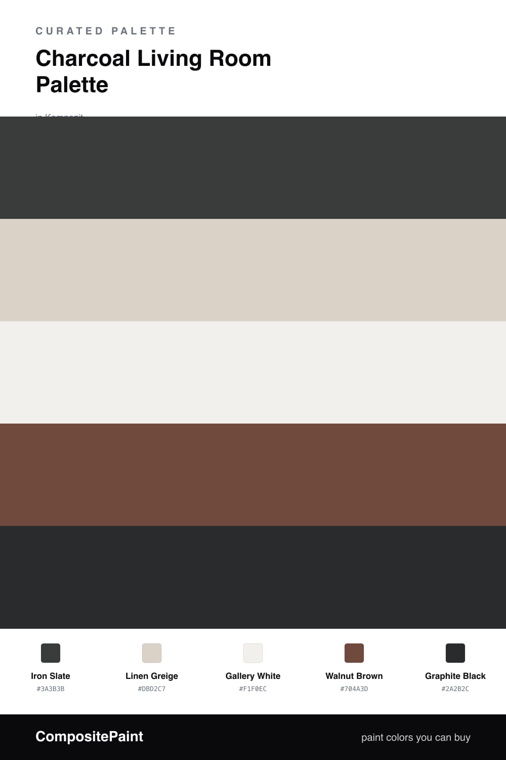
Charcoal is the move for 2026 living rooms, and Iron Slate is the kind of deep, slightly warm gray that anchors a space without swallowing it. It is the lead here, carrying the main walls and setting a calm, grown-up mood.
To keep it from feeling heavy, Linen Greige softens any built-ins or a media cabinet, and Gallery White on the trim and ceiling draws a clean line that lets the charcoal breathe. Walnut Brown does the real work, pulling warmth back in through floors, a coffee table, or a console.
The spark is Graphite Black — a near-black accent for a lamp base, a frame, or hardware. Use the charcoal as your dominant tone, keep the white and greige doing the quiet balancing, and let walnut and graphite add just enough depth to make the room feel layered.
Buy These Colors
Each color matched to the closest real paint in every brand, by ΔE2000. Kompozit first; take any SKU to the store — these mix on demand.
Questions
Not if you balance them. Charcoal reads cozy rather than cramped when you keep the trim and ceiling bright and let warm wood tones bounce light around the room. Save the deepest tone for one feature wall if you want to ease in.
Go with a matte or eggshell sheen. Flat finishes hide wall texture and stop the deep color from looking patchy, while a touch of eggshell keeps the surface wipeable in a high-traffic room.
Similar Palettes
Closest schemes by color — not by label.