CP

Blush Living Room Palette — Dawn Blush & Soft Clay

A warm five-color living room scheme led by soft blush, balanced by a greige backdrop, a clean white, a walnut wood tone, and a deep plum accent — every color matched to real paint you can buy.

By Jessica Williams · Color Stylist & Interior Editor

Dawn Blush
Walls
Kompozit Pout · 0125
#E4CCC3
LRV 64
Soft Greige
Cabinets or Vanity
Kompozit Power Lunch · 0572
#D4D1C7
LRV 64
Quiet White
Trim & Ceiling
Kompozit Bunny Cake · 0012
#F5EFE2
LRV 87
Walnut Brown
Wood & Floors
Kompozit Evolution · 0130
#704A3D
LRV 9
Deep Plum
Accent
Kompozit Grape Soda · 1222
#533D47
LRV 6
View palette in

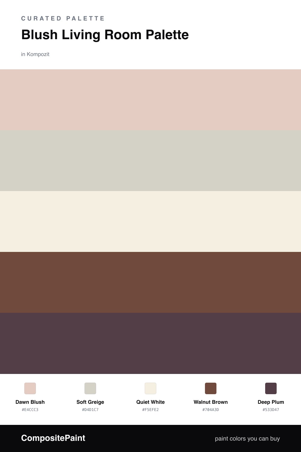
Blush has quietly grown up. In a living room, Dawn Blush on the walls gives you that first-light warmth — soft, barely-there color that turns golden in lamplight and stays restful by day. It is the kind of shade that makes a room feel held rather than decorated.

Around it, Soft Greige earns its keep on built-ins or a media cabinet, while Quiet White keeps the trim and ceiling fresh and lets the blush breathe. Walnut Brown comes in through floors and wood furniture, grounding all that softness with something honest and a little rugged.

Then Deep Plum does the contemporary work — a moody, dusty accent on a chair or a single wall that keeps the whole scheme from drifting too sweet. Lead with the blush, let the neutrals do the quiet talking, and save the plum for the moments you want the eye to land.

Buy These Colors

Each color matched to the closest real paint in every brand, by ΔE2000. Kompozit first; take any SKU to the store — these mix on demand.

Dawn Blush
#E7CFC6 · LRV 66 · Walls
Kompozit Pout · 0125 ΔE 0.71
Backdrop August · BD-AU ΔE 3.73
Behr Soft Shoe · MQ3-37 ΔE 3.09
Benjamin Moore Rose Accent · 1177 ΔE 0.71
Clare Neutral Territory · PNT100-LT-20 ΔE 6.1
Dunn-Edwards Pale Berries · DE6051 ΔE 1.97
Farrow & Ball Calamine · No. 230 ΔE 1.55
Magnolia Home Ella Rose · JG-24 ΔE 2.16
PPG / Glidden Honeysweet · 1065-3 ΔE 1.38
Sherwin-Williams Romance · SW 6323 ΔE 1.6
Valspar Tender Shell · 1006-10C ΔE 1.82
Soft Greige
#D8CFC2 · LRV 63 · Cabinets or Vanity
Kompozit Power Lunch · 0572 ΔE 2.87
Backdrop Real Real · BD-RR ΔE 2.3
Behr Aged Beige · PPU7-09 ΔE 0.79
Benjamin Moore Cedar Key · 982 ΔE 0.93
Clare Flatiron · PNT100-LT-17 ΔE 1.31
Dunn-Edwards Fine Grain · DE6213 ΔE 0.45
Farrow & Ball Shaded White · No. 201 ΔE 2.35
Magnolia Home Stoneware Pieces · JG-55 ΔE 4.41
PPG / Glidden Cool Concrete · 1023-2 ΔE 0.91
Sherwin-Williams Modern Gray · SW 7632 ΔE 0.89
Valspar Gentle Shadows · 8005-5A ΔE 1.02
Quiet White
#F4EEE6 · LRV 86 · Trim & Ceiling
Kompozit Bunny Cake · 0012 ΔE 2.28
Backdrop Jane · BD-JA ΔE 2.49
Behr Flurries · HDC-WR14-1 ΔE 0.52
Benjamin Moore Alabaster · 876 ΔE 1.41
Clare Wing It · PNT100-LT-24 ΔE 1.34
Dunn-Edwards Light Beige · DE6211 ΔE 0.54
Farrow & Ball Pointing · No. 2003 ΔE 2.75
Magnolia Home Silos White · JG-107 ΔE 1.9
PPG / Glidden Cow's Milk · 1053-1 ΔE 1.04
Sherwin-Williams Arcade White · SW 7100 ΔE 0.55
Valspar Wooly Lamb · V156 ΔE 0.55
Walnut Brown
#6B4A38 · LRV 8 · Wood & Floors
Kompozit Evolution · 0130 ΔE 3.32
Backdrop It's a Date · BD-IT ΔE 4.29
Behr Bricktone · BXC-42 ΔE 3.24
Benjamin Moore Forest Brown · 2105-10 ΔE 1.76
Clare Vintage · PNT100-DP-67 ΔE 9.94
Dunn-Edwards Chaps · DE6049 ΔE 4.12
Farrow & Ball Preference Red · No. 297 ΔE 11.67
Magnolia Home Mountain Currant · JG-171 ΔE 4.68
PPG / Glidden Bird House Brown · 1072-7 ΔE 2.43
Sherwin-Williams Sturdy Brown · SW 6097 ΔE 4.22
Valspar Cowboy Hat · 3010-8 ΔE 1.39
Deep Plum
#5A3A47 · LRV 6 · Accent
Kompozit Grape Soda · 1222 ΔE 3.68
Backdrop It's a Date · BD-IT ΔE 14.73
Behr Semi Sweet · 130F-7 ΔE 3.02
Benjamin Moore Autumn Purple · 2073-20 ΔE 4.13
Clare Blackish · PNT100-DP-54 ΔE 16.46
Dunn-Edwards Mulberry · DEA194 ΔE 3.24
Farrow & Ball Brinjal · No. 222 ΔE 2.83
Magnolia Home Plum Suede · JG-102 ΔE 6.4
PPG / Glidden Gooseberry · 1048-7 ΔE 3.56
Sherwin-Williams Blackberry · SW 7577 ΔE 2.2
Valspar Plummy Rouge · 8003-2G ΔE 3.04

Questions

Why does blush work as a living room wall color?

Blush reads as a soft neutral with a warm pulse, so it flatters skin tones and evening light without feeling pink or precious. Paired with greige and a clean white, it stays grown-up and calm.

How much of the deep plum should I use?

Keep it to roughly one-fifth of the room — a pair of chairs, a throw, or a single painted nook. It gives the blush something to lean against so the scheme feels anchored, not sweet.

Similar Palettes

Closest schemes by color — not by label.