CP

Blush Kitchen Palette — Soft Blush & Warm Walnut

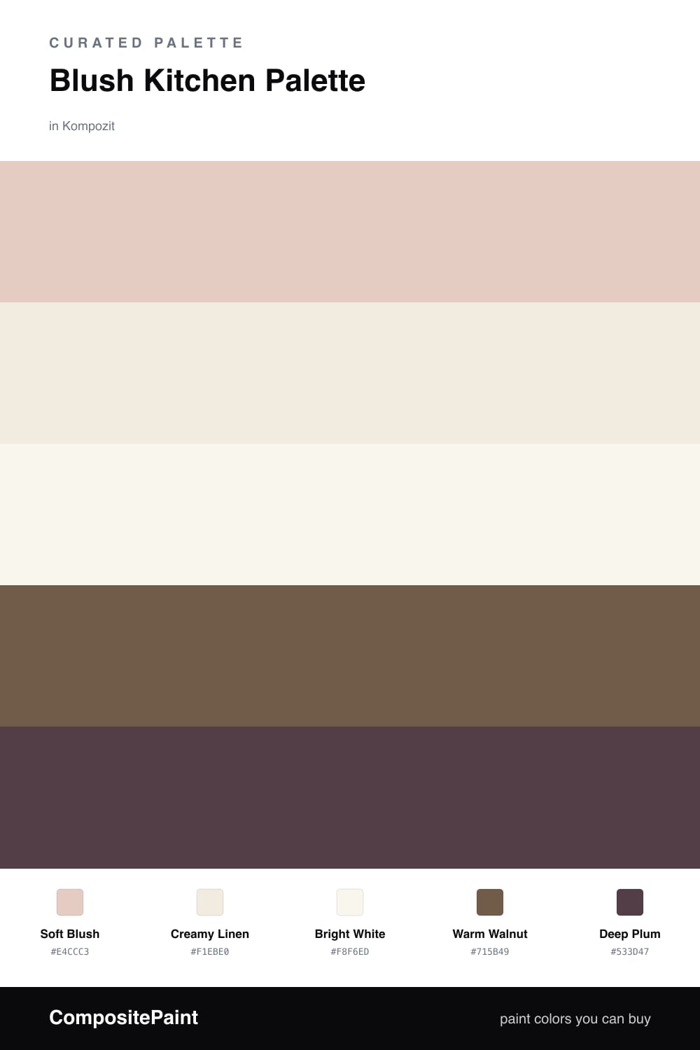
A gentle five-color kitchen scheme led by soft blush walls with a creamy backdrop, crisp white trim, warm walnut wood, and a deep plum accent — every color matched to real paint you can buy.

By Emily Roberts · DIY Editor & First-Timer's Guide

Soft Blush
Walls
Kompozit Pout · 0125
#E4CCC3
LRV 64
Creamy Linen
Cabinets or Vanity
Kompozit Nilla Vanilla · 0003
#F1EBE0
LRV 83
Bright White
Trim & Ceiling
Kompozit Sugar Dust · 0011
#F8F6ED
LRV 92
Warm Walnut
Wood & Floors
Kompozit Dapper · 0192
#715B49
LRV 11
Deep Plum
Accent
Kompozit Grape Soda · 1222
#533D47
LRV 6
View palette in

A blush kitchen is one of my favorite ways to add warmth without going bold. Soft Blush on the walls feels cozy and a little romantic, but it stays grounded because the tone is dusty and earthy instead of candy pink. It is the kind of color that glows in morning light and softens at night.

To keep it feeling like a real kitchen and not a dollhouse, I lean on quiet neutrals. Creamy Linen is lovely on cabinets, and Bright White keeps the trim and ceiling crisp so everything looks clean and fresh. Warm Walnut comes in through wood floors, open shelves, or a butcher-block counter, adding that grounded, natural feel that is everywhere in 2026 kitchens.

For a little drama, add Deep Plum in small doses — a pantry door, an island base, or a few bar stools. It picks up the warmth in the blush and gives your eye somewhere to land. Let the blush lead, keep the neutrals doing the quiet work, and use the plum as your one bold note.

Buy These Colors

Each color matched to the closest real paint in every brand, by ΔE2000. Kompozit first; take any SKU to the store — these mix on demand.

Soft Blush
#E7CBC2 · LRV 64 · Walls
Kompozit Pout · 0125 ΔE 1.44
Backdrop August · BD-AU ΔE 3.62
Behr Sand Dance · S190-2 ΔE 1.88
Benjamin Moore Rose Blush · 037 ΔE 1.57
Clare Turbinado · PNT100-LT-21 ΔE 9.84
Dunn-Edwards Pale Berries · DE6051 ΔE 2.39
Farrow & Ball Calamine · No. 230 ΔE 2.73
Magnolia Home Ella Rose · JG-24 ΔE 3.12
PPG / Glidden Au Naturel · 1067-3 ΔE 0.71
Sherwin-Williams Quaint Peche · SW 6330 ΔE 1.38
Valspar Harmony · 2001-8C ΔE 1.29
Creamy Linen
#F2EBDE · LRV 84 · Cabinets or Vanity
Kompozit Nilla Vanilla · 0003 ΔE 0.84
Backdrop Jane · BD-JA ΔE 2.41
Behr Papier Blanc · HDC-NT-08 ΔE 1.4
Benjamin Moore Winter Sky · 2163-70 ΔE 1.23
Clare Like Buttah · PNT100-LT-62 ΔE 2.45
Dunn-Edwards Bone China · DEW339 ΔE 1.17
Farrow & Ball White Tie · No. 2002 ΔE 2.31
Magnolia Home Pearly Cotton · JG-33 ΔE 2.23
PPG / Glidden Macaroon Cream · 15-05 ΔE 1.49
Sherwin-Williams Shell White · SW 8917 ΔE 1.07
Valspar Statuesque · 7002-5 ΔE 1.21
Bright White
#F7F4EF · LRV 91 · Trim & Ceiling
Kompozit Sugar Dust · 0011 ΔE 2.12
Backdrop Tabula Rasa · BD-TR ΔE 3.03
Behr Whisper White · HDC-MD-08 ΔE 0.85
Benjamin Moore Chantilly Lace · 2121-70 ΔE 2.48
Clare Timeless · PNT100-LT-04 ΔE 1.97
Dunn-Edwards Droplets · DEW381 ΔE 0.5
Farrow & Ball Wimborne White · No. 239 ΔE 2.7
Magnolia Home True White · JG-21 ΔE 2.01
PPG / Glidden Delicate White · 1001-1 ΔE 2.01
Sherwin-Williams High Reflective White · SW 7757 ΔE 1.76
Valspar Cuddle Down · 8007-6F ΔE 1.7
Warm Walnut
#7A5848 · LRV 12 · Wood & Floors
Kompozit Dapper · 0192 ΔE 5.42
Backdrop Buenos Aires · BD-BA ΔE 5.06
Behr Iron Oxide · QE-15 ΔE 2.46
Benjamin Moore Hedgehog Brown · 2097-30 ΔE 1.12
Clare Vintage · PNT100-DP-67 ΔE 8.77
Dunn-Edwards Burns Cave · DE6098 ΔE 0.47
Farrow & Ball Salon Drab · No. 290 ΔE 9.42
Magnolia Home Cognac · JG-164 ΔE 6.24
PPG / Glidden Spiced Cinnamon · 1071-7 ΔE 1.88
Sherwin-Williams Grounded · SW 6089 ΔE 3.18
Valspar Wooden Wagon · 3001-7A ΔE 1.8
Deep Plum
#5A3A45 · LRV 6 · Accent
Kompozit Grape Soda · 1222 ΔE 3.61
Backdrop It's a Date · BD-IT ΔE 13.93
Behr Napa Wine · QE-63 ΔE 2.02
Benjamin Moore Autumn Purple · 2073-20 ΔE 4.95
Clare Blackish · PNT100-DP-54 ΔE 16.14
Dunn-Edwards Mulberry · DEA194 ΔE 4.05
Farrow & Ball Brinjal · No. 222 ΔE 2.03
Magnolia Home Plum Suede · JG-102 ΔE 6.58
PPG / Glidden Gooseberry · 1048-7 ΔE 2.9
Sherwin-Williams Cordovan · SW 6027 ΔE 4.33
Valspar Plummy Rouge · 8003-2G ΔE 3.58

Questions

Will a blush kitchen feel too pink?

Not if you keep the blush soft and earthy rather than bright. This shade leans warm and dusty, so it reads as a cozy neutral on the walls. The cream and white around it calm things down even more.

What finish should I use on kitchen walls?

Reach for an eggshell or satin finish on the blush walls — it wipes clean near the stove and sink. Save a tougher semi-gloss for the trim and any painted cabinets.

Similar Palettes

Closest schemes by color — not by label.