CP

Lavender Study Palette — Quiet Lavender & Burnished Walnut

A focused, calming 5-color scheme for a study: soft lavender walls, a warm greige backdrop, clean trim, grounding walnut, and a deep plum accent — every color matched to real paint you can buy.

By Maya Patel · Reviews Editor & Product Tester

Quiet Lavender
Walls
Kompozit Orchid Fragrance · 1287
#C9C1D0
LRV 55
Warm Greige
Backdrop & Built-ins
Kompozit Mossy Shade · 0195
#DBD2C7
LRV 65
Soft Chalk White
Trim & Ceiling
Kompozit Cyprus Spring · 0411
#F2F2EA
LRV 88
Burnished Walnut
Desk & Shelving
Kompozit Alpha Male · 0193
#715A45
LRV 11
Deep Plum
Accent Wall
Kompozit Purple Shadow · 1215
#493843
LRV 5
View palette in

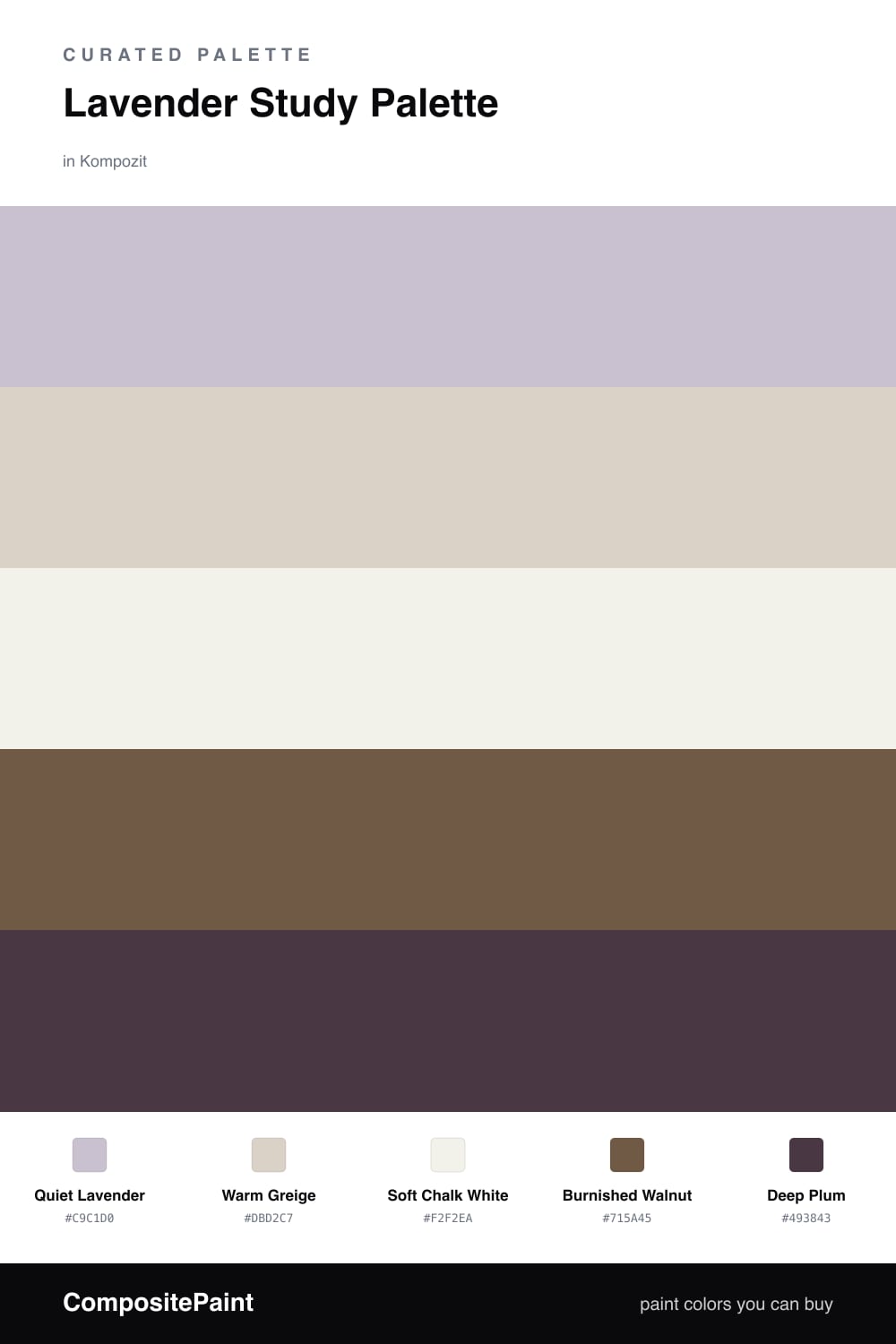
A study is the one room where lavender earns its keep. It is soft enough to keep you calm through a long afternoon, but the gray in it keeps things grown-up instead of girlish. I built this scheme around a muted Quiet Lavender on the walls — the kind of shade that leans dove-gray in low light and only shows its purple when the sun moves across it.

Around it, Warm Greige does the quiet work on built-ins and the backs of shelves, so the lavender never floats alone. Soft Chalk White on the trim and ceiling keeps the edges clean without going stark. The winner of this palette, though, is Burnished Walnut on the desk and shelving — that warm brown is what stops a lavender room from feeling cold, and it ties straight into the grounded, earthy direction everyone is chasing for 2026.

Save Deep Plum for one move only: a single accent wall behind the desk or the inside of a bookcase. It is the deepest color here, and it cocoons the room when you use it small. Spread it wider than one-fifth of the space and it stops reading as an accent and starts reading as a cave.

Buy These Colors

Each color matched to the closest real paint in every brand, by ΔE2000. Kompozit first; take any SKU to the store — these mix on demand.

Quiet Lavender
#C9C2D6 · LRV 56 · Walls
Kompozit Orchid Fragrance · 1287 ΔE 1.98
Backdrop Lost in the 80s · BD-LO ΔE 16.75
Behr Mulberry Stain · N110-2 ΔE 0.51
Benjamin Moore French Lilac · 1403 ΔE 1.4
Clare Motor City · PNT100-LT-09 ΔE 12.14
Dunn-Edwards Soft Purple · DE5954 ΔE 3.78
Farrow & Ball Calluna · No. 270 ΔE 6.32
Magnolia Home Cement Pots · JG-93 ΔE 8.48
PPG / Glidden Purple Dragon · 1247-4 ΔE 3.9
Sherwin-Williams Enchant · SW 6555 ΔE 3.63
Valspar Playful Petal · 1001-4B ΔE 3.11
Warm Greige
#D9D3C7 · LRV 65 · Backdrop & Built-ins
Kompozit Mossy Shade · 0195 ΔE 1.74
Backdrop Real Real · BD-RR ΔE 2.26
Behr Windrush · HDC-CT-19 ΔE 1.3
Benjamin Moore Alaskan Skies · 972 ΔE 1.3
Clare Beigeing · PNT100-LT-18 ΔE 2.73
Dunn-Edwards Shady · DEC774 ΔE 0.87
Farrow & Ball Shaded White · No. 201 ΔE 2.04
Magnolia Home Stoneware Pieces · JG-55 ΔE 3.1
PPG / Glidden Gray Beige · 14-30 ΔE 1.76
Sherwin-Williams Natural Tan · SW 7567 ΔE 1.93
Valspar Warm Putty · 6006-1A ΔE 0.95
Soft Chalk White
#F6F3EC · LRV 90 · Trim & Ceiling
Kompozit Cyprus Spring · 0411 ΔE 1.71
Backdrop Tabula Rasa · BD-TR ΔE 2.04
Behr Whisper White · HDC-MD-08 ΔE 0.58
Benjamin Moore Opulence · 879 ΔE 0.99
Clare Timeless · PNT100-LT-04 ΔE 1.25
Dunn-Edwards Droplets · DEW381 ΔE 0.97
Farrow & Ball Wimborne White · No. 239 ΔE 1.74
Magnolia Home True White · JG-21 ΔE 2.01
PPG / Glidden Delicate White · 1001-1 ΔE 2.15
Sherwin-Williams High Reflective White · SW 7757 ΔE 1.6
Valspar Ivory Keys · 8007-4A ΔE 0.95
Burnished Walnut
#7A5A40 · LRV 12 · Desk & Shelving
Kompozit Alpha Male · 0193 ΔE 3.53
Backdrop Buenos Aires · BD-BA ΔE 2
Behr Molasses · S220-7 ΔE 2.08
Benjamin Moore Marsh Brown · 2164-20 ΔE 2.07
Clare Coffee Date · PNT100-DP-53 ΔE 10.87
Dunn-Edwards Burns Cave · DE6098 ΔE 4.4
Farrow & Ball Salon Drab · No. 290 ΔE 7.96
Magnolia Home Cognac · JG-164 ΔE 2.5
PPG / Glidden Maple Syrup · 1084-7 ΔE 1.7
Sherwin-Williams Burnished Brandy · SW 7523 ΔE 0.85
Valspar Wooden Wagon · 3001-7A ΔE 2.92
Deep Plum
#4A3346 · LRV 4 · Accent Wall
Kompozit Purple Shadow · 1215 ΔE 4.19
Backdrop Last Call · BD-LC ΔE 12.89
Behr Mahogany Spice · BNC-31 ΔE 3.34
Benjamin Moore Dark Purple · 2073-10 ΔE 3.47
Clare Blackish · PNT100-DP-54 ΔE 16.38
Dunn-Edwards Preserve · DEA193 ΔE 4.22
Farrow & Ball Pelt · No. 254 ΔE 6.02
Magnolia Home Plum Suede · JG-102 ΔE 4.55
PPG / Glidden Napoleon · 1013-7 ΔE 12.75
Sherwin-Williams Merlot · SW 2704 ΔE 5.55
Valspar Virtuoso · M215 ΔE 3.69

Questions

Will lavender walls make a study feel too soft to focus in?

Not at this muted, slightly gray lavender. The gray keeps it serious, and the walnut desk and deep plum accent add enough weight that the room reads focused rather than sweet.

Where should I put the deep plum in a study?

Keep it to one surface — the wall behind the desk or the interior of a bookcase. Used on more than about one-fifth of the room it stops being an accent and starts to close the space in.

Similar Palettes

Closest schemes by color — not by label.