CP

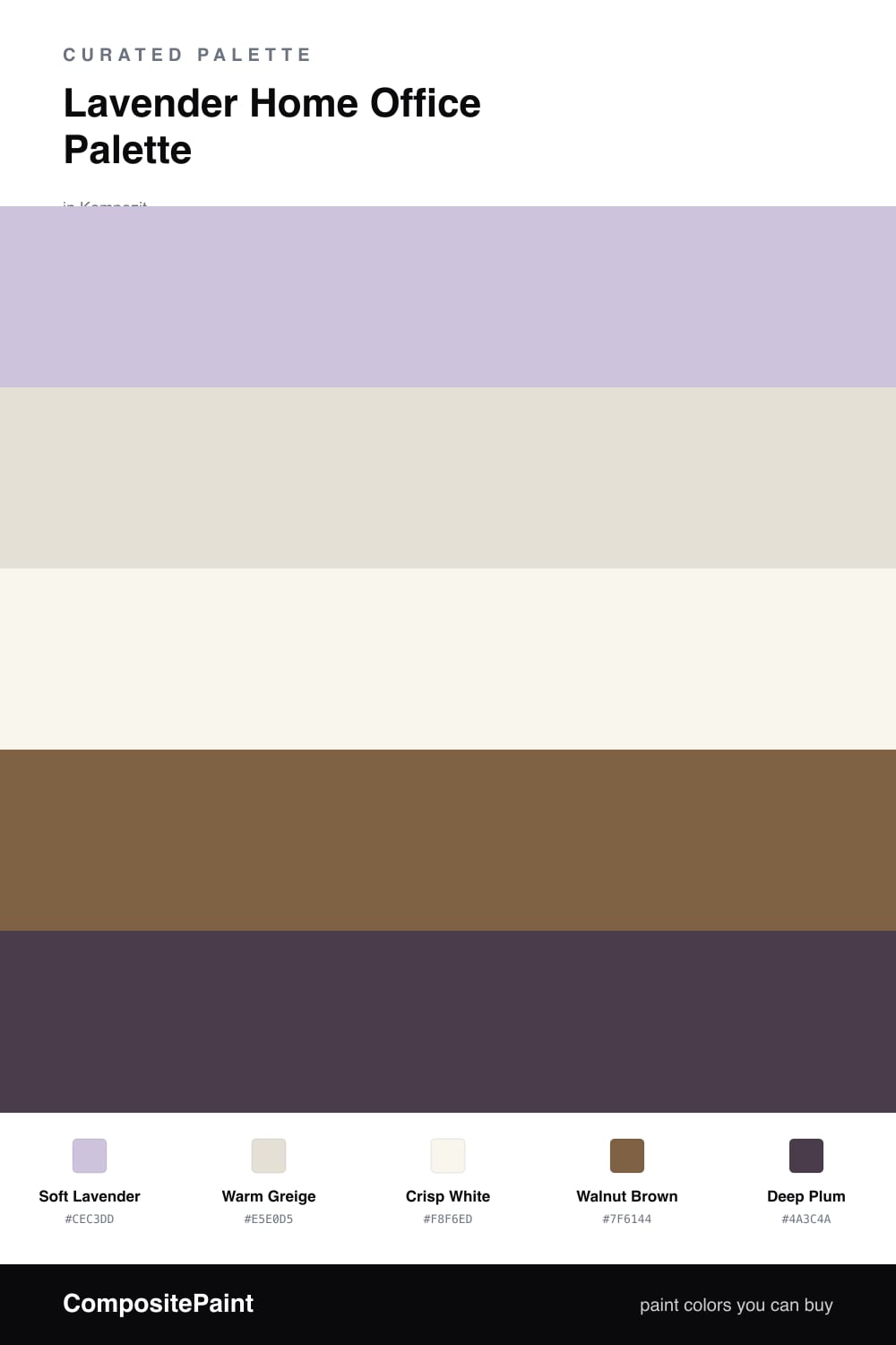
Lavender Home Office Palette — Soft Lavender & Warm Greige

A calm, focused 5-color scheme for a home office: soft lavender walls, warm greige, crisp trim, grounding walnut wood, and a deep plum accent, with every color matched to real paint you can buy.

By Emily Roberts · DIY Editor & First-Timer's Guide

Soft Lavender
Walls
Kompozit Lavender Bliss · 1252
#CEC3DD
LRV 57
Warm Greige
Built-Ins & Shelving
Kompozit August Moon · 0194
#E5E0D5
LRV 75
Crisp White
Trim & Ceiling
Kompozit Sugar Dust · 0011
#F8F6ED
LRV 92
Walnut Brown
Desk & Wood
Kompozit Fall in Season · 0179
#7F6144
LRV 13
Deep Plum
Accent Wall
Kompozit Petunia Patty · 1228
#4A3C4A
LRV 5
View palette in

A home office should help you settle in and focus, and that is exactly what a soft lavender does. This palette leads with a Soft Lavender on the walls, a dusty, slightly gray version that feels calm and grown-up rather than sweet. It is the kind of color that quiets a room without putting you to sleep.

Around it, Warm Greige on the built-ins and shelving keeps things easy and warm, and a clean Crisp White on the trim and ceiling gives everything a tidy edge. Walnut Brown comes in through the desk and any wood pieces, grounding all that softness so the office feels solid and lived-in.

For the finishing touch, a Deep Plum accent gives your eye somewhere to land. Use it on just one wall, like the one behind your desk, or inside a bookshelf. One small dose of the dark color is all you need to make the lavender feel intentional and the whole room pull together.

Buy These Colors

Each color matched to the closest real paint in every brand, by ΔE2000. Kompozit first; take any SKU to the store — these mix on demand.

Soft Lavender
#CFC4DC · LRV 58 · Walls
Kompozit Lavender Bliss · 1252 ΔE 0.72
Backdrop Real Real · BD-RR ΔE 20.05
Behr Foxgloves · 660E-3 ΔE 3.62
Benjamin Moore French Lilac · 1403 ΔE 2.96
Clare Wink · PNT100-LT-31 ΔE 11.44
Dunn-Edwards Plum Point · DE5982 ΔE 4.98
Farrow & Ball Calluna · No. 270 ΔE 8.08
Magnolia Home Cement Pots · JG-93 ΔE 10.61
PPG / Glidden Lilac Breeze · 1248-4 ΔE 2.47
Sherwin-Williams Rhapsody Lilac · SW 6828 ΔE 1.45
Valspar Playful Petal · 1001-4B ΔE 1.1
Warm Greige
#E5DFD4 · LRV 74 · Built-Ins & Shelving
Kompozit August Moon · 0194 ΔE 0.53
Backdrop Cookies & Cream · BD-CC ΔE 4.98
Behr Cotton Knit · PPU7-11 ΔE 0.45
Benjamin Moore Etiquette · AF-50 ΔE 0.53
Clare No Filter · PNT100-LT-19 ΔE 1.99
Dunn-Edwards Stucco Tan · DE6205 ΔE 2.32
Farrow & Ball School House White · No. 291 ΔE 1.24
Magnolia Home Soft Linen · JG-108 ΔE 0.57
PPG / Glidden Hourglass · 1022-1 ΔE 0.53
Sherwin-Williams Shoji White · SW 7042 ΔE 0.54
Valspar Wispy White · 7006-1 ΔE 0.53
Crisp White
#FAF8F4 · LRV 94 · Trim & Ceiling
Kompozit Sugar Dust · 0011 ΔE 2.43
Backdrop Tabula Rasa · BD-TR ΔE 3.54
Behr Ultra Pure White · PPU18-06 ΔE 1.01
Benjamin Moore Snowfall White · 2144-70 ΔE 3.11
Clare Whipped · PNT100-LT-02 ΔE 1.23
Dunn-Edwards Milk Glass · DEW358 ΔE 1.41
Farrow & Ball All White · No. 2005 ΔE 0.5
Magnolia Home True White · JG-21 ΔE 1.78
PPG / Glidden Delicate White · 1001-1 ΔE 2.02
Sherwin-Williams High Reflective White · SW 7757 ΔE 1.61
Valspar Ultra White · 7006-24 ΔE 1.23
Walnut Brown
#7A5C42 · LRV 12 · Desk & Wood
Kompozit Fall in Season · 0179 ΔE 2.13
Backdrop Buenos Aires · BD-BA ΔE 1.3
Behr Molasses · S220-7 ΔE 3
Benjamin Moore Marsh Brown · 2164-20 ΔE 2.96
Clare Coffee Date · PNT100-DP-53 ΔE 10.5
Dunn-Edwards Rodeo · DEA163 ΔE 1.96
Farrow & Ball Salon Drab · No. 290 ΔE 7.15
Magnolia Home Cognac · JG-164 ΔE 2.52
PPG / Glidden Spiced Cinnamon · 1071-7 ΔE 4.66
Sherwin-Williams Burnished Brandy · SW 7523 ΔE 1.04
Valspar Muddy Mississippi · 3004-9A ΔE 0.87
Deep Plum
#4A3650 · LRV 5 · Accent Wall
Kompozit Petunia Patty · 1228 ΔE 5.44
Backdrop Last Call · BD-LC ΔE 11.51
Behr Deep Aubergine · 100F-7 ΔE 3.72
Benjamin Moore Exotic Purple · 2071-10 ΔE 1.91
Clare Blackish · PNT100-DP-54 ΔE 17.37
Dunn-Edwards Preserve · DEA193 ΔE 3.41
Farrow & Ball Pelt · No. 254 ΔE 7.11
Magnolia Home Plum Suede · JG-102 ΔE 5.72
PPG / Glidden Victory Blue · 1165-7 ΔE 10.69
Sherwin-Williams Concord Grape · SW 6559 ΔE 3.54
Valspar Virtuoso · M215 ΔE 4.45

Questions

Will lavender walls feel too sweet for a workspace?

Not if you keep it soft and slightly gray, like the Soft Lavender here. A muted, dusty lavender reads more like a calm neutral than a pastel, and pairing it with warm greige and walnut wood grounds it so the room feels focused, not floral.

Where should the deep plum go in a home office?

Save the darkest color for one small surface, like the wall behind your desk or the back of an open bookshelf. On a single wall it frames your video calls and adds depth, but spread across the whole room it would feel heavy and close in the space.

Similar Palettes

Closest schemes by color — not by label.