Lilac Study Palette — Soft Lilac & Walnut Brown
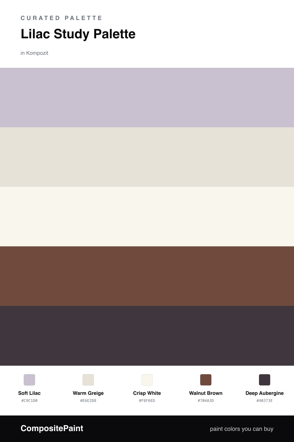
A calm, focused 5-color scheme for a study: soft lilac walls, a warm greige backdrop, crisp trim, grounding walnut, and a deep aubergine accent, every color matched to real paint you can buy.
By Emily Roberts · DIY Editor & First-Timer's Guide
A study should feel quiet and a little bit grown-up, the kind of room where your shoulders drop when you sit down. This palette leads with a soft lilac on the walls, a gentle, dusty shade that feels calm without being sleepy. It reads as a warm neutral on a gray morning and shows its lilac color when the light comes in.
Around it, a warm greige gives you a softer backdrop where you want a break from the color, and a clean crisp white on the trim and ceiling keeps everything fresh. Walnut brown on the desk and shelving grounds the whole room and pulls in that warm, earthy 2026 mood.
For the accent, a deep aubergine gives your eye somewhere to land, the back of a bookcase or a single built-in is perfect. Use the darkest color sparingly here: one surface, no more, and the lilac stays the star.
Buy These Colors
Each color matched to the closest real paint in every brand, by ΔE2000. Kompozit first; take any SKU to the store — these mix on demand.
Questions
Not with this mix. This lilac leans warm and soft rather than icy, and the greige and walnut around it add warmth, so the room stays cozy and easy to focus in.
Keep it to one small surface, like the back of a bookshelf, a single built-in, or interior shelving. On more than about one-fifth of the room it stops reading as an accent and starts to feel heavy.
Similar Palettes
Closest schemes by color — not by label.