Shiplap
The color that named a whole design movement, reviewed honestly: why it reads as a deeper tan cream instead of the bright farmhouse white people expect, and where it actually earns the reputation.

Jessica has spec'd whites and neutrals for more than 300 rooms and keeps a sample wall of painted drawdowns in her studio. Every color review is checked against real reader rooms in the comments and re-tested when a formula changes. About the testing process →
- 1Heirloom Shade63
- 2First Star69
- 3Shiplap77
- 4Alabaster82
- 5Chantilly Lace91
The Fast Verdict
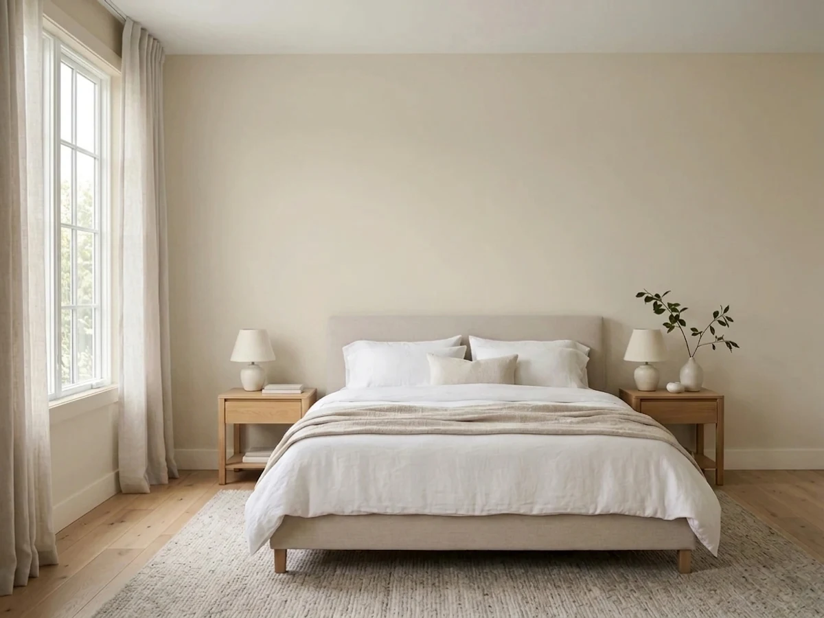
Shiplap is the color Joanna Gaines named after the wood boards she made a national design trend, and it is not the crisp airy white the name implies. It is a genuinely warm, tan-leaning cream — closer to a soft greige than to a trim white — and at LRV 77 it sits well below its own siblings True White and Silos White in the Magnolia Home line. Give it a room with real daylight, warm wood, and black or iron hardware and it looks exactly like the farmhouse photo that made it famous. Buy it expecting a bright white and you will be surprised by how much color it actually carries.
Farmhouse-style kitchens and living rooms · rooms with warm wood floors and black or iron hardware · literal shiplap-board accent walls · anyone who wants "warm off-white," not "bright white"
You want a crisp, bright trim white · your room is dim and north-facing with no warm light · you are pairing it against brighter builder-white trim without a plan · your hardware and fixtures are all cool chrome
- Instantly recognizable, best-selling farmhouse cream with real design pedigree
- Warm without tipping into yellow or orange
- The obvious, correct choice for painting real shiplap or board-and-batten walls
- Flatters warm wood, brass, and black iron hardware
- Deeper LRV hides scuffs and handprints better than a bright white
- Not a bright white — buyers expecting crisp farmhouse-white are routinely surprised
- Reads flat and slightly gray in dim, cool-lit rooms
- Looks dingy set next to a brighter builder-white trim
- Fewer retail counters carry it than the big national paint brands, which makes sampling harder
What Color Is Shiplap, Really?
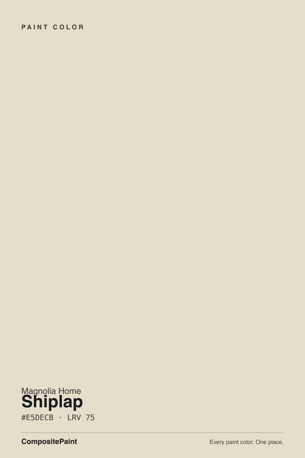
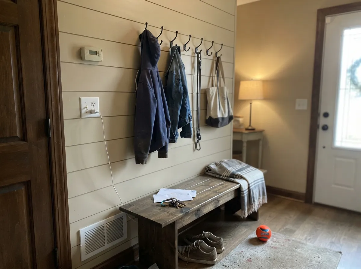
A creamy, tan-toned off-white named directly after the horizontal wood paneling Joanna Gaines made a design signature on Fixer Upper — Magnolia Home built the color to match the reclaimed, weathered board look, not to be a neutral trim white. That is the whole story of the color: it was made to sit ON shiplap and beside it, which is why it carries more warmth and more visible tan than most colors people search for as "farmhouse white."
At LRV 77 it is a mid-to-high off-white, but it is clearly deeper than the two whiter colors in its own family — True White (LRV 87) and Silos White (LRV 84) both read noticeably brighter and cooler beside it. Shiplap is the tan one of the three. Put it next to a bright trim white and the difference is obvious in person, even though online swatches can make all three look interchangeable.
Undertone in one line: warm cream with visible tan, never gray, never pink, in real daylight. Owner reports of this color genuinely disagree on how it reads — some call it "a gorgeous white with no undertone," others describe it as noticeably gray or dingy. Both are honest reactions to the same paint: it is warm and cream-forward in good light, and it goes flatter and murkier the moment the light is dim or cool. That swing is the single most useful thing to know before you buy a gallon.
Where It Shines
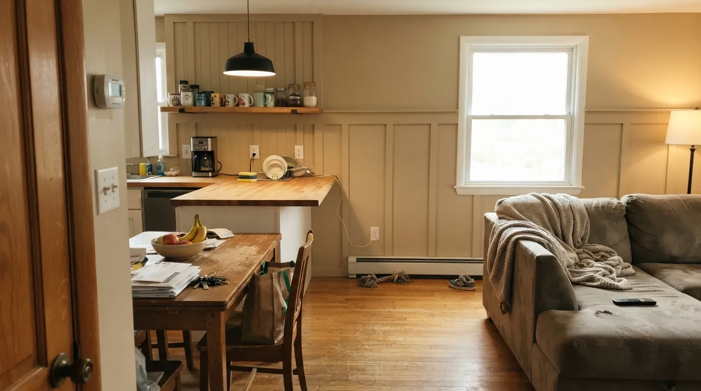
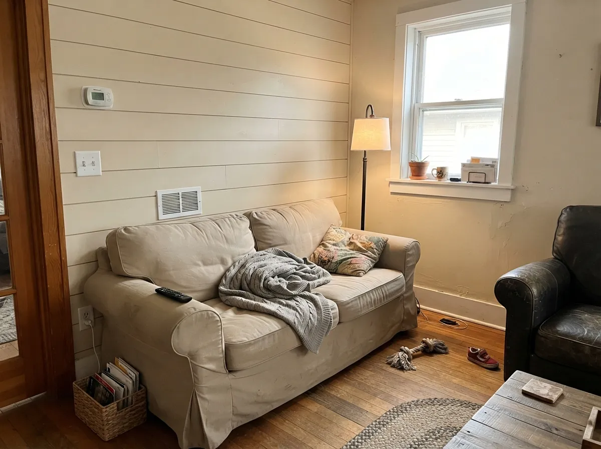
Shiplap earns its name in exactly the room type it was designed for: real daylight, warm oak or reclaimed wood, and black iron or aged-brass hardware. On an actual shiplap-board wall, painted in Shiplap, it delivers the reclaimed-farmhouse look on sight — walls, trim, and boards all reading as one warm, textured surface. In open farmhouse kitchens with butcher block and matte-black fixtures it does the same job a brighter white cannot: it softens instead of glares, and it hides the everyday scuffs of a working kitchen better than a bright white would.
Where It Fails
Almost every disappointed review of Shiplap traces back to one of three expectations, and all three are avoidable if you know them going in. The color has not changed — the buyer's mental picture of "farmhouse white" usually has.
Pinterest and Instagram photos of shiplap rooms are almost always over-bright and slightly blown out, which trains people to expect a crisp white. Shiplap is a cream. If your mental picture is chalky-bright walls, sample it on the actual wall before buying gallons — the tan will surprise you.
The most common regret is Shiplap walls next to bright builder-white trim or a whiter door. The brighter white wins the comparison and Shiplap starts to look dingy by contrast, exactly like every warm cream does next to a cooler white. Match the trim to it — a warm white like White Dove — rather than fighting it with something brighter.
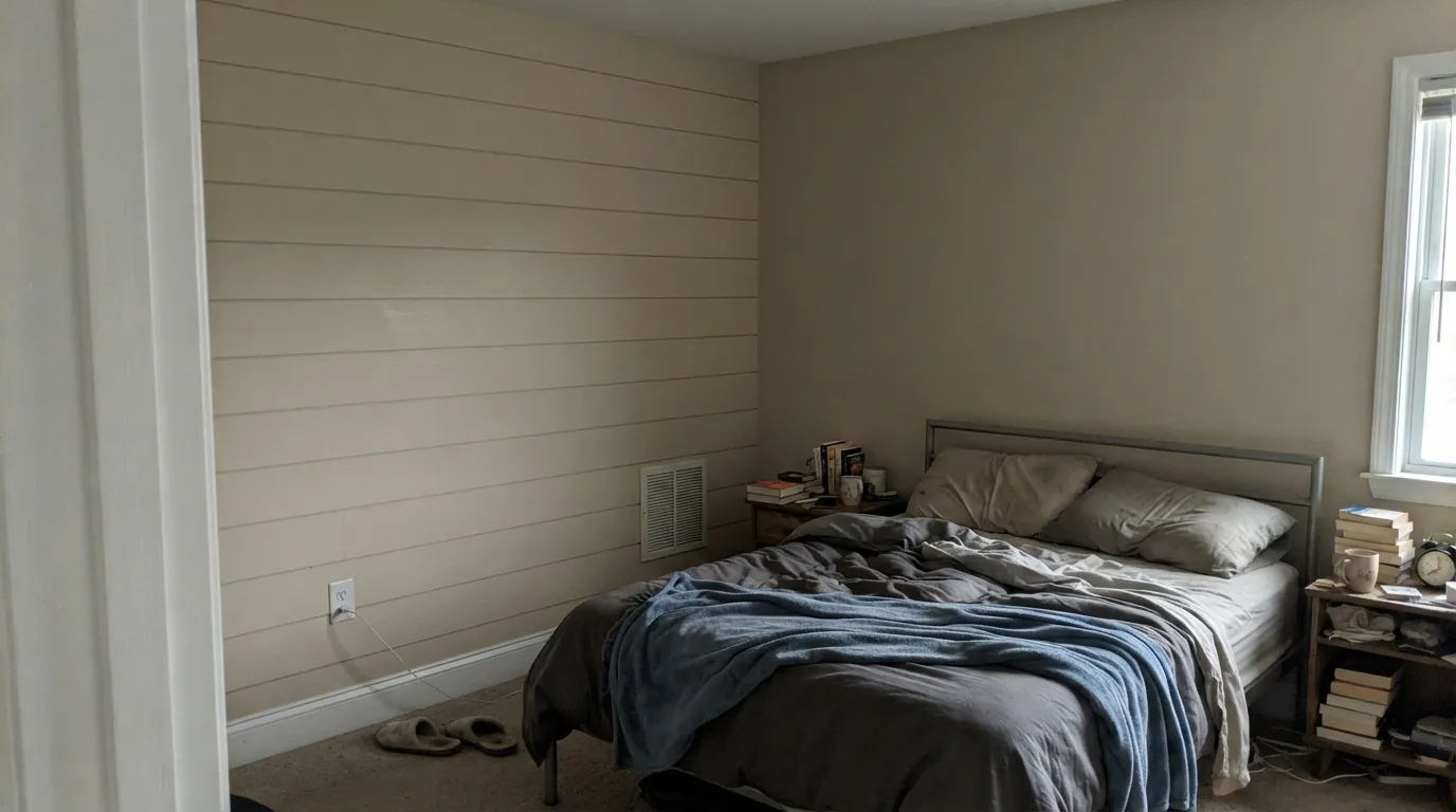
In a north-facing room, or under cool white LEDs with no warm light to balance it, the cream drains out and the color reads flat and slightly murky — this is the "kind of gray" complaint you'll find in real owner reviews. It is the same paint; it is just being honest about a room with no warm light in it. Add a warm 2700K lamp or pick a brighter, cooler color for a genuinely dim north room.
Room by Room
Butcher block, brass or matte-black hardware, open shelving — this is the room the color was built for. It hides scuffs and handprints better than a bright white and never fights warm wood.
A calm, warm backdrop for slipcovered furniture and wood beams. Eggshell on walls; the same color in semi-gloss on trim keeps the room from feeling chopped up.
Cozy rather than crisp under 2700K lamps. If the room is north-facing and dim, add warm lighting or step up to a slightly brighter cream.
Because it is deeper than a bright white, Shiplap hides the daily traffic marks a busy hallway collects far better than a whiter neutral would.
With warm wood vanities and brass it is lovely. With cool gray or blue-toned marble and chrome, the warmth argues with the stone — sample before committing to four walls.
Painting real shiplap or tongue-and-groove boards in this color is the look the name promises: satin or eggshell on the boards, and it reads warm and weathered rather than stark, which is the entire point of the trend it started.
Your Light Is the Risk
South or west sun brings the cream forward and keeps the tan honest without tipping orange. This is the light in every photo that made the color famous.
Without warm light to carry it, the color drains toward flat and slightly gray — the exact complaint in mixed owner reviews. Test before painting a north room.
Creamier and warmer at the sun hours, quieter and more neutral the rest of the day. A normal, gentle shift for a color this warm.
2700K warm bulbs deepen the cream and make it feel cozy at night. Cool white LEDs flatten it toward gray — swap the bulbs before you blame the paint.
Most complaints about Shiplap are a light mismatch. Upload a photo of your actual room and see it on your walls — then ask for the same wall in north light or evening lamps before you buy a single sample.
Need It From Another Brand?
Any paint counter can custom-tint Magnolia Home JG-22 directly. If you would rather stay in one brand's own deck, these are the closest stock matches, measured as ΔE2000. Under 2 is a difference you will not see on the wall.
| Brand | Closest color | ΔE | LRV | |
|---|---|---|---|---|
| Sherwin-Williams | Spare WhiteSW 6203 · Sherwin-Williams | 0.9 | 77 | Color page → |
| Behr | White PepperPPU24-13 · Behr | 0.5 | 77 | Color page → |
| Benjamin Moore | Seapearl961 · Benjamin Moore | 1.1 | 76 | Color page → |
| Valspar | Ghost Story8004-29A · Valspar | 0.5 | 77 | Color page → |
| PPG / Glidden | Silvery MoonPPG1029-1 · PPG / Glidden | 0.0 | 77 | Color page → |
| Glidden | Silvery MoonPPG1029-1 · Glidden | 0.2 | 78 | Color page → |
Similar Magnolia Home Colors
The nearest shades to Shiplap within Magnolia Home's own range, ranked by perceptual color distance — useful when you want the same look a touch lighter, darker, or warmer.
WCAG 2.1: AA is 4.5 : 1 for normal text, 3 : 1 for large text, AAA is 7 : 1.
Shiplap vs the Colors You're Also Considering
Every Shiplap sample board has the same rivals on it. The numbers show the real lightness gap — then it comes down to which risk you would rather live with.
Pick this for the deeper, more visibly tan farmhouse cream that reads as color, not as a quiet white.
Benjamin Moore OC-17 · LRV 85White DovePick this if you want the same warm-but-not-yellow calm at a noticeably brighter, more trim-friendly LRV.
Pick this when you specifically want the deeper, tan-leaning cream instead of a lighter soft white.
Benjamin Moore OC-45 · LRV 84Swiss CoffeePick this for a brighter, more widely available creamy white with the same farmhouse warmth.
Shiplap (JG-049, LRV 75) has close neighbors in the Magnolia line, and the differences are subtle but worth checking side by side. Castle Cream (JG-153, LRV 74) is nearly the same brightness and warmth; it can read a touch creamier, so choose it if you want the golden note just slightly stronger.
Soft Landing (JG-17, LRV 75) matches Shiplap in lightness but sits a little cleaner and less gold, which makes it a good swap if Shiplap feels too warm in your south-facing light. Blanched (JG-103, LRV 76) is the brightest of the group and leans the most neutral, so it works when you want a light warm white that pulls back from cream toward a plainer off-white.
Because these all live within a couple of LRV points, sample the two you are deciding between on the same wall rather than trusting the chip.
Shiplap Coordinating Colors
The pairing rule is simple: keep everything warm, and use a genuinely warm white for trim rather than a bright one. It loves black and aged iron hardware, warm woods, and deep navy or charcoal accents — the same palette that shows up in almost every farmhouse room photographed for the trend it started.
The Name Behind the Color
Shiplap the wood detail — horizontal boards with a small reveal between them, originally an exterior siding technique — became a design phenomenon largely because of Fixer Upper. Joanna Gaines tore into wall after wall to expose or recreate it, and it became shorthand for the modern-farmhouse look the show popularized nationally. Magnolia Home's Shiplap paint takes the color she used on and around those boards and turns it into a stand-alone shade.
That history explains why the color is deeper and warmer than most people expect from its name: it was matched to weathered, reclaimed wood tones, not designed as a neutral trim white. Buying it as "the farmhouse white" without knowing that is where most of the surprise comes from.
Shiplap With Wood Tones and Floors
Warm wood is this color's natural partner. Oak, reclaimed barnwood, walnut, and butcher block all sit comfortably against it because the paint's own warmth meets theirs halfway — this is precisely the pairing the farmhouse look was built on.
Cool floors are the one combination that needs a sample first. Gray-washed or cool-toned LVP pulls Shiplap's warmth into sharper relief, and the wall can start to look yellow-tan next to a distinctly cool floor. It is rarely a dealbreaker with warm rugs and black or brass accents in the room, but test a large sample above the actual floor before committing a whole house to it.
Three Ready Palettes Built on Shiplap
A color is never alone on the wall. These are complete combinations in the 60-30-10 pattern, with the reason each one holds together. Every one opens in the visualizer.
A warm white trim keeps Shiplap from looking dingy by comparison, and the near-black grounds the scheme the way iron hardware and a farmhouse sink would in the room that made this color famous.
Try this palette in your roomA lighter, cooler white on the main walls sets up Shiplap's tan warmth as the deliberate accent it is meant to be, rather than an uncontrolled undertone shift across a single open room.
Try this palette in your roomRevere Pewter shares Shiplap's warm base, so the wall-to-accent handoff is seamless, while White Dove trim keeps the whole house from tipping too tan in rooms with less daylight.
Try this palette in your roomShiplap FAQ
Is Shiplap warm or cool?
Warm — genuinely so. It is a tan-leaning cream, not a neutral white, and it will read that way clearly once it is on four walls, even though online photos can make it look like a plain bright white.
Does it work on real shiplap or board-and-batten walls?
Yes — this is the use it was built for. On actual wood boards it delivers the warm, weathered farmhouse look the color is named after, in eggshell or satin.
What trim white goes with Shiplap walls?
A warm white, not a bright one — something like White Dove or Swiss Coffee. A stark bright white trim will make Shiplap walls read dingy by comparison, the single most common complaint about this color.
Is Shiplap too dark to be a "white"?
At LRV 77 it reflects most of the light that hits it and is still an off-white, but it sits noticeably below its own siblings True White (LRV 87) and Silos White (LRV 84). If you want the brightest option in the Magnolia Home line, pick one of those instead.
Where can I buy Magnolia Home Shiplap?
Magnolia Home by Joanna Gaines paint is made with KILZ and sold through Magnolia's own site, Ace Hardware, and Lowe's. Bring the color name and code to any of those counters, or a color-matched swatch, to have it mixed.
Will it look gray in a north-facing room?
It can. Real owner reports of this color genuinely split between "warm, no undertone" and "kind of gray" — both are honest, and the difference is almost always the light. Warm daylight or a 2700K lamp keeps it cream; cool, dim, north light pulls it toward flat gray.
Have you painted with Shiplap?
Rate it — one tap helps the next reader decide.
Ask a Question