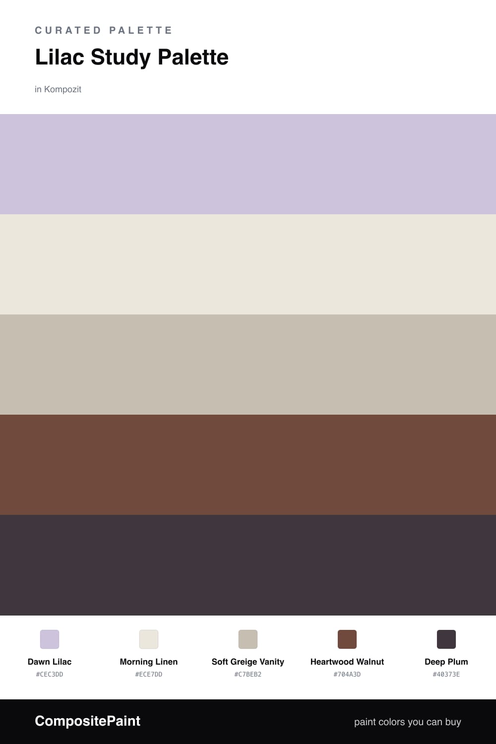
Lilac Study Palette — Dawn Lilac & Heartwood Walnut
A calm five-color study scheme led by soft lilac walls, warmed by walnut and grounded by a deep plum accent — every color matched to real paint you can buy.
By David Chen · Formulation Lead & Resident Chemist
Lilac is one of those colors people underestimate. Pull most of the saturation out of purple and you get a shade that behaves almost like a warm gray with a pulse — calm enough for long hours, but not flat. That is why Dawn Lilac earns the walls here. It sets a quiet, contemporary tone the moment you walk in.
Around it I keep the supporting cast soft and honest. Morning Linen on the trim and ceiling is a touch warmer than a pure white, so the lilac never goes cold, and Soft Greige Vanity lets built-in shelving or a desk cabinet sit in the scheme without shouting. Think of these two as the room taking a breath.
Then comes the grounding. Heartwood Walnut underfoot adds real warmth and weight, and a little Deep Plum — a lampshade, a chair, the spines of a bookshelf — ties straight back to the lilac and gives the whole study a center of gravity. Lead with the lilac, lean on the wood, and use the plum sparingly.
Buy These Colors
Each color matched to the closest real paint in every brand, by ΔE2000. Kompozit first; take any SKU to the store — these mix on demand.
Questions
Lilac is a low-saturation cousin of blue and purple, so it reads as calm and a little focused rather than sweet. In a room where you sit and think, that quiet quality keeps the walls from competing with your work.
Anchor it with the wood and the accent. Heartwood Walnut on the floor and a few touches of Deep Plum give your eye a place to land, so the lilac stays restful instead of washed out.
Similar Palettes
Closest schemes by color — not by label.