CP

Lavender Dining Room Palette — Soft Lavender & Walnut Brown

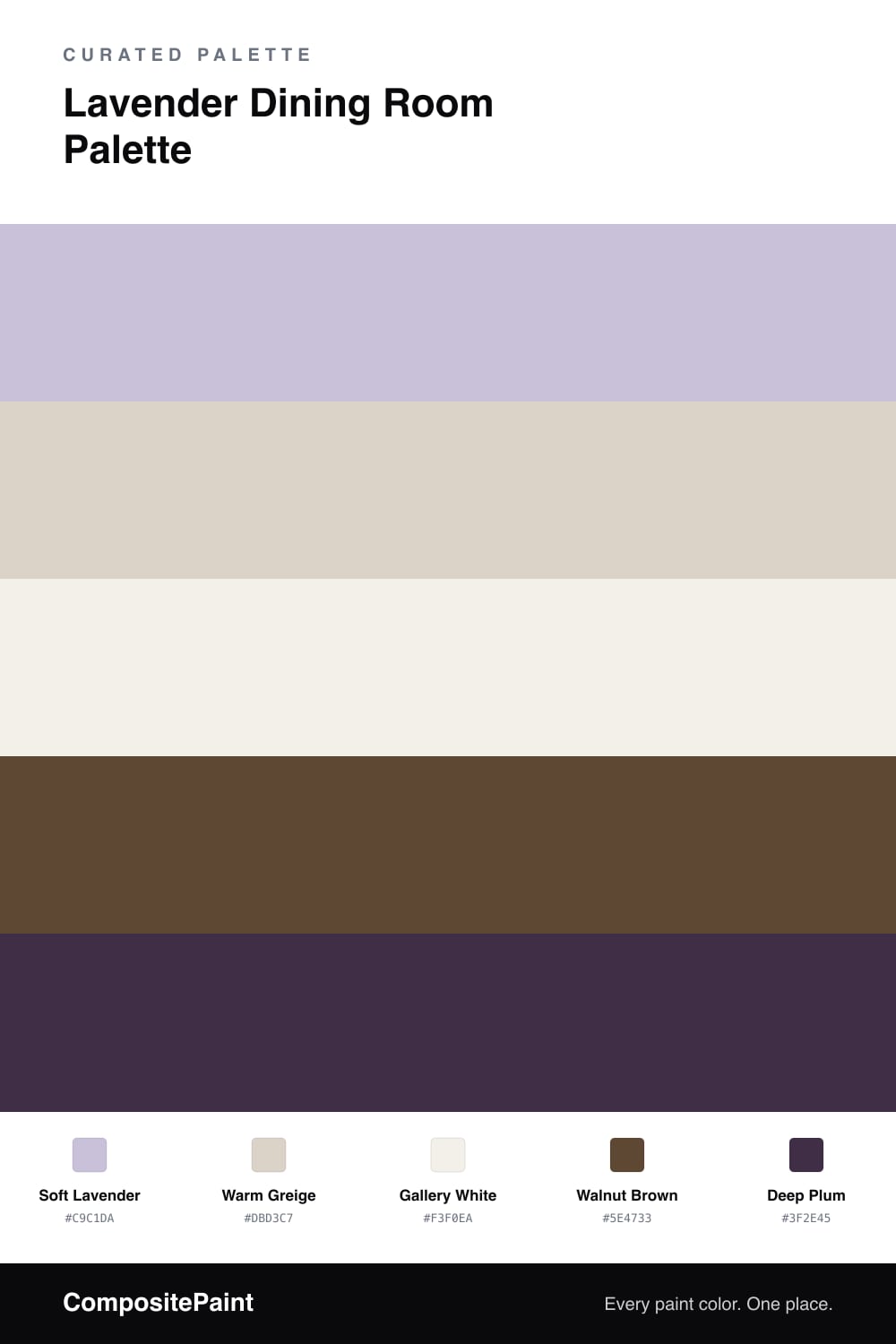
A serene five-color dining room scheme led by soft lavender walls, warmed with walnut and grounded by a deep plum accent — every color matched to real paint you can buy.

By Jessica Williams · Color Stylist & Interior Editor

Lavender has quietly grown up. In a dining room, Soft Lavender on the walls feels hushed and a little luxurious, the kind of color that flatters candlelight and looks just as easy at brunch. It is the lead here, and everything else exists to keep it warm and steady.

I balance it with a Warm Greige on the cabinetry and a clean Gallery White for trim and ceiling, so the lavender never tips into purple. The cool and the warm hold hands instead of competing.

Underfoot, Walnut Brown floors bring depth and a natural anchor, while a small dose of Deep Plum on a sideboard, a chair, or the back of an open hutch gives the whole room a contemporary, confident finish.

View palette in
Soft Lavender
Walls
Kompozit Lavender Bliss · 1252
#CEC3DD
LRV 57
Warm Greige
Cabinets or Vanity
Sherwin-Williams Taupe of the Morning · SW 9590
#DAD2C6
LRV 65
Gallery White
Trim & Ceiling
Behr Silk Pillow · PWN-15
#F3F0EA
LRV 87
Walnut Brown
Wood & Floors
Dutch Boy Ageless Bronze · 413-7DB
#5E4836
LRV 7
Deep Plum
Accent
Benjamin Moore Exotic Purple · 2071-10
#43334D
LRV 4

Buy These Colors

Each color matched to the closest real paint in every brand, by ΔE2000. Tap a swatch for its full guide or + to save it — take any SKU to the store, they mix on demand.

Soft Lavender
#C9C1DA · LRV 56 · Walls
Sherwin-Williams · SW 9066 · ΔE 7.8
Behr · P560-3 · ΔE 2.64
Benjamin Moore · 1403 · ΔE 2.01
Valspar · 1001-4B · ΔE 2.39
PPG / Glidden · PPG1247-4 · ΔE 2.16
Glidden · PPG1247-4 · ΔE 2.11
Dutch Boy · 144-4DB · ΔE 1.66
HGTV Home by Sherwin-Williams · HGSW 1405 · ΔE 7.8
Dunn-Edwards · DE5954 · ΔE 2.68
Magnolia Home · JG-93 · ΔE 10.03
Farrow & Ball · NO. 9913 · ΔE 5.22
Diamond Vogel · 1252 · ΔE 1.78
Hirshfield's · 1252 · ΔE 1.35
Rodda · R013 · ΔE 10.09
C2 Paint · BD9 · ΔE 8.84
Clare · PNT100-LT-09 · ΔE 13.86
Portola Paints · PIGEON GRAY · ΔE 11.34
Annie Sloan · LOUIS BLUE · ΔE 13.39
Backdrop · BD-LO · ΔE 17.65
Rust-Oleum · 285143 · ΔE 10.9
Kompozit · 1252 · ΔE 1.35
Warm Greige
#DBD3C7 · LRV 66 · Cabinets or Vanity
Sherwin-Williams · SW 9590 · ΔE 0.24
Behr · HDC-CT-19 · ΔE 0.53
Benjamin Moore · 988 · ΔE 1.36
Valspar · 6006-1A · ΔE 0.52
PPG / Glidden · PPG1075-3 · ΔE 1.04
Glidden · 50YY 65/071 · ΔE 0.5
Dutch Boy · 440-1DB · ΔE 1.04
HGTV Home by Sherwin-Williams · HGSW 4019 · ΔE 1.32
Dunn-Edwards · DEC774 · ΔE 1.53
Magnolia Home · JG-132 · ΔE 3.29
Farrow & Ball · NO. 241 · ΔE 1.02
Diamond Vogel · 0195 · ΔE 0.87
Hirshfield's · 0195 · ΔE 0.82
Rodda · CA031 · ΔE 0.96
C2 Paint · C2-915 · ΔE 2.31
Clare · PNT100-LT-21 · ΔE 2.42
Portola Paints · FIGUEROA · ΔE 1.74
Annie Sloan · OLD OCHRE · ΔE 7.97
Backdrop · BD-RR · ΔE 2.64
Rust-Oleum · 285142 · ΔE 9.19
Kompozit · 0195 · ΔE 0.82
Gallery White
#F3F0EA · LRV 87 · Trim & Ceiling
Sherwin-Williams · SW 7100 · ΔE 1.02
Behr · PWN-15 · ΔE 0
Benjamin Moore · AF-10 · ΔE 0.48
Valspar · 7002-6 · ΔE 0.56
PPG / Glidden · PPG0998-1 · ΔE 1.56
Glidden · PPG0998-1 · ΔE 0.8
Dutch Boy · 004W · ΔE 1.03
HGTV Home by Sherwin-Williams · HGSW 4053 · ΔE 1.83
Dunn-Edwards · DE6239 · ΔE 0.95
Magnolia Home · JG-107 · ΔE 0.84
Farrow & Ball · NO. 239 · ΔE 2.5
Diamond Vogel · 1265 · ΔE 1.54
Hirshfield's · 1265 · ΔE 1.19
Rodda · R003 · ΔE 1.82
C2 Paint · C2-820 · ΔE 0.93
Clare · PNT100-LT-24 · ΔE 2.34
Portola Paints · ORIGAMI · ΔE 0.64
Annie Sloan · OLD OCHRE · ΔE 13.51
Backdrop · BD-TR · ΔE 2.5
Rust-Oleum · 285140 · ΔE 4.32
Kompozit · 1265 · ΔE 1.19
Walnut Brown
#5E4733 · LRV 7 · Wood & Floors
Sherwin-Williams · SW 6090 · ΔE 3.55
Behr · 280F-7 · ΔE 1.48
Benjamin Moore · 2110-10 · ΔE 1.17
Valspar · V084-6 · ΔE 1.57
PPG / Glidden · PPG1073-7 · ΔE 4.98
Glidden · PPG1075-7 · ΔE 4.43
Dutch Boy · 413-7DB · ΔE 0.9
HGTV Home by Sherwin-Williams · HGSW 3071 · ΔE 3.55
Dunn-Edwards · DEA158 · ΔE 5.15
Magnolia Home · JG-171 · ΔE 7.57
Farrow & Ball · NO. W101 · ΔE 9.97
Diamond Vogel · 0452 · ΔE 10.68
Hirshfield's · 0137 · ΔE 4.87
Rodda · R132 · ΔE 6.28
C2 Paint · C2-549 · ΔE 8.17
Clare · PNT100-DP-54 · ΔE 12.4
Portola Paints · PONDEROSA · ΔE 10.32
Annie Sloan · PRIMER RED · ΔE 13.14
Backdrop · BD-IT · ΔE 2.74
Rust-Oleum · 391445 · ΔE 23.47
Kompozit · 0137 · ΔE 4.87
Deep Plum
#3F2E45 · LRV 3 · Accent
Sherwin-Williams · SW 6279 · ΔE 10.17
Behr · 680F-7 · ΔE 3.74
Benjamin Moore · 2071-10 · ΔE 2.01
Valspar · M215 · ΔE 4.08
PPG / Glidden · PPG0995-7 · ΔE 15.42
Glidden · 00NN 05/000 · ΔE 14.02
Dutch Boy · 344-7DB · ΔE 5.82
HGTV Home by Sherwin-Williams · HGSW 6988 · ΔE 10.73
Dunn-Edwards · DEA185 · ΔE 11.64
Magnolia Home · JG-05 · ΔE 13.55
Farrow & Ball · NO. W24 · ΔE 9.31
Diamond Vogel · H101 · ΔE 14.85
Hirshfield's · 1229 · ΔE 8.4
Rodda · CA210 · ΔE 12.24
C2 Paint · BD42 · ΔE 6.63
Clare · PNT100-DP-54 · ΔE 17.12
Portola Paints · DANCING SHOES · ΔE 3.55
Annie Sloan · NAPOLEONIC BLUE · ΔE 12.71
Backdrop · BD-LC · ΔE 11.65
Rust-Oleum · 285144 · ΔE 16.2
Kompozit · 1229 · ΔE 8.4

Questions

Is lavender too soft for a dining room?

Not at all. Lavender reads calm and a little dressy at the same time, which suits a room built for slow dinners. Pairing it with warm wood keeps it grown-up rather than sweet.

How do I keep the palette from feeling cold?

Lean on the warm tones to balance the cool lavender. Walnut floors, a greige cabinet, and a touch of deep plum add warmth so the room feels inviting instead of icy.

KEEP EXPLORING

Similar Palettes

Closest schemes by color — not by label.