Party Hat
Behr's softest party-purple, reviewed honestly: the light where the lilac glows, the light where it goes flat gray-blue, and what to pick instead.

Jessica has spec'd whites and neutrals for more than 300 rooms and keeps a sample wall of painted drawdowns in her studio. Every color review is checked against real reader rooms in the comments and re-tested when a formula changes. About the testing process →
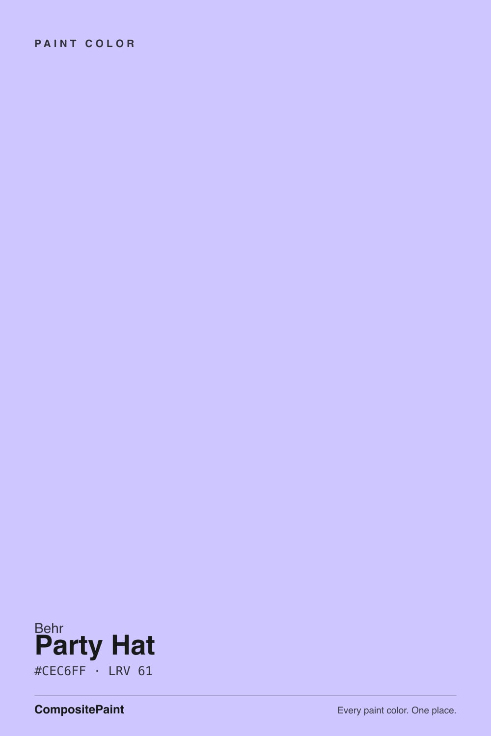
- 1Blackberry Mocha26
- 2Wisteria48
- 3Party Hat56
- 4Lavender Mist63
- 5Silver Peony68
The Fast Verdict
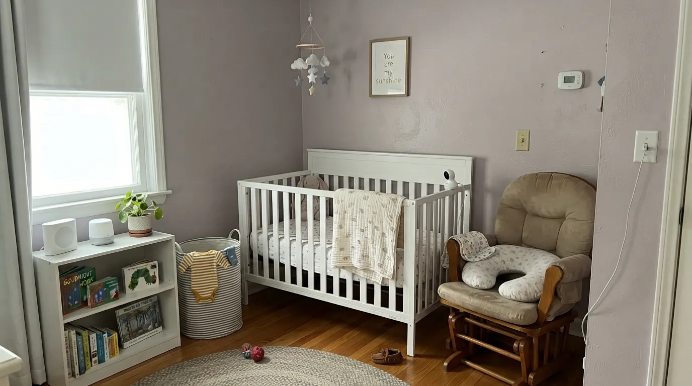
Party Hat is Behr's proof that a pastel can grow up. The name and the shelf copy promise a bright, fun purple, but the paint on the wall is quieter than that: a gray-veiled lilac with just enough mauve in it to feel warm, not candy-colored. It was never built to be a whole-house color — it's the smart pick for a nursery that needs to survive past age six, a powder room, or one accent wall that wants to read as deliberate lavender instead of accidental purple.
Nurseries and kids' rooms that need to age with the child · powder rooms and small jewel-box spaces · one accent wall with warm white trim · anyone who wants visible lilac without a saturated purple commitment
Your room faces north and stays dim · your floors or trim are honey oak or gold-toned · you actually want a true gray, not a purple that sometimes reads gray · you're painting a whole house or an exterior
- Grayed down enough to read sophisticated, not candy-colored
- Holds its lilac color at LRV 56 instead of washing to near-white
- Grows with a kid from nursery into tween years without a repaint
- Small rooms — powder rooms, closets — take the color beautifully
- Pairs cleanly with warm white trim, brass hardware, and warm wood
- Cold north light drains the mauve and leaves a flat gray-blue
- Honey oak floors and gold-toned trim fight the violet in both directions
- Reads more purple on four walls than the pale chip suggests
- Too niche and light-dependent for a whole house or exterior
What Color Is Party Hat, Really?
A gray-veiled lilac with a whisper of mauve — that gray is the whole trick, same as it is for most of Behr's better pastels. Behr's own listing calls it a "bright yet not-too-intense" light purple built to lift the mood of a room, and on the paint chip that reads true. On four walls the color is calmer than the shelf copy promises: the violet is softened by enough gray that it sits closer to a dusty lavender than a party-supply purple — closer in spirit to the grayed pastels a brand reaches for when it wants a color that reads as a decision, not a whim.
At LRV 56 it sits in genuine medium-light territory — noticeably deeper than the near-white lilacs (Sherwin-Williams' own Inspired Lilac clears LRV 71) and a full step lighter than a lilac built to read as true purple on the wall (Sherwin-Williams' Wisteria sits at LRV 48). That middle position is why Party Hat holds its color instead of washing to nothing, but it also means the wall reads more purple in person than the pale chip suggests — the single most common surprise with any grayed lilac this deep.
Undertone in one line: violet with a mauve-pink whisper, never true blue and never a flat neutral gray. If your sample looks flatly gray-blue, your light is cold and north-facing; if it looks distinctly pink, that's warm afternoon sun or a 2700K bulb doing exactly what this paint is built to do.
Where It Shines
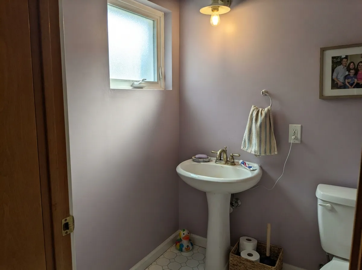
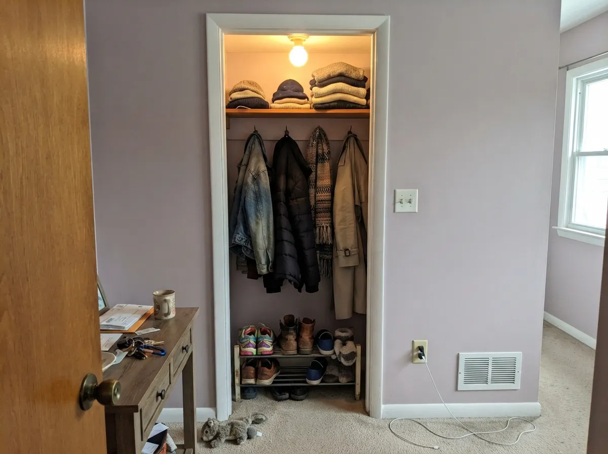
Give it a small room and warm light and it earns its name. Powder rooms, closets, and nurseries are where a grayed lilac like this does its best work — enough color to feel like a real decision, not enough to fight the rest of the house the moment you walk out the door. It is at its best with a crisp warm white trim and one dark anchor color nearby; without those two things it can drift toward looking accidental instead of chosen.
Where It Fails
Almost every disappointed reaction to a color like this comes from one of three predictable mismatches. None of them are a flaw in the paint — they are what happens when a light, gray-veiled purple meets the wrong room.
On the sample chip, or in a dim store aisle, Party Hat can pass for a soft neutral gray. Painted across four real walls in daylight, the violet is unmistakable — depth and square footage both amplify undertone. If "gray with maybe a hint of something" was the goal, this has too much something; look at a genuinely gray neutral instead and let a lilac like this stay a deliberate accent.
Yellow-orange sits opposite violet on the color wheel, so warm honey oak floors or brass-yellow trim pull the fight in both directions: the wood reads more orange, the wall reads more purple. Walnut, white oak, or a trim painted in a soft warm white avoid the standoff; if the honey floors are staying, keep Party Hat to a small room or a single wall.
Cold, overcast north daylight strips out the mauve-pink and leaves a flat, slightly chalky gray-blue that reads dull rather than lilac. This is the same failure mode every grayed pastel purple has — the fix is warm 2700K bulbs and, ideally, a room that also catches some direct sun during the day.
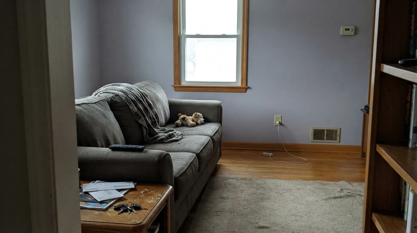
Room by Room
Softer than a typical baby-purple and grayed enough that it doesn't read as a theme, Party Hat is one of the few light purples that can stay on the wall from the nursery years into a tween bedroom without feeling outgrown. Pair with a warm white trim and let warm wood furniture do the grounding.
Small, enclosed, and usually seen for thirty seconds at a time — exactly the conditions where a grayed lilac reads sophisticated instead of sweet. Brass fixtures and a warm-stone counter make the mauve in it come forward.
As a single accent wall behind a desk it adds color without turning the whole room purple. Works best near a south or west window; in a windowless interior office it can read flat without help from a warm lamp.
In a room that gets genuine sun it is calm and gently colorful, not childish. Skip it for a primary bedroom you'll paint once and live with for a decade unless you already know you love the lilac — this is a color for someone who wants it, not a safe default.
Enclosed, small, and usually lit by one warm bulb, a closet is where Party Hat gets to be exactly what it looks like on the chip: a soft, jewel-toned lilac with nothing nearby to argue with it.
Too light-dependent and too narrow a mood for full-house or exterior use. Full sun grays it out, and it has to negotiate its violet undertone against roofing, siding, and every neighboring wood tone on the block. This is a room color, not a house color.
Your Light Is the Risk
Warm afternoon sun brings the mauve-pink forward and softens the blue-violet — the color at its most flattering, and the light to sample it in first.
Cold, overcast daylight drains the pink and leaves a flat, slightly chalky gray-blue. Test a large sample here before committing to a north-facing room.
Cooler and more blue-lilac at midday, warmer and more mauve as the light lowers in the afternoon. The shift is gentle, not a different color.
2700K warm bulbs pull it toward dusty mauve-pink at night. Cool white LEDs flatten it back toward gray — swap the bulb before you swap the paint.
Most complaints about Party Hat are a light mismatch. Upload a photo of your actual room and see it on your walls — then ask for the same wall in north light or evening lamps before you buy a single sample.
Need It From Another Brand?
Any paint counter can custom-tint Behr P560-3 directly. If you would rather stay in one brand's own deck, these are the closest stock matches, measured as ΔE2000. Under 2 is a difference you will not see on the wall.
| Brand | Closest color | ΔE | LRV | |
|---|---|---|---|---|
| Benjamin Moore | French Lilac1403 · Benjamin Moore | 4.2 | 56 | Color page → |
| Valspar | Purple Hibiscus8001-48C · Valspar | 0.9 | 54 | Color page → |
| PPG / Glidden | Purple DragonPPG1247-4 · PPG / Glidden | 1.3 | 54 | Color page → |
| Glidden | Purple DragonPPG1247-4 · Glidden | 1.1 | 54 | Color page → |
| Dutch Boy | Candied Purple143-3DB · Dutch Boy | 1.7 | 55 | Color page → |
| Dunn-Edwards | Violet GemsDE5940 · Dunn-Edwards | 3.1 | 52 | Color page → |
Similar Behr Colors
The nearest shades to Party Hat within Behr's own range, ranked by perceptual color distance — useful when you want the same look a touch lighter, darker, or warmer.
WCAG 2.1: AA is 4.5 : 1 for normal text, 3 : 1 for large text, AAA is 7 : 1.
Party Hat vs the Colors You're Also Considering
Every Party Hat sample board has the same rivals on it. The numbers show the real lightness gap — then it comes down to which risk you would rather live with.
Pick this if you're already comparing Behr swatches and want the same soft lilac without switching brands.
Benjamin Moore 1403 · LRV 56French LilacPick this if your painter works in Benjamin Moore — the same soft, grayed lilac at the same LRV, dressed a touch more formally.
Pick this if Wisteria feels like too much color — Party Hat is the gentler, easier-to-live-with version of the same family.
Sherwin-Williams SW 6822 · LRV 48WisteriaPick this if you want more visible purple — Wisteria is a full step more saturated and reads as lavender even in weak light.
Party Hat Coordinating Colors
The rule with Party Hat: warm whites and warm neutrals soften it, cool blue-whites make it look dingy, and it layers beautifully with deeper members of its own lilac family. These are the partners that keep the color reading intentional:
The Name vs. The Paint: Why Party Hat Reads Calmer Than It Sounds
Behr's own listing calls Party Hat a "bright yet not-too-intense" light purple built to lift the mood of a room — shelf copy for a color meant to sound playful and easy. What actually lands on the wall is more restrained than that: enough gray mixed into the violet that it reads as a considered lilac rather than a party-supply purple.
That gap between the name and the paint is good news for anyone nervous about committing to purple. You get the visual interest the name promises without the saturated, kid-party color it implies — which is exactly why this color works in a powder room or a home office as easily as it works in a nursery.
Party Hat With Wood Tones and Floors
This decision matters more than the paint chip does: walnut, espresso, and pale white oak are Party Hat's easiest partners — the darker or cooler the wood, the more the lilac reads as a deliberate, grown-up color instead of a pastel accident.
Honey oak, golden pine, and any warm yellow-toned trim are the one real conflict. Violet and yellow-orange sit opposite each other on the color wheel, so each side pushes the other further from what you wanted — the floor looks more orange, the wall looks more purple. If the golden floor isn't going anywhere, keep Party Hat to a single wall or a small room, and let a large rug or runner separate the two.
Three Ready Palettes Built on Party Hat
A color is never alone on the wall. These are complete combinations in the 60-30-10 pattern, with the reason each one holds together. Every one opens in the visualizer.
A warm white trim keeps the lilac from reading cold, and the near-black accent stops the pastel from feeling sugary — the combination that lets this color age past the nursery years.
Try this palette in your roomTonal lilac layering — two depths of the same family — keeps a small room sophisticated instead of themed, and the crisp trim white gives the eye a place to land.
Try this palette in your roomA quiet neutral on three walls lets Party Hat read as a considered pop of color on the fourth, and the dark trim adds the structure a soft pastel needs to feel intentional.
Try this palette in your roomParty Hat FAQ
Is Party Hat purple or gray?
Purple — a genuinely gray-veiled one, but purple. On the small chip or in dim light it can pass for a soft neutral gray; painted across real walls the violet is unmistakable. If gray is actually what you want, this is the wrong color to gamble on.
What's the best room for Party Hat?
A small, enclosed space with some warm light: a nursery, a powder room, or a closet. It isn't built to be a whole-house or living-room color — it's a color for a room you want to feel deliberately soft and a little unexpected.
Does it work with honey oak floors?
Not well. Yellow-orange is violet's complement, so golden oak floors and Party Hat push each other the wrong way — the floor reads more orange, the wall reads more purple. Walnut, white oak, or painted trim are much easier partners.
Is it too pink or too blue?
Neither, most of the time — it's a violet with a mauve-pink whisper. Warm light and warm bulbs bring the pink forward; cold north daylight pushes it toward blue-gray. Sample it in your actual room's light before deciding it's "too" anything.
What trim white goes with Party Hat?
A warm white — Benjamin Moore White Dove or Chantilly Lace both work — keeps the lilac from looking cold. A stark, blue-white trim will make the walls read dingier than they actually are.
Can I use it on a whole house or exterior?
No — this is a room color, not a house color. It's too light-dependent for full sun and has to negotiate roofing, siding, and every nearby wood tone. Keep it to a single interior room or accent wall.
Have you painted with Party Hat?
Rate it — one tap helps the next reader decide.
Ask a Question