CP

Lilac Dining Room Palette — Soft Lilac & Warm Walnut

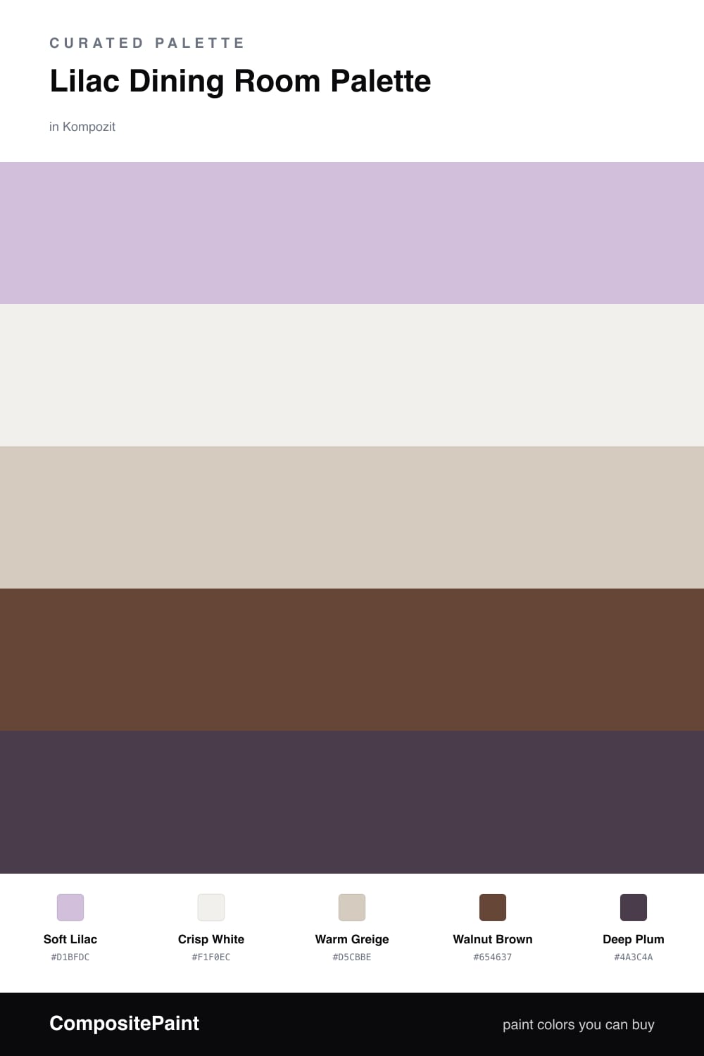
A calm five-color dining room scheme led by soft lilac, balanced with a warm greige, crisp white trim, walnut wood, and a deep plum accent — every color matched to real paint you can buy.

By Emily Roberts · DIY Editor & First-Timer's Guide

Soft Lilac
Walls
Kompozit Plum Cake · 1233
#D1BFDC
LRV 56
Crisp White
Trim & Ceiling
Kompozit White Shoulders · 1265
#F1F0EC
LRV 87
Warm Greige
Cabinets or Vanity
Kompozit Awakening · 0560
#D5CBBE
LRV 61
Walnut Brown
Wood & Floors
Kompozit Hideaway · 0137
#654637
LRV 7
Deep Plum
Accent
Kompozit Petunia Patty · 1228
#4A3C4A
LRV 5
View palette in

Lilac gets a bad rap as a kids-room color, but a soft, grayed-down Soft Lilac on the walls is one of the most quietly elegant things you can do in a dining room. It catches candlelight beautifully and feels warm without going pink.

To keep it feeling current and not fussy, I balance it with Warm Greige on any cabinetry and Crisp White on the trim and ceiling. These two do the steadying work so the lilac can stay the star.

The real magic is in the dark tones. Walnut Brown floors anchor the whole room, and a few Deep Plum touches — a sideboard, the dining chairs, maybe a velvet runner — pull the lilac into something rich and intentional. Use the plum sparingly and let lilac lead.

Buy These Colors

Each color matched to the closest real paint in every brand, by ΔE2000. Kompozit first; take any SKU to the store — these mix on demand.

Soft Lilac
#C9BBD6 · LRV 53 · Walls
Kompozit Plum Cake · 1233 ΔE 1.91
Backdrop Lost in the 80s · BD-LO ΔE 20.18
Behr Iris Pink · 690E-3 ΔE 1.62
Benjamin Moore Wishing Well · 1389 ΔE 2.3
Clare Cloud Watching · PNT100-MD-73 ΔE 16.08
Dunn-Edwards Soft Purple · DE5954 ΔE 0.43
Farrow & Ball Calluna · No. 270 ΔE 9.74
Magnolia Home Cement Pots · JG-93 ΔE 12.15
PPG / Glidden Purple Dragon · 1247-4 ΔE 2.61
Sherwin-Williams Free Spirit · SW 6973 ΔE 3.85
Valspar Frosted Orchid · M241 ΔE 1
Crisp White
#F4F1EC · LRV 88 · Trim & Ceiling
Kompozit White Shoulders · 1265 ΔE 1.02
Backdrop Tabula Rasa · BD-TR ΔE 2.97
Behr Nano White · HDC-MD-06 ΔE 0.59
Benjamin Moore Opulence · 879 ΔE 0.21
Clare Wing It · PNT100-LT-24 ΔE 2.29
Dunn-Edwards Fossil · DE6225 ΔE 0.49
Farrow & Ball Wimborne White · No. 239 ΔE 2.71
Magnolia Home Silos White · JG-107 ΔE 1.32
PPG / Glidden Delicate White · 1001-1 ΔE 1.93
Sherwin-Williams Arcade White · SW 7100 ΔE 1.28
Valspar Santa's Beard · 8007-6E ΔE 1.01
Warm Greige
#D6CDC0 · LRV 62 · Cabinets or Vanity
Kompozit Awakening · 0560 ΔE 0.66
Backdrop Real Real · BD-RR ΔE 2.32
Behr Aged Beige · PPU7-09 ΔE 0.89
Benjamin Moore Cedar Key · 982 ΔE 0.91
Clare Flatiron · PNT100-LT-17 ΔE 1.03
Dunn-Edwards Porous Stone · DE6220 ΔE 2.01
Farrow & Ball Cromarty · No. 285 ΔE 4.19
Magnolia Home Stoneware Pieces · JG-55 ΔE 4.45
PPG / Glidden In The Buff · 1019-2 ΔE 1.3
Sherwin-Williams Modern Gray · SW 7632 ΔE 0.89
Valspar Secluded Beach · V146-1 ΔE 2.54
Walnut Brown
#5C4536 · LRV 7 · Wood & Floors
Kompozit Hideaway · 0137 ΔE 3.5
Backdrop It's a Date · BD-IT ΔE 0.54
Behr Moose Trail · N190-7 ΔE 1.81
Benjamin Moore Deep Taupe · 2111-10 ΔE 0.87
Clare Blackish · PNT100-DP-54 ΔE 11.63
Dunn-Edwards Northern Territory · DEA158 ΔE 2.82
Farrow & Ball Mahogany · No. 36 ΔE 7.29
Magnolia Home Wooded Acres · JG-122 ΔE 6.34
PPG / Glidden Racy Raisin · 16-24 ΔE 5.73
Sherwin-Williams Well-Bred Brown · SW 7027 ΔE 2.84
Valspar Incognito · V084-6 ΔE 1.55
Deep Plum
#4A3550 · LRV 5 · Accent
Kompozit Petunia Patty · 1228 ΔE 5.92
Backdrop Last Call · BD-LC ΔE 11.9
Behr Deep Aubergine · 100F-7 ΔE 4.18
Benjamin Moore Exotic Purple · 2071-10 ΔE 2.02
Clare Blackish · PNT100-DP-54 ΔE 17.83
Dunn-Edwards Preserve · DEA193 ΔE 3.92
Farrow & Ball Pelt · No. 254 ΔE 7.57
Magnolia Home Plum Suede · JG-102 ΔE 6.18
PPG / Glidden Victory Blue · 1165-7 ΔE 11
Sherwin-Williams Concord Grape · SW 6559 ΔE 3.57
Valspar Virtuoso · M215 ΔE 4.89

Questions

Is lilac too soft for a dining room?

Not at all. A muted lilac reads calm and a little grown-up, which suits a room where people linger over dinner. Pairing it with walnut wood and a deep plum accent keeps it from feeling too sweet.

How do I keep this palette from looking washed out?

Lean on the dark tones for contrast — let the walnut floors and plum accent do the heavy lifting while lilac stays on the walls and white frames the trim and ceiling.

Similar Palettes

Closest schemes by color — not by label.