Clay Figurine
A mid-tone clay greige reviewed honestly: the rooms where the warmth holds, the light that turns it muddy, and what to pick instead.

Jessica has spec'd whites and neutrals for more than 300 rooms and keeps a sample wall of painted drawdowns in her studio. Every color review is checked against real reader rooms in the comments and re-tested when a formula changes. About the testing process →
- 1Dorian Gray39
- 2Mindful Gray48
- 3Clay Figurine54.2
- 4Agreeable Gray60
- 5Pale Oak69
The Fast Verdict
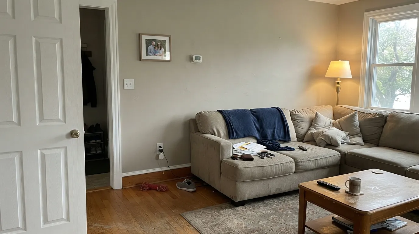
Clay Figurine is the greige you pick when the famous light ones washed out. At LRV 54.2 it has enough body to read as a real wall color — a muted tan-gray with a soft clay warmth, not beige soup and not office gray. In south or west daylight it sits quietly against oak and white trim. In a dim north room the clay drains out and you are left with something drab and slightly dirty. Sample it large. This is not a color that behaves the same in every house.
Living rooms, dining rooms, and hallways with real daylight · oak floors and brass · anyone who found lighter greiges too washed-out · a main floor that needs to actually show
Your room faces north and stays dim · you actually want gray · your floors or counters are cool gray · you want a light, airy wash
- Deep enough (LRV 54.2) to actually show on walls
- Clay-tan warmth with no green and no pink to manage
- Flatters oak, walnut, brass, and soft white trim
- Sold at Lowe's — easy to get, easy to recode
- Sits in the same mid-greige band as the famous names without the hype tax
- Goes drab and slightly muddy in dim north light
- Not gray — buyers expecting gray see clay by the second wall
- Fights cool gray LVP, gray-washed floors, and blue-gray stone
- Too mid to air out a dark room; too quiet to be the interesting color in a beige house
What Color Is Clay Figurine, Really?
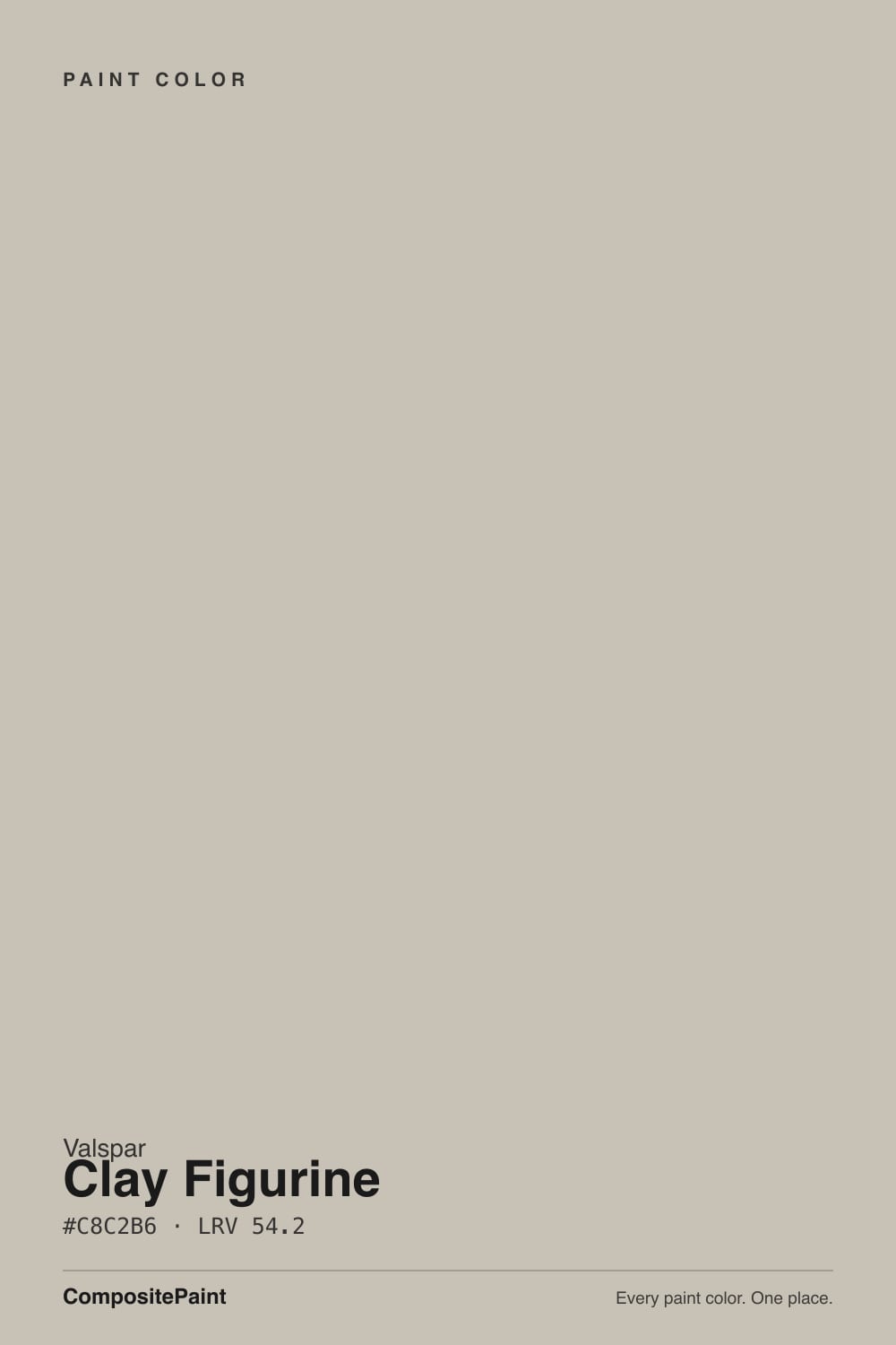
A muted mid-tone greige with a clay-tan warmth — beige grayed down until it stops reading decorator-cream, then left just warm enough that it never goes office-gray. Valspar files it in Neutral with a Warm tag, and the chemistry matches: the hue sits on a yellow-clay axis with almost no red and no green. That is the useful part. A lot of mid greiges in this range flash green (Revere Pewter's famous risk) or violet (Repose Gray, Alpaca). Clay Figurine stays tan. Low chroma keeps it from looking like a painted-on beige; the gray in it is a mute, not a second personality.
At LRV 54.2 it is a genuine mid-tone, not a light neutral wearing a beige name. Agreeable Gray at LRV 60 and Edgecomb Gray at LRV 63 still bounce a lot of light and can disappear on a big, bright wall. Clay Figurine is deep enough to actually show — the thing owners who keep sampling lighter greiges are usually hunting for. The tradeoff is honest: it will not air out a dark room. Plan for the wall to read a half-step deeper and more clay than the chip, especially once it wraps four walls.
Undertone in one line: warm clay-tan — yellow-beige, never pink, never green. If your sample looks gray and lifeless, the light is cold. If it looks suddenly sandy or a touch yellow, that is west sun or honey oak bouncing up. Both versions are the same paint telling the truth about the room.
Where It Shines
Give it real daylight and warm materials and it does the job mid greiges are supposed to do: the room looks finished, the wood looks chosen, the white trim looks crisp without cutting. Living rooms, dining rooms, and hallways are its home turf — the rooms where you want a color that is present but will not pick a fight with furniture you already own. Brass, linen, oak, and a soft white like Dove White or Soft Wool are the company it was mixed for.
Where It Fails
Almost every regret story about a mid greige this depth follows one of three scripts, and Clay Figurine is no exception. None of them are a surprise once you know the light and the neighbors. If your room matches one, this is not your color — a bigger sample will only confirm it.
Cool gray daylight strips the clay out and leaves a flat, slightly muddy gray. At LRV 54.2 there is not enough bounce to save a dark room, and the low chroma that keeps it elegant in sun reads lifeless without it. Owners who loved the chip in the store describe the finished walls as too dark and a little dirty. The paint did not fail; the light did. Go lighter — Edgecomb Gray at LRV 63, or a warm off-white — or commit to a lot of 2700K lamps.
On a chip in fluorescent store light it can pass for a warm gray. On four walls the clay-tan is unmistakable. If your goal is a true modern gray, this will read beige-adjacent the first sunny afternoon, and you will feel tricked. Look at Repose Gray if you want gray with only a whisper of warmth — and know that one has a violet risk of its own.
Gray LVP, gray-washed wood, and blue-gray quartz sit on the opposite side of the temperature line. They pull Clay Figurine's yellow-clay forward until the walls look sandy and the floor looks colder. Both sides lose. This color wants oak, walnut, cream stone, or a big warm rug between it and anything cool-gray. Test a large board above the actual floor before you roll a gallon.
Room by Room
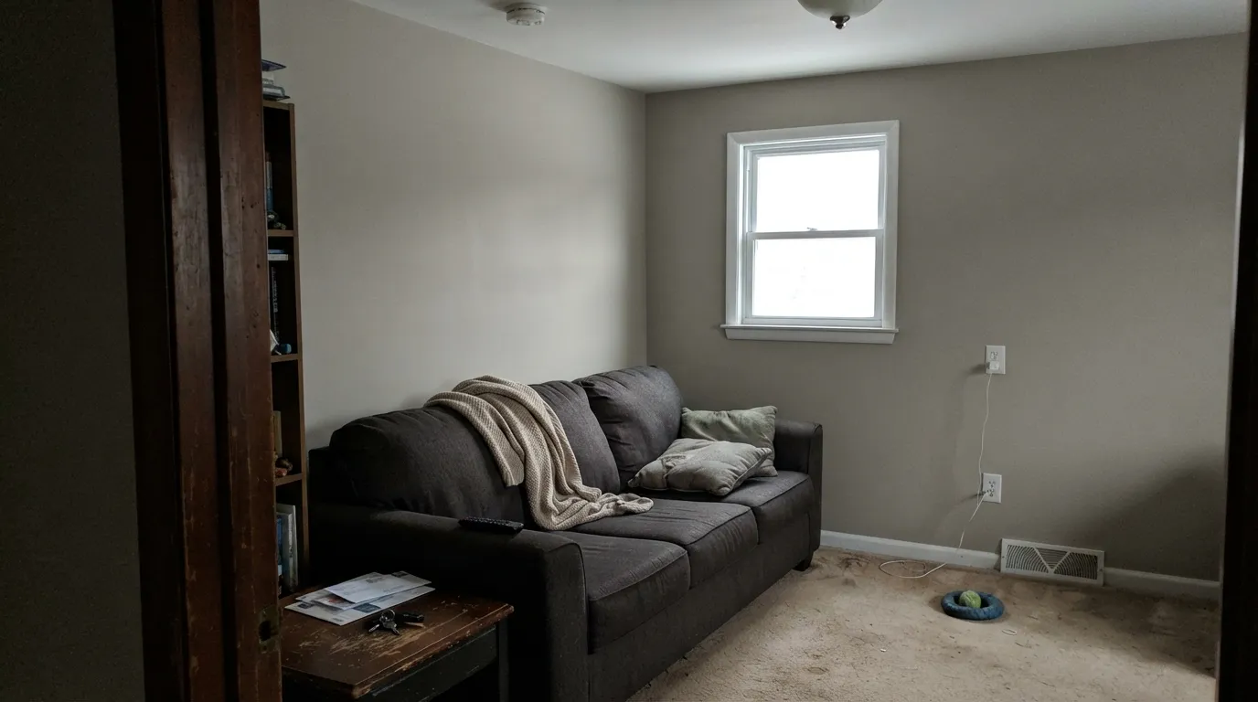
South or west light, oak floors, a worn sofa, white trim: this is the room the color was mixed for. Eggshell on the walls; Dove White or Soft Wool on trim in semi-gloss. It reads as a finished greige, not a project.
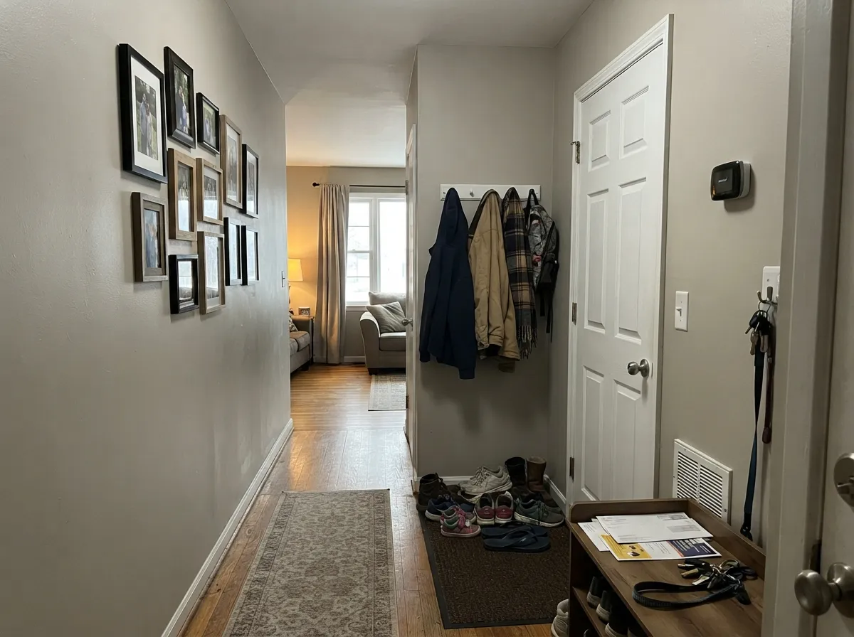
Mid greiges earn their keep in the pass-throughs, and Clay Figurine is deep enough to look intentional next to white six-panel doors. If the hall is a windowless tunnel, it will go drab — steal light from the rooms at either end, or pick something lighter.
Evening lamps bring the clay forward and the room goes quietly warm, which is what you want over a table. Pair with walnut or oak and brass. Eggshell; keep the bulbs at 2700K.
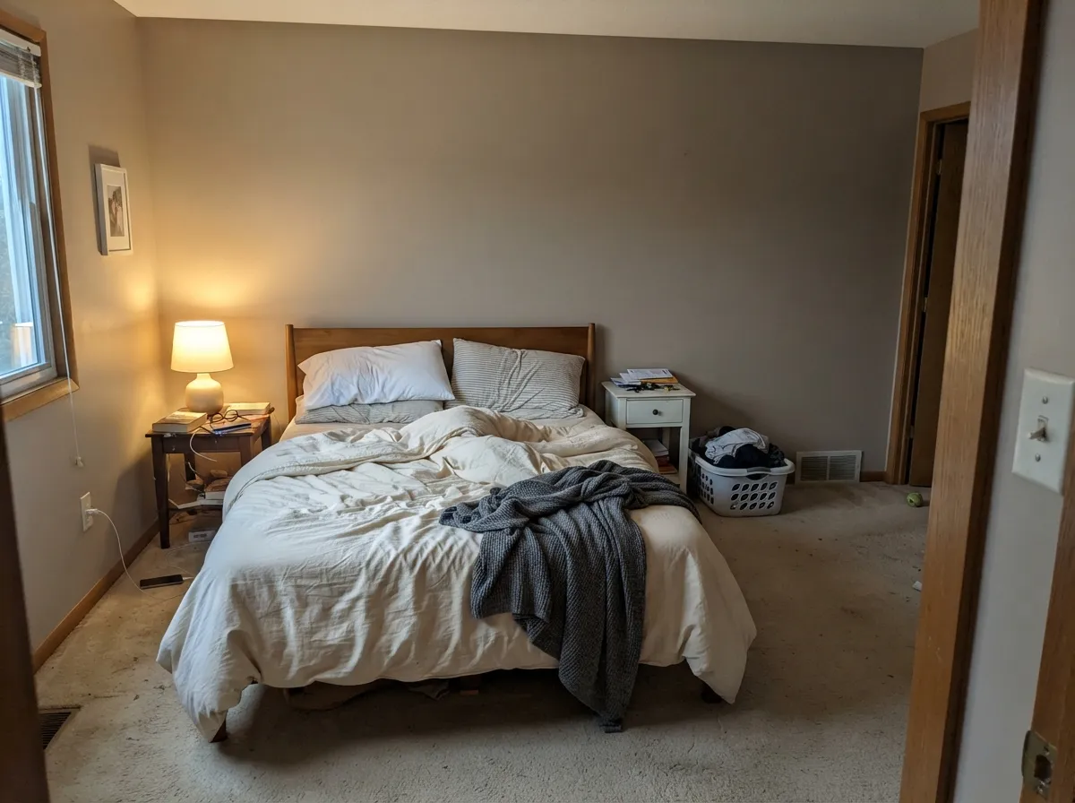
Calm and restful under warm bulbs. In a bright south bedroom it stays a soft clay greige all day. In a north bedroom it needs lamps or it goes flat. Cream or white bedding, not beige, which stacks too much tan.
Warm quartz, butcher block, cream stone, brass: it works, and satin Clay Figurine on an island or lower cabinets is a solid Lowe's move under Soft Wool or Dove White uppers. Cool gray counters or blue-gray tile will argue. Sample against the slab, not the chip.
A present, quiet backdrop that does not go icy on camera the way a true gray will. A north office with one window and cool task LEDs is the wrong setup — swap the bulbs or pick a lighter warm neutral.
Your Light Is the Risk
The clay warmth holds and the gray mute keeps it from going sandy. This is the light that makes it look expensive instead of builder.
Cool gray daylight cancels the tan and leaves a flat, slightly dirty gray. At this LRV the room will also read darker than the chip. Test here first if this is your light.
Quieter and grayer in morning east light; the clay comes forward through west afternoon and golden hour. The shift is a temperature change, not a new color.
2700K lamps keep the clay soft and slightly cozy. Cool white LEDs strip the warmth and can make the walls look dingy — swap the bulbs before you blame the paint.
Most complaints about Clay Figurine are a light mismatch. Upload a photo of your actual room and see it on your walls — then ask for the same wall in north light or evening lamps before you buy a single sample.
Need It From Another Brand?
Any paint counter can custom-tint Valspar M341 directly. If you would rather stay in one brand's own deck, these are the closest stock matches, measured as ΔE2000. Under 2 is a difference you will not see on the wall.
| Brand | Closest color | ΔE | LRV | |
|---|---|---|---|---|
| Sherwin-Williams | High SierraSW 9588 · Sherwin-Williams | 1.1 | 53 | Color page → |
| Behr | Sculptor ClayPPU5-08 · Behr | 1.5 | 55 | Color page → |
| Benjamin Moore | Cumulus Cloud1550 · Benjamin Moore | 1.4 | 52 | Color page → |
| PPG / Glidden | Rabbit's EarPPG0999-2 · PPG / Glidden | 1.4 | 54 | Color page → |
| Glidden | Great GrayPPG15-28 · Glidden | 1.9 | 54 | Color page → |
| Dutch Boy | Scalloped Gray439-2DB · Dutch Boy | 1.0 | 53 | Color page → |
Similar Valspar Colors
The nearest shades to Clay Figurine within Valspar's own range, ranked by perceptual color distance — useful when you want the same look a touch lighter, darker, or warmer.
WCAG 2.1: AA is 4.5 : 1 for normal text, 3 : 1 for large text, AAA is 7 : 1.
Clay Figurine vs the Colors You're Also Considering
Every Clay Figurine sample board has the same rivals on it. The numbers show the real lightness gap — then it comes down to which risk you would rather live with.
Pick this when you want the same mid-tone presence without Revere's green risk; Clay Figurine stays clay-tan.
Benjamin Moore HC-172 · LRV 56Revere PewterPick this if you want the famous mid greige and you have the daylight it needs — knowing its warmth can flash green.
Pick this for the Lowe's version of the same mid-greige depth — clay-tan, not pink, and a fraction easier to recode.
Farrow & Ball No. 229 · LRV 52Elephant's BreathPick this if you want the Farrow & Ball classic and you can live with a color that reads beige, grey, or faintly pink depending on the room.
Clay Figurine Coordinating Colors
Stay on the warm side of the fence. Clay Figurine wants soft whites, deeper clay-greiges, muted sage, and a true black — and it argues with icy whites, cool grays, and blue-gray stone. These are the partners that keep showing up in rooms that work:
The Clay in the Name — and Why This One Is Not Famous
Clay Figurine is not a Color of the Year, not a viral cabinet color, and not the greige your painter will name from memory. It lives on the Valspar Neutral card at Lowe's and independent retailers, tagged Warm, and it occupies the same mid-depth band as Revere Pewter (LRV 56) and Elephant's Breath (LRV 52) without either name's baggage. That obscurity is not a flaw. It is how you get a mid greige that nobody is already tired of.
The clay in the name is the part to take seriously. This is not a green-warm greige and not a pink-taupe. The undertone is yellow-tan, low chroma, closer to unglazed pottery than to sand. That is why it holds next to oak and why it looks suddenly sandy next to cool gray floors. If you have been sampling the famous light greiges and they keep disappearing on the wall, this is the depth they were missing — just do not buy it hoping the name was a metaphor and the color is actually gray.
Clay Figurine With Wood Tones and Floors
Warm wood is the easy yes. Oak — honey, red, or white — walnut, and butcher block all meet the clay halfway, and the gray mute in the paint keeps honey oak from going louder. Cedar and pine work too. Brass, antique bronze, and matte black hardware all sit comfortably; polished chrome is the one metal that leans a little cold against it.
The floor that needs a large sample is anything cool: gray LVP, gray-washed oak, blue-gray tile. Those surfaces cancel the clay and leave you with sandy walls and a colder floor. Cream carpet and natural jute are fine. If the cool floor is staying, put a big warm rug between it and this paint, or pick a cooler greige and stop asking a clay color to behave like gray.
Three Ready Palettes Built on Clay Figurine
A color is never alone on the wall. These are complete combinations in the 60-30-10 pattern, with the reason each one holds together. Every one opens in the visualizer.
One trip to Lowe's covers the whole scheme. Dove White is the closest thing to White Dove on that shelf, so the trim stays soft instead of plastic-bright; Dark Kettle Black is a true black with no blue in it, which is the single dark note a mid greige house needs.
Try this palette in your roomSoft Wool is a near White Dove twin, so the cabinet-to-wall handoff stays in the same warm family. Smoked Oyster is the deeper greige on the same Lowe's wall — enough contrast to ground the island without jumping to a different color story. Brass hardware and a warm counter finish it.
Try this palette in your roomThe sage is muted enough that it reads as atmosphere next to a clay greige, not as a themed green bedroom. Soft Wool trim keeps the edges warm; a crisp gallery white would make Clay Figurine look dusty by comparison.
Try this palette in your roomClay Figurine FAQ
Is Clay Figurine gray or beige?
Greige — specifically a clay-tan greige. On the chip it can pass for warm gray; on four walls the tan is clear. If you actually want gray, this is the wrong color, and that mismatch is behind most of the disappointment. If you want beige, Accessible Beige is the warmer, slightly lighter pick.
What trim white goes with Clay Figurine?
A soft warm white. Dove White and Soft Wool are the Lowe's answers; White Dove is the same idea if your painter is in Benjamin Moore. A bright cool white like Chantilly Lace makes the walls look dingy next to the crisp edge. Semi-gloss on the trim, eggshell on the walls.
Will Clay Figurine look dark on my walls?
In a bright south or west room, no — it reads as a present mid-tone, not a cave. In a dim or north room, yes: LRV 54.2 does not bounce enough light to save a dark space, and the finished walls will look a half-step deeper than the chip. Sample on the darkest wall you have.
Does it work with oak floors?
Yes — oak is one of its best partners. Honey, red, and white oak all sit comfortably against the clay warmth, and the gray mute keeps the floor from looking more orange. Walnut is equally good. The floor that needs a sample first is cool gray LVP or gray-washed wood.
Clay Figurine or Agreeable Gray?
Agreeable Gray at LRV 60 is lighter, safer, and more of a wash — the default whole-house greige until the light goes cool. Clay Figurine is the step deeper for people who sampled Agreeable Gray and thought it disappeared. If your rooms are already bright, either works; if you want the wall to have a color, pick this one.
Does Clay Figurine work in a north-facing room?
Only if you are willing to light it. Cool north daylight strips the clay and leaves a drab gray. Warm 2700K lamps can rescue an evening, but they will not fix the way it looks at 2pm on an overcast day. If the room stays dim, pick a lighter warm neutral and save Clay Figurine for a room with a real window.
Have you painted with Clay Figurine?
Rate it — one tap helps the next reader decide.
Ask a Question