CP

Plum Powder Room Palette — Velvet Plum & Warm Linen

A moody five-color powder room scheme led by velvet plum, balanced by warm linen, crisp white, walnut wood, and an aubergine accent — every color matched to real paint you can buy.

By Maya Patel · Reviews Editor & Product Tester

Velvet Plum
Walls
Kompozit Dreamy Heaven · 1201
#594158
LRV 7
Warm Linen
Trim & Ceiling
Kompozit Umber Style · 0208
#ECE7DD
LRV 80
Soft Mauve Gray
Cabinets or Vanity
Kompozit So Dainty · 1309
#CDC0C9
LRV 55
Walnut Brown
Wood & Floors
Kompozit Evolution · 0130
#704A3D
LRV 9
Deep Aubergine
Accent
Kompozit Silent Sea · 0515
#2A2B2C
LRV 2
View palette in

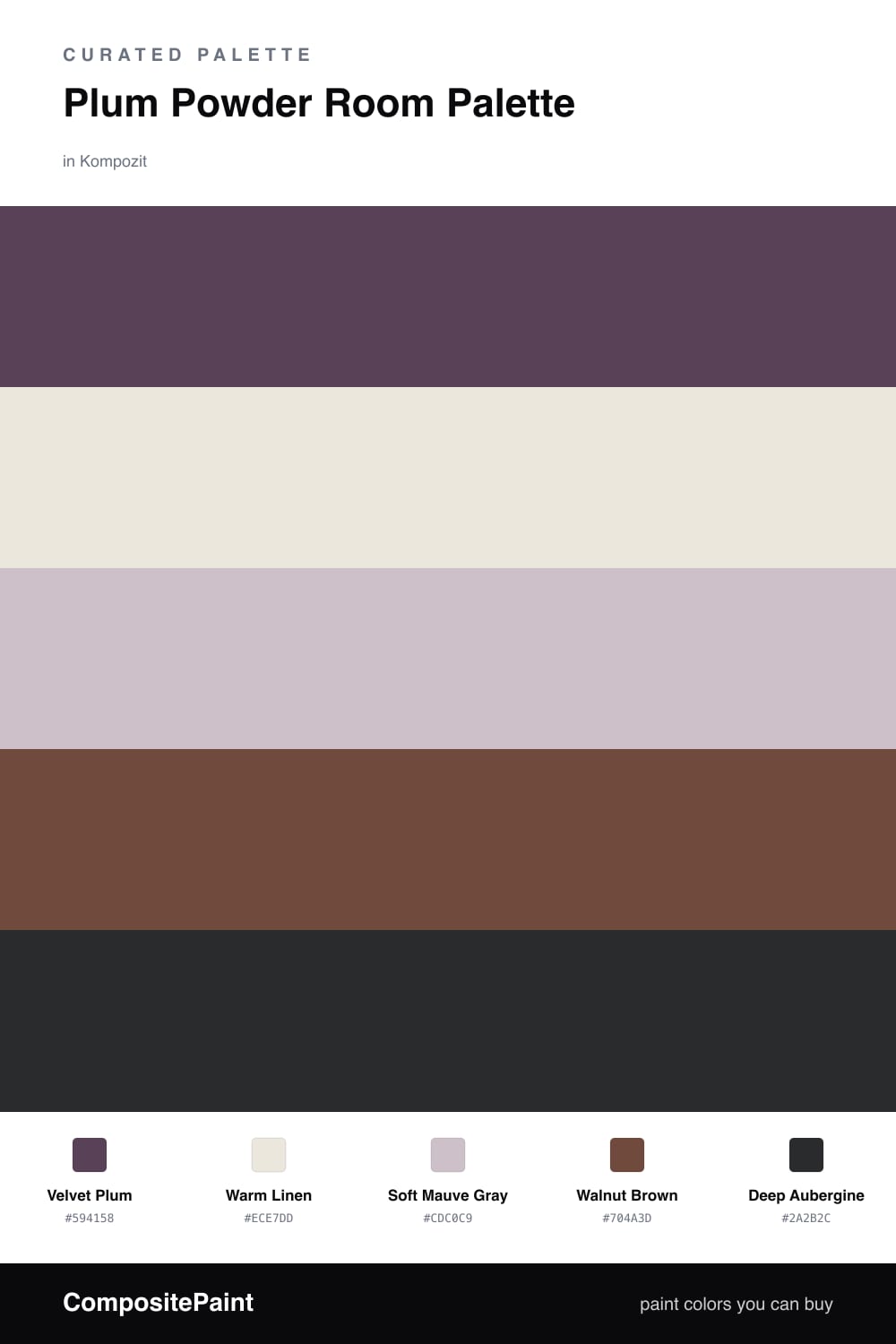
A powder room is the one place I tell people to be brave. It is small, you are only in it for a minute, and a saturated color lands far better here than on a whole great room. This scheme leads with Velvet Plum, a soft contemporary purple that feels current without tipping into anything trendy.

I keep the trim and ceiling in Warm Linen so the top of the room lifts and the plum never feels heavy. Soft Mauve Gray on the vanity bridges the two, while Walnut Brown in the floor or a wood counter adds warmth that keeps the purple from going cold.

The move that makes it feel 2026 is the accent. A near-black Deep Aubergine on a mirror frame, sconce, or hardware reads almost like a shadow of the plum and gives the whole room a quiet, polished edge. Use the plum everywhere, the neutrals to breathe, and the aubergine in small sharp doses.

Buy These Colors

Each color matched to the closest real paint in every brand, by ΔE2000. Kompozit first; take any SKU to the store — these mix on demand.

Velvet Plum
#5C415D · LRV 7 · Walls
Kompozit Dreamy Heaven · 1201 ΔE 1.91
Backdrop Last Call · BD-LC ΔE 13.29
Behr Exotic Eggplant · S110-7 ΔE 3.23
Benjamin Moore Taro · 1386 ΔE 1.14
Clare Night Groove · PNT100-DP-77 ΔE 7.21
Dunn-Edwards Purple Odyssey · DEA143 ΔE 3.88
Farrow & Ball Pelt · No. 254 ΔE 7.75
Magnolia Home Moody Fig · JG-155 ΔE 11.47
PPG / Glidden Pansy Petal · 1177-7 ΔE 1.31
Sherwin-Williams Mature Grape · SW 6286 ΔE 3.35
Valspar Royal Velvet · V077-6 ΔE 3.05
Warm Linen
#EDE6DA · LRV 80 · Trim & Ceiling
Kompozit Umber Style · 0208 ΔE 1.09
Backdrop Don't Eat the Yellow Snow · BD-DS ΔE 4.66
Behr Exclusive Ivory · HDC-MD-11 ΔE 0.79
Benjamin Moore White Down · 970 ΔE 1.88
Clare Like Buttah · PNT100-LT-62 ΔE 2.53
Dunn-Edwards Finest Silk · DE6127 ΔE 2.21
Farrow & Ball James White · No. 2010 ΔE 2.96
Magnolia Home Antique Rose · JG-23 ΔE 0.86
PPG / Glidden Pearls And Lace · 1074-1 ΔE 0.79
Sherwin-Williams Futon · SW 7101 ΔE 0.45
Valspar Cozy White · 3008-10C ΔE 0
Soft Mauve Gray
#C9BCC0 · LRV 52 · Cabinets or Vanity
Kompozit So Dainty · 1309 ΔE 2.51
Backdrop Boy Meets Girl · BD-BG ΔE 10.81
Behr Such Melodrama · MQ5-32 ΔE 3.43
Benjamin Moore Piano Concerto · 1445 ΔE 2.14
Clare Motor City · PNT100-LT-09 ΔE 9.09
Dunn-Edwards Wafting Gray · DE6031 ΔE 3.46
Farrow & Ball Purbeck Stone · No. 275 ΔE 8.91
Magnolia Home Anatolian · JG-127 ΔE 7.76
PPG / Glidden Hush · 1004-3 ΔE 4.92
Sherwin-Williams Mauve Finery · SW 6282 ΔE 3.13
Valspar Lavender Sand · P001 ΔE 1.54
Walnut Brown
#6B4A36 · LRV 8 · Wood & Floors
Kompozit Evolution · 0130 ΔE 4.12
Backdrop It's a Date · BD-IT ΔE 4.36
Behr Outback Brown · BXC-65 ΔE 2.52
Benjamin Moore Forest Brown · 2105-10 ΔE 2.6
Clare Vintage · PNT100-DP-67 ΔE 10.77
Dunn-Edwards Chaps · DE6049 ΔE 4.76
Farrow & Ball Preference Red · No. 297 ΔE 12.59
Magnolia Home Mountain Currant · JG-171 ΔE 5.54
PPG / Glidden Bird House Brown · 1072-7 ΔE 3.26
Sherwin-Williams Sturdy Brown · SW 6097 ΔE 3.34
Valspar Cowboy Hat · 3010-8 ΔE 1.03
Deep Aubergine
#33222F · LRV 2 · Accent
Kompozit Silent Sea · 0515 ΔE 12.64
Backdrop Hocus Pocus · BD-HP ΔE 11.09
Behr Beluga · 770F-7 ΔE 17.94
Benjamin Moore Velvet Cloak · CSP-480 ΔE 3.73
Clare Blackish · PNT100-DP-54 ΔE 16.71
Dunn-Edwards Black · DEA187 ΔE 13.27
Farrow & Ball Pitch Black · No. 256 ΔE 13.23
Magnolia Home Blackboard · JG-05 ΔE 12.71
PPG / Glidden Black Magic · 1001-7 ΔE 14.28
Sherwin-Williams Raisin · SW 7630 ΔE 6.49
Valspar Rare Wine · 1011-9 ΔE 1.6

Questions

Why does plum work so well in a powder room?

A powder room is small and used in short bursts, so it can handle a saturated color that would feel heavy in a big space. Plum reads rich and a little glamorous, and the tight footprint makes it feel intentional rather than overwhelming.

Will dark plum walls make the room feel cramped?

No — in a small room a deep color actually blurs the corners and makes the walls feel further away. Keep the trim and ceiling in warm linen to lift the top of the room and the plum stays cozy instead of closing in.

Similar Palettes

Closest schemes by color — not by label.