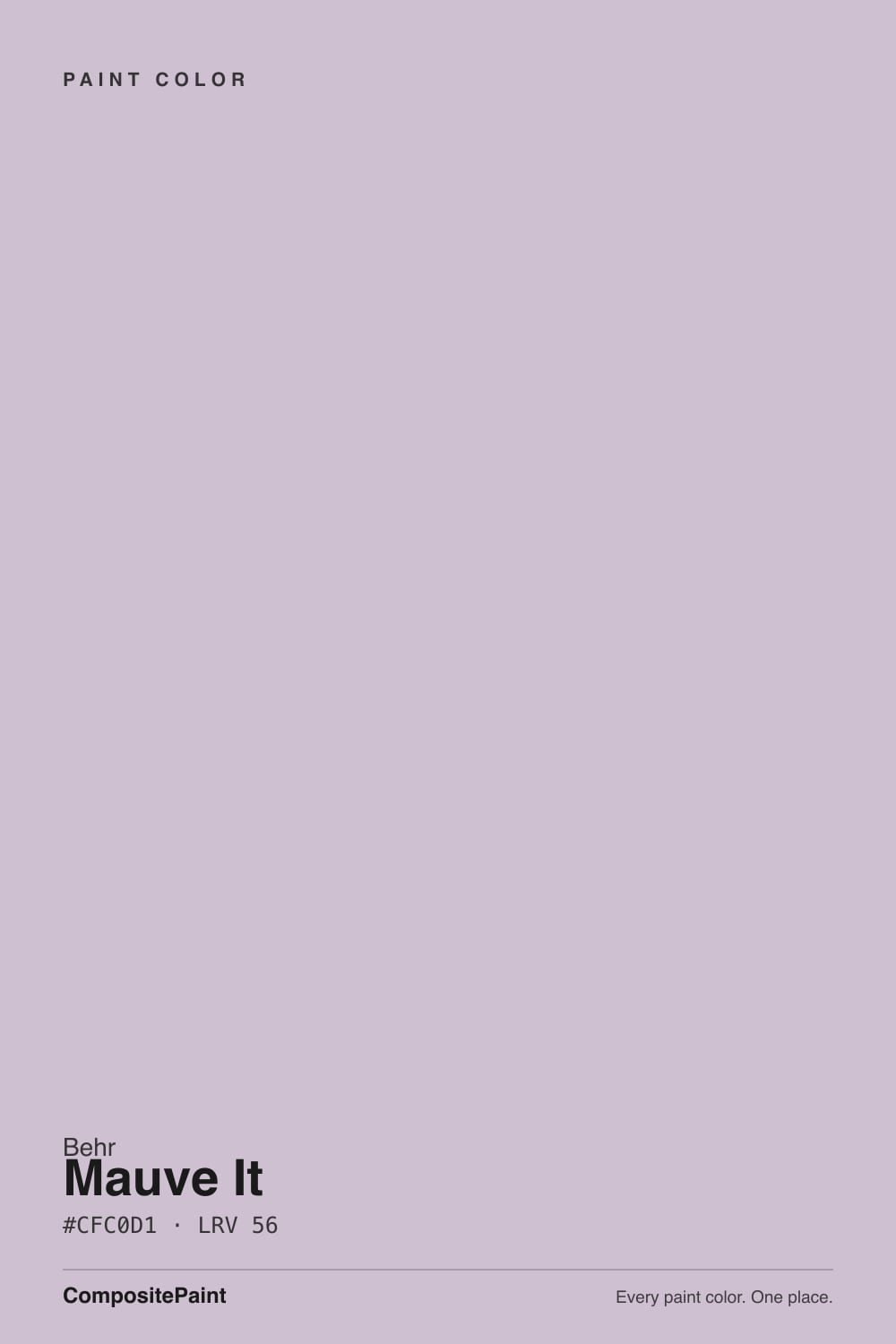
Mauve It
Behr's quietest mauve, reviewed honestly: the light where it turns soft and dusty, the light where it goes flat gray, and what to pick instead.

Jessica has spec'd whites and neutrals for more than 300 rooms and keeps a sample wall of painted drawdowns in her studio. Every color review is checked against real reader rooms in the comments and re-tested when a formula changes. About the testing process →
- 1Retro Pink38
- 2Vintage Tea Rose47
- 3Mauve It52
- 4Pale Cherry Blossom61
- 5First Light76
The Fast Verdict
Mauve It is a dusty violet grayed down until it almost, almost passes for a neutral — and Behr's own color-family tag agrees, filing it under "Neutral" even though the numbers say otherwise. At LRV 52 it is light enough to run a whole bedroom without feeling heavy, and muted enough to sit quietly next to cream and warm wood. It is not a famous color, not a Color of the Year, not the one your painter already knows by name — it is a genuinely well-behaved mauve that has to earn its keep on its own merits, and it does.
Bedrooms and guest rooms · powder rooms and vanities · calm home offices and reading nooks · anyone who wants a hint of mauve without repainting the whole house
You actually want a true gray · your floors are honey oak or golden pine · the room runs on cool white LEDs with no lamps · you're deciding from a 2-inch chip under fluorescent store lighting
- A genuine dusty mauve, not a gray with a rumor of purple in it
- Light enough (LRV 52) to run a whole room, not just an accent wall
- Behr's everyday deck — mixed at any Behr dealer, no premium-line upcharge
- Bedrooms, powder rooms and vanities all read calm and finished
- Layers naturally with deeper members of its own muted-violet family
- Behr calls it "Neutral"; on four walls it reads unmistakably violet
- Cool LEDs and north light flatten it to a dull, chalky gray-lavender
- Fights honey oak and golden wood tones — same complement-color problem as every muted violet
- Thin real-world track record — one chip among thousands in a huge deck, with little independent room-photo proof beyond the swatch
What Color Is Mauve It, Really?
Pull the hex apart and the story is simple: R207, G192, B209. Green sits below both red and blue, and that gap is exactly what reads as violet instead of gray — green is the channel that has to drop for a color to tip magenta-mauve rather than neutral. Behr files N120-3 in its "Neutral" color family on its own site, which says more about how big and loosely sorted Behr's deck is than it does about the color: on a wall, four coats of Mauve It reads as a soft, unmistakable dusty purple, not a colorless backdrop.
At LRV 52 it sits in the mid-light range — noticeably deeper than pale lilac washes like Lavender Mist (LRV 63), but far lighter than a mood color like Sleepy Hollow (LRV 28). That lightness is the practical upside: it can run a whole bedroom or living room without the room going dark or dramatic, the way deeper mauves do. The tradeoff is the same one every light, low-chroma color makes — it is easier to wash out in flat light and easier to read as "just gray" if the room never gets warm light or a lamp.
Undertone in one line: violet first, with a grayed, slightly cool cast — never truly pink, never truly blue. Third-party color-match sites disagree with each other here (more on that below); the number that actually ships on the chip and in Behr's own swatch data is the cooler lavender-mauve, not a warm pink-beige.
Where It Shines
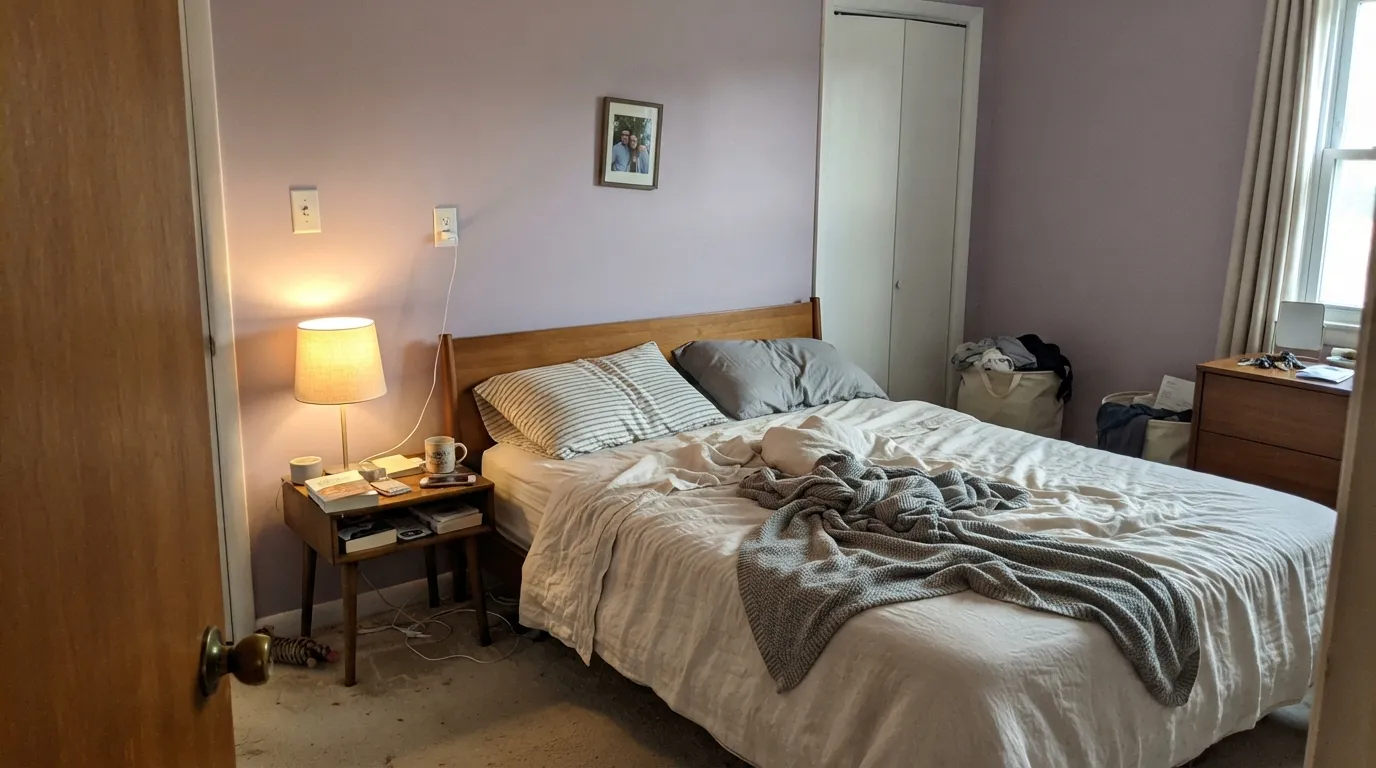
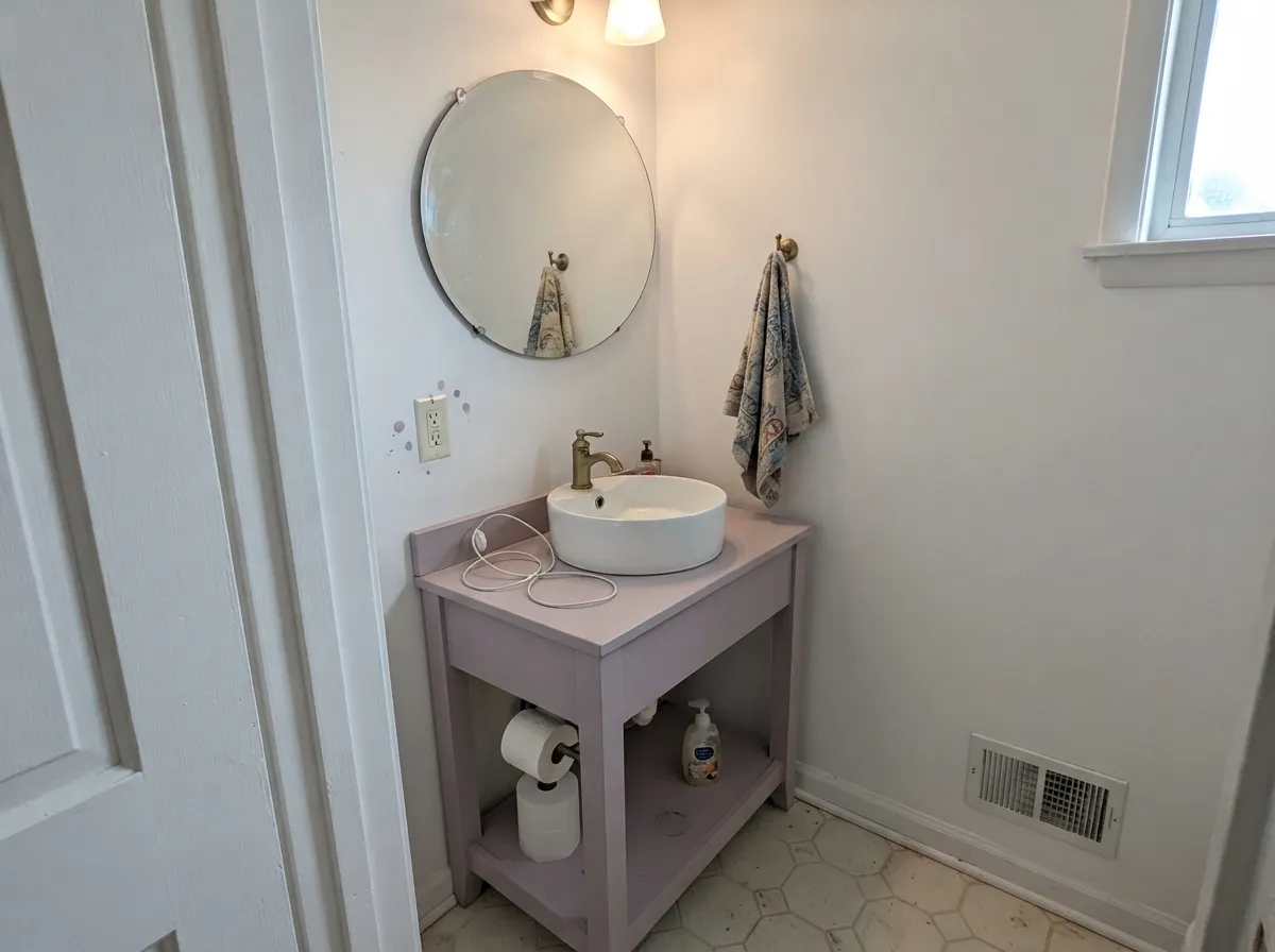
Give it a room that gets real daylight or a warm lamp at night and Mauve It does exactly what a good muted color should: it reads as a deliberate design choice, not an accident. Bedrooms are its natural home — light enough to stay livable, colored enough to feel finished. Its second-best job is the small commitment: a powder room or a bathroom vanity, where the mauve carries the whole room's personality without betting an entire house on a trend color.
Where It Fails
Almost every regret story with a color like this follows the same three scripts, and none of them are the paint's fault. If your room matches one, sampling a bigger square will only confirm the problem, not fix it.
Behr's own "Neutral" filing sets up this exact disappointment. On a small chip it can pass for a warm gray; across four walls the violet is unmistakable — depth always multiplies undertone. If "gray with maybe a hint of color" is the goal, this has more personality than that, not less. Look at Pashmina instead and let mauve stay an accident, not the plan.
Yellow-orange sits opposite violet on the color wheel, so golden oak floors and honey-toned trim amplify the purple while the wall pushes the floor toward orange. Neither side wins. Walnut, espresso, or pale white oak all get along with Mauve It far better than anything golden does.
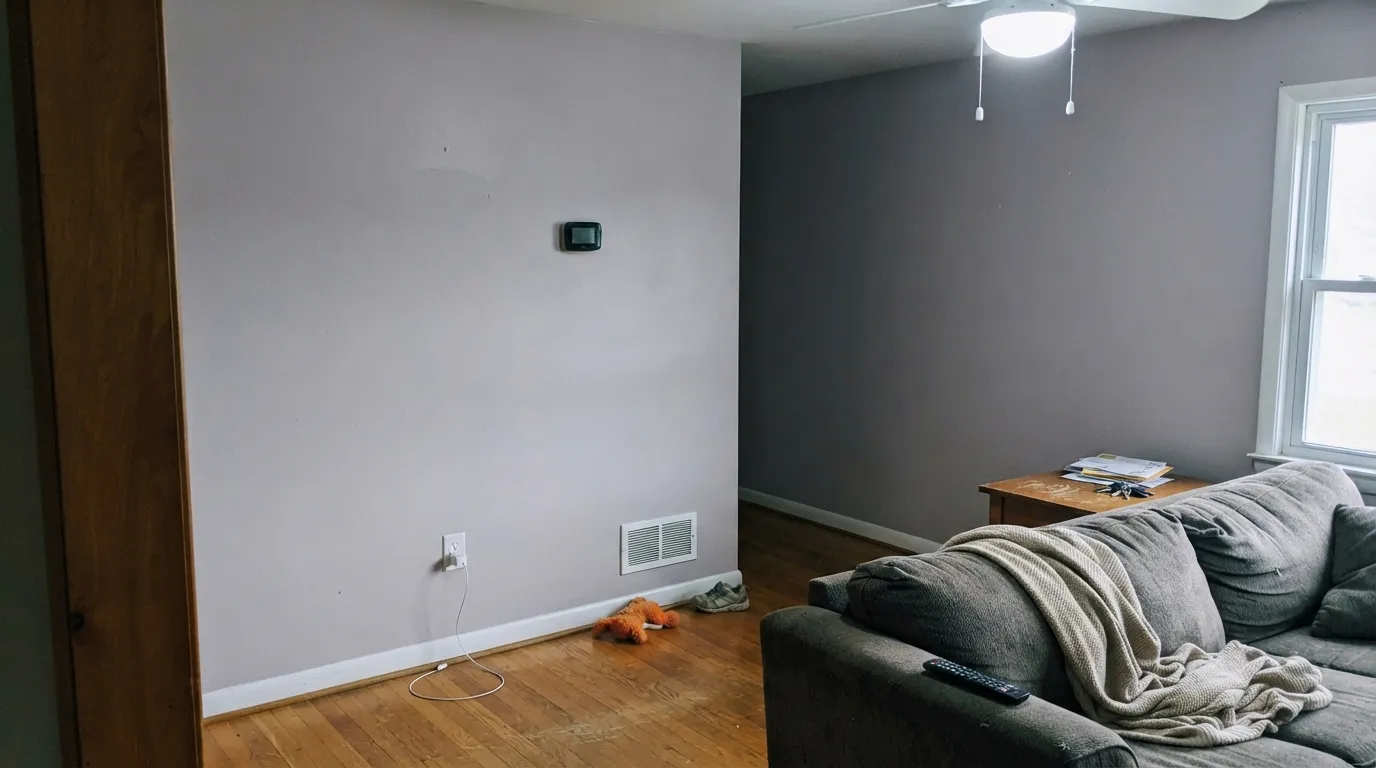
Cold light strips the warmth out of any grayed color, and Mauve It is no exception — under a north window with cool bulbs it flattens toward a chalky, slightly dull gray-lavender that loses the mauve entirely. Swap to 2700K bulbs before blaming the paint; it is a five-dollar fix, not a repaint.
Room by Room
Light enough to feel restful, colored enough to feel chosen. Matte hides wall texture and keeps the mauve soft; a warm white trim keeps the edges from looking dusty. Cream or white bedding reads best — beige competes with the violet instead of complementing it.
A Mauve It vanity under a white or marble-look counter with brass or matte-black hardware is a weekend project that reads custom. Full four-wall powder rooms work too — small rooms carry deep or unusual color well, and the mistake is cheap here even if it doesn't land.
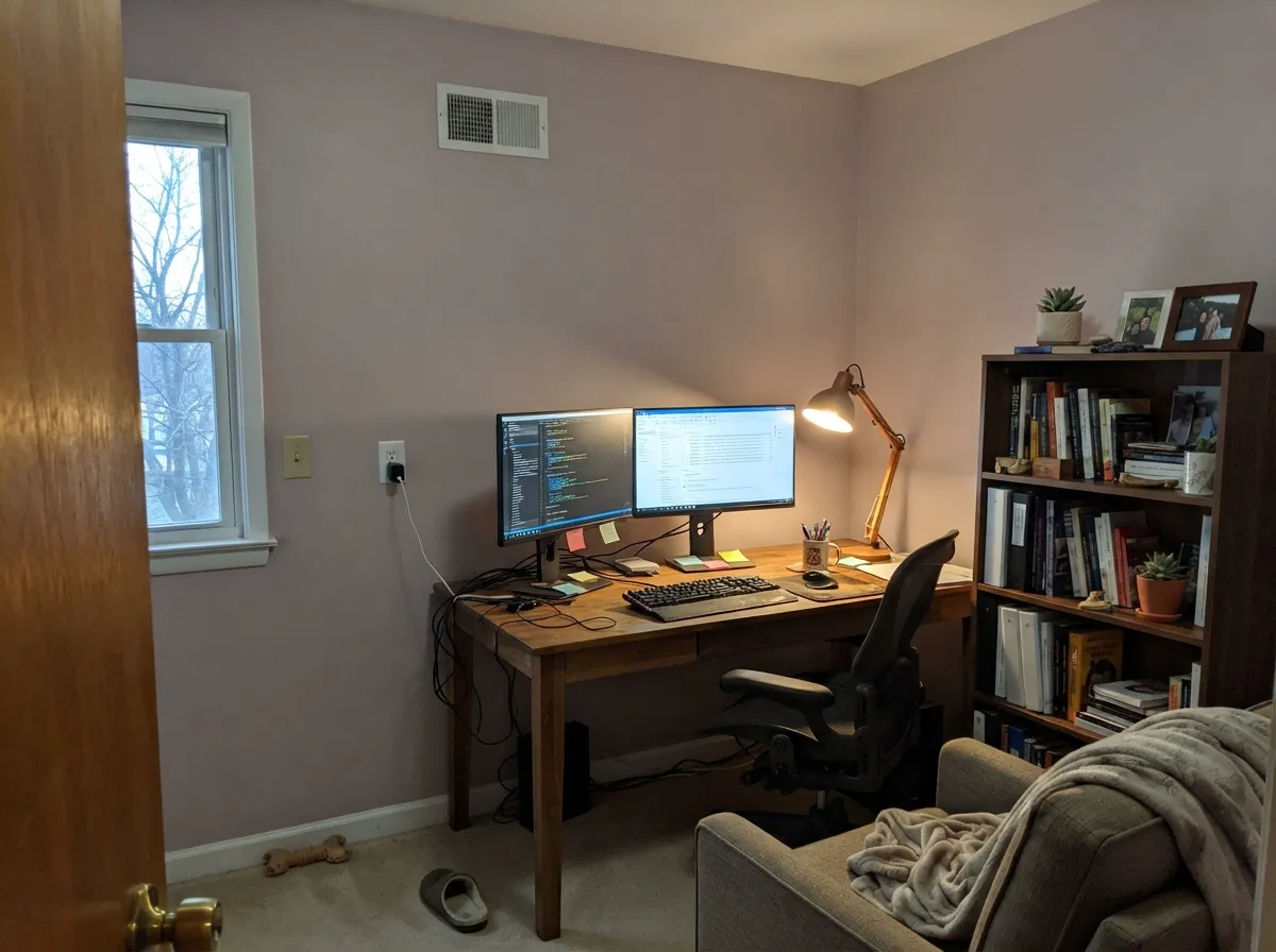
Calm without being sleepy, and forgiving of the desk-lamp light most home offices actually run on. Pairs well with walnut shelving and leather; eggshell holds up to chair scuffs better than matte.
Beautiful in a closed, lamplit room with cream and warm wood. Riskier in an open floor plan, where it has to negotiate with kitchen cabinetry and whatever the next room over is wearing. A warm greige like Pashmina in the adjoining space is the easiest handoff.
On an island or a single wall under white uppers it can be genuinely charming and unexpected. A full kitchen of Mauve It cabinets over honey-oak floors is the one combination this review would talk you out of — see the fails section above.
There is no reliable outdoor track record for this exact chip, and a light, low-chroma violet is one of the harder colors to predict in full sun without a real sample tested on the actual siding. This review does not have the evidence to call it a yes.
Your Light Is the Risk
South or west light, or a 2700K lamp at night, keeps the violet soft and dusty without washing it out. This is the color at its most livable.
Cool, flat daylight drains the warmth and leaves a dull gray-lavender. Fine if you half-wanted gray; disappointing if you paid for mauve.
Warmer and more clearly mauve at the sun hours, quieter and grayer once the direct light passes. Sample at both times before committing.
2700K bulbs bring the violet forward and soften it. Cool white LEDs push it flat and slightly cold — change the bulb before you second-guess the paint.
Most complaints about Mauve It are a light mismatch. Upload a photo of your actual room and see it on your walls — then ask for the same wall in north light or evening lamps before you buy a single sample.
Need It From Another Brand?
Any paint counter can custom-tint Behr N120-3 directly. If you would rather stay in one brand's own deck, these are the closest stock matches, measured as ΔE2000. Under 2 is a difference you will not see on the wall.
| Brand | Closest color | ΔE | LRV | |
|---|---|---|---|---|
| Sherwin-Williams | Mauve FinerySW 6282 · Sherwin-Williams | 3.3 | 51 | Color page → |
| Benjamin Moore | Homespun Charm1249 · Benjamin Moore | 1.0 | 51 | Color page → |
| Valspar | Fairy BubblesT532 · Valspar | 3.3 | 53.1 | Color page → |
| PPG / Glidden | Fond MemoryPPG1017-3 · PPG / Glidden | 4.8 | 52 | Color page → |
| Glidden | Fond MemoryPPG1017-3 · Glidden | 4.4 | 52 | Color page → |
| Dutch Boy | Wintered Night446-3DB · Dutch Boy | 4.2 | 53 | Color page → |
Similar Behr Colors
The nearest shades to Mauve It within Behr's own range, ranked by perceptual color distance — useful when you want the same look a touch lighter, darker, or warmer.
WCAG 2.1: AA is 4.5 : 1 for normal text, 3 : 1 for large text, AAA is 7 : 1.
Mauve It vs the Colors You're Also Considering
Every Mauve It sample board has the same rivals on it. The numbers show the real lightness gap — then it comes down to which risk you would rather live with.
Pick this for a lighter, more livable version that can run a whole room, not just a night-time accent.
Benjamin Moore 1454 · LRV 28Sleepy HollowPick this for the same grayed-violet idea taken deeper and moodier — Sleepy Hollow is nearly half the LRV and reads like dusk instead of daylight.
Pick this for the warmer, rosier read at that same depth — Mauve It leans mauve, French Lilac leans lilac-blue.
Benjamin Moore 1403 · LRV 56French LilacPick this for the cooler, more clearly lilac-blue sibling at the exact same LRV.
Benjamin Moore Violet Petal 1382 at LRV 55 is the closest cross-brand match, with a deltaE of 0.60, so the two are effectively the same color on a wall. Farrow and Ball Sugared Almond No. 9913 at LRV 55 is a deltaE of 1.37, visually identical in normal room light.
Dunn-Edwards Antique Heather DE5975 comes in at deltaE 1.94 but with an LRV of 49, seven points darker, so it will read noticeably deeper even though the hue matches. Dutch Boy Shadowed Rose 346-3DB at LRV 54 is 2.12 and Valspar Playful Petal 1001-4B at LRV 57.7 is 2.68, both very close but worth sampling first.
Sherwin-Williams Enchant SW 6555 at LRV 59 is deltaE 2.85, slightly lighter and grayer. The furthest is PPG Old Mission Pink PPG1046-3 at LRV 57 with a deltaE of 4.51, which trades the violet for an obvious pink and is close but visibly different side by side.
Mauve It Coordinating Colors
The rule for coordinating with Mauve It is the same one that governs every muted violet: warm creams and near-blacks flatter it, golden and yellow-warm tones fight it. It layers especially well with deeper members of its own grayed-violet family, and it needs at least one crisp or near-black note nearby or the whole scheme can drift soft and pastel.
Sorting Out the Muted-Purple Family: Mauve It, Sleepy Hollow, and French Lilac
Muted violet has quietly become one of the busier corners of every major paint deck, and it helps to know where Mauve It actually sits in that lineup rather than guessing from the name. French Lilac shares its exact LRV (56) but leans cooler and bluer. Sleepy Hollow is the same family idea pushed to a mid-to-deep mood color at LRV 28 — dramatic, best in low light. Mauve It sits at the light, livable end: pale enough to run a whole room, colored enough that nobody mistakes it for plain gray.
There is no famous Color of the Year story or viral room behind this specific chip, and this review will not invent one. It is one of thousands of colors in Behr's everyday deck, mixed the same way at any Behr dealer without a premium-line upcharge — the honest pitch is a genuinely well-designed mauve with a small footprint in the wider conversation, not a trend color riding a moment.
Mauve It With Wood Tones and Floors
Dark, warm woods are this color's best friends: walnut, espresso, and aged leather all make the violet read smoky and deliberate instead of pastel. Pale white oak and gray-washed floors are safe and give a room a soft, slightly Scandinavian cast. Cream or true-gray carpet both work fine underfoot.
The one real no is golden: honey oak floors, orange-toned trim, or yellow-beige carpet all sit on violet's complement, so each side pushes the other further off — the floor reads more orange, the wall reads more purple, and it does not resolve with more coats. If a golden floor is staying put, a large rug between it and the paint helps, or step down to Pashmina and keep the muted, grown-up mood without the fight.
Metals are the easy part: unlacquered brass, aged bronze, and matte black all sit comfortably next to it. Polished chrome is the one finish that reads noticeably cold in comparison.
Three Ready Palettes Built on Mauve It
A color is never alone on the wall. These are complete combinations in the 60-30-10 pattern, with the reason each one holds together. Every one opens in the visualizer.
A cream trim keeps the mauve from reading cold, and one near-black note stops the whole room from floating into pastel territory. Brass or matte-black hardware finishes the look.
Try this palette in your roomA crisp white keeps a small room bright while the color lives on the one surface that is easiest to redo later — the vanity. The near-black frame gives the scheme one deliberate dark note instead of letting it read soft and undecided.
Try this palette in your roomPashmina's warm greige carries the rest of the house without any purple risk, so a Mauve It den or a run of Mauve It doors reads as one quiet family growing more colorful in one room, not a mismatched accident. Cream trim ties both back together.
Try this palette in your roomMauve It FAQ
Is Mauve It purple or gray?
Purple — quietly, but genuinely. Behr lists it in its "Neutral" color family, which is more about how loosely Behr's huge deck is sorted than about the actual color: on a wall the violet is clear, especially compared to a true gray. If you want gray with maybe a whisper of color, this has more color in it than that.
Is Mauve It warm or cool?
Cool-leaning. The hex breaks down to more blue than red and noticeably less green, which is what reads as a grayed violet-mauve rather than a warm dusty rose. In cool light it can flatten toward plain gray; under a warm lamp it softens and reads more clearly mauve.
What trim goes with Mauve It?
A warm, soft white — Behr Swiss Coffee or a similar warm off-white keeps the mauve from looking cold. A stark bright white makes the walls read slightly dusty by comparison. Semi-gloss on trim and doors, matte or eggshell on the walls.
Does Mauve It work with honey oak floors?
Not well. Yellow-orange is violet's complement on the color wheel, so golden oak floors push the walls more purple while the walls push the floor more orange — both sides lose. Walnut, espresso, or pale white oak all pair far better.
Is it good for a bathroom or powder room?
Yes — it is arguably the color's best small-room use. A Mauve It vanity or a fully painted powder room under a bright white or marble-look counter reads custom without committing an entire house to the color.
Why does Behr call a mauve color "Neutral"?
Behr's color-family tags are broad, and "Neutral" in that system covers a wide range of low-saturation colors, not just true grays and beiges. It is a filing quirk, not a claim about how the paint actually looks on a wall — treat the hex and LRV as the real information, not the category label.
Have you painted with Mauve It?
Rate it — one tap helps the next reader decide.
Ask a Question