CP

Rose Study Palette — Dusty Rose & Warm Walnut

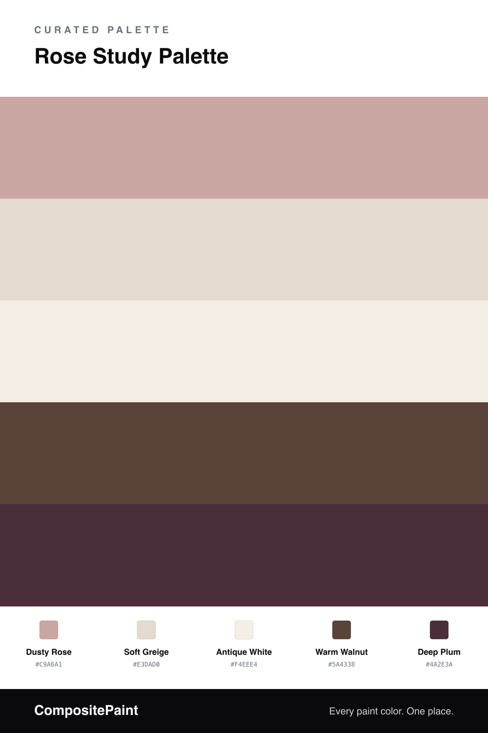
A soft yet grounded five-color study scheme led by dusty rose walls, with a warm neutral, a clean trim white, walnut wood, and a deep plum accent — every color matched to real paint you can buy.

By Emily Roberts · DIY Editor & First-Timer's Guide

A study should feel calm enough to think in but warm enough to want to linger. This scheme starts with a soft, dusty Dusty Rose on the walls — gentle and a little contemporary, the kind of muted rose that feels current in 2026 without trying too hard.

To keep it from going sweet, I balance it with a quiet Soft Greige on the trim and ceiling and a clean Antique White for built-in shelving or a vanity. Then the room gets its backbone from Warm Walnut wood tones underfoot and on the shelves.

Finish with Deep Plum as your accent — a chair, a lampshade, a stack of book spines. Keep the rose doing most of the talking and let the plum show up in small, deliberate doses, and the whole room reads cozy and considered.

View palette in
Dusty Rose
Walls
Glidden Parfait · PPG1059-4
#C8A6A1
LRV 42
Soft Greige
Trim & Ceiling
Valspar March Breeze · 1001-10C
#E3D9CF
LRV 71
Antique White
Cabinets or Vanity
Behr Stonewashed Pink · ECC-61-2
#F4EEE4
LRV 86
Warm Walnut
Wood & Floors
Dunn-Edwards Northern Territory · DEA158
#5E463C
LRV 7
Deep Plum
Accent
Behr Chicory Root · BXC-21
#4A2F37
LRV 4

Buy These Colors

Each color matched to the closest real paint in every brand, by ΔE2000. Tap a swatch for its full guide or + to save it — take any SKU to the store, they mix on demand.

Dusty Rose
#C9A6A1 · LRV 42 · Walls
Sherwin-Williams · SW 6052 · ΔE 4.36
Behr · HDC-NT-06 · ΔE 2.67
Benjamin Moore · 2101-50 · ΔE 2.19
Valspar · 1006-10B · ΔE 2.91
PPG / Glidden · PPG1059-4 · ΔE 0.5
Glidden · PPG1059-4 · ΔE 0.32
Dutch Boy · 408-3DB · ΔE 6.11
HGTV Home by Sherwin-Williams · HGSW 2025 · ΔE 4.68
Dunn-Edwards · DEC700 · ΔE 2.72
Magnolia Home · JG-154 · ΔE 6.35
Farrow & Ball · NO. 246 · ΔE 4.5
Diamond Vogel · 0071 · ΔE 3.29
Hirshfield's · 0071 · ΔE 3.54
Rodda · R129 · ΔE 9.78
C2 Paint · C2-813 · ΔE 7.78
Clare · PNT100-MD-76 · ΔE 4.44
Portola Paints · HAVANA · ΔE 6.5
Annie Sloan · PALOMA · ΔE 9.42
Backdrop · BD-RO · ΔE 3.77
Rust-Oleum · 285143 · ΔE 15.55
Kompozit · 0071 · ΔE 3.54
Soft Greige
#E3DAD0 · LRV 71 · Trim & Ceiling
Sherwin-Williams · SW 6035 · ΔE 1.38
Behr · PPL-78 · ΔE 0.59
Benjamin Moore · 1023 · ΔE 1.29
Valspar · 1001-10C · ΔE 0.52
PPG / Glidden · PPG1073-2 · ΔE 2.79
Glidden · 30YY 69/048 · ΔE 1.11
Dutch Boy · 408-1DB · ΔE 1.38
HGTV Home by Sherwin-Williams · HGSW 4020 · ΔE 1.53
Dunn-Edwards · DEGR09 · ΔE 2.38
Magnolia Home · JG-112 · ΔE 2.98
Farrow & Ball · NO. 2009 · ΔE 3.6
Diamond Vogel · 0146 · ΔE 3.24
Hirshfield's · 0544 · ΔE 1.89
Rodda · CA049 · ΔE 0.56
C2 Paint · C2-850 · ΔE 1.4
Clare · PNT100-LT-19 · ΔE 3.59
Portola Paints · GEM · ΔE 3.28
Annie Sloan · OLD OCHRE · ΔE 9.02
Backdrop · BD-CC · ΔE 5.82
Rust-Oleum · 285142 · ΔE 8.19
Kompozit · 0544 · ΔE 1.89
Antique White
#F4EEE4 · LRV 86 · Cabinets or Vanity
Sherwin-Williams · SW 7566 · ΔE 0.78
Behr · ECC-61-2 · ΔE 0
Benjamin Moore · 876 · ΔE 1.68
Valspar · V153 · ΔE 1.17
PPG / Glidden · PPG18-01 · ΔE 2.65
Glidden · 61YY 85/050 · ΔE 0.58
Dutch Boy · 020W · ΔE 1.47
HGTV Home by Sherwin-Williams · HGSW 4003 · ΔE 0.78
Dunn-Edwards · DEW315 · ΔE 1.82
Magnolia Home · JG-107 · ΔE 2.03
Farrow & Ball · NO. 2003 · ΔE 1.54
Diamond Vogel · 0012 · ΔE 1.17
Hirshfield's · 0012 · ΔE 1.34
Rodda · CA013 · ΔE 0.79
C2 Paint · C2-708 · ΔE 1.49
Clare · PNT100-LT-24 · ΔE 2.1
Portola Paints · ORIGAMI · ΔE 2.35
Annie Sloan · OLD OCHRE · ΔE 11.83
Backdrop · BD-JA · ΔE 2.03
Rust-Oleum · 329598 · ΔE 5.21
Kompozit · 0012 · ΔE 1.34
Warm Walnut
#5A4338 · LRV 6 · Wood & Floors
Sherwin-Williams · SW 6041 · ΔE 2.04
Behr · T15-5 · ΔE 1.77
Benjamin Moore · AF-175 · ΔE 1.57
Valspar · 1004-9A · ΔE 3.27
PPG / Glidden · 16-24 · ΔE 4.14
Glidden · 50YR 06/081 · ΔE 3.9
Dutch Boy · 416-7DB · ΔE 3.84
HGTV Home by Sherwin-Williams · HGSW 3431 · ΔE 2.04
Dunn-Edwards · DEA158 · ΔE 1.35
Magnolia Home · JG-122 · ΔE 6.31
Farrow & Ball · NO. 36 · ΔE 7.3
Diamond Vogel · 0144 · ΔE 5.2
Hirshfield's · H0134 · ΔE 6.95
Rodda · CA215 · ΔE 4.56
C2 Paint · C2-549 · ΔE 3.97
Clare · PNT100-DP-54 · ΔE 11.24
Portola Paints · POE · ΔE 6.64
Annie Sloan · AUBUSSON BLUE · ΔE 22.18
Backdrop · BD-IT · ΔE 1.96
Rust-Oleum · 391445 · ΔE 25.38
Kompozit · 0137 · ΔE 3.56
Deep Plum
#4A2E3A · LRV 4 · Accent
Sherwin-Williams · SW 2704 · ΔE 2.34
Behr · BXC-21 · ΔE 1.82
Benjamin Moore · AF-650 · ΔE 5.6
Valspar · M215 · ΔE 6.26
PPG / Glidden · PPG0995-7 · ΔE 15.63
Glidden · 00NN 05/000 · ΔE 14.08
Dutch Boy · 302-7DB · ΔE 6.68
HGTV Home by Sherwin-Williams · HGSW 3411 · ΔE 5.36
Dunn-Edwards · DEBN13 · ΔE 9.97
Magnolia Home · JG-150 · ΔE 12.36
Farrow & Ball · NO. 256 · ΔE 14.47
Diamond Vogel · H101 · ΔE 15.39
Hirshfield's · 1215 · ΔE 4.96
Rodda · CA210 · ΔE 14.74
C2 Paint · BD42 · ΔE 3.51
Clare · PNT100-DP-54 · ΔE 16.48
Portola Paints · DANCING SHOES · ΔE 3.79
Annie Sloan · BURGUNDY · ΔE 11.08
Backdrop · BD-AH · ΔE 21.53
Rust-Oleum · 285144 · ΔE 17.99
Kompozit · 1215 · ΔE 4.96

Questions

Is rose too soft for a study or office?

Not at all. A muted, dusty rose reads more like a warm neutral than a sweet pink, so it stays calm and grown-up. Pairing it with walnut wood and a deep plum accent keeps the room feeling focused rather than fussy.

How do I keep the rose from looking too pink?

Lean on the browns and the deep plum to ground it. Wood floors, walnut shelving, and a plum chair or curtain pull the rose toward warm and earthy instead of candy pink.

KEEP EXPLORING

Similar Palettes

Closest schemes by color — not by label.