CP

Blush Entryway Palette — Soft Blush & Warm Clay

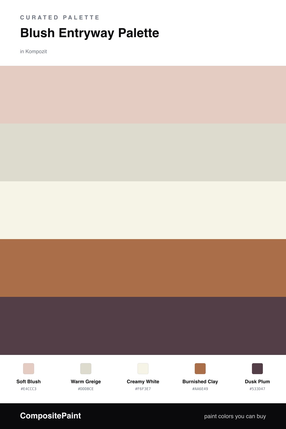
A welcoming 5-color scheme for entryways: a soft blush feature wall, warm greige backdrop, creamy trim, grounding clay-brown, and a deep plum anchor — every color matched to real paint you can buy.

By Jessica Williams · Color Stylist & Interior Editor

Soft Blush
Feature Wall
Kompozit Pout · 0125
#E4CCC3
LRV 64
Warm Greige
Walls
Kompozit Saturnia · 0369
#DDDBCE
LRV 70
Creamy White
Trim & Ceiling
Kompozit Rapture's Light · 1020
#F6F3E7
LRV 89
Burnished Clay
Console & Wood
Kompozit Flickering Flame · 1005
#AA6E49
LRV 20
Dusk Plum
Door Accent
Kompozit Grape Soda · 1222
#533D47
LRV 6
View palette in

An entryway is the first breath of a home, and blush is the gentlest way to say welcome. This palette leads with a soft blush on the feature wall you meet head-on at the door — warm enough to flatter skin and morning light, never candy-sweet. Around it, a warm greige keeps the side walls quiet so the blush stays the star.

The trim and ceiling wear a creamy white with just enough warmth to avoid going stark, framing everything like soft matting around a photograph. To give the eye somewhere to settle, burnished clay grounds the room through a console table or wood floor, echoing the warmth in the blush from below.

Save dusk plum for the smallest, most deliberate surface — the front door seen from inside, or a bench. A single deep note is all an entry needs to feel layered rather than pale. Keep that darkest color to one element and let the blush do the welcoming.

Buy These Colors

Each color matched to the closest real paint in every brand, by ΔE2000. Kompozit first; take any SKU to the store — these mix on demand.

Soft Blush
#E6CBC2 · LRV 63 · Feature Wall
Kompozit Pout · 0125 ΔE 1.09
Backdrop August · BD-AU ΔE 3.53
Behr Sand Dance · S190-2 ΔE 1.82
Benjamin Moore Rose Blush · 037 ΔE 1.9
Clare Turbinado · PNT100-LT-21 ΔE 9.51
Dunn-Edwards Pale Berries · DE6051 ΔE 2.18
Farrow & Ball Calamine · No. 230 ΔE 2.5
Magnolia Home Ella Rose · JG-24 ΔE 2.84
PPG / Glidden Tangy Taffy · 1058-3 ΔE 1.33
Sherwin-Williams Quaint Peche · SW 6330 ΔE 1.41
Valspar Harmony · 2001-8C ΔE 1.62
Warm Greige
#E2DACE · LRV 71 · Walls
Kompozit Saturnia · 0369 ΔE 3.17
Backdrop Cookies & Cream · BD-CC ΔE 4.69
Behr Vintage Linen · PPU7-16 ΔE 1.33
Benjamin Moore Sonnet · AF-55 ΔE 0.91
Clare No Filter · PNT100-LT-19 ΔE 2.49
Dunn-Edwards Gallery Gray · DE6072 ΔE 3.69
Farrow & Ball Ammonite · No. 274 ΔE 1.71
Magnolia Home Locally Sown · JG-112 ΔE 2.02
PPG / Glidden Scotch Mist · 14-07 ΔE 1.99
Sherwin-Williams Egret White · SW 7570 ΔE 1.11
Valspar Warm Oatmeal · V179 ΔE 0.23
Creamy White
#F7F2EA · LRV 89 · Trim & Ceiling
Kompozit Rapture's Light · 1020 ΔE 2.32
Backdrop Tabula Rasa · BD-TR ΔE 2.32
Behr White Flour · OR-W10 ΔE 0.93
Benjamin Moore Opulence · 879 ΔE 1.47
Clare Wing It · PNT100-LT-24 ΔE 1.73
Dunn-Edwards Dove's Wing · DE6267 ΔE 1.5
Farrow & Ball Wimborne White · No. 239 ΔE 1.61
Magnolia Home True White · JG-21 ΔE 2.98
PPG / Glidden Delicate White · 1001-1 ΔE 3.06
Sherwin-Williams Cotton White · SW 7104 ΔE 1.97
Valspar Ivory Keys · 8007-4A ΔE 1.27
Burnished Clay
#A9714E · LRV 21 · Console & Wood
Kompozit Flickering Flame · 1005 ΔE 1.23
Backdrop Old Soul · BD-OS ΔE 19.81
Behr Burnt Toffee · S230-6 ΔE 2.46
Benjamin Moore Byzantine · CSP-1075 ΔE 3.68
Clare Big Apple · PNT100-DP-30 ΔE 13.6
Dunn-Edwards Autumn Umber · DE5216 ΔE 1.88
Farrow & Ball Picture Gallery Red · No. 42 ΔE 11.4
Magnolia Home Work Worn Wood · JG-35 ΔE 4.41
PPG / Glidden Ginger Spice · 1070-6 ΔE 1.34
Sherwin-Williams Brandywine · SW 7710 ΔE 1.85
Valspar Rustic Oak · 2007-7B ΔE 2.9
Dusk Plum
#5B404A · LRV 6 · Door Accent
Kompozit Grape Soda · 1222 ΔE 2.31
Backdrop It's a Date · BD-IT ΔE 13.08
Behr Napa Wine · QE-63 ΔE 0.67
Benjamin Moore Chambourd · AF-645 ΔE 4.57
Clare Night Groove · PNT100-DP-77 ΔE 4.06
Dunn-Edwards Mulberry · DEA194 ΔE 4.2
Farrow & Ball Brinjal · No. 222 ΔE 3.17
Magnolia Home Moody Fig · JG-155 ΔE 5.15
PPG / Glidden Gooseberry · 1048-7 ΔE 2.67
Sherwin-Williams Deep Maroon · SW 72 ΔE 3.47
Valspar Plummy Rouge · 8003-2G ΔE 2.63

Questions

How much blush is too much in a small entryway?

Let blush carry one wall — the one you see straight on as you walk in — and keep the rest in warm greige. On every wall it can feel sugary, but on a single plane it reads soft and intentional.

What undertone of blush works in a north-facing entry?

Reach for a blush with a warm peach or clay undertone like this one, not a cool pink. North light is bluish and cool, and it will gray out a true pink, while a warmer blush holds its glow.

Similar Palettes

Closest schemes by color — not by label.