CP

Blush Powder Room Palette — Soft Blush & Warm Clay

A warm, welcoming 5-color scheme for a powder room: a soft blush feature wall, a creamy backdrop, crisp trim, grounding clay, and a deep plum accent — every color matched to real paint you can buy.

By Emily Roberts · DIY Editor & First-Timer's Guide

Soft Blush
Feature Wall
Kompozit Pout · 0125
#E4CCC3
LRV 64
Warm Ivory
Walls
Kompozit Nilla Vanilla · 0003
#F1EBE0
LRV 83
Crisp White
Trim & Ceiling
Kompozit Sugar Dust · 0011
#F8F6ED
LRV 92
Burnished Clay
Vanity & Wood
Kompozit Semolina · 1011
#B6774F
LRV 24
Deep Plum
Accent
Kompozit Grape Soda · 1222
#533D47
LRV 6
View palette in

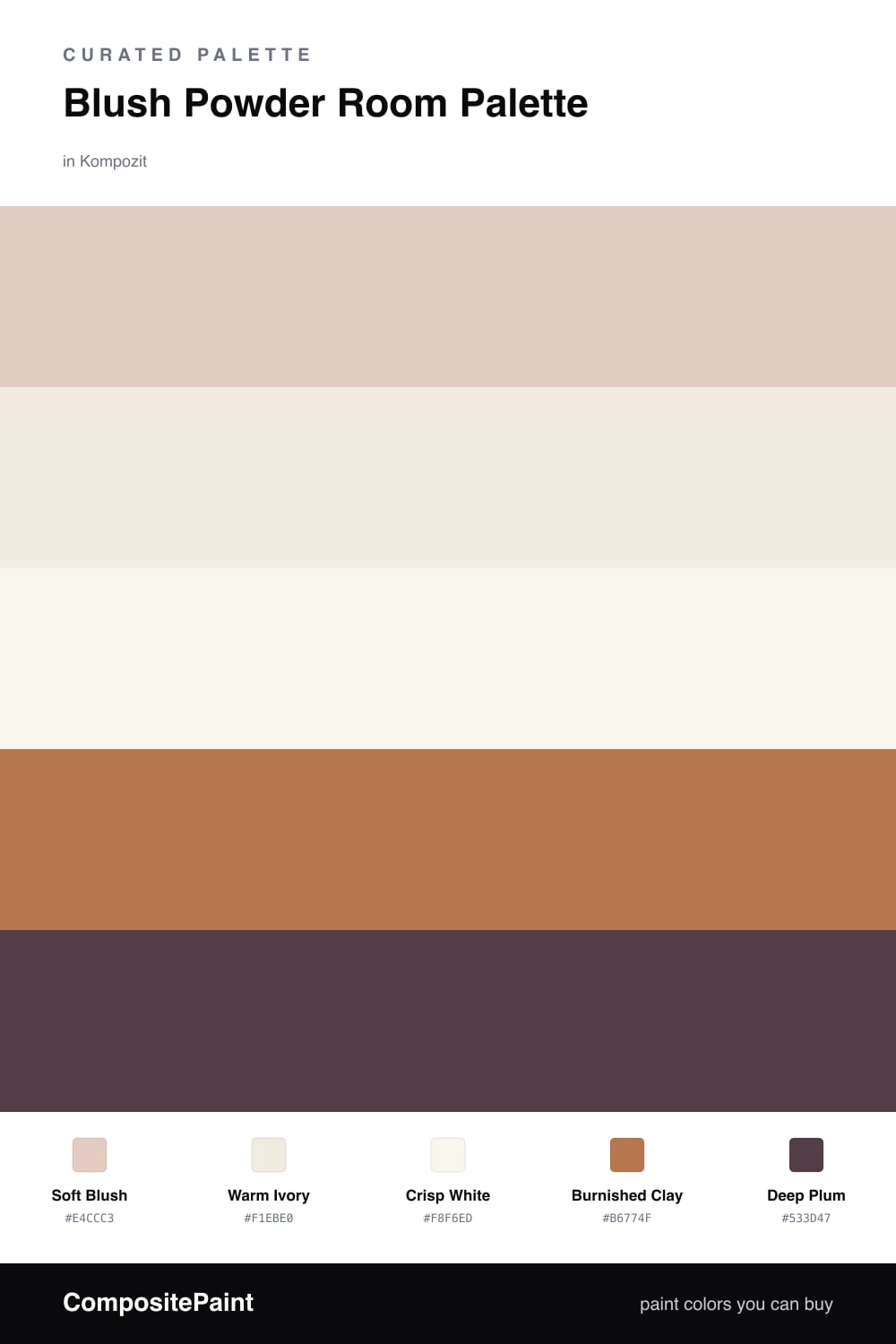
A powder room is small, so you get to have a little fun with it — and soft blush is one of the friendliest colors you can put on a wall. It is a dusty, slightly clay-tinted pink that catches the warm light over a vanity and makes everyone look a little better in the mirror. Lead with it on the feature wall behind the sink.

To keep that blush feeling grown-up, wrap the rest of the room in warm ivory and let a clean crisp white sharpen the trim and ceiling. The contrast is gentle, which is exactly what you want in a tight space — nothing here fights for attention.

Then ground it. A burnished clay vanity or wood-framed mirror gives the blush a warm, earthy anchor, and just a whisper of deep plum — on a piece of art, a towel, or the inside of an open shelf — adds the cocooning depth that is so 2026. Keep that plum to the smallest surface and the whole room stays soft, warm, and welcoming.

Buy These Colors

Each color matched to the closest real paint in every brand, by ΔE2000. Kompozit first; take any SKU to the store — these mix on demand.

Soft Blush
#E6CCC2 · LRV 64 · Feature Wall
Kompozit Pout · 0125 ΔE 0.72
Backdrop August · BD-AU ΔE 3.08
Behr Victorian Cameo · HDC-NT-10 ΔE 1.5
Benjamin Moore Rose Accent · 1177 ΔE 1.26
Clare Turbinado · PNT100-LT-21 ΔE 8.82
Dunn-Edwards Pale Berries · DE6051 ΔE 2.36
Farrow & Ball Calamine · No. 230 ΔE 2.39
Magnolia Home Ella Rose · JG-24 ΔE 2.14
PPG / Glidden Au Naturel · 1067-3 ΔE 1.44
Sherwin-Williams Quaint Peche · SW 6330 ΔE 1.17
Valspar Harmony · 2001-8C ΔE 2.08
Warm Ivory
#F2EBDF · LRV 84 · Walls
Kompozit Nilla Vanilla · 0003 ΔE 0.53
Backdrop Jane · BD-JA ΔE 2.36
Behr Papier Blanc · HDC-NT-08 ΔE 1.49
Benjamin Moore Winter Sky · 2163-70 ΔE 0.98
Clare Like Buttah · PNT100-LT-62 ΔE 2.73
Dunn-Edwards Tea Biscuit · DE6120 ΔE 2.02
Farrow & Ball White Tie · No. 2002 ΔE 2.72
Magnolia Home Pearly Cotton · JG-33 ΔE 2.59
PPG / Glidden Pale Ecru · 1195-1 ΔE 0.91
Sherwin-Williams Shell White · SW 8917 ΔE 0.93
Valspar Statuesque · 7002-5 ΔE 1.52
Crisp White
#FAF8F4 · LRV 94 · Trim & Ceiling
Kompozit Sugar Dust · 0011 ΔE 2.43
Backdrop Tabula Rasa · BD-TR ΔE 3.54
Behr Ultra Pure White · PPU18-06 ΔE 1.01
Benjamin Moore Snowfall White · 2144-70 ΔE 3.11
Clare Whipped · PNT100-LT-02 ΔE 1.23
Dunn-Edwards Milk Glass · DEW358 ΔE 1.41
Farrow & Ball All White · No. 2005 ΔE 0.5
Magnolia Home True White · JG-21 ΔE 1.78
PPG / Glidden Delicate White · 1001-1 ΔE 2.02
Sherwin-Williams High Reflective White · SW 7757 ΔE 1.61
Valspar Ultra White · 7006-24 ΔE 1.23
Burnished Clay
#B07A5A · LRV 24 · Vanity & Wood
Kompozit Semolina · 1011 ΔE 2.71
Backdrop Old Soul · BD-OS ΔE 20.14
Behr Campfire Blaze · HDC-AC-06 ΔE 3.46
Benjamin Moore Lenape Trail · 1222 ΔE 1.36
Clare Fire Sign · PNT100-DP-74 ΔE 8.3
Dunn-Edwards Saddle Brown · DE5264 ΔE 1.63
Farrow & Ball Red Earth · No. 64 ΔE 7.53
Magnolia Home Work Worn Wood · JG-35 ΔE 5.21
PPG / Glidden Cowboy Hat · 1082-6 ΔE 4.26
Sherwin-Williams Spiced Cider · SW 7702 ΔE 1.72
Valspar Terra Cotta Trail · 2005-7B ΔE 0.85
Deep Plum
#5A3B47 · LRV 6 · Accent
Kompozit Grape Soda · 1222 ΔE 3.29
Backdrop It's a Date · BD-IT ΔE 14.25
Behr Napa Wine · QE-63 ΔE 1.87
Benjamin Moore Autumn Purple · 2073-20 ΔE 4.42
Clare Blackish · PNT100-DP-54 ΔE 16.01
Dunn-Edwards Mulberry · DEA194 ΔE 3.47
Farrow & Ball Brinjal · No. 222 ΔE 2.57
Magnolia Home Plum Suede · JG-102 ΔE 6.17
PPG / Glidden Gooseberry · 1048-7 ΔE 3.15
Sherwin-Williams Cordovan · SW 6027 ΔE 4.81
Valspar Plummy Rouge · 8003-2G ΔE 2.93

Questions

Is blush too bold for a small powder room?

Not at all — a powder room is the perfect place to be a little brave. Because you only pass through it, a soft blush feels cozy and special rather than overwhelming. Put it on the feature wall behind the mirror so it glows in the vanity light.

How do I keep a blush powder room from looking too pink or babyish?

Ground it. The burnished clay vanity and a touch of deep plum give the blush something warm and grown-up to lean on, and the warm ivory walls keep it soft instead of sweet. Add brass or aged-bronze fixtures and the room reads polished, not nursery.

Similar Palettes

Closest schemes by color — not by label.