CP

Blush Bedroom Palette — Powder Blush & Warm Greige

A soft five-color bedroom scheme led by powder blush walls and balanced with warm greige, a clean ceiling white, oak warmth, and a deep plum accent — every color matched to real paint you can buy.

By Jessica Williams · Color Stylist & Interior Editor

Powder Blush
Walls
Kompozit Truffles · 0146
#EAD7CD
LRV 71
Warm Greige
Trim & Ceiling
Kompozit Power Lunch · 0572
#D4D1C7
LRV 64
Soft Cloud White
Cabinets or Vanity
Kompozit White Shoulders · 1265
#F1F0EC
LRV 87
Honey Oak
Wood & Floors
Kompozit Blonde Shell · 0170
#BE9673
LRV 34
Deep Plum
Accent
Kompozit Grape Soda · 1222
#533D47
LRV 6
View palette in

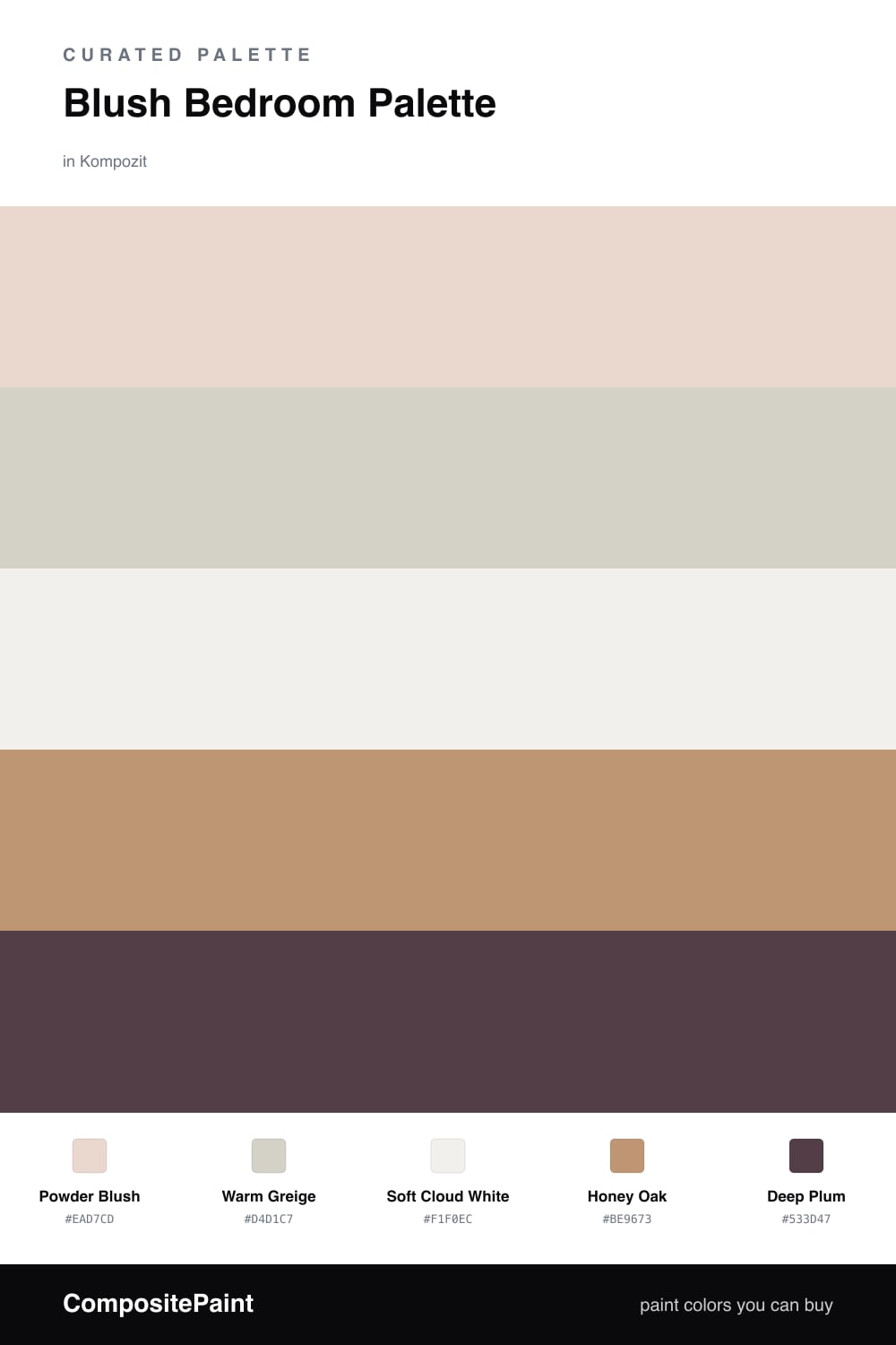
A blush bedroom only works when the pink is restrained, so I built this scheme around Powder Blush, a soft clay-pink that behaves like a warm neutral until the light drops and it glows. On the walls it gives you that hushed, just-woke-up softness without ever tipping into nursery territory.

To keep it grown-up and current, I wrapped the room in Warm Greige on the trim and ceiling and let a clean Soft Cloud White carry the vanity, so the blush has something quiet to lean on. Honey Oak brings in real warmth underfoot and in the bed frame, which is what makes the whole scheme feel like 2026 rather than a throwback.

The piece that pulls it together is Deep Plum — one rich, moody note for a headboard wall, a velvet throw, or a single painted dresser. Use it in small doses and the blush instantly looks more intentional and a little more luxe.

Buy These Colors

Each color matched to the closest real paint in every brand, by ΔE2000. Kompozit first; take any SKU to the store — these mix on demand.

Powder Blush
#E8D2CC · LRV 68 · Walls
Kompozit Truffles · 0146 ΔE 2.77
Backdrop Cookies & Cream · BD-CC ΔE 11.92
Behr Conch Shell · S200-1 ΔE 0.91
Benjamin Moore Pleasant Pink · 2094-60 ΔE 1.57
Clare Neutral Territory · PNT100-LT-20 ΔE 6.5
Dunn-Edwards Whirlwind · DE6030 ΔE 3.55
Farrow & Ball Calamine · No. 230 ΔE 0.47
Magnolia Home Ella Rose · JG-24 ΔE 3.46
PPG / Glidden Birthday Cake · 1059-2 ΔE 0.37
Sherwin-Williams Innocence · SW 6302 ΔE 2.62
Valspar Charmed · 8003-9A ΔE 1.38
Warm Greige
#D8CEC2 · LRV 63 · Trim & Ceiling
Kompozit Power Lunch · 0572 ΔE 3.34
Backdrop Real Real · BD-RR ΔE 3.1
Behr Aged Beige · PPU7-09 ΔE 1.6
Benjamin Moore Cedar Key · 982 ΔE 1.62
Clare Flatiron · PNT100-LT-17 ΔE 0.92
Dunn-Edwards Fine Grain · DE6213 ΔE 1.21
Farrow & Ball Shaded White · No. 201 ΔE 3.17
Magnolia Home Stoneware Pieces · JG-55 ΔE 5.05
PPG / Glidden River Rock · 18-02 ΔE 1.71
Sherwin-Williams Modern Gray · SW 7632 ΔE 0.91
Valspar Rabbit's Foot · 8004-9B ΔE 1.69
Soft Cloud White
#F4EFE9 · LRV 87 · Cabinets or Vanity
Kompozit White Shoulders · 1265 ΔE 1.94
Backdrop Tabula Rasa · BD-TR ΔE 3.16
Behr Pearl Drops · 700C-1 ΔE 1.76
Benjamin Moore White Zinfandel · 880 ΔE 0.5
Clare Wing It · PNT100-LT-24 ΔE 1.39
Dunn-Edwards Light Beige · DE6211 ΔE 0.56
Farrow & Ball Pointing · No. 2003 ΔE 3.54
Magnolia Home Silos White · JG-107 ΔE 1.73
PPG / Glidden Snowy Mount · 1049-1 ΔE 1.54
Sherwin-Williams Arcade White · SW 7100 ΔE 0.54
Valspar Crisp Cotton · 7007-4 ΔE 0.98
Honey Oak
#B89272 · LRV 32 · Wood & Floors
Kompozit Blonde Shell · 0170 ΔE 1.63
Backdrop Anita · BD-AN ΔE 8.07
Behr Spice Cake · UL130-6 ΔE 2
Benjamin Moore Wilderness Cabin · 1168 ΔE 2.59
Clare Good as Gold · PNT100-DP-59 ΔE 7.92
Dunn-Edwards Colorado Trail · DE6117 ΔE 1.56
Farrow & Ball Dead Salmon · No. 28 ΔE 6.92
Magnolia Home Antiquing · JG-128 ΔE 11.75
PPG / Glidden Tudor Beige · 16-17 ΔE 2.21
Sherwin-Williams Soft Fawn · SW 9097 ΔE 2.92
Valspar Changing Seasons · 3001-9C ΔE 1.79
Deep Plum
#5A3A47 · LRV 6 · Accent
Kompozit Grape Soda · 1222 ΔE 3.68
Backdrop It's a Date · BD-IT ΔE 14.73
Behr Semi Sweet · 130F-7 ΔE 3.02
Benjamin Moore Autumn Purple · 2073-20 ΔE 4.13
Clare Blackish · PNT100-DP-54 ΔE 16.46
Dunn-Edwards Mulberry · DEA194 ΔE 3.24
Farrow & Ball Brinjal · No. 222 ΔE 2.83
Magnolia Home Plum Suede · JG-102 ΔE 6.4
PPG / Glidden Gooseberry · 1048-7 ΔE 3.56
Sherwin-Williams Blackberry · SW 7577 ΔE 2.2
Valspar Plummy Rouge · 8003-2G ΔE 3.04

Questions

Is blush too much for a whole bedroom?

Not when it is this quiet. Powder Blush reads almost like a warm neutral in daylight and only shows its pink in the evening, so the room feels calm rather than sweet.

What metal or hardware looks best with this palette?

Brushed brass and warm bronze both sit beautifully against the blush and plum. Skip cool chrome here — it fights the soft, warm mood you are building.

Similar Palettes

Closest schemes by color — not by label.