Seaside Villa
Behr's own favorite quiet pink, reviewed honestly: the rooms where it reads as a warm neutral, the wood tones that turn it into a monochrome mess, and what to pick instead.

Jessica has spec'd whites and neutrals for more than 300 rooms and keeps a sample wall of painted drawdowns in her studio. Every color review is checked against real reader rooms in the comments and re-tested when a formula changes. About the testing process →

- 1Revere Pewter55
- 2Agreeable Gray60
- 3Seaside Villa69
- 4Shoji White74
- 5Dover White83
The Fast Verdict
Seaside Villa is what happens when a paint company loves pink but knows most people won't buy a can labeled that way. Behr calls it a peach-shell neutral; on the wall it is a soft, grayed dusty blush with a terracotta undertone, pale enough at LRV 69 to read as a warm off-white in a listing photo and unmistakably pink the moment you stand in the room. It behaves — it just does not hide.
Nurseries that need to outgrow the crib without a repaint · primary and guest bedrooms with real daylight · windowless powder rooms lit by warm sconces · dining rooms above wainscoting · anyone who wants a little color but is scared to say "pink"
You want a true warm white with zero pink · your floors are honey or red oak · the room is a dim north box lit by cool LEDs · you're pairing it with icy gray stone, chrome, or stark white quartz
- A genuinely soft, grown-up pink — not candy, not baby-shower cute
- High LRV (72) keeps rooms bright even with real color on the wall
- Ages past the nursery years without needing a repaint
- Pairs beautifully with brass, travertine, linen, and pale white oak
- Behr's own editorial pick — this is not an obscure or discontinued color
- Reads as a warm white on the chip, unmistakably pink on four walls
- Honey and red oak floors turn the room monochrome-warm instead of intentional
- Cool LEDs and north light drain it to a dusty, chalky flatness
- Fights icy gray stone, chrome, and stark white quartz
What Color Is Seaside Villa, Really?
A warm, grayed-down blush with a soft terracotta undertone — Behr's own marketing calls it a "peach-shell" color and pairs it with beach sand, which is a more accurate description than "pink" but not a more honest one. The gray content is real: it keeps the color from reading candy-sweet or nursery-cute, and it is exactly why Behr has featured it twice on its own Colorfully Behr blog — once as a standalone Color of the Month, once inside a roundup of the three pink paint colors the brand says it loves. That is a company quietly admitting the color is pink while never putting the word on the chip.
At LRV 69 it sits in the same light-reflectance neighborhood as a soft warm white — close to Behr's own Blank Canvas (LRV 79) — which is the whole trick and the whole risk. In a sample swatch or a small paint chip, the high LRV reads as "barely there," almost neutral. On four walls in real daylight, depth multiplies undertone the same way it does with every muted color on this site: the terracotta comes forward, and by the second wall nobody in the room is calling it a warm white anymore.
Undertone in one line: red-orange first, gray second, never true pink and never orange. If your sample looks dusty and flat, that is cool or overcast light pulling the warmth out — not a different can of paint.
Where It Shines
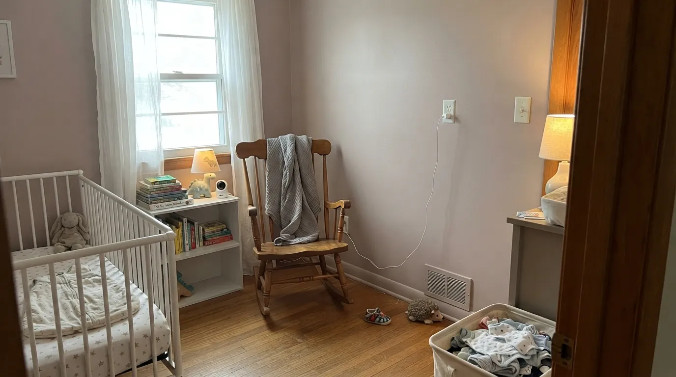
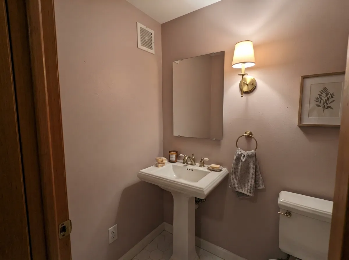
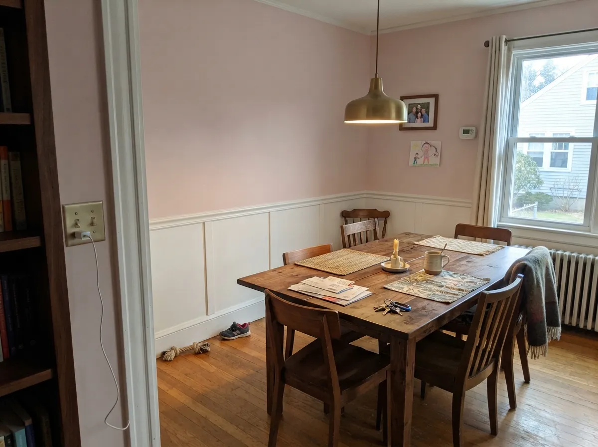
Give it warm daylight or lamp light and a room that wants softness rather than crispness, and Seaside Villa earns the Behr blog love. Nurseries are its natural home — muted enough to skip the theme-room problem, warm enough to feel finished the day the crib gets swapped for a twin bed. Its second calling is the small commitment: a windowless powder room under a warm sconce, or a dining room painted above wainscoting, where brushed brass, travertine, and warm linen make the blush read expensive instead of sugary.
Where It Fails
Nearly every regret story with Seaside Villa comes from one of three predictable mismatches, and none of them are the paint being unstable — the color is doing exactly what a pale, gray-terracotta pink does in that situation.
On the chip, next to a bright white, Seaside Villa can pass for a soft off-white. On four walls in real daylight the pink is unmistakable — this is the single most common surprise. If "barely-there warmth" is actually the goal, buy Blank Canvas instead and let this one stay a color, not a compromise.
Seaside Villa sits in the red-orange spectrum, and so does honey and red oak. Put them in the same room and neither one reads as a deliberate choice — the floor pushes orange, the walls push pink, and the whole room goes fleshy-warm and monochrome. Pale white oak, walnut, or a large rug breaks the two apart.
Cold light strips the terracotta out of this color fast. Readers describe the result as dusty, chalky, almost like unfinished plaster — not pink, not white, just flat. The fix is cheap: warm 2700K bulbs are part of the paint job here, the same way they are for any color this dependent on warmth.
Room by Room
Muted enough to skip the theme-nursery cliché, warm enough to still feel like a color decision. It ages with the kid better than a truer pink would — swap the crib for a bed and the wall still works. Eggshell for wipeable walls.
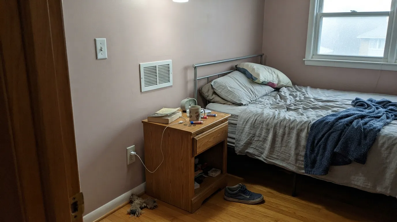
In a primary or guest room with south or east light it reads as a soft, grown-up blush rather than a girl's-room pink. Pair it with linen bedding and walnut, not gray-toned furniture, which fights the warmth.
A windowless powder room under warm sconces is exactly the scale this color wants: enough wall to notice, small enough that the commitment feels safe. Brass fixtures, travertine, and a marble vanity top are its best company. Satin for the walls, semi-gloss trim.
The classic use: Seaside Villa on the upper wall, a warm white on painted wainscoting below, brass chandelier overhead. It reads soft and formal without going full pink dining room.
A hutch, an island, or a breakfast-nook wall works. A full kitchen of Seaside Villa cabinets over honey-oak floors is the exact clash this review warns about — the whole room goes monochrome-fleshy instead of intentional.
Beautiful in a closed room with warm light and its own identity. Riskier in an open floor plan, where it has to negotiate with kitchen cabinets, adjacent wall colors, and whatever wood is underfoot the whole way through.
Your Light Is the Risk
The terracotta undertone comes forward and the color glows soft and warm without tipping candy-pink. This is the light the color was built for.
Cold light pulls the warmth out fast, leaving a dusty, chalky, almost plaster-like flatness. Test a large sample here before committing a whole room.
Warm and pink at the sun hours, quieter and more neutral the rest of the day. Most owners like the change; test both if you're unsure.
2700K warm bulbs: cozier, more clearly rose-toned. Cool white LEDs: flat and slightly gray — swap the bulbs before you swap the paint.
Most complaints about Seaside Villa are a light mismatch. Upload a photo of your actual room and see it on your walls — then ask for the same wall in north light or evening lamps before you buy a single sample.
Need It From Another Brand?
Any paint counter can custom-tint Behr S190-1 directly. If you would rather stay in one brand's own deck, these are the closest stock matches, measured as ΔE2000. Under 2 is a difference you will not see on the wall.
| Brand | Closest color | ΔE | LRV | |
|---|---|---|---|---|
| Sherwin-Williams | Fragile BeautySW 7553 · Sherwin-Williams | 3.5 | 70 | Color page → |
| Benjamin Moore | Dusty Trail1157 · Benjamin Moore | 3.1 | 69 | Color page → |
| Valspar | Safari Map8004-12A · Valspar | 2.3 | 70 | Color page → |
| PPG / Glidden | Bare Beige1067-2 · PPG / Glidden | 1.2 | 68 | Color page → |
| Glidden | Blush BeigePPG1070-2 · Glidden | 1.5 | 70 | Color page → |
| Dutch Boy | Shelled307-2DB · Dutch Boy | 3.1 | 69 | Color page → |
Similar Behr Colors
The nearest shades to Seaside Villa within Behr's own range, ranked by perceptual color distance — useful when you want the same look a touch lighter, darker, or warmer.
WCAG 2.1: AA is 4.5 : 1 for normal text, 3 : 1 for large text, AAA is 7 : 1.
Seaside Villa vs the Colors You're Also Considering
Every Seaside Villa sample board has the same rivals on it. The numbers show the real lightness gap — then it comes down to which risk you would rather live with.
Pick this when you actually want the pink to show, not just flirt with it.
Benjamin Moore 2102-70 · LRV 76First LightPick this for a pink that stays closer to a warm off-white — it only flushes rosy in direct light, where Seaside Villa commits at every hour.
Pick this when you want people to notice there is a color on the wall.
Behr DC-003 · LRV 79Blank CanvasPick this if you actually want the safe, barely-there warm white Seaside Villa only pretends to be on the chip.
Antique Pearl (210E-2) at LRV 73 and hex #EFD9D9 is the closest neighbor in the Behr deck. Its green and blue values are equal, so it is a fraction cleaner and brighter than Seaside Villa, which carries a touch more warmth. Stolen Kiss (MQ3-34) at LRV 73 and #EFD9D2 drops its blue further and reads peachier, while Sugar Berry (180E-2) at LRV 72 and #E8D9DE holds more blue and looks slightly mauve. Vienna Lace (PPU17-07) at LRV 72 is the greyest of the group.
Across brands, Valspar Barely Pink (1006-8C) at LRV 69.9 has a deltaE of 0.74 and Rose Blush (PPG18-18) at LRV 71 comes in at 0.97, so both are effectively the same color. Benjamin Moore Paisley Pink (1261) at LRV 70 sits at deltaE 1.37, visually identical in normal room light. Clare Baby Soft (PNT100-LT-25) at LRV 75 is deltaE 2.04 and lighter, so sample first. HGTV Home by Sherwin-Williams Cachet Pink (HGSW 1057) at deltaE 3.53 is close but visibly different side by side.
Seaside Villa Coordinating Colors
The rule for coordinating with Seaside Villa is the same as with any muted warm color: stay warm, stay soft, and give it one grounding dark note so the room doesn't drift toward pastel-on-pastel. Brass, travertine, walnut, and linen all read as intentional; icy grays and chrome read like an accident.
Behr's Quiet Pink: The Color of the Month Story
Seaside Villa is not an obscure or forgotten chip. Behr has featured it directly on its own Colorfully Behr editorial blog — once as a standalone Color of the Month, and again inside a roundup where the brand named it as one of three pink paint colors it loves. That is worth knowing because it separates this color from a passing trend pick: it is a deliberate, repeated editorial choice, described in Behr's own copy as a peach-shell warmth that recalls sand on a beach.
What that framing leaves out is how the color behaves once it is not a small square on a screen. The grayed, terracotta-leaning undertone that reads as "barely pink" in marketing photography reads as genuinely pink across four real walls — the gap between chip and room is the whole story of this review, and it is exactly why the fails section above exists.
Seaside Villa With Wood Tones and Floors
This decision gets made at the floor, not the paint store. Pale or white oak, walnut, and espresso all sit comfortably against Seaside Villa because their warmth is either cooler or deeper than the wall's, so the two stay distinct instead of blending together. Warm metals — brushed brass, unlacquered copper — read as an obvious, deliberate pairing.
The one honest no is honey or red oak: both the floor and the wall sit in the same red-orange family, and putting them together doesn't create harmony, it creates a room that reads as one overwhelming warm-pink blur with no contrast to anchor it. If the golden floor is staying, break the two apart with a rug, or step down to Creamy Mushroom, which shares the pink secret but reads more taupe than blush against warm wood.
Three Ready Palettes Built on Seaside Villa
A color is never alone on the wall. These are complete combinations in the 60-30-10 pattern, with the reason each one holds together. Every one opens in the visualizer.
Sage and blush is the muted-nursery pairing designers keep returning to because neither color reads as a theme. White Dove trim softens the handoff instead of cutting a hard line against the pink.
Try this palette in your roomBlank Canvas keeps the trim in the same warm family instead of fighting it with a stark white, and Beach Glass supplies the one cooler, blue-green note the coastal mood needs without curdling the pink.
Try this palette in your roomAlabaster keeps the wainscoting warm instead of stark-white, which is what keeps this from reading like a little girl's dining room. Wrought Iron gives the one near-black note that makes the whole scheme feel deliberate rather than accidental.
Try this palette in your roomSeaside Villa FAQ
Is Seaside Villa pink or beige?
Pink — a soft, grayed, terracotta-leaning pink that Behr markets as a peach-shell neutral. On a small chip next to a bright white it can pass for a warm off-white; on four full walls in real daylight, nobody mistakes it for beige.
Will it still work once my kid outgrows the nursery?
Better than a truer pink would. Because it is grayed down toward a neutral rather than saturated, it reads as a soft, grown-up color once the crib is gone — you're repainting for a new mood, not because the color aged badly.
What white trim goes with Seaside Villa?
A warm white, not a stark one — Behr Blank Canvas or Sherwin-Williams Alabaster. A bright, cool trim white makes the walls look pinker by contrast, the same way a cool white makes any warm color look more saturated than it is.
Does it work with oak floors?
Depends on the oak. Pale or white oak, walnut, and espresso are fine. Honey or red oak is the real clash — both floor and wall sit in the same red-orange family, and the room reads monochrome-warm instead of like a deliberate pairing. A large rug helps if the floor is staying.
Is it too pink for an adult bedroom?
Not with the right light and company. With linen bedding, walnut furniture, and brass hardware it reads soft and grown-up rather than juvenile. Pair it with gray-toned furniture or icy accessories and it starts to feel more like a kid's room.
How does it look in a dim, north-facing room?
Flatter and duskier than the chip promises — readers describe a dusty, almost chalky quality once the terracotta warmth drains out under cool light. Warm 2700K bulbs fix most of this; a genuinely dim north room without lamps is the one situation to sample carefully first.
Have you painted with Seaside Villa?
Rate it — one tap helps the next reader decide.
Ask a Question