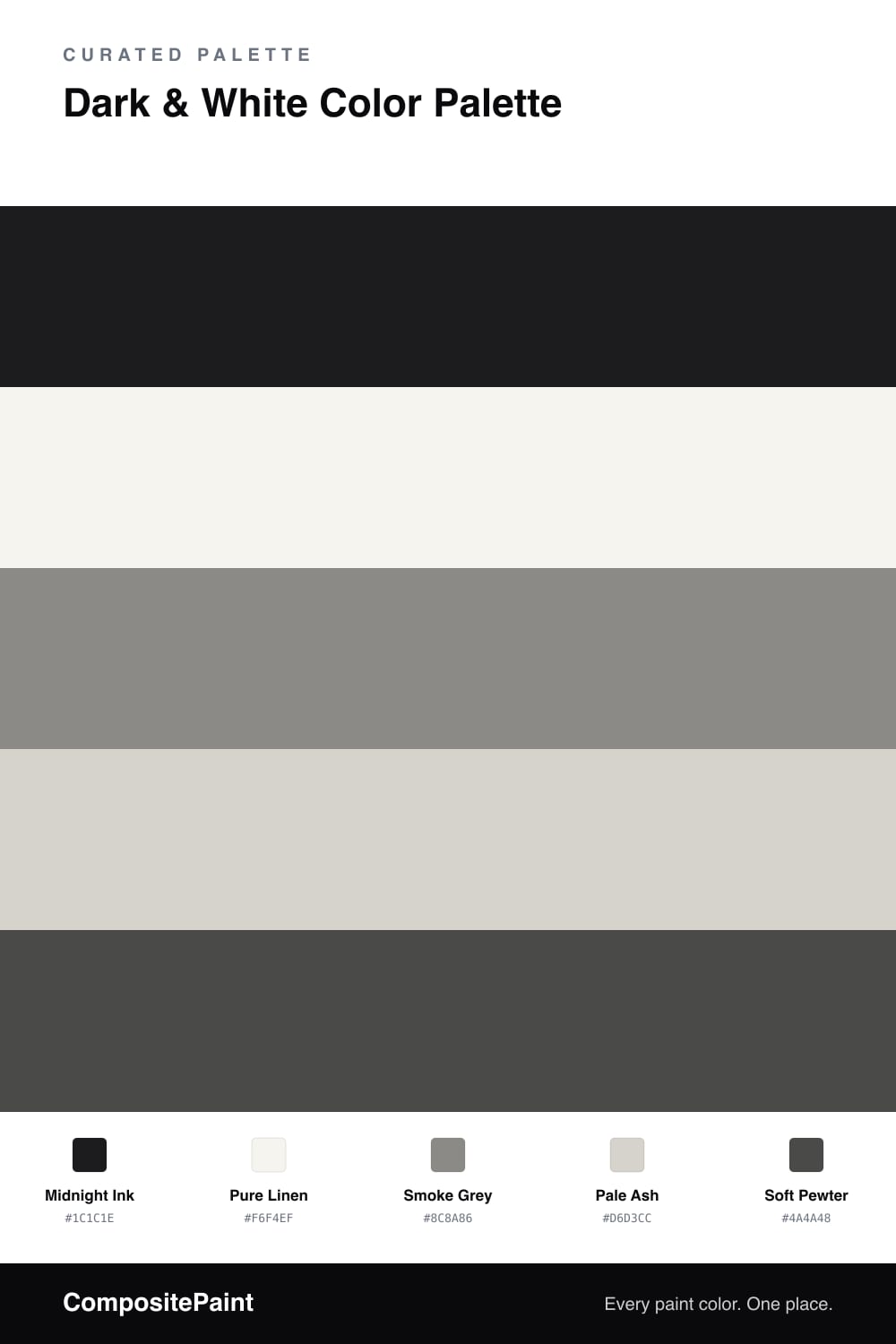
Dark & White Color Palette — Ink & Linen
A high-contrast four-color scheme of deep near-black against crisp white, softened by two quiet greys — every color matched to real paint you can buy.
By Jessica Williams · Color Stylist & Interior Editor
There is something deeply calming about a room that knows its own mind, and nothing reads more sure of itself than near-black against white. Midnight Ink is the anchor here, a soft charcoal-black that feels velvety rather than harsh, and Pure Linen answers it with a warm, paper-soft white that keeps the contrast from turning clinical.
The magic is in the middle. Smoke Grey and Pale Ash are the two greys that let your eye travel slowly between the dark and the light instead of bouncing off the extremes, while Soft Pewter sits close to the ink as a deep accent for trim, a frame, or the underside of a shelf.
For a contemporary 2026 feel, let the white lead the walls and save the ink for one bold gesture — a single moody wall, a door, a run of cabinetry — then thread the greys through soft furnishings so the whole scheme breathes.
Buy These Colors
Each color matched to the closest real paint in every brand, by ΔE2000. Tap a swatch for its full guide or + to save it — take any SKU to the store, they mix on demand.
Questions
Choose warm versions of both. A near-black with a hint of brown like Midnight Ink, paired with a soft paper white like Pure Linen, feels cozy instead of clinical, and the two greys in between keep the contrast gentle.
Let white lead and use the dark in smaller doses, roughly a one-fifth share. Save the near-black for one wall, a door, or cabinetry, then carry the greys through textiles so the room reads balanced rather than heavy.
Similar Palettes
Closest schemes by color — not by label.