CP

Dark & White Color Palette — Ink & Paper

A crisp four-color scheme pairing deep near-black ink with clean white and two soft greys for balance — every color matched to real paint you can buy.

By Emily Roberts · DIY Editor & First-Timer's Guide

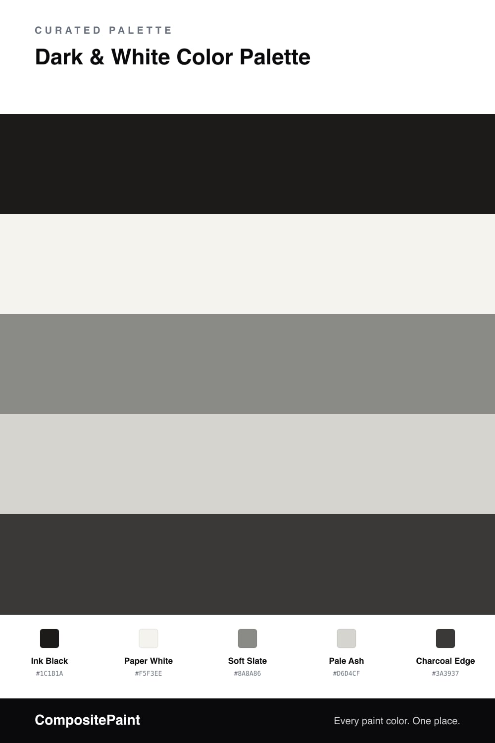
High-contrast black and white never really goes out of style, and the 2026 take is a little softer than the stark version you might picture. This scheme anchors on a deep, slightly warm Ink Black and sets it against a calm, off-white Paper White so the contrast feels crisp instead of harsh.

The greys are what make it work. Soft Slate is a mid-tone that bridges the two extremes, and Pale Ash is a quiet light grey that softens the jump from white to black. A touch of Charcoal Edge gives you a near-black with a bit more depth, handy for trim, hardware, or a shadow line where pure black would feel flat.

Let Paper White do most of the heavy lifting, bring in Ink Black in smaller, confident doses, and let the two greys fill the space between. It is a simple formula, but it reads clean, modern, and timeless all at once.

View palette in
Ink Black
Dominant
Portola Paints Factory Black · Factory Black
#262625
LRV 2
Paper White
Base
Dunn-Edwards Droplets · DEW381
#F6F4EF
LRV 83
Soft Slate
Secondary
PPG / Glidden Downpour · PPG1010-5
#8A8A87
LRV 25
Pale Ash
Support
Diamond Vogel Santo · 0538
#D7D4CF
LRV 66
Charcoal Edge
Accent
Farrow & Ball Pitch Black · No. 256
#3B3938
LRV 4

Buy These Colors

Each color matched to the closest real paint in every brand, by ΔE2000. Tap a swatch for its full guide or + to save it — take any SKU to the store, they mix on demand.

Ink Black
#1C1B1A · LRV 1 · Dominant
Sherwin-Williams · SW 2936 · ΔE 10.2
Behr · 770F-7 · ΔE 8.33
Benjamin Moore · PM-9 · ΔE 5.55
Valspar · 8006-8G · ΔE 5.6
PPG / Glidden · PPG0995-7 · ΔE 10.79
Glidden · 00NN 05/000 · ΔE 10.32
Dutch Boy · 438-7DB · ΔE 6.46
HGTV Home by Sherwin-Williams · HGSW 1441 · ΔE 6.46
Dunn-Edwards · DEA002 · ΔE 9.89
Magnolia Home · JG-05 · ΔE 9.12
Farrow & Ball · NO. 256 · ΔE 9.61
Diamond Vogel · H101 · ΔE 9.9
Hirshfield's · 0515 · ΔE 5.25
Rodda · CA210 · ΔE 12.44
C2 Paint · BD49 · ΔE 11.92
Clare · PNT100-DP-54 · ΔE 14.1
Portola Paints · FACTORY BLACK · ΔE 3.47
Annie Sloan · OXFORD NAVY · ΔE 13.75
Backdrop · BD-HP · ΔE 4.49
Rust-Oleum · 285144 · ΔE 10.63
Kompozit · 0515 · ΔE 5.25
Paper White
#F5F3EE · LRV 90 · Base
Sherwin-Williams · SW 9541 · ΔE 0.8
Behr · HDC-MD-08 · ΔE 0.49
Benjamin Moore · 879 · ΔE 0.53
Valspar · 8007-6E · ΔE 0.56
PPG / Glidden · PPG1001-1 · ΔE 1.54
Glidden · PPG1001-1 · ΔE 1.48
Dutch Boy · 002W · ΔE 1.25
HGTV Home by Sherwin-Williams · HGSW 4002 · ΔE 1.83
Dunn-Edwards · DEW381 · ΔE 0.21
Magnolia Home · JG-21 · ΔE 1.56
Farrow & Ball · NO. 2005 · ΔE 1.13
Diamond Vogel · 0355 · ΔE 1.43
Hirshfield's · 0411 · ΔE 1.97
Rodda · R001 · ΔE 1.21
C2 Paint · C2-612 · ΔE 1.2
Clare · PNT100-LT-04 · ΔE 1.66
Portola Paints · ORIGAMI · ΔE 1.12
Annie Sloan · OLD OCHRE · ΔE 14.32
Backdrop · BD-TR · ΔE 2.79
Rust-Oleum · 285140 · ΔE 3.69
Kompozit · 0411 · ΔE 1.97
Soft Slate
#8A8A86 · LRV 25 · Secondary
Sherwin-Williams · SW 9569 · ΔE 2.92
Behr · PPU26-04 · ΔE 2.02
Benjamin Moore · AF-710 · ΔE 1.39
Valspar · 8006-2F · ΔE 2.92
PPG / Glidden · PPG1010-5 · ΔE 0.55
Glidden · PPG1010-5 · ΔE 0.55
Dutch Boy · 437-4DB · ΔE 1.07
HGTV Home by Sherwin-Williams · HGSW 3473 · ΔE 3.26
Dunn-Edwards · DEGR59 · ΔE 3
Magnolia Home · JG-124 · ΔE 3.52
Farrow & Ball · NO. 272 · ΔE 2.22
Diamond Vogel · 0582 · ΔE 1.81
Hirshfield's · 0442 · ΔE 5.72
Rodda · CA200 · ΔE 2.39
C2 Paint · C2-952 · ΔE 1.64
Clare · PNT100-DP-52 · ΔE 5.07
Portola Paints · VOODOO · ΔE 7.42
Annie Sloan · COCO · ΔE 10.51
Backdrop · BD-PW · ΔE 9.11
Rust-Oleum · 391446 · ΔE 4.19
Kompozit · 0442 · ΔE 5.72
Pale Ash
#D6D4CF · LRV 66 · Support
Sherwin-Williams · SW 7647 · ΔE 1
Behr · T17-01 · ΔE 2.02
Benjamin Moore · CSP-500 · ΔE 1.03
Valspar · 7004-18 · ΔE 0.57
PPG / Glidden · FLLW961 · ΔE 2.03
Glidden · PPG0994-1 · ΔE 2.18
Dutch Boy · 426-1DB · ΔE 5.28
HGTV Home by Sherwin-Williams · HGSW 1456 · ΔE 2.22
Dunn-Edwards · DE6366 · ΔE 2.09
Magnolia Home · JG-132 · ΔE 1.33
Farrow & Ball · NO. 277 · ΔE 1.62
Diamond Vogel · 0538 · ΔE 0.52
Hirshfield's · 0530 · ΔE 1.53
Rodda · CA030 · ΔE 1.47
C2 Paint · C2-979 · ΔE 2.66
Clare · PNT100-LT-18 · ΔE 1.46
Portola Paints · SAN FERNANDO · ΔE 1.76
Annie Sloan · OLD OCHRE · ΔE 11.44
Backdrop · BD-RR · ΔE 5.32
Rust-Oleum · 285142 · ΔE 9.27
Kompozit · 0530 · ΔE 1.53
Charcoal Edge
#3A3937 · LRV 4 · Accent
Sherwin-Williams · SW 6994 · ΔE 2.55
Behr · MQ5-05 · ΔE 1.56
Benjamin Moore · 2126-10 · ΔE 2.14
Valspar · V120-3 · ΔE 2.56
PPG / Glidden · PPG0995-7 · ΔE 2.02
Glidden · 00NN 05/000 · ΔE 2.2
Dutch Boy · 424-7DB · ΔE 5.44
HGTV Home by Sherwin-Williams · HGSW 3291 · ΔE 5.44
Dunn-Edwards · DEA002 · ΔE 1.43
Magnolia Home · JG-150 · ΔE 4.81
Farrow & Ball · NO. 256 · ΔE 1.08
Diamond Vogel · H101 · ΔE 2.15
Hirshfield's · H0101 · ΔE 2.04
Rodda · CA210 · ΔE 7.37
C2 Paint · C2-981 · ΔE 1.49
Clare · PNT100-DP-54 · ΔE 4.63
Portola Paints · NOMAD · ΔE 6.9
Annie Sloan · AUBUSSON BLUE · ΔE 11.3
Backdrop · BD-AH · ΔE 4.77
Rust-Oleum · 285144 · ΔE 4.25
Kompozit · 0529 · ΔE 1.72

Questions

How do I keep an all dark-and-white scheme from feeling cold?

Pick a near-black with a hint of warmth, like Ink Black, instead of a true blue-black. Then lean on the off-white rather than a stark bright white. Those small warm undertones keep the whole thing crisp without turning chilly or clinical.

Where should the dark color actually go?

Use Ink Black in smaller, deliberate spots rather than everywhere. Think one wall, the trim, or a single bold piece, while Paper White carries most of the space. That way the contrast stays sharp and the dark reads as confident, not heavy.

KEEP EXPLORING

Similar Palettes

Closest schemes by color — not by label.