Silver Spoon
A quiet silvery gray at LRV 60, reviewed honestly: the marble-and-chrome rooms where it clicks, the north light that turns it green, and what to pick instead.

Jessica has spec'd whites and neutrals for more than 300 rooms and keeps a sample wall of painted drawdowns in her studio. Every color review is checked against real reader rooms in the comments and re-tested when a formula changes. About the testing process →
- 1Stardew43
- 2Quietude48
- 3Silver Spoon60
- 4Gray Owl65
- 5Glass Slipper70
The Fast Verdict
Silver Spoon is the gray you pick when you actually want gray — silvery, low-chroma, and cool enough to sit next to marble and chrome without going beige. At LRV 60 it has real body without feeling heavy, and in south light it reads like brushed nickel on a wall. It is not famous, not a Color of the Year, and not a whole-house default: dim north rooms and honey oak will punish it. Sample it in the room you have.
South-facing living rooms and kitchens with marble or chrome · cool-stone bathrooms · daylight hallways and offices · anyone who wants gray, not greige
Your floors are honey oak · the room faces north and stays dim · you wanted Agreeable Gray warmth · your trim is a creamy white
- Actually gray — silvery, not greige, not violet
- LRV 60 holds in bright rooms without washing to white
- Designed company: marble, chrome, stainless, cool stone
- Does not go baby-blue the way some light grays do
- Quiet enough for offices, hallways, and whole daylight floors
- North light and overcast days pull a dingy green-gray
- Fights honey oak, cream trim, and warm brass-and-beige rooms
- Low chroma can read like primer without a crisp white or dark note
- Regional workhorse, not a national default — fewer real-room photos to copy
What Color Is Silver Spoon, Really?
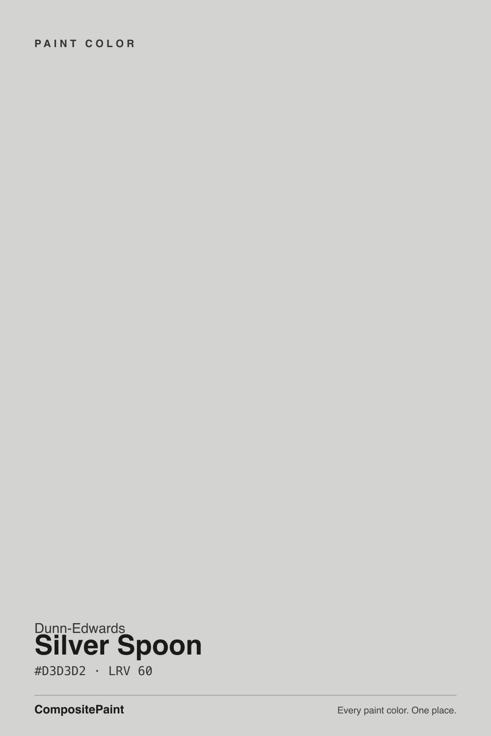
A near-achromatic silvery gray with a cool blue-green spine — Dunn-Edwards files it as DE6366, and the chip looks almost like unpainted metal until you put it on a wall. The chroma is tiny, which is the whole trick: most light grays at this depth sneak in beige or violet so they read as greige. Silver Spoon does not. It stays gray, then flashes a faint cool green when the light goes cold, the way brushed nickel goes slightly green next to a cream wall. That is why the brand pairs it with marble, chrome, and a crisp bright white, not with oak and brass.
At LRV 60 it sits in the same numeric neighborhood as Agreeable Gray (LRV 60) and Passive (LRV 60), but the temperature is the opposite of the first and a close cousin of the second. Put it next to Chantilly Lace (LRV 90) and it is clearly a color, not a white; put it next to Mindful Gray (LRV 48) and it looks airy. It has enough bounce to keep a kitchen from going cave, and enough gray to hide the scuffs a true white would broadcast. It will not brighten a dark room the way a white will — 60 is mid-light, not a rescue.
Undertone in one line: cool gray first, a whisper of blue-green second — never beige, never violet. If your sample looks green, that is north light or a creamy neighbor exposing the blue-green; if it looks warm, something in the room is reflecting. The paint itself is not a greige.
Where It Shines
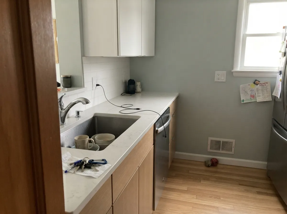
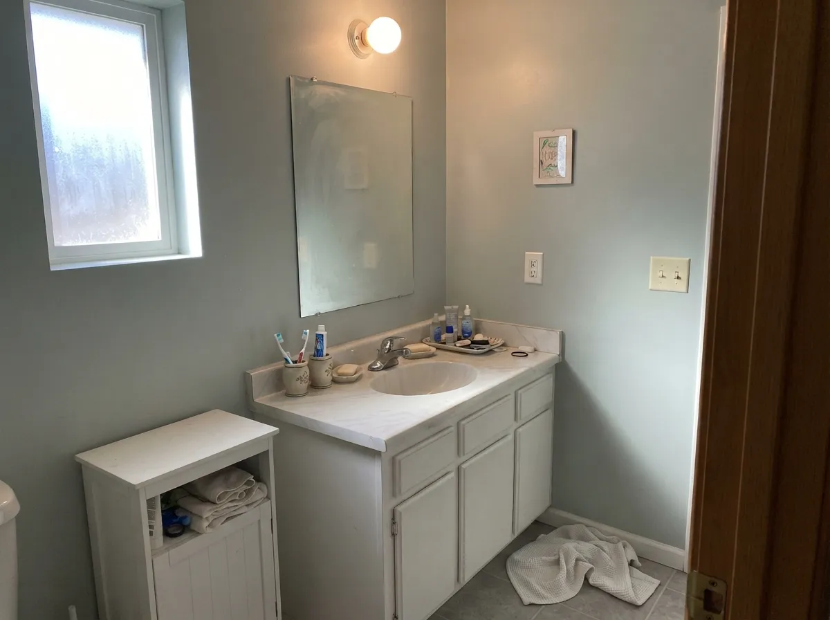
Give it real daylight and cool materials and it behaves like a custom metal finish. South-facing living rooms, marble-and-chrome kitchens, and bathrooms with white stone are its best rooms: the silver stays silver, the green stays in the undertone, and chrome hardware looks designed rather than leftover. Offices and daylight hallways are the sleeper use — a professional gray that does not go purple the way some light grays do.
Where It Fails
Almost every regret about Silver Spoon is a temperature mismatch, and all three versions are visible on a sample board before anyone opens a gallon. None of them are the paint's fault — but if your room matches one, this is not your gray, and more coats will not warm it up.
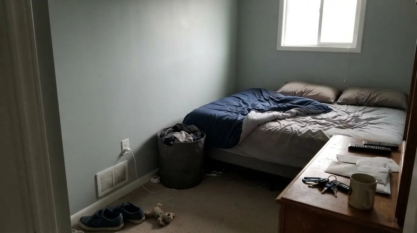
Cool gray daylight strips the silver and leaves the blue-green base: walls go institutional, slightly dingy, a little like unpainted metal in a garage. Readers who loved it in a sunny room report a green-gray they did not order. The color did not fail; the light did. Go warmer (Agreeable Gray) or add lamps — this paint will not invent warmth.
Yellow-orange floors and White Dove or Swiss Coffee trim sit on the warm side of the fence; Silver Spoon sits on the cool side. Each side exaggerates the other — the gray goes greener, the oak goes more orange, the cream trim looks yellowed. Pair it with a crisp white (Chantilly Lace, Pure White) and cooler wood or stone, or pick a greige and keep the oak.
At this chroma, four walls of Silver Spoon with builder-beige carpet and no dark note can read like primer that never got a topcoat. It needs a crisp white trim line, a dark metal, or actual stone to prove it is a color. If the room is beige-on-beige, this gray will look unfinished, not quiet.
Room by Room
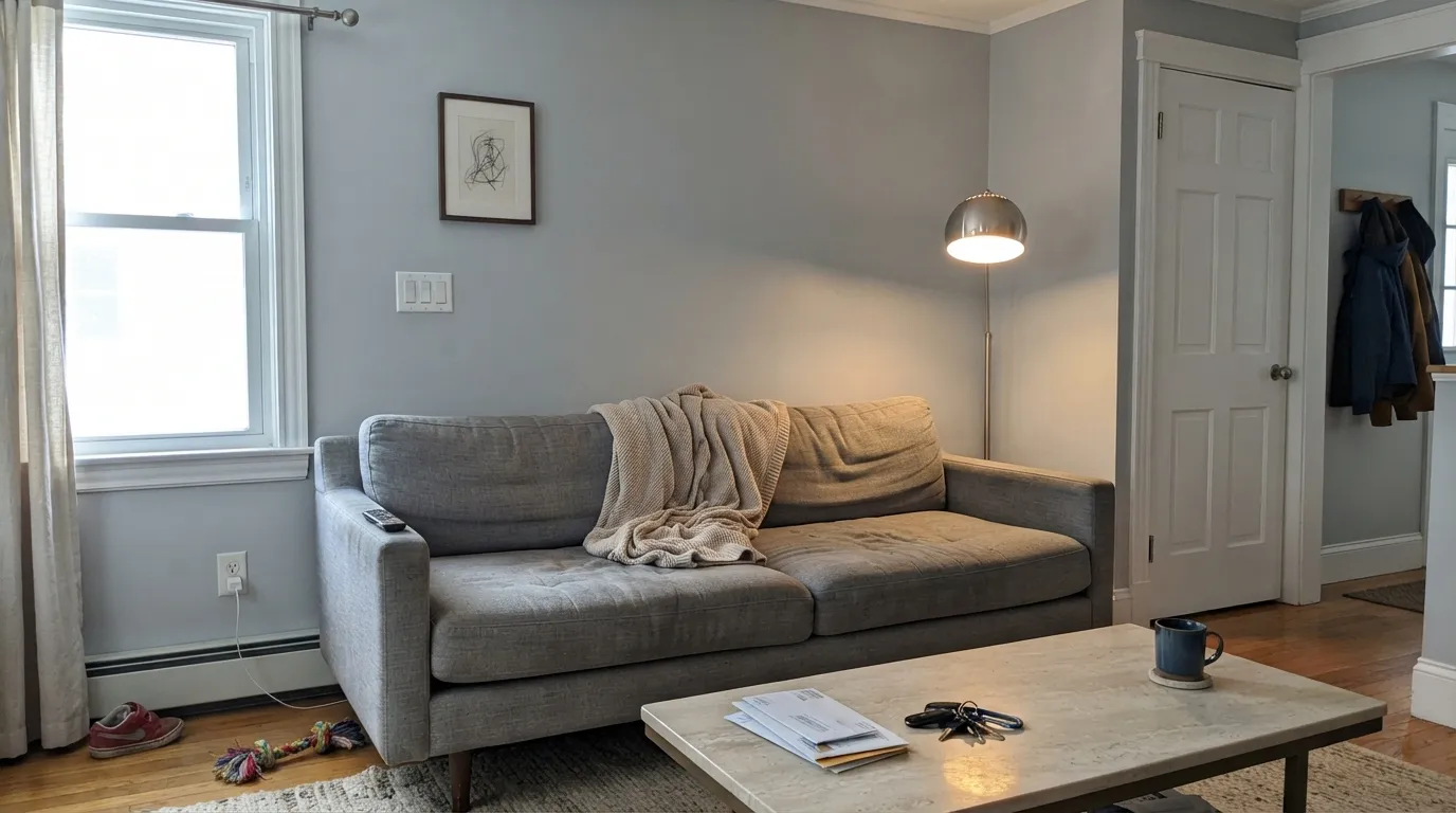
South or west light keeps it silvery and calm against a gray sofa and matte-black or chrome lamp. Eggshell on the walls, a crisp white on trim. Skip it in a closed north living room with no lamps — that is the dingy-green version.
White quartz, marble, chrome faucets, stainless: this is the pairing Dunn-Edwards wrote the color for. Satin on cabinets wipes clean and still reads gray, not dirty white. Honey butcher block and creamy subway tile argue with it — sample above the actual counters.
Marble, chrome, white tile, and a gray wall is a finished look at LRV 60 without going spa-green. Eggshell on walls, satin on a vanity. If the tile is beige or the fixtures are all brass, the cool gray will look leftover from a different house.
In a room with a real window it is a restful, non-beige backdrop for white bedding. Under 2700K lamps it loses a little of the green and goes quieter. A dim north bedroom is the risk room: test an evening with the lamps you actually own.
Daylight hallways carry it room to room without the violet flash Repose Gray is famous for. A home office in south or west light looks professional and current. Long interior halls with no window need a lamp; otherwise it drops to primer-gray.
Dunn-Edwards has spec'd it on metal railings and trim (Market Square Condominiums used it that way). As a whole-house body color, shade turns it green-gray from the street. If you want it outside, keep it on metal, garage doors, or trim against a brighter white body.
Your Light Is the Risk
Midday sun keeps it a true silvery gray — the brushed-nickel read. This is the light that makes the color worth buying.
Cool gray daylight exposes the blue-green base. Walls go institutional and slightly dingy. Test on an overcast morning before you commit.
Cooler and a touch greener in morning shade, cleaner and more silver when the sun is on the wall. The shift is real but smaller than a greige's beige-to-gray swing.
2700K lamps knock the green back and the wall goes quieter, almost neutral. Cool 4000K LEDs push the institutional gray — swap bulbs before you blame the paint.
Most complaints about Silver Spoon are a light mismatch. Upload a photo of your actual room and see it on your walls — then ask for the same wall in north light or evening lamps before you buy a single sample.
Need It From Another Brand?
Any paint counter can custom-tint Dunn-Edwards DE6366 directly. If you would rather stay in one brand's own deck, these are the closest stock matches, measured as ΔE2000. Under 2 is a difference you will not see on the wall.
| Brand | Closest color | ΔE | LRV | |
|---|---|---|---|---|
| Sherwin-Williams | ReflectionSW 7661 · Sherwin-Williams | 1.3 | 66 | Color page → |
| Behr | PlatinumPPU26-11 · Behr | 2.0 | 65 | Color page → |
| Benjamin Moore | Silvery Moon1604 · Benjamin Moore | 2.9 | 64 | Color page → |
| Valspar | Morning Lake7004-21 · Valspar | 1.3 | 64.8 | Color page → |
| PPG / Glidden | Wright Cloud WhiteFLLW961 · PPG / Glidden | 1.6 | 65 | Color page → |
| Glidden | ElementalPPG1011-2 · Glidden | 1.5 | 65 | Color page → |
Similar Dunn-Edwards Colors
The nearest shades to Silver Spoon within Dunn-Edwards's own range, ranked by perceptual color distance — useful when you want the same look a touch lighter, darker, or warmer.
WCAG 2.1: AA is 4.5 : 1 for normal text, 3 : 1 for large text, AAA is 7 : 1.
Silver Spoon vs the Colors You're Also Considering
Every Silver Spoon sample board has the same rivals on it. The numbers show the real lightness gap — then it comes down to which risk you would rather live with.
Pick this if you are already in Dunn-Edwards and want the slightly more metallic, less concrete version of the same cool idea.
Sherwin-Williams SW 7064 · LRV 60PassivePick this if your painter is in Sherwin-Williams — same LRV, the truest cool gray in that deck, a hair more cement than silver.
Pick this when beige in the gray is exactly what you do not want, and you would rather risk green than purple.
Sherwin-Williams SW 7015 · LRV 58Repose GrayPick this if you want the famous modern greige — a light gray with a warm base, and a known violet flash in north light.
Silver Spoon Coordinating Colors
The rule for coordinating with Silver Spoon is temperature, not taste: stay cool. Crisp whites, true navies, charcoal, chrome, and cool stone make it look intentional; cream, honey, and warm greige make it look like the wrong sample. These are the partners that keep the silver on the right side of green:
Not Greige, Not Famous — What This Color Actually Is
Silver Spoon is not a Color of the Year and it does not have a viral room. Dunn-Edwards' own page calls it a soft silvery gray with cool undertones and points it at marble, chrome, and a crisp bright white — which is more honest than most gray marketing. In the Coatings Guide it shows up as metal and trim at Market Square Condominiums, not as a celebrity living room. That is the right scale for this color: a Southwest workhorse, not a national default.
The thing people miss on the chip is that LRV 60 in the Dunn-Edwards deck is doing a different job than LRV 60 Agreeable Gray. Agreeable is the safest greige until the light goes cool. Silver Spoon is already cool. If you arrived here because a designer said 'just a light gray' and you have oak floors and cream trim, you are on the wrong page — go to Agreeable Gray or Revere Pewter. If you arrived because the kitchen is marble and chrome and every greige looked dirty, you are in the right place.
Silver Spoon With Wood Tones and Floors
Cool floors love it; warm floors do not. Ashy white oak, gray-washed wood, concrete-look LVP, and pale stone all sit in the same family, so the wall reads as a quiet continuation rather than a temperature argument. Walnut can work if the rest of the room stays cool (chrome, white stone, no honey accents) — the dark red-brown gives the silver something to push against.
Honey oak, orange builder stain, yellow-beige carpet, and terracotta tile are the honest misses. Cool gray next to yellow-orange is complement contrast: both sides get louder. A large rug in a living room can hide enough floor to make it livable; a kitchen with wall-to-wall honey oak and Silver Spoon cabinets will look like two different projects. Metals are easier: chrome, brushed nickel, and stainless are native; unlacquered brass wants a sample, because the yellow metal can pull the same green the oak does.
Three Ready Palettes Built on Silver Spoon
A color is never alone on the wall. These are complete combinations in the 60-30-10 pattern, with the reason each one holds together. Every one opens in the visualizer.
Pure White is the default crisp cabinet white that only fails when you pair it wrong — here the cool gray wall is the right pairing. Iron Ore at LRV 6 gives the one dark note this low-chroma gray needs so the kitchen does not read as primer.
Try this palette in your roomThe brand itself wants a crisp bright white next to this gray; Chantilly Lace is the cleanest white BM makes, so the silver stays silver instead of going green against cream. Hale Navy is the safest navy for a door as long as the entry has light.
Try this palette in your roomWhisper is Dunn-Edwards' White Dove analog, so the house stays in one brand; sample it next to Silver Spoon — if the trim looks creamy, step to a crisper white. Kendall Charcoal is the best-behaved dark gray for a vanity, deep enough to ground the silver without going black.
Try this palette in your roomSilver Spoon FAQ
Is Silver Spoon warm or cool?
Cool. It is a silvery gray with a faint blue-green undertone, not a greige. In south light it reads as quiet metal; in north light the green comes forward. If you wanted the warmth of Agreeable Gray, this is the wrong deck page.
What trim white goes with Silver Spoon?
A crisp bright white — Chantilly Lace or Pure White — matching how Dunn-Edwards itself pairs it. Creamy whites (White Dove, Swiss Coffee, even Whisper if it reads yellow in your light) push the gray toward green. Semi-gloss on the trim, eggshell on the walls.
Does it work with oak floors?
Depends on the oak. Pale, gray-washed, or ashy white oak is compatible. Golden honey oak is the honest no: the cool gray makes the floor look more orange, and the floor makes the wall look more green. A large rug can buffer a small room; wall-to-wall honey tones want a greige instead.
Is it good for a whole house?
Only if the house has decent daylight and cool or mixed materials. Open south-facing floors, hallways with a window, kitchens with white stone: yes. A ranch with honey oak and a string of north bedrooms: no. It is a whole-daylight-floor gray, not a whole-dark-house gray.
Will Silver Spoon look green?
It can. The undertone is blue-green at very low chroma, so cool north light, overcast days, and creamy neighbors all pull a faint green-gray. South sun and 2700K lamps keep it silver. If green is a dealbreaker, sample on the darkest wall and look at it on a gray morning.
How does it compare to Passive and Repose Gray?
Passive is the closest Sherwin-Williams twin: same LRV 60, a true cool gray, a bit more cement than silver. Repose Gray is the famous light greige at LRV 58 — warmer, and it can flash violet in north light. Pick Silver Spoon when you want metallic-cool without beige; pick Repose when you want the greige everyone already knows.
Have you painted with Silver Spoon?
Rate it — one tap helps the next reader decide.
Ask a Question